UI Controls and data
What you will learn in this guide
In the guides up to this point we have often connected UI Controls, such as Text Inputs, to data. In this guide we will present a few patterns that is commonly used to connect data to UI controls.
Connecting UI Controls to data
A very common pattern is that we want a UI Control to write to some sort of data node (Variable, Object etc) when it is updated. All UI Controls that allow for some sort of data input has both an input and an output for the data. For instance, the Text Input has both an input and output called Text, and the Slider has an input and output called Value.
The output is used to write the data to some sort of data node. Most UI Controls have a Changed signal output that is triggered when the user has interacted with the control. This should be used as a trigger to an action that writes data. The most simple one being shown below. When the slider is updated we write the current value to a Variable.
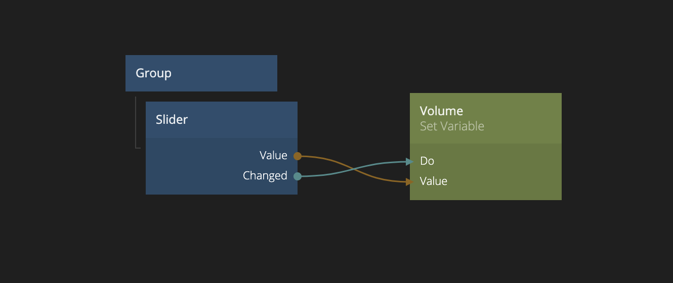
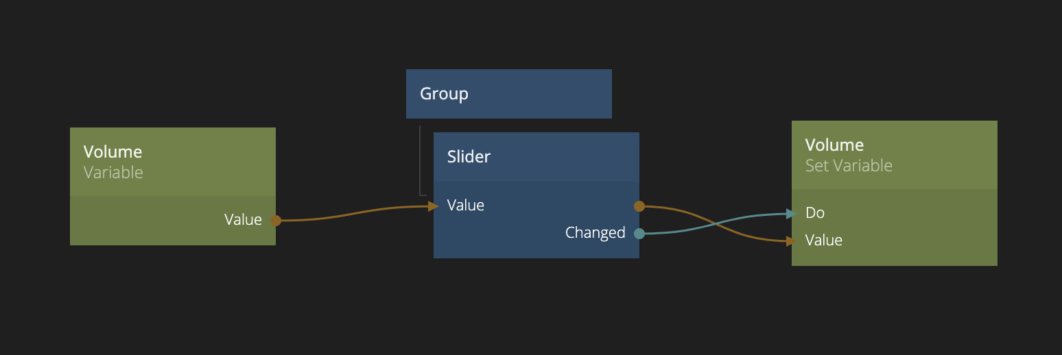
This is the most basic pattern at it will make sure the Variable named Volume is updated when the slider is dragged. However, if the Volume variable is updated somewhere else, the slider is not updated to refelect that change. For that we can connect the Variable to the slider Value input as well. Like below:
This can be useful to create truly reactive user interfaces. Take the simple example below, where you have both a Text Input and a Slider that are both controlling the volume. The slider updates as soon as the user interacts with it, and the text input when it's blurred (looses focus) or when you press enter.
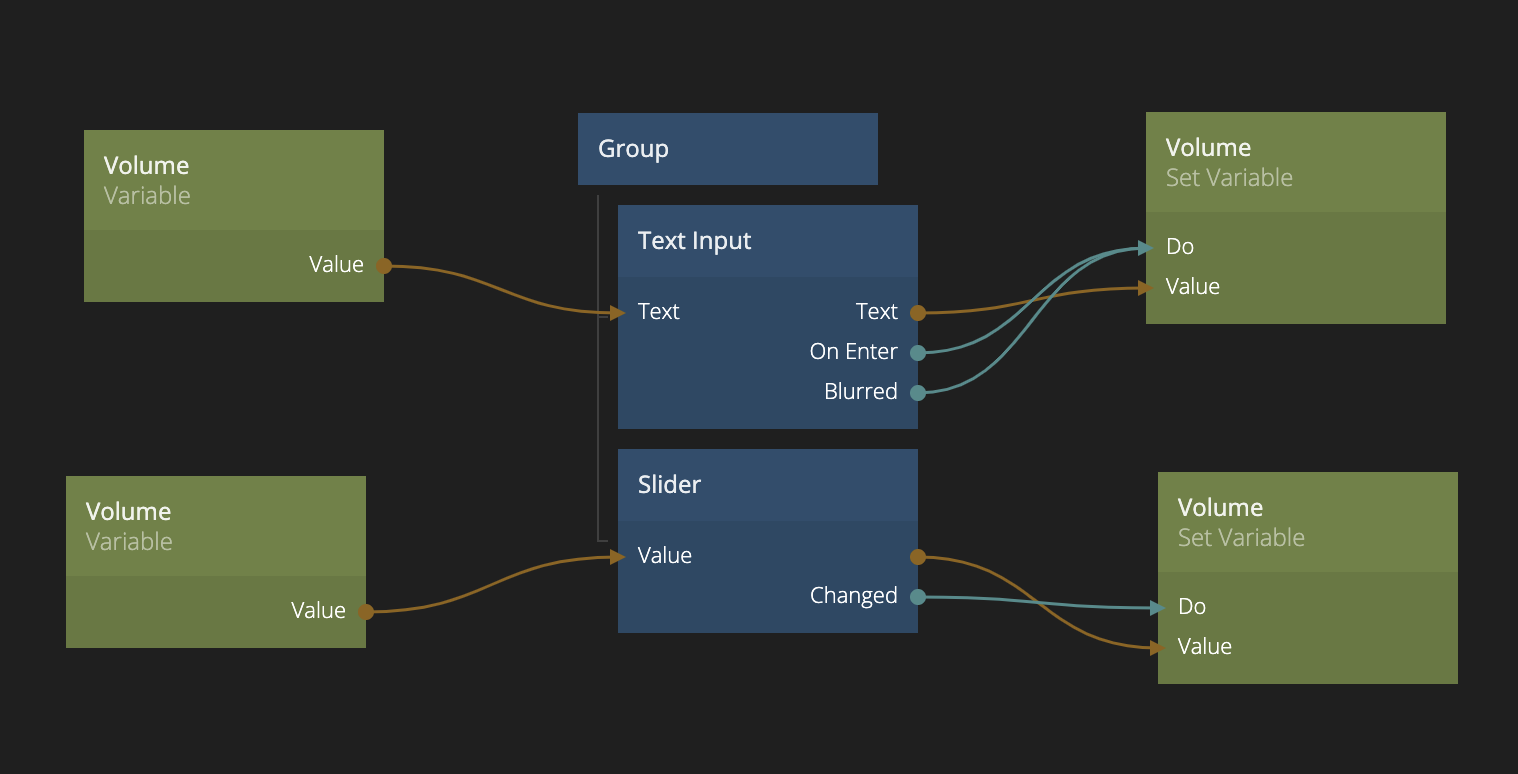
Hooking you controls up likes this will keep them in sync when interacting with them. Check out the result below:
Forms
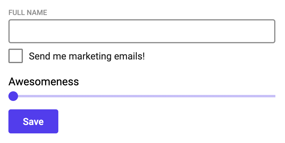
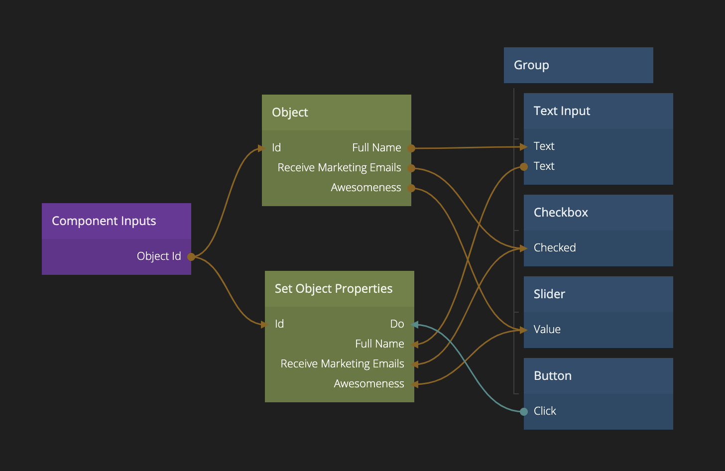
Many times you want to use a form, or simply a set of UI Controls, to view and edit the data in an Object. You could create a component that has an input for the object id of the object it should edit and then use the pattern above, but instead we want to save when a button is clicked. Let's say we want to create the simple form below:
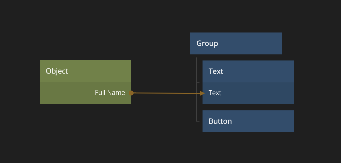
We will keep the information about a user (full name etc) in an Object and we can edit the object using the following simple component. Here you can see that the Object Id is provided as an input to this component. An Object node is used to "read" the data and connect it to the UI Controls, this will populate them with the correct data for the object when the Object Id changes. The properties are then written to the object when the Save button is clicked using the Set Object Properties node.
Create, Read, Update & Delete
A very common pattern in web apps is CRUD (Create, Read, Update & Delete) user interfaces. This is you have a list of objects and you want to be able to create, read, update and delete these objects. Let's extend out form into a full CRUD user interface.
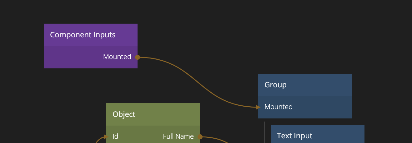
To begin with, we'll add a few small things to our Form component that we created above. First we will expose the Mounted property on the root Group node as an input. This will allow us to control the visibility of the form when using it in our CRUD interface.
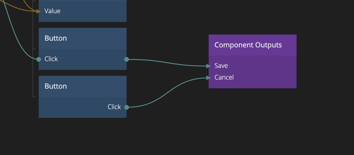
Secondly, we will add a cancel button and send both the save button and cancel button Clicked signals as outputs from this component.
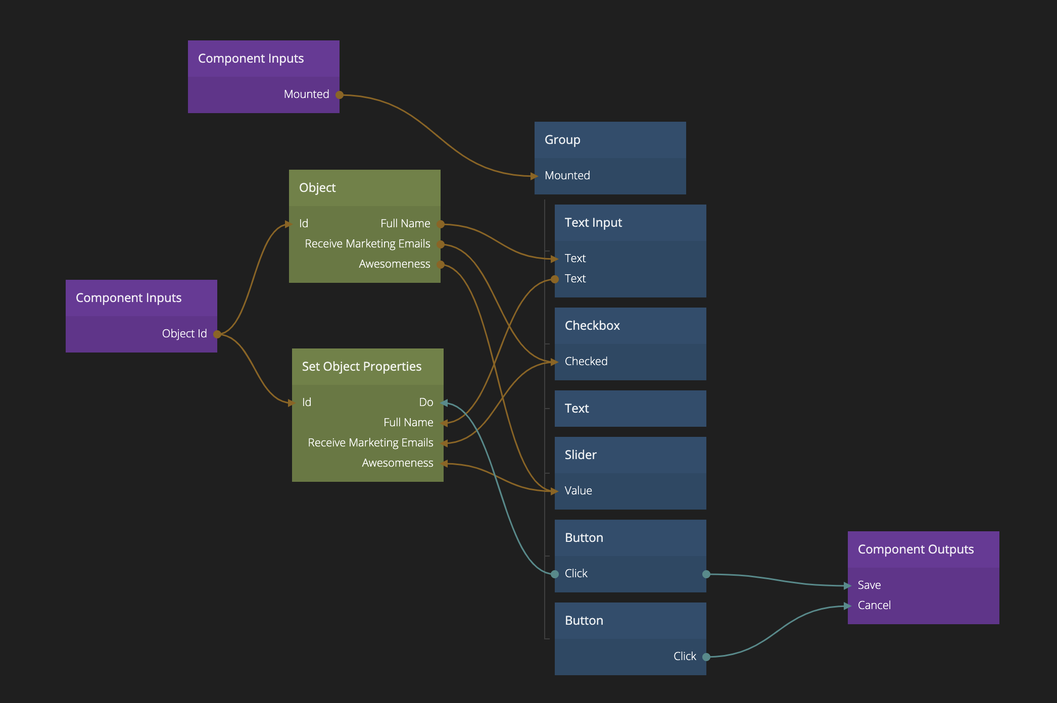
Then we end up with this. This is now our Form visual component. It will be used both for editing and creating new objects.
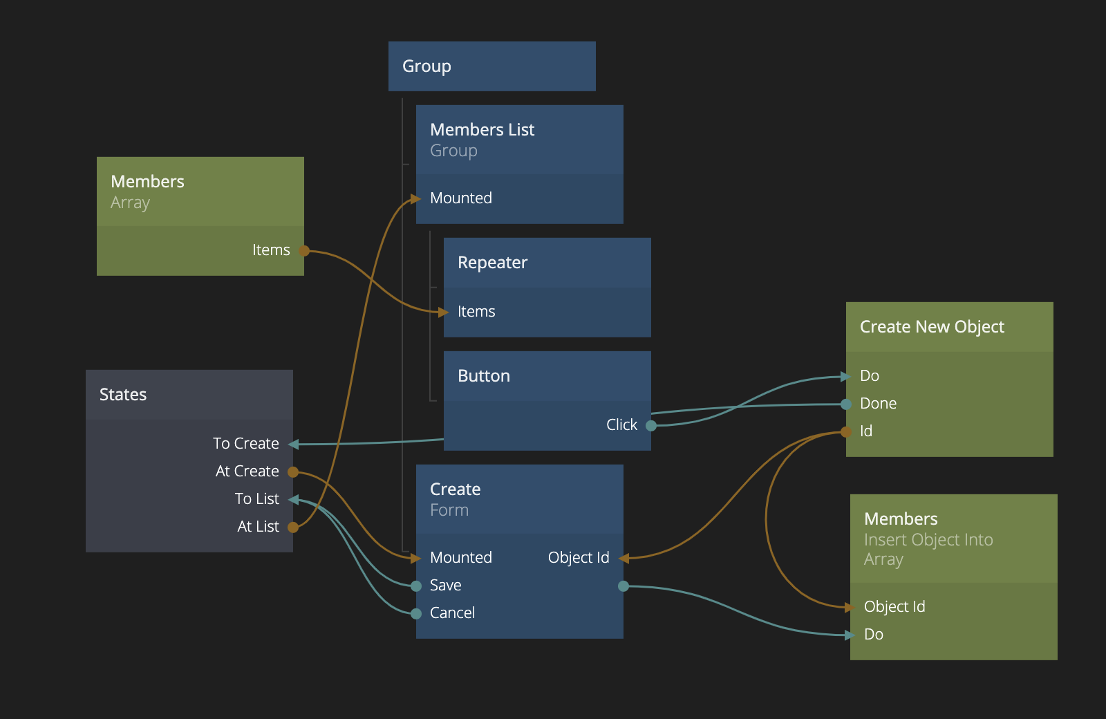
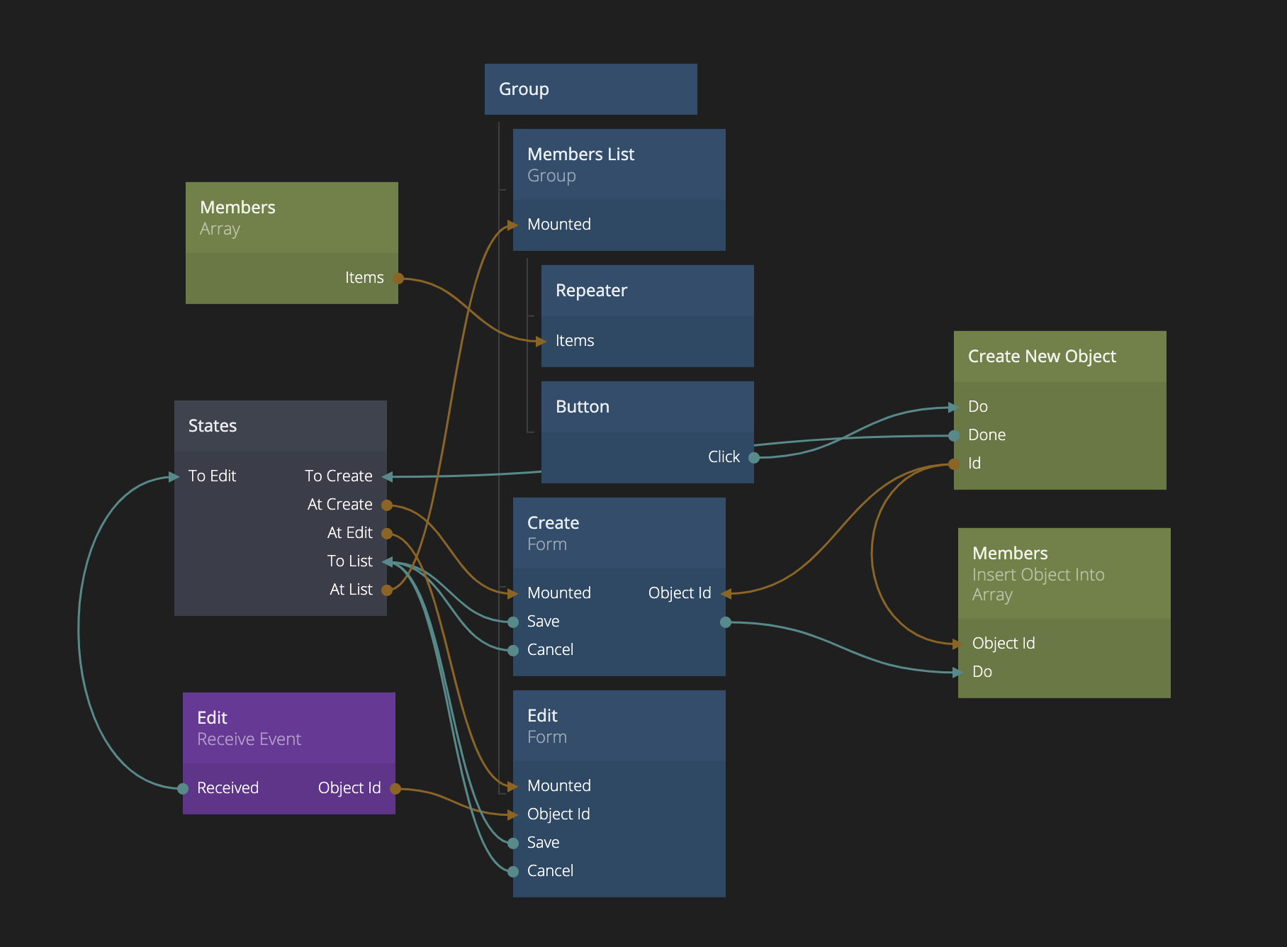
Now lets start on a new component, let's call this one Members List. Imaging the we want to manage a list of members with their name, if they want our marketing email and their general awesomeness. First we create the members list. We won't cover things like repeaters in detail in this guide, check out the list guide.
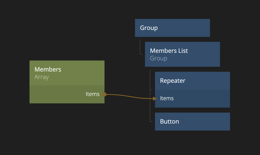
We have a Repeater node that is connected to an Array that we have given the Id "Members". This array will be empty to start with. We also have a button that we will later use to show the create form. We also need a Member Item that the repeater will use as template.
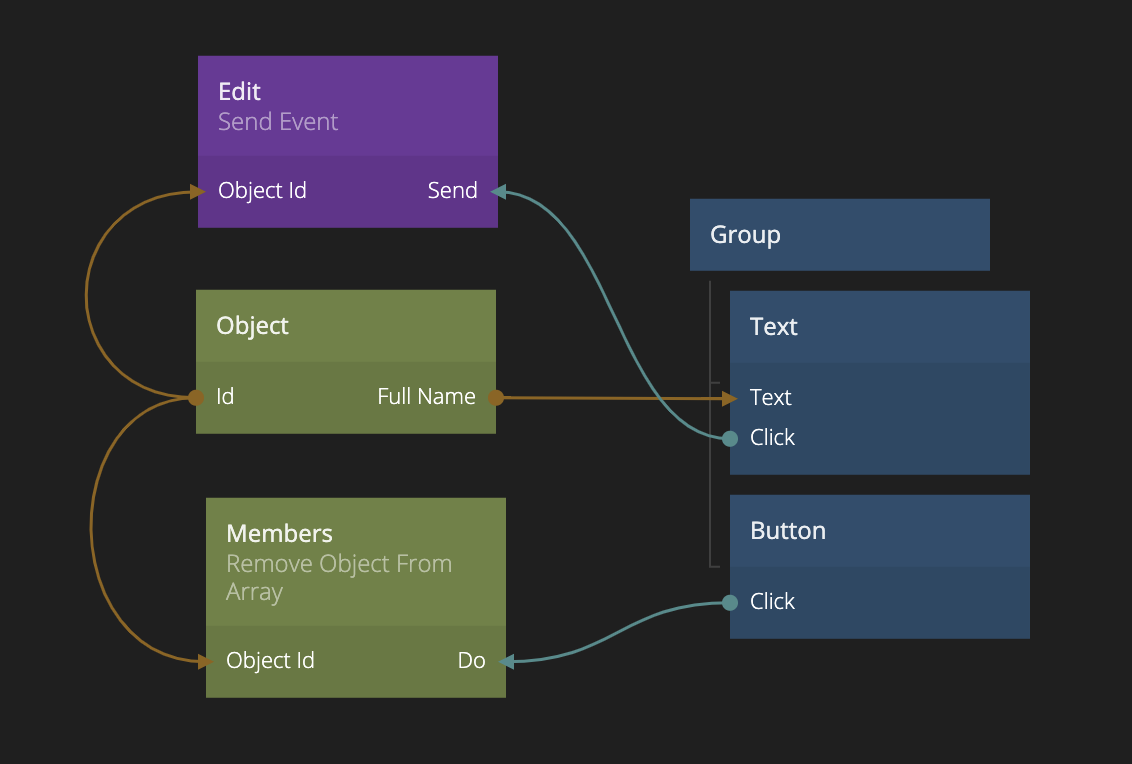
In the Member Item component, we simply show the full name of the object, and we include a delete button.
Now, let's add the form component to our Members List component to support creating new members. This is what that looks like:
Let's review the different parts here:
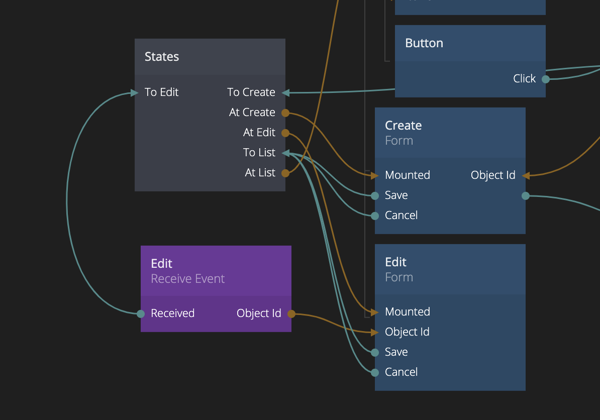
We created a States node and gave it three different states, Create, Update and List. These states will be used to toggle the visibility of our different parts of the user interface. We also made sure it starts in the List state.
When the Add member button is clicked, a Create New Object node is triggered. In this node we set the default properties of the new member object. That means that the newly created object will start with these properties.
When the Create New Object is done the states node is switched to Create state and the Id of the newly created object is passed to the Object Id input of the Form component that we created before.
The At List and At Create outputs from the states node is used to control the visibility of the member list and the create form. So that changing the state of the States node will show the correct component.
Finally, when the Save signal is sent from the Form component (the user has clicked the save button) the object is inserted into the Members array.
Phew, now we have the create part in place. Let's add the read and update part as well. For that we will just first add a small thing to the Member Item component. We will send an event with the Send Event node when the text label is clicked, and we will pass along the object Id of the clicked object.
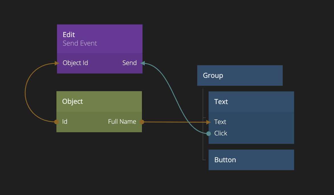
We simply called the event Edit, now we can receive the event in the Members List using the Receive Event node component and use it to toggle the States node to Edit state. As you can see we also added another instance of the Form component at the bottom of the Members List component and we hooked it up to the States node to control it's visibility.
Now that we have both create, read and update in place this is what we end up with in the Members List component.
Now we just have one final thing left, and that is to hook up the delete button in the Member Item component. That is pretty easy to do, we simple connect the Click signal to an Remove Object From Array making sure the we specify the array id Members that we used in the Members List component (so we are changing the right array) and then provide the object Id to remove as well.
And there we go, now we have create the a fully functional CRUD user interface: