Styling the Table
What you will learn in this guide
In this guide we will look at how we can style the Table prefab and make the app we have created in the previous guides look a bit nicer. We will only make some minor changes to the background colors and borders of the Table, but we encourage you to play around with the Table prefab on your own and make it into something that fits your use cases.
Changing the app background
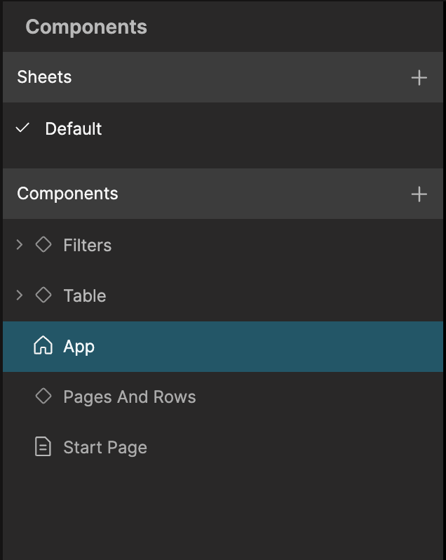
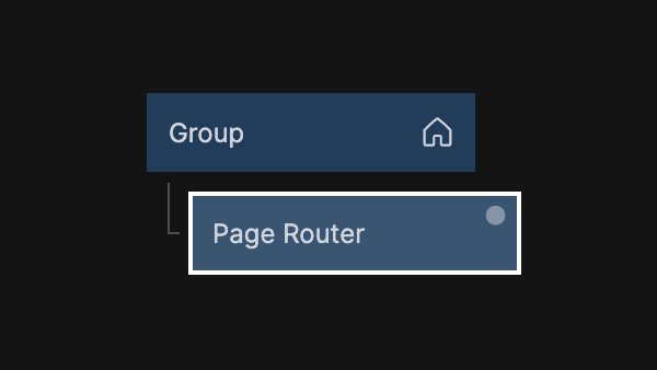
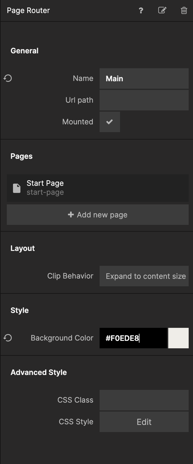
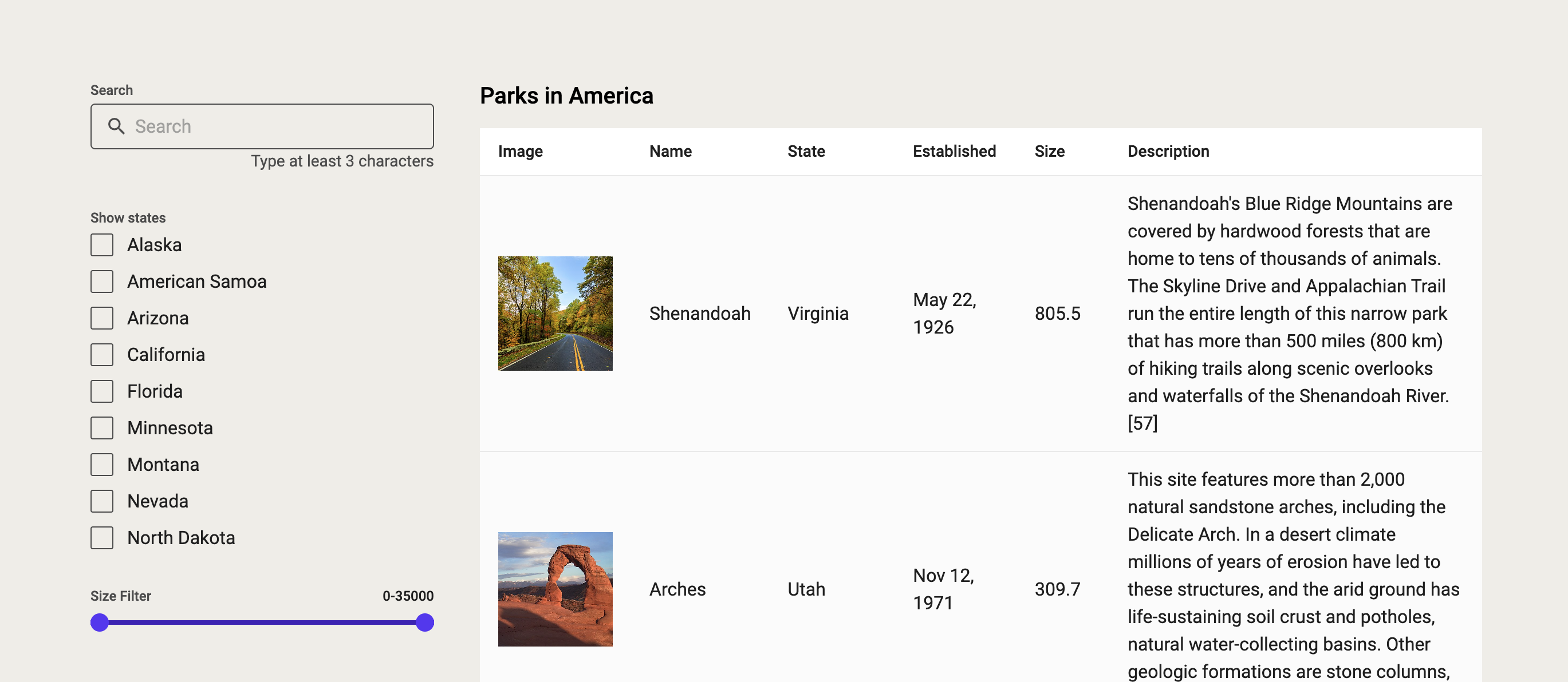
Let's start with an easy change, the overall background color of our app. Go the the App component and select the Page Router.
Now change the Background Color property to #F0EDE8, and the app should look like the second image below.
Styling the table
Go back to the Start Page and double click on the Table component in the node graph. It should take you into the Table prefab, and this is where we will make some styling changes.
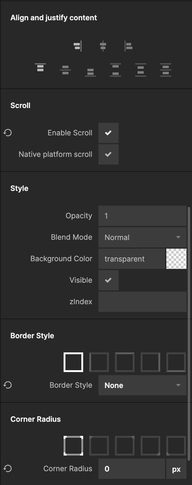
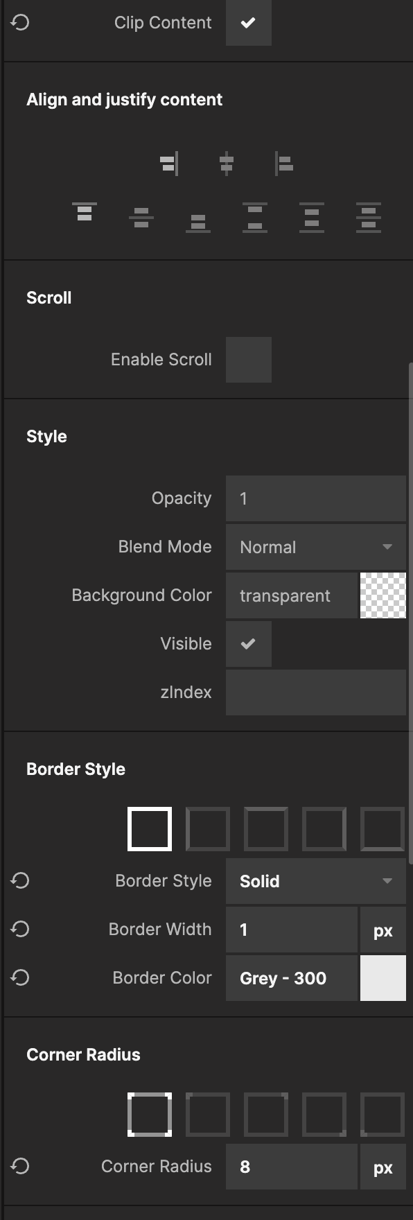
Select the top Group and remove it's Border by setting it to none and set the Corner Radius to 0:
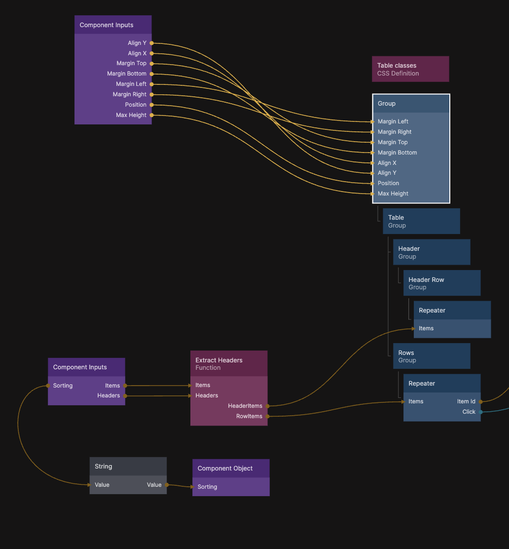
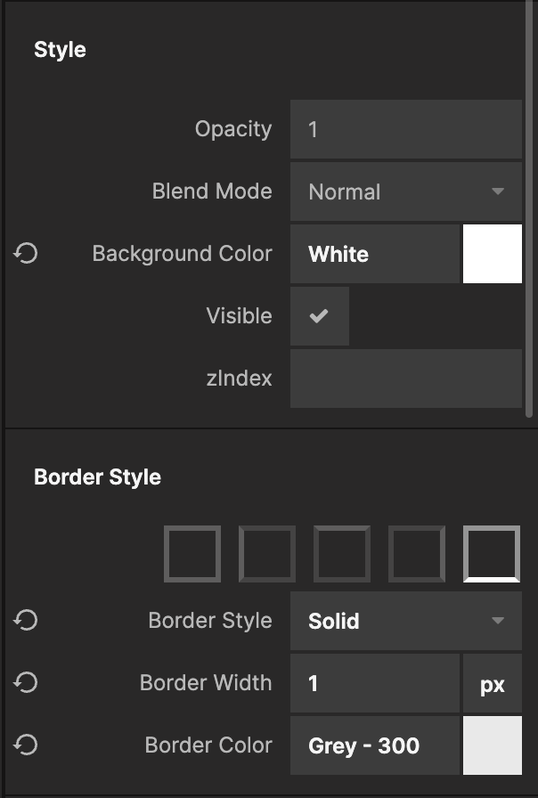
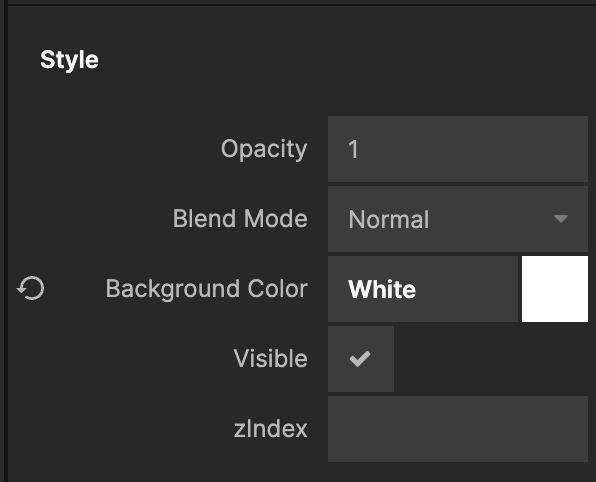
Next select the Group named Header Row and find the Border Style section. In the Border Style section, select the bottom border and set it's color to Grey - 300. Let's also set it's Background Color to White.
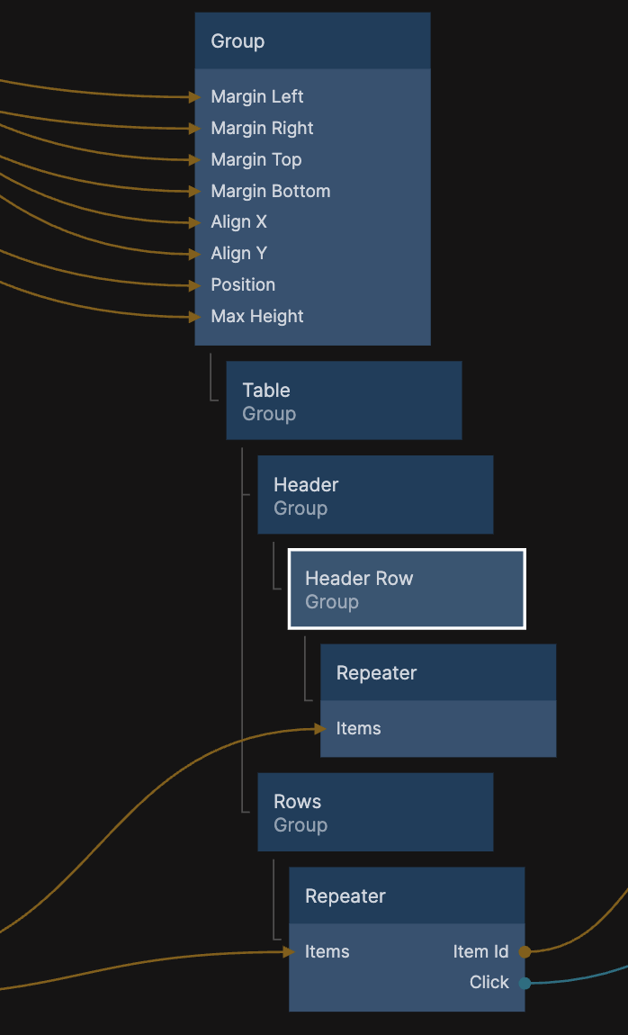
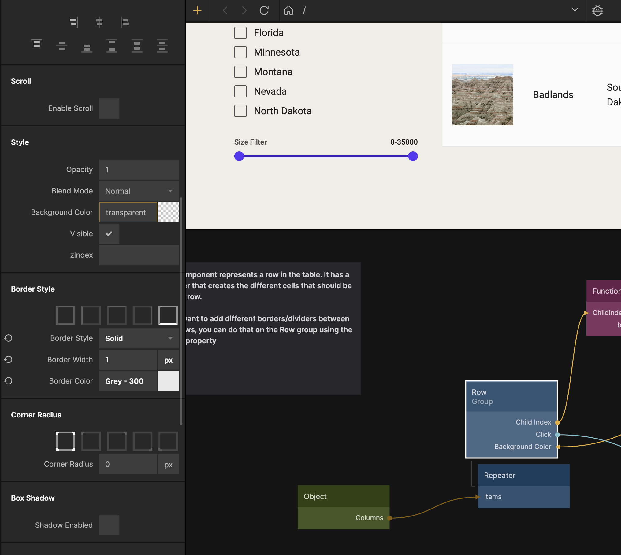
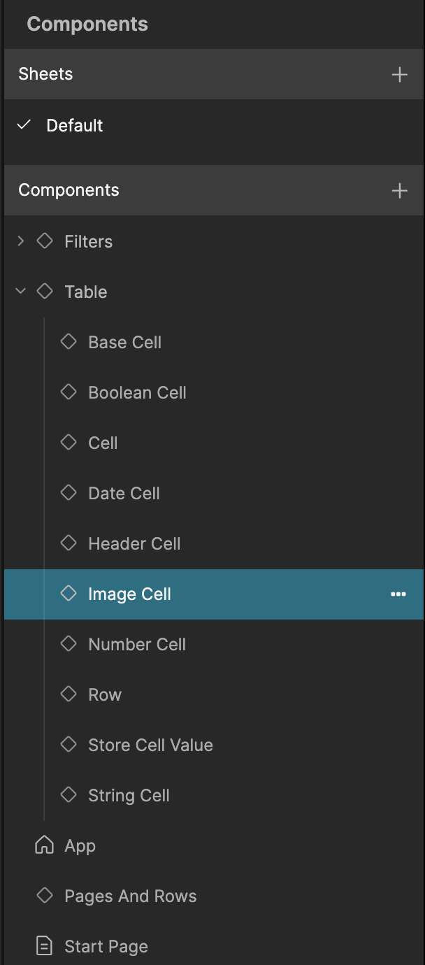
It doesn't look like much right now, but let's continue by styling the rows of the Table. In the Components tab, unfurl the Table and select the Row subcomponent.
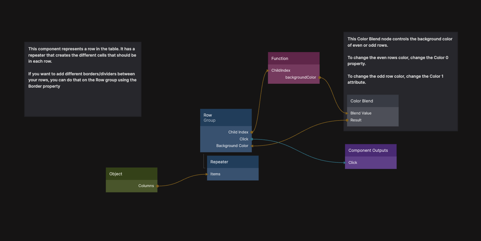
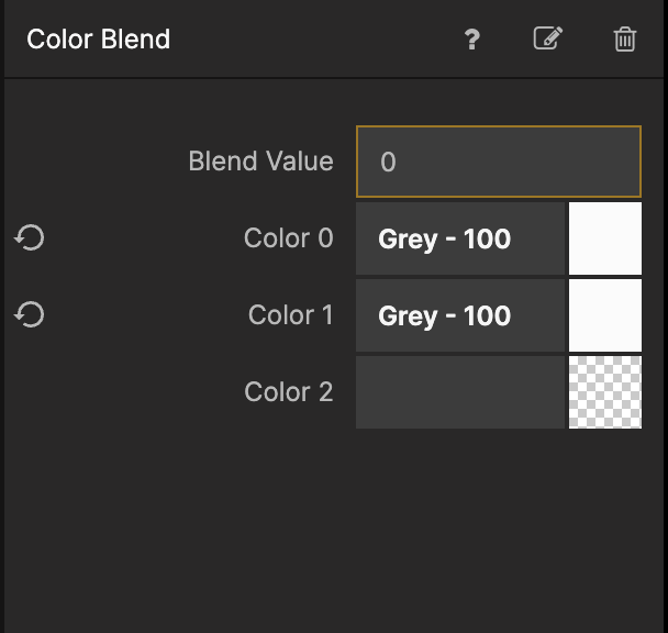
We want all rows to have the same background color so select the Color Blend node and set Color 0 and Color 1 to Grey - 100.
Also make sure that the bottom border of the Group named Row is set to 1px and Grey - 300
The table is starting to look pretty good, we want to add a border around the whole thing, but before we do that, let's style the Image Cell slightly.
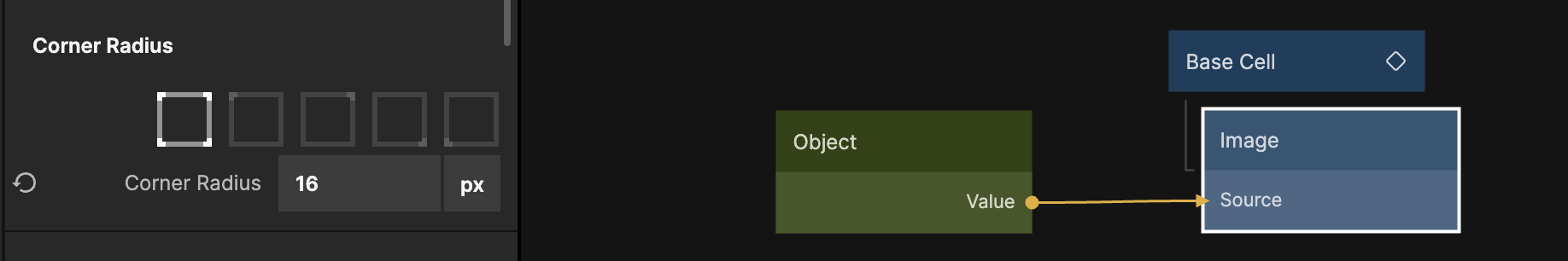
Select the Image Cell in the Components view.
Find the Image node and give it 8px Corner Radius.
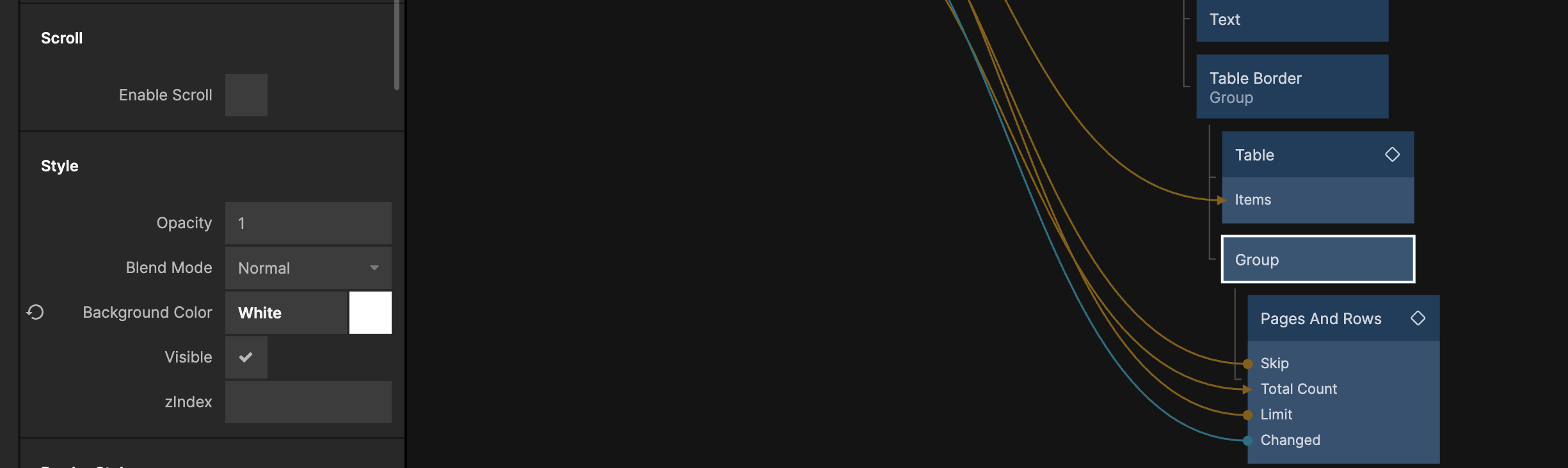
Now we will add a border around the whole Table and we will also include the Pages And Rows in that border. Go back to the Start Page, and wrap the Table and Pages And Rows in a Group called Table Border.
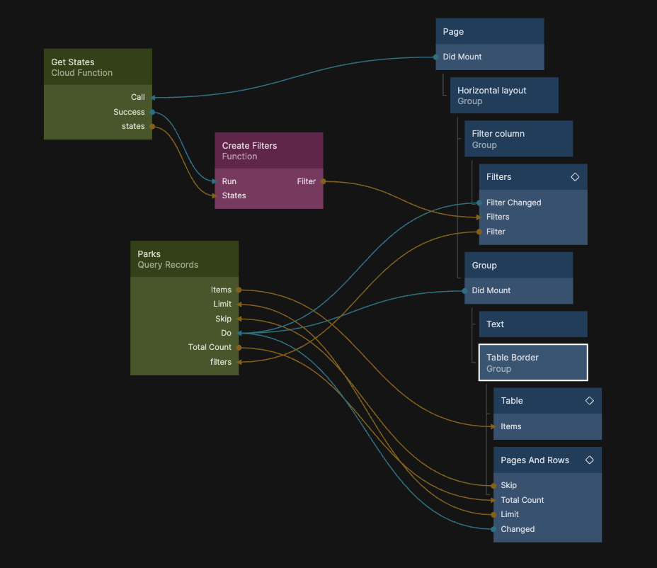
Select the Table Border Group and set the Border style to Solid 1px and Grey - 300, give it 8px Corner Radius and make sure that Clip Content is checked:
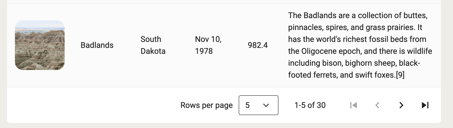
The table now looks really good, except for the bottom where we have the Pages And Rows.

Let's fix it by wrapping the Pages And Rows in it's own Group and give that Group a White Background.
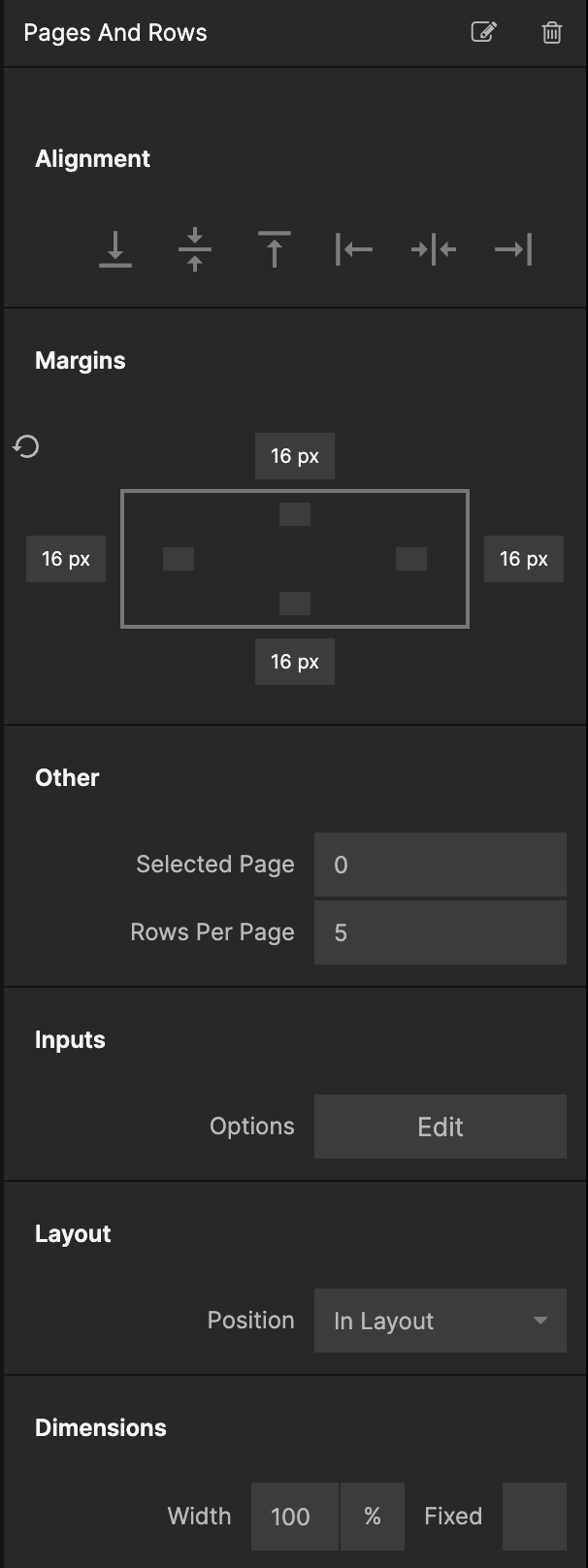
Select the Pages And Rows and give it 16px margin all around.
That looks quite nice, so let's make the Filters section look a bit nicer too.
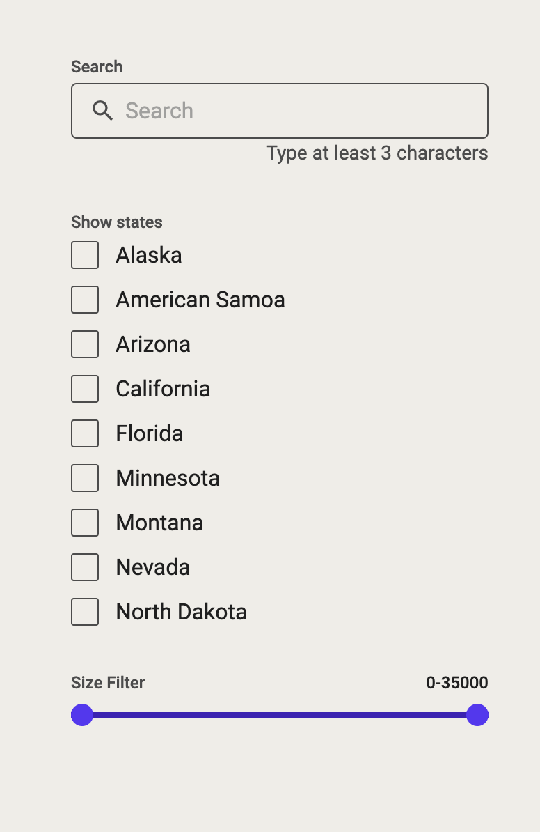
Style the Filters section
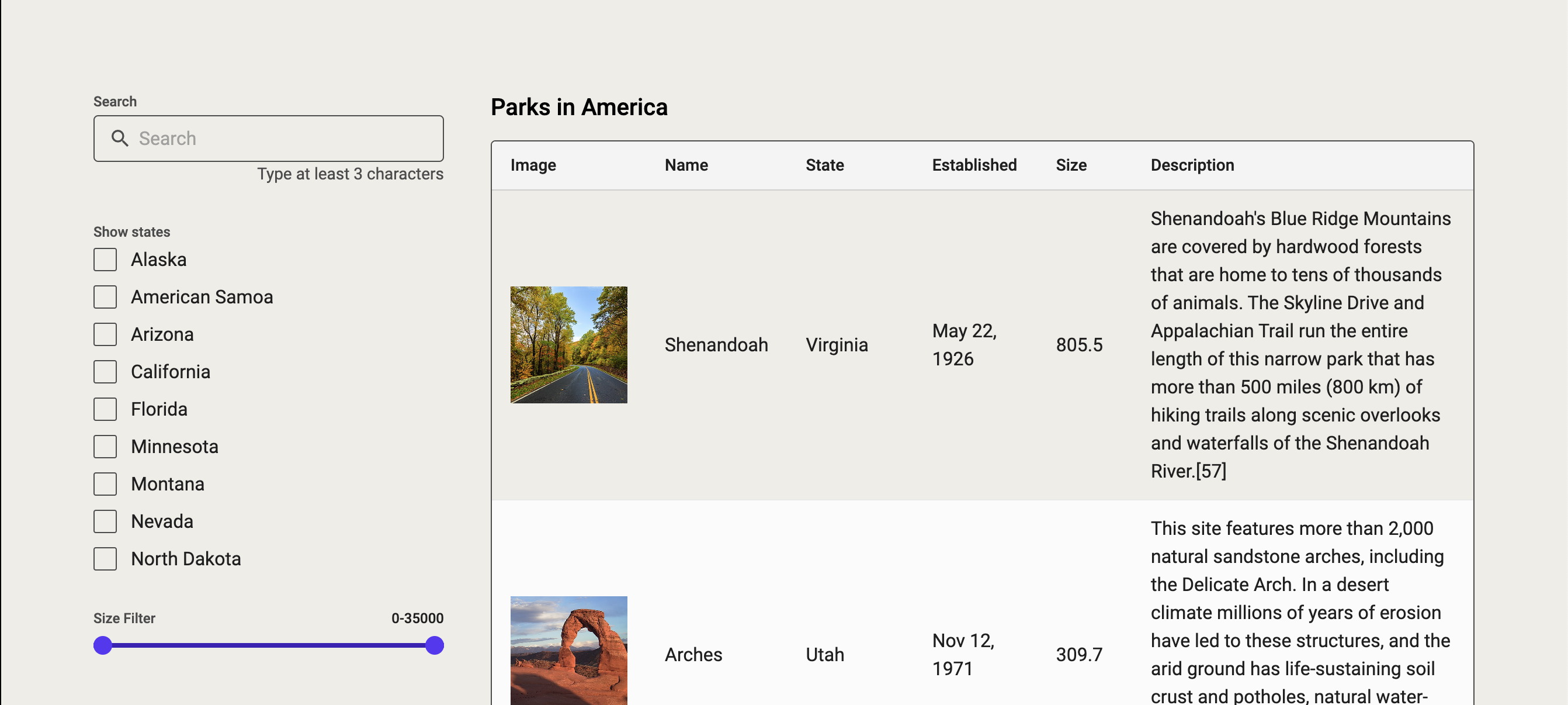
The filters section currently looks like this:
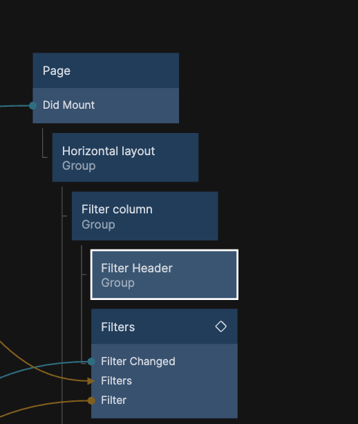
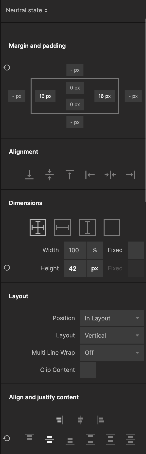
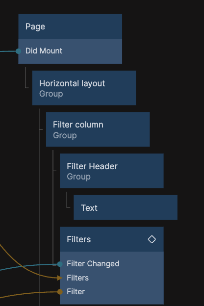
It needs a header so let's add a Group as a child to the Filter Column and call it Filter Header. Then with the Filter Header Group selected set the Height to 42px and have it align it's content vertically centered. Also give it 16px Padding both left and right and set it's Background Color to White.
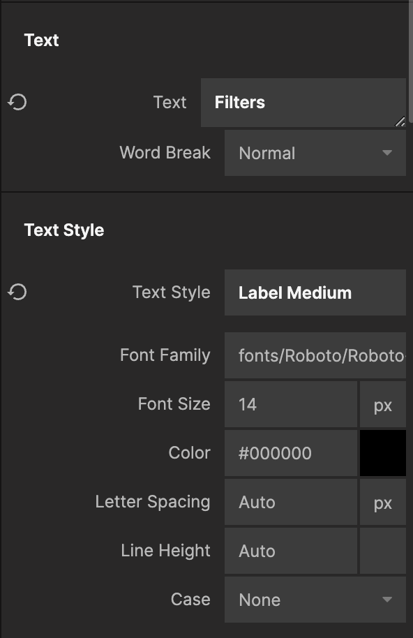
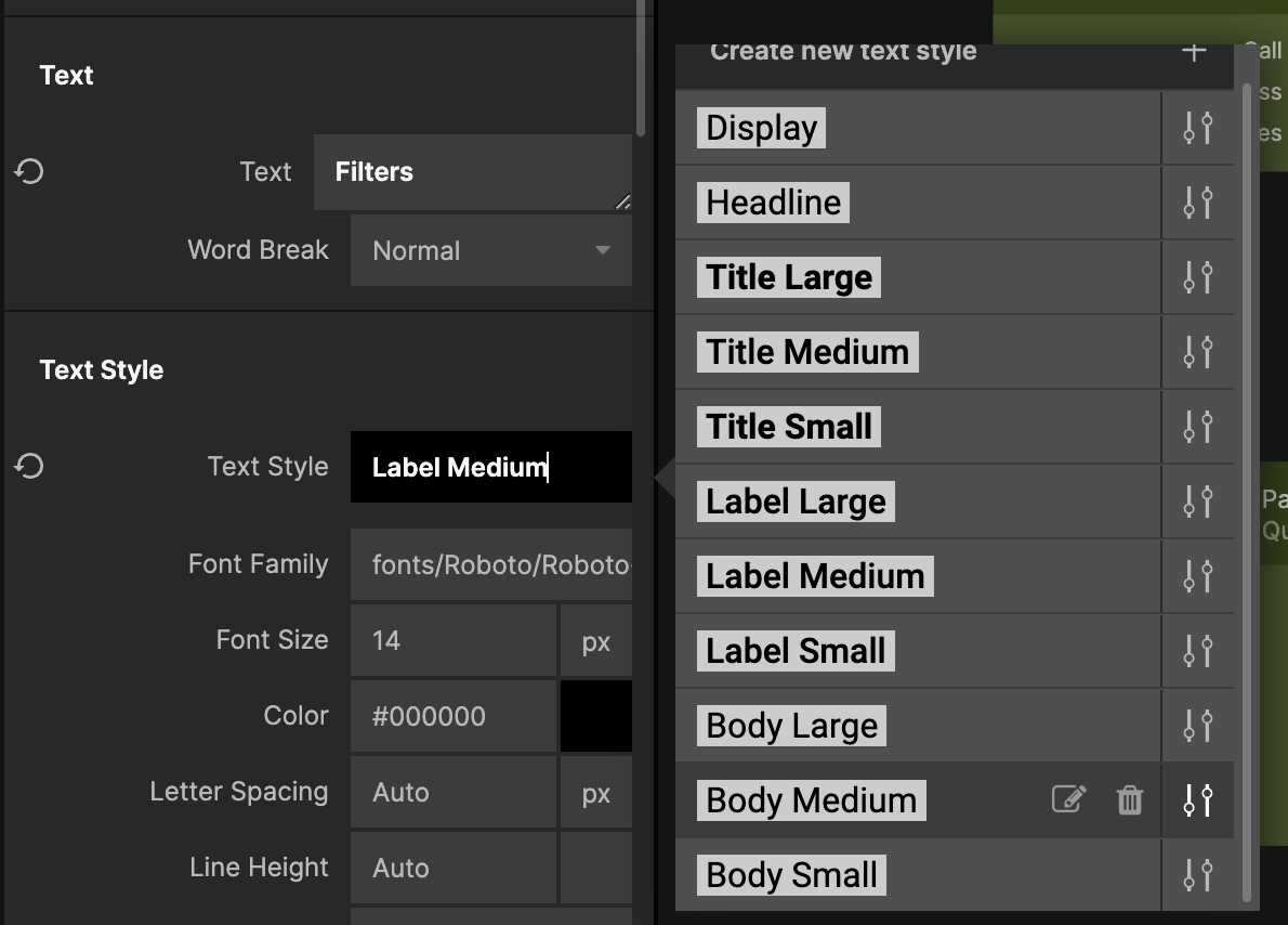
Add Text node as a child to the Filter Header Group and set the Text property to "Filters" and change the Text Style to Label Medium.
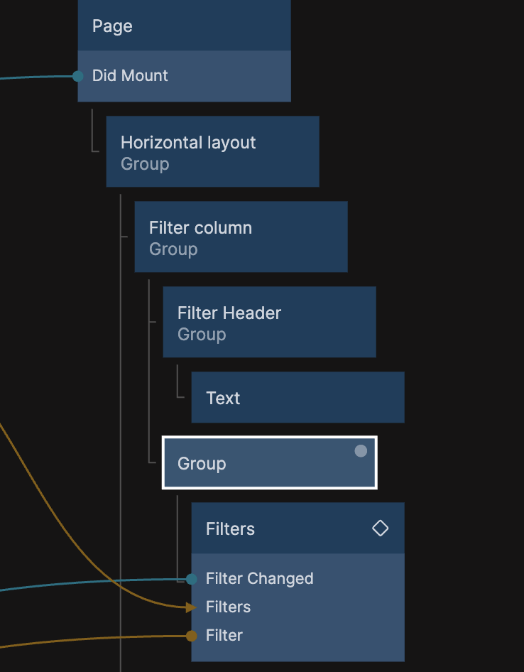
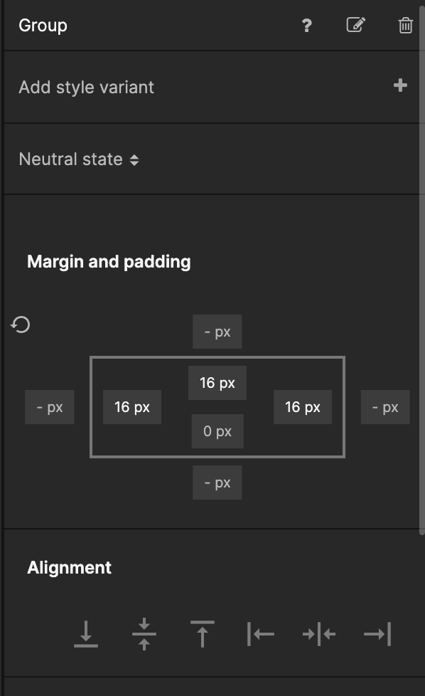
Wrap the Filter component in a Group and add 16px Top, Left and Right *Padding** to the Group.
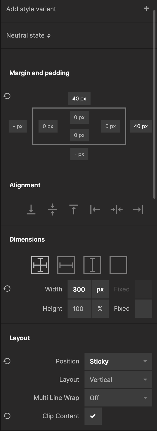
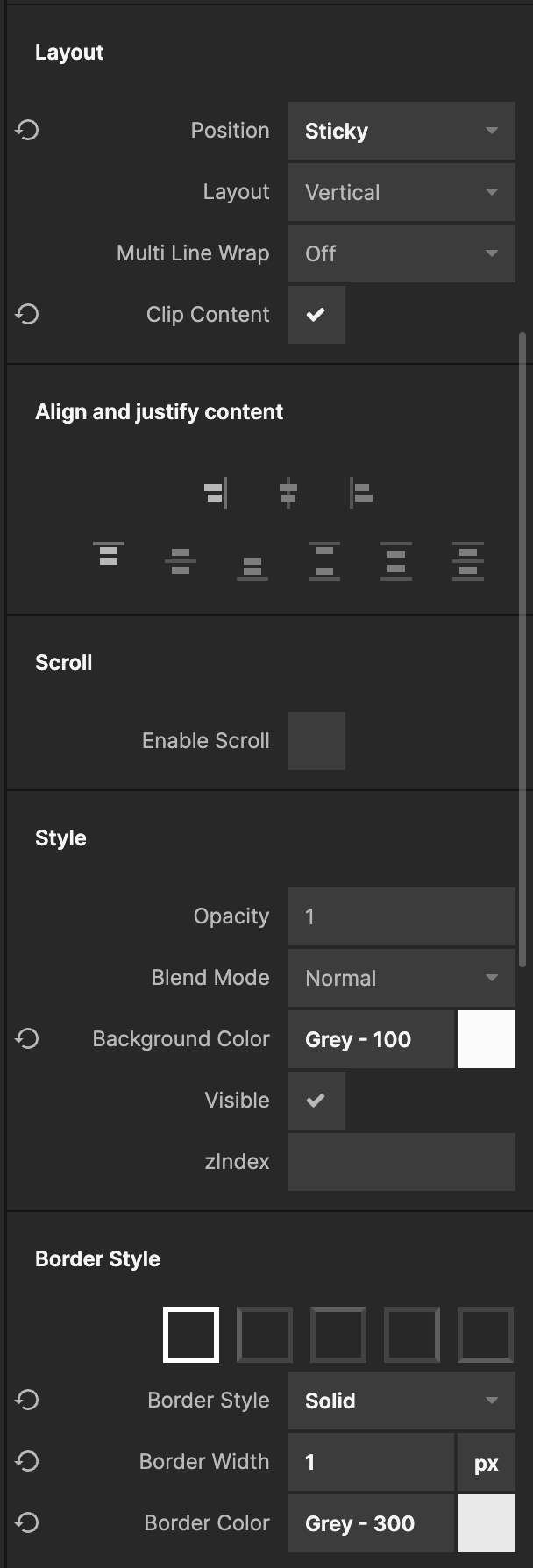
Now select the Filter Column Group and update the Top Margin to 40px, check the Clip Content property, set the Background Color to Grey - 100, give it a Solid 1px, Grey - 300 border all around and a Corner Radius of 16px.
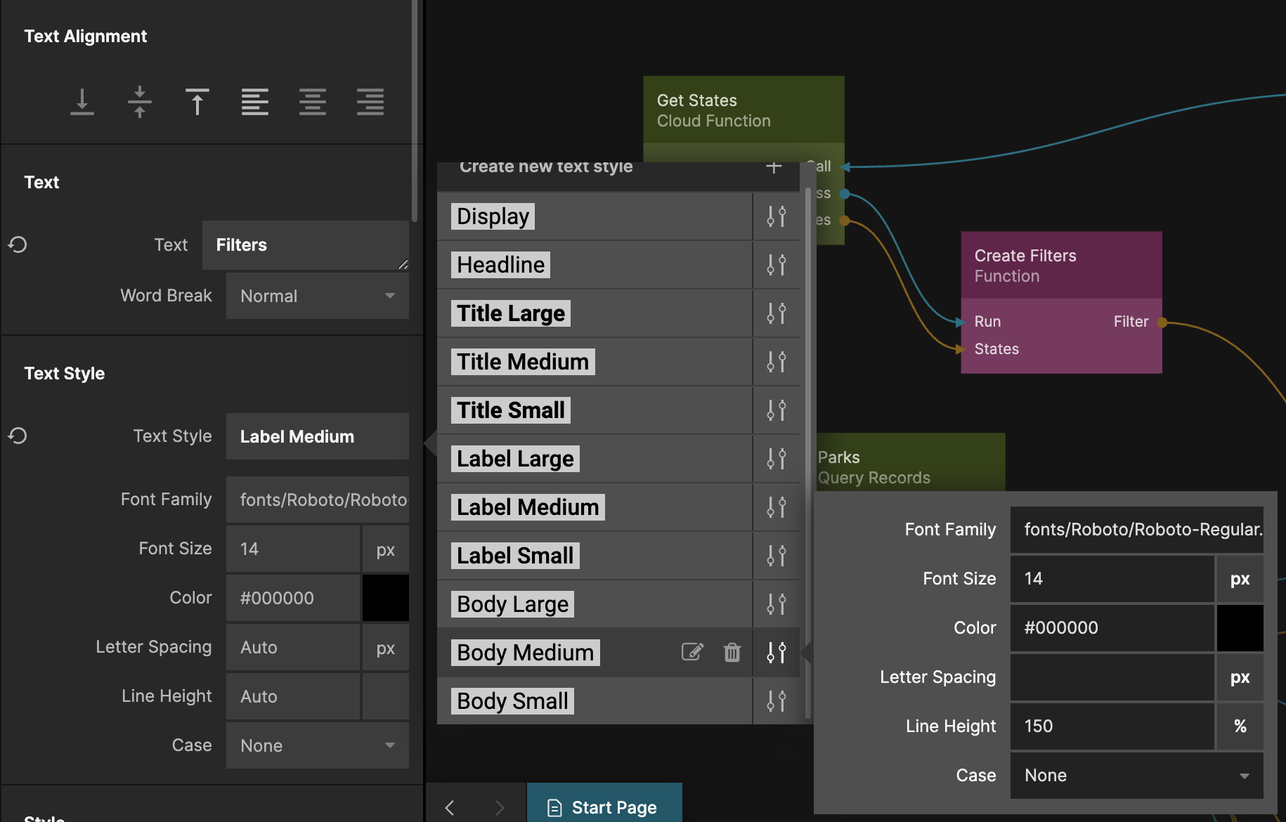
That's if for the filters section, but as a final touch we will update the Text Style called Body Medium. Select the Text node in the Filter Header, find the Text Style property and click the settings icon next to Body Medium and set the Size to 14px.
Summary
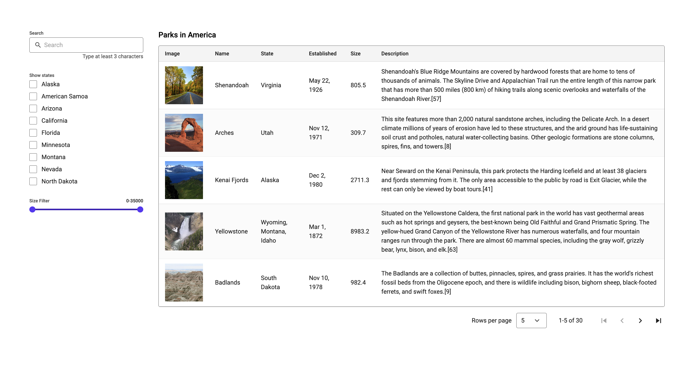
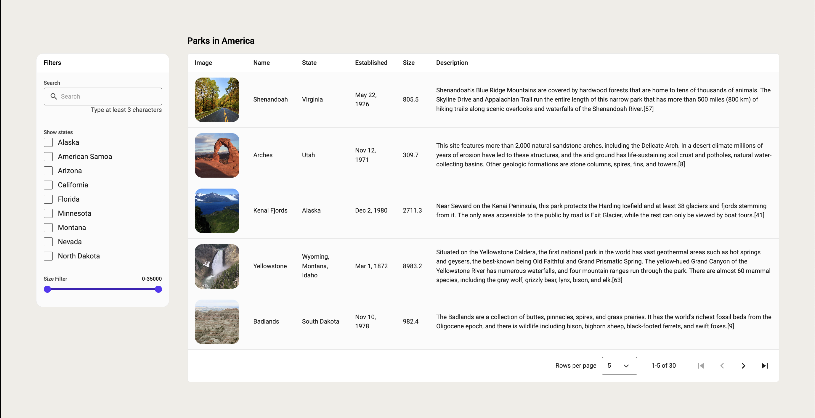
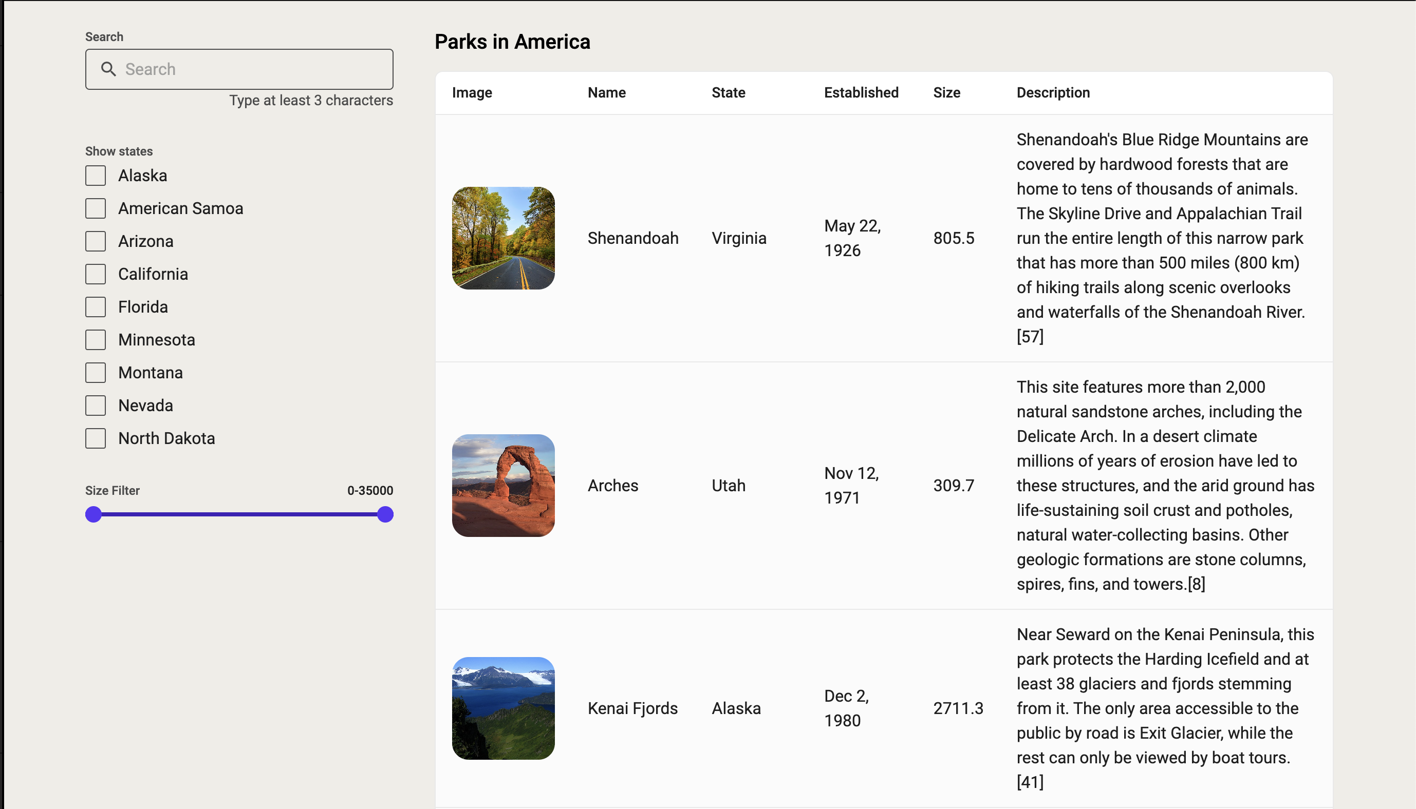
Now we have styled our Table and the filters section and below you can see what it looked like before and after the styling. Prefabs like that Table are a great way to quickly build out your experiences, but they are meant to be tinkered with and hopefully this guide has given you some ideas of how you can update the look and feel of prefabs.