Filter your Table data
What you will learn in this guide
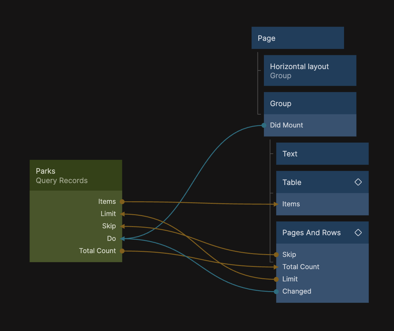
This guide continues building on the Using the Table node to display data and the Adding pagination to the Table guides. In those two guides we have created a Table with pagination that displays data on National Parks in the US. In this guide we will use the Filters component prefab so that we can filter the data and have the Table display only the parks that fit the filter.
Some additional layouting
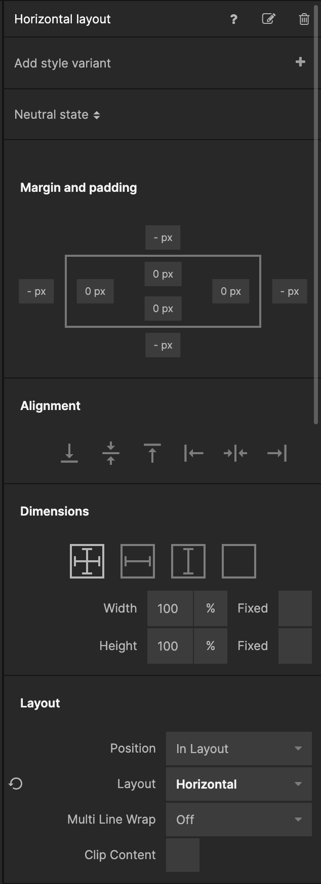
Before we add the Filters prefab let's add some more Groups so that we get a nice layout for both the Table and the Filters. Add a Group directly under the Page and set it's Layout property to be Horizontal. Let's also name it Horizontal Group so that we know what it is. Below are two screenshots showing where the Horizontal Group is placed in the node graph and it's properties.
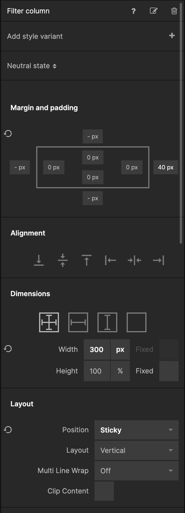
Add another Group as a child to the Horizontal Group, and set it's Width to 300px. Let's also givie it 40px Right Margin, and set it's Position in the Layour section to be Sticky. Name it Filter Column, it should look like the screenshots below:
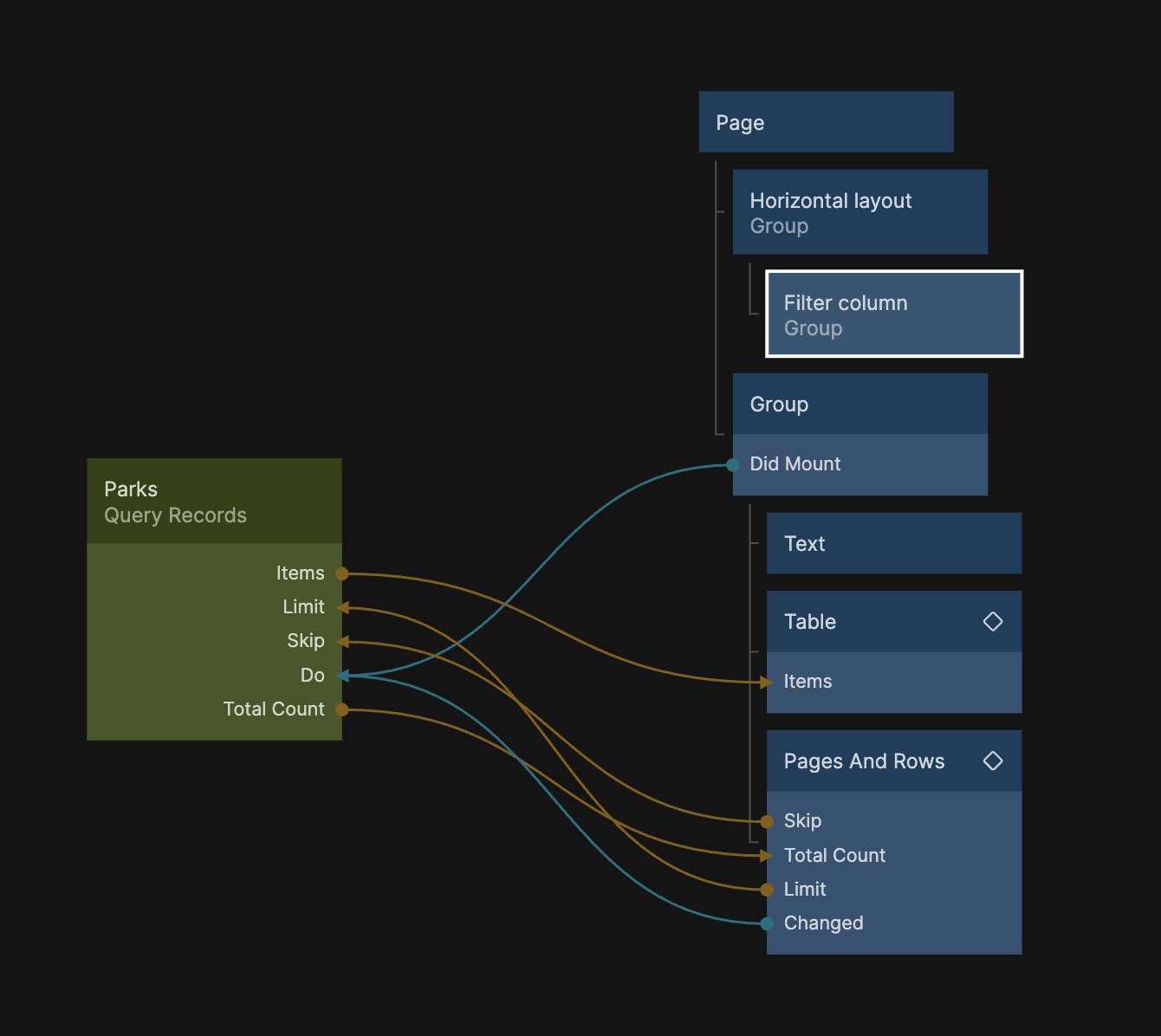
As a last step, move the Group that contains our Table and related nodes, so it is a sibling to the Filter Column.
Import the Filters component
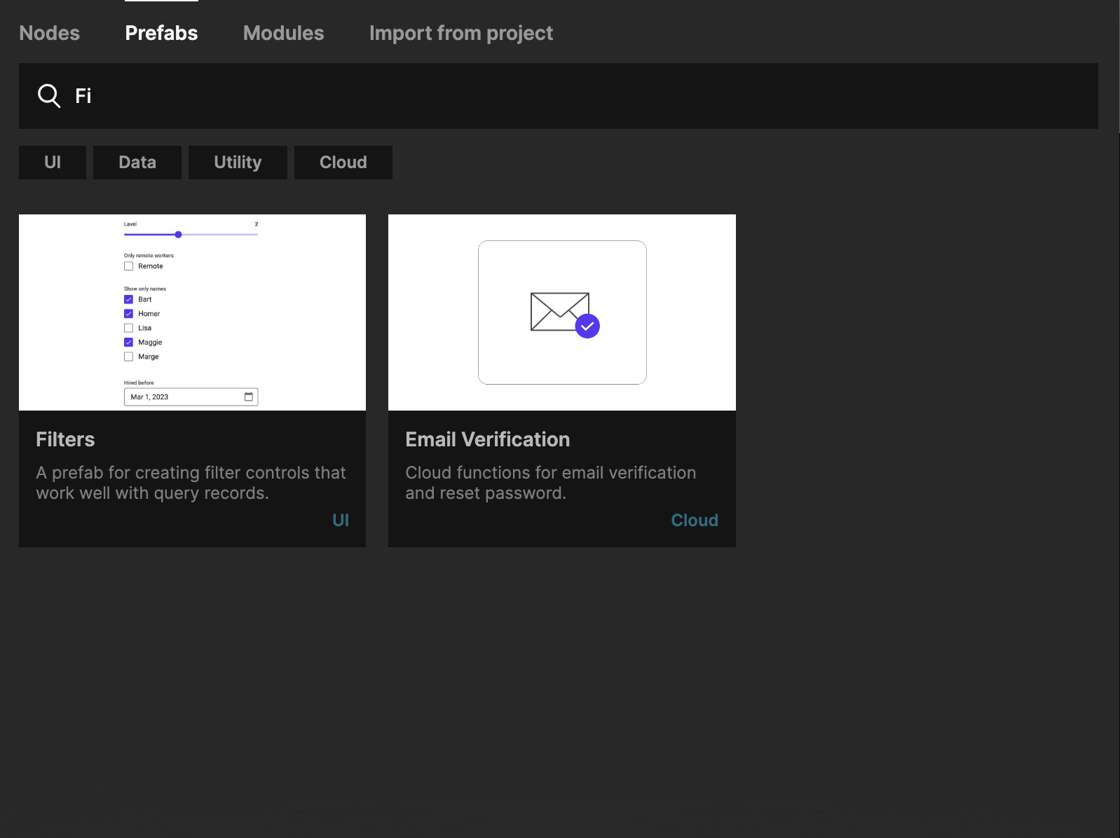
Bring up the Node Picker, select the prefabs tab, and find the Filters prefab. Click the Clone button to bring it into your project.
Let's add the Filters component as a child to the Filter Column Group.
Hooking up Filters to Query Records
Before we define the exact filters we want to have, let's prepare the Query Records node to take in the filters from the Filters component and hook it all up.
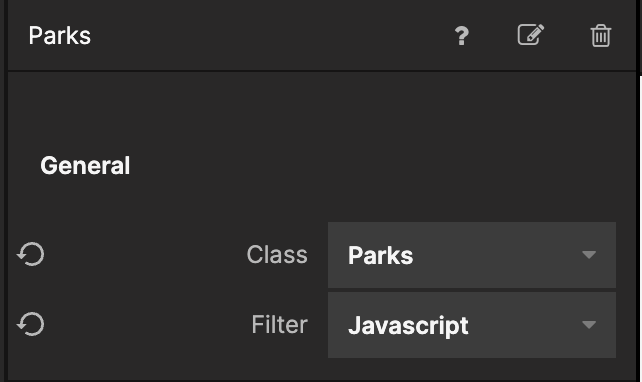
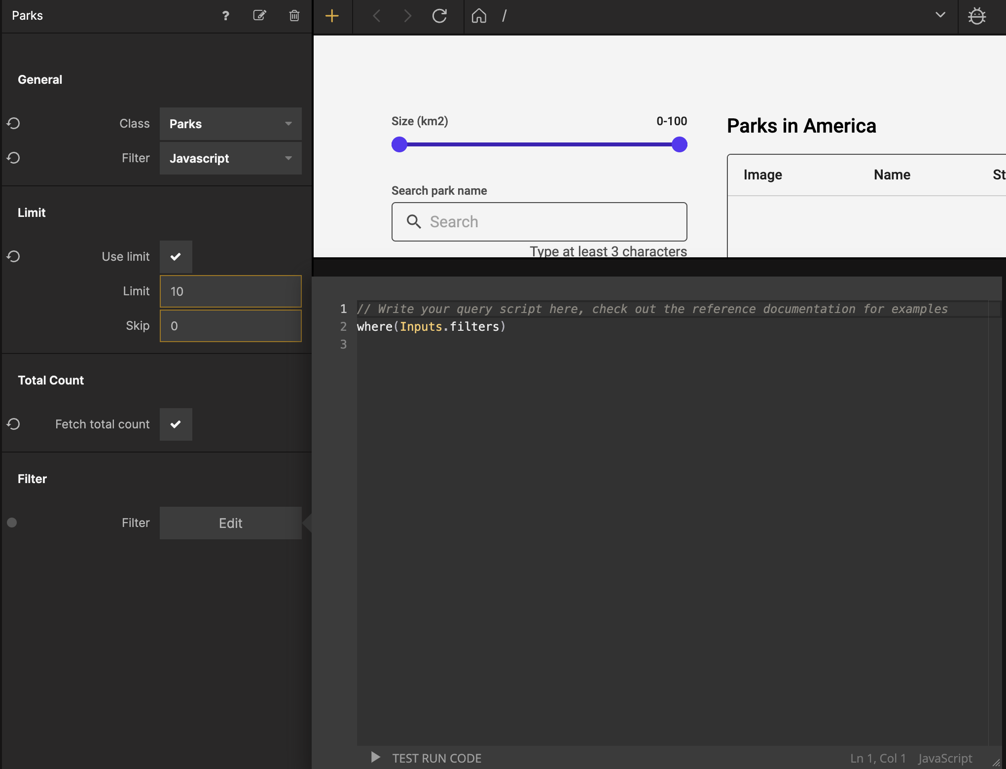
Select the Query Records node and change the Filter proeprty in the General section to be Javascript:
Then click the Edit button by the Filter property in the Filter section for the Query Records node and input the following code:
where(Inputs.filters);
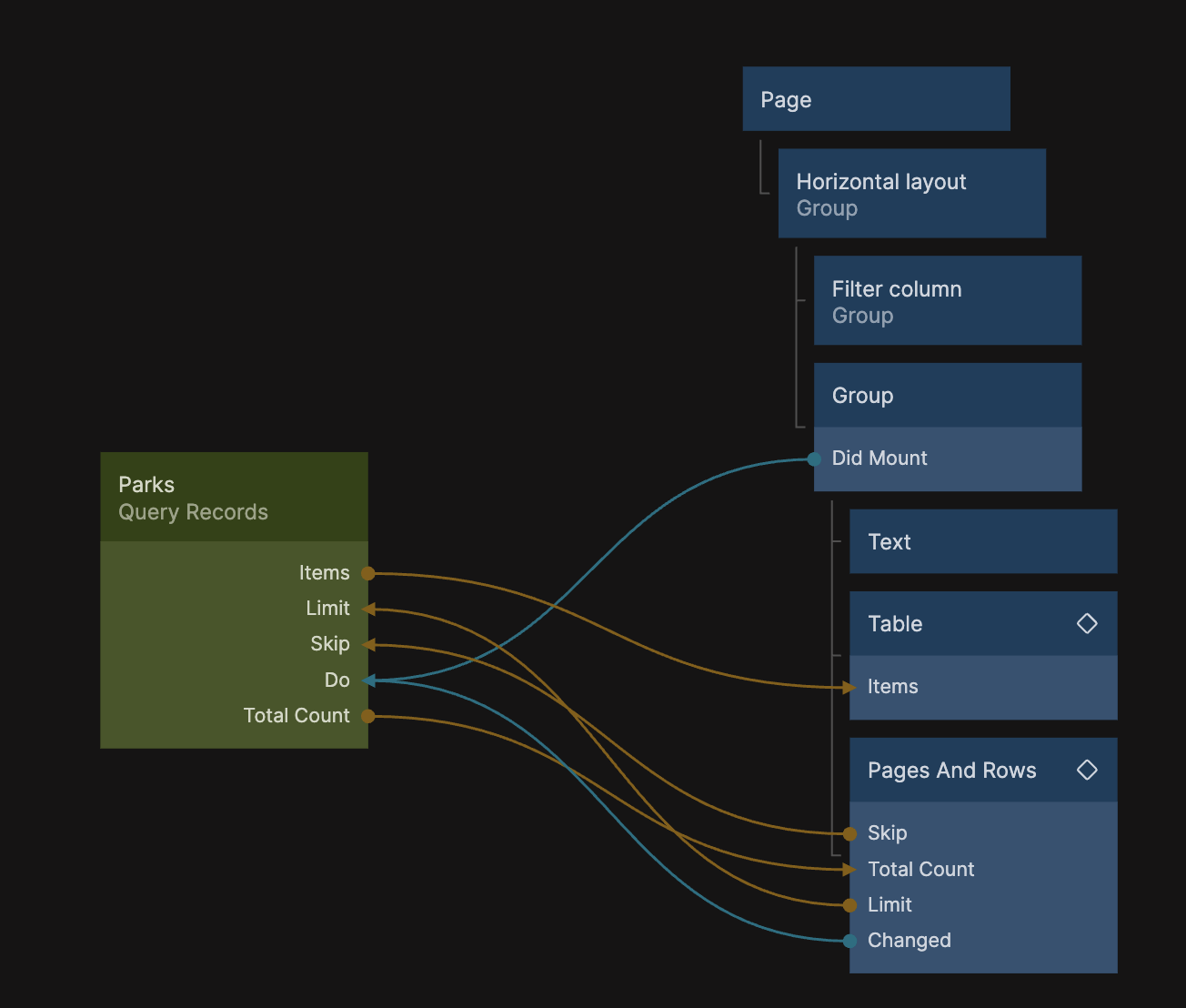
This gives us an input that takes filters from the Filters component, so let's hook it up like this:
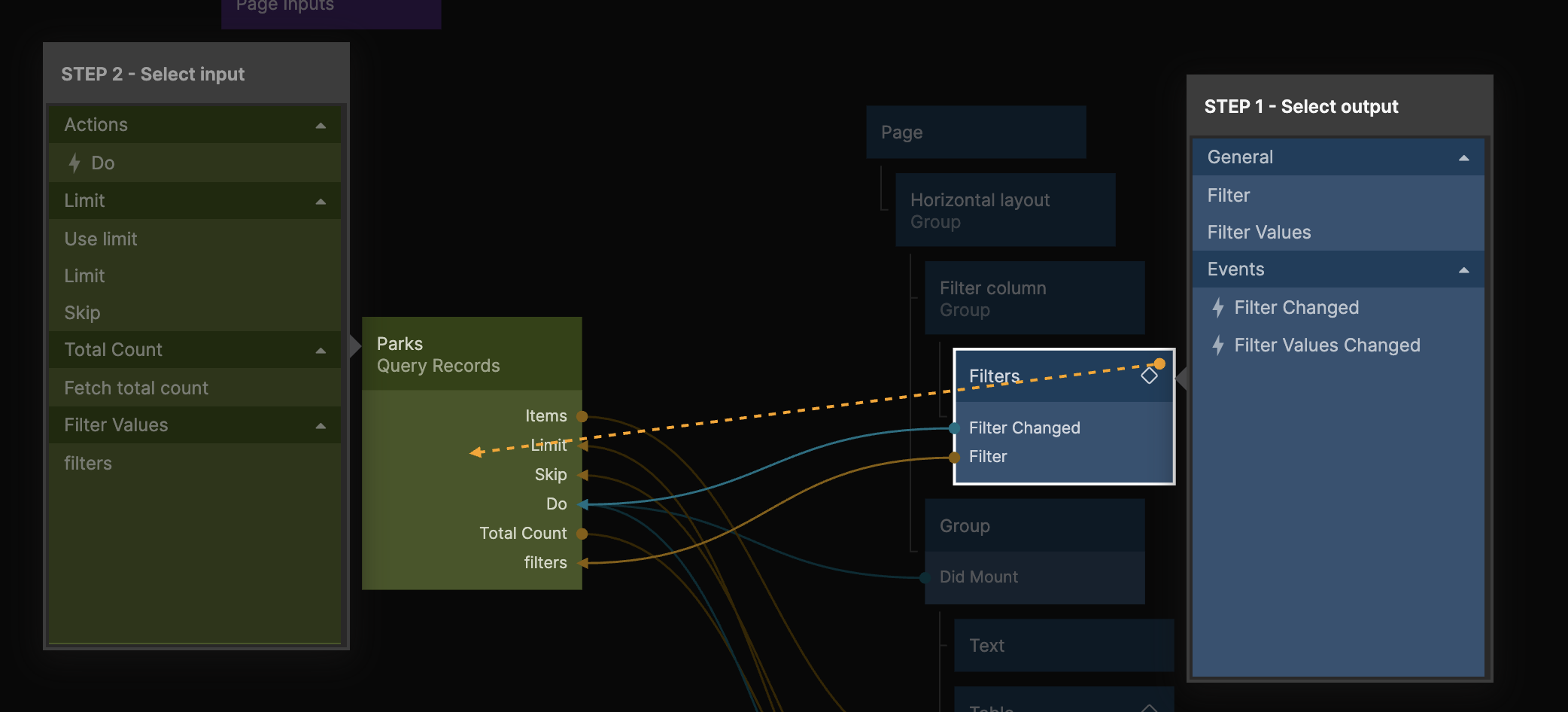
- Connect Filter from the Filters to Filters in the Query Records
- Connect Filter Changed from the Filters to Do in the Query Records
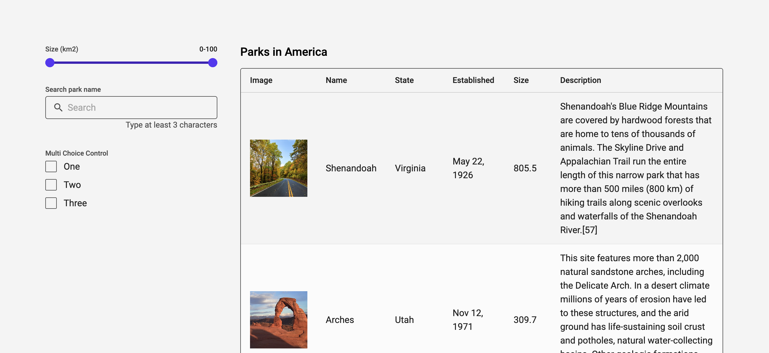
You should now see the default filters from the Filters component in your preview, and in the next section we will customize which filters we will use in this app.
Customizing the filters
If you look at the Filters documentation you can see that we have the ability to use 7 different types of filters out of the box. Let's use a Text search filter so that we can search for a specific park, the Multi Choice filter so that we can select one or more specific states, and the range filter so that we can filter the parks based on their size.
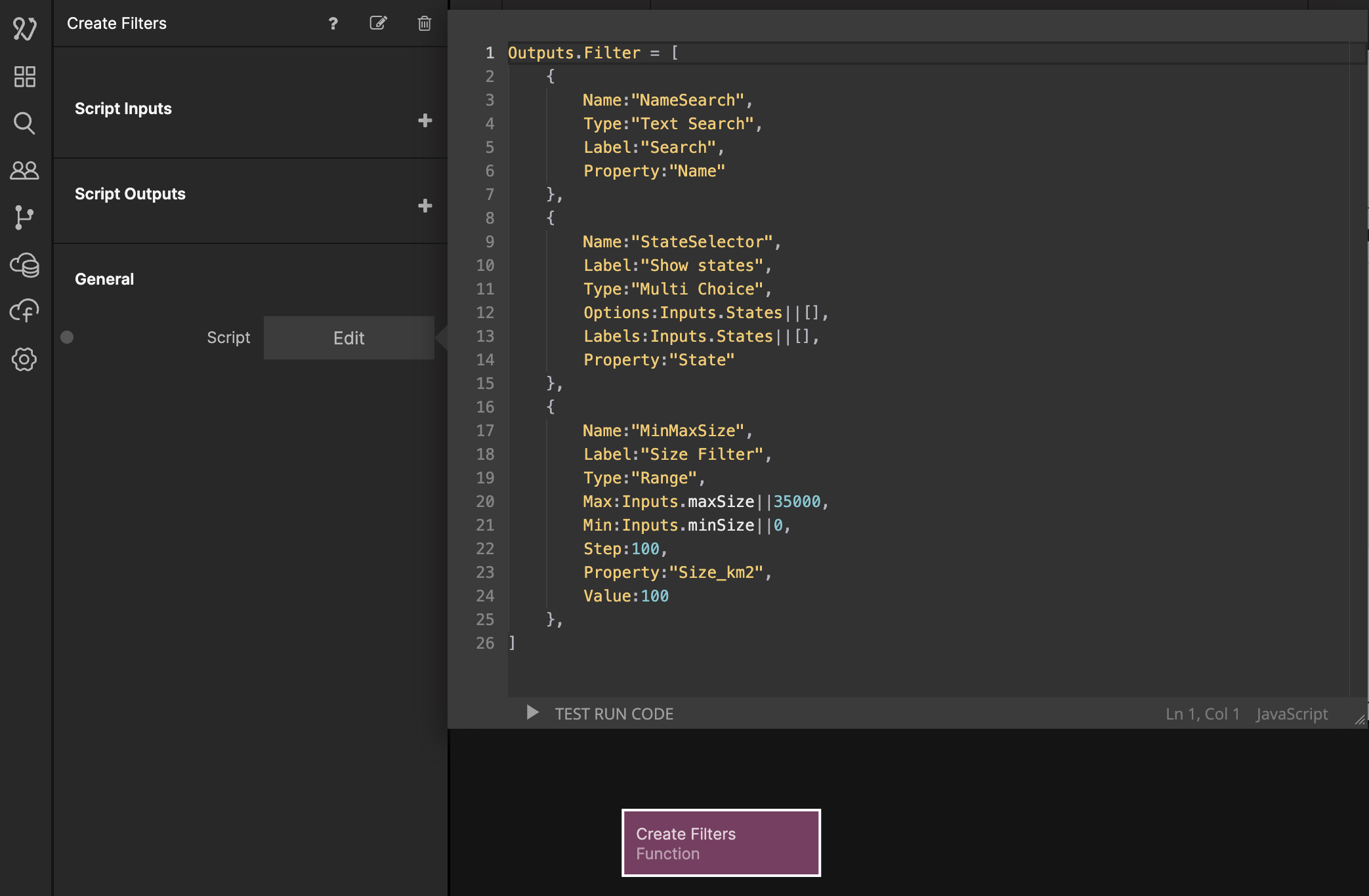
The Filters component can take an array of filters as an input, so let's use a Function node to create an array with our filters. Add a Function node, name it Create Filters and add the following code:
Outputs.Filter = [
  {
    Name: 'NameSearch',
    Type: 'Text Search',
    Label: 'Search',
    Property: 'Name',
  },
  {
    Name: 'StateSelector',
    Label: 'Show states',
    Type: 'Multi Choice',
    Options: Inputs.States || [],
    Labels: Inputs.States || [],
    Property: 'State',
  },
  {
    Name: 'MinMaxSize',
    Label: 'Size Filter',
    Type: 'Range',
    Max: Inputs.maxSize || 35000,
    Min: Inputs.minSize || 0,
    Step: 100,
    Property: 'Size_km2',
    Value: 100,
  },
];
Before we continue, let's have a look at the Multi Choice filter which is the second object in the array:
    {
        Name:"StateSelector",
        Label:"Show states",
        Type:"Multi Choice",
        Options:Inputs.States||[],
        Labels:Inputs.States||[],
        Property:"State"
    }
Here we have defined an Inputs.States, and the idea is that we will provide this function node with a list of distinct states that are available in the Parks data. If Inputs.States is undefined, we just return an empty array, that is what this line does: Inputs.States||[] (The same pattern is used for the max and min size). So until we have a list of states, the Multi Choice filter will be empty. Let's hook up the Function node to the Filters so that we can see what we get:
Try out the search and range filter, it should already work.
Getting a distinct list of states and min and max size
To get a list of distinct states and the minimum and maximum size from the data we have in the Parks class we can use a Cloud Function and some Javascript. We will use the Noodl.Records.distinct() function and the Noodl.Records.aggregate() and it is only available for use in a Cloud Function so let's create one of those.
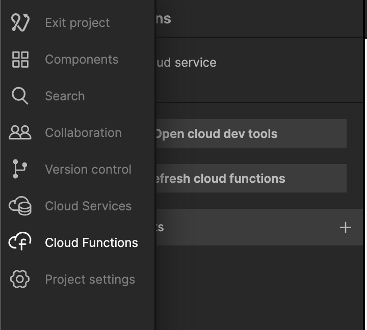
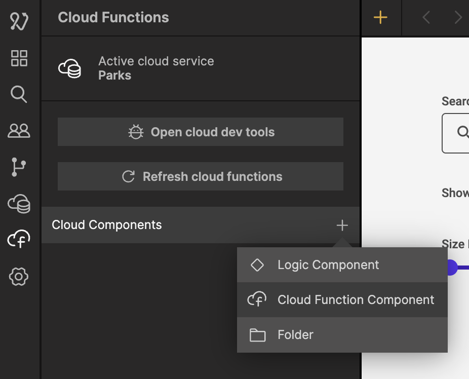
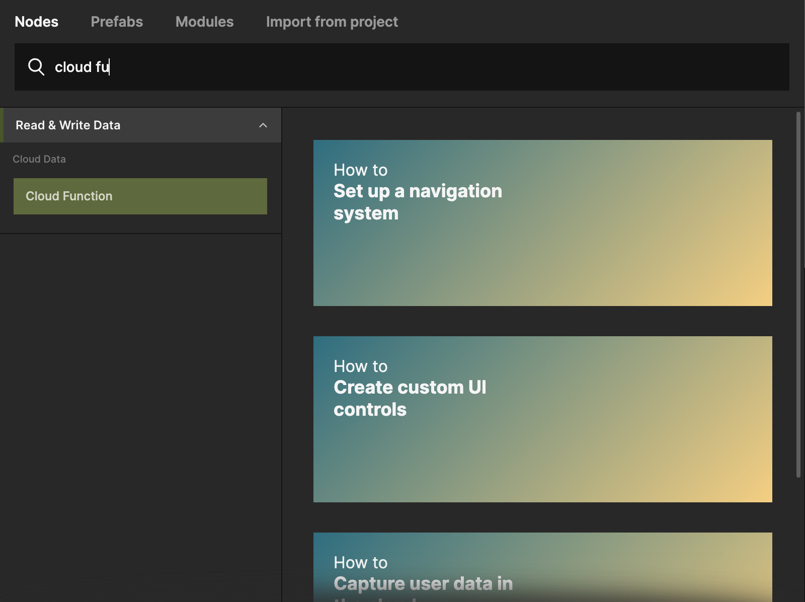
Select the Cloud Functions tab.
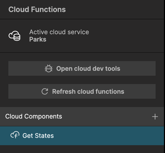
Click the plus sign and create a new Cloud Function Component and call it Get States.
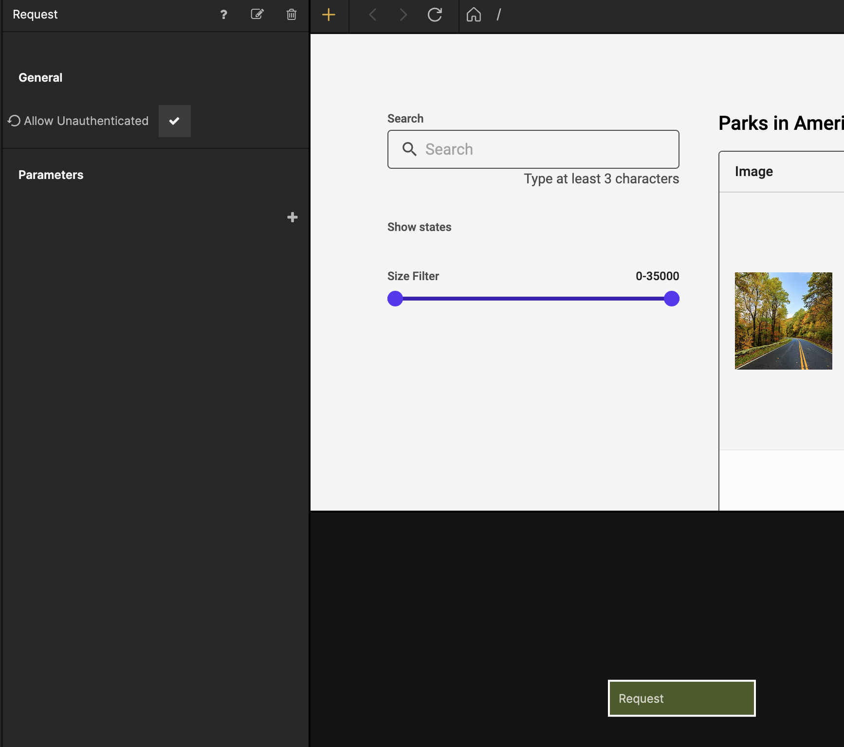
Next select the Request node and check the Allow Unauthenticated property. This is so that we can call the Cloud Function without having a signed in user.
Now let's add a Function node and copy in the following code:
try {
  Outputs.states = await Noodl.Records.distinct('Parks', 'State');
  const minMax = await Noodl.Records.aggregate('Parks', {
    minSize: { min: 'Size_km2' },
    maxSize: { max: 'Size_km2' },
  });

  Outputs.maxSize = minMax.maxSize;
  Outputs.minSize = minMax.minSize;
  Outputs.success();
} catch (e) {
  Outputs.errorMessage = e;
  Outputs.error();
}
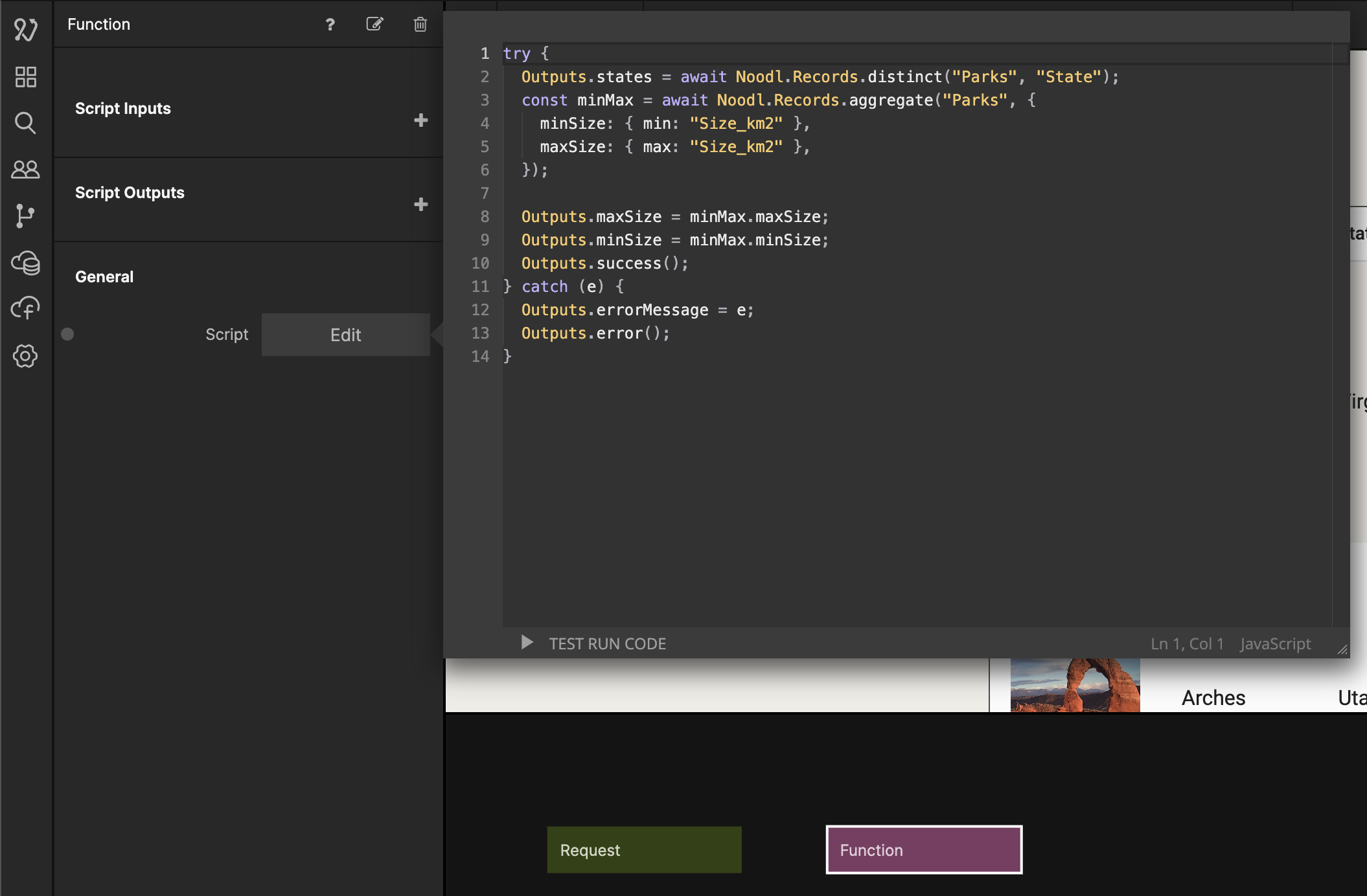
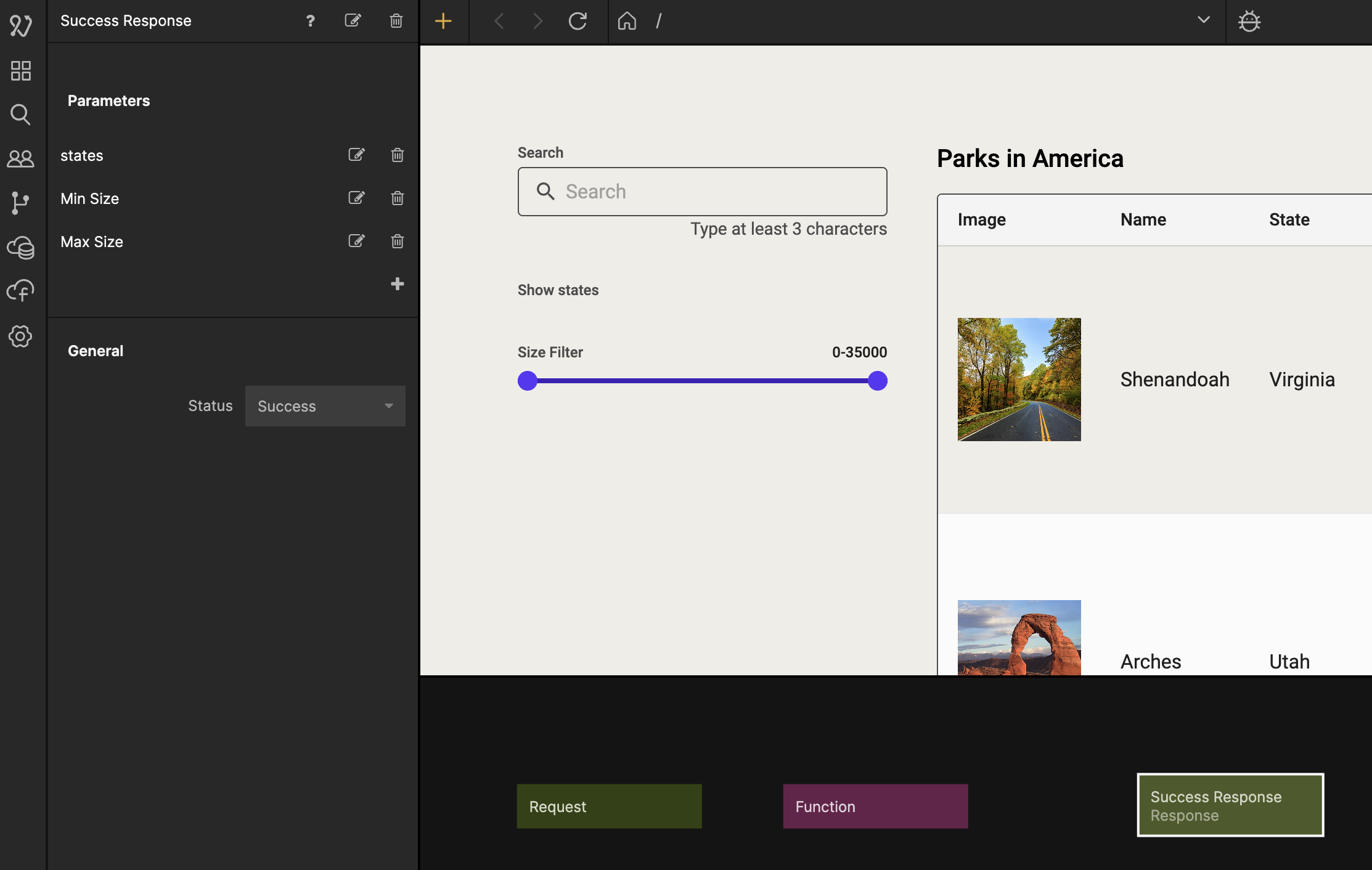
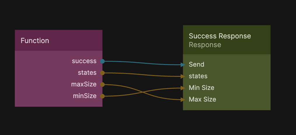
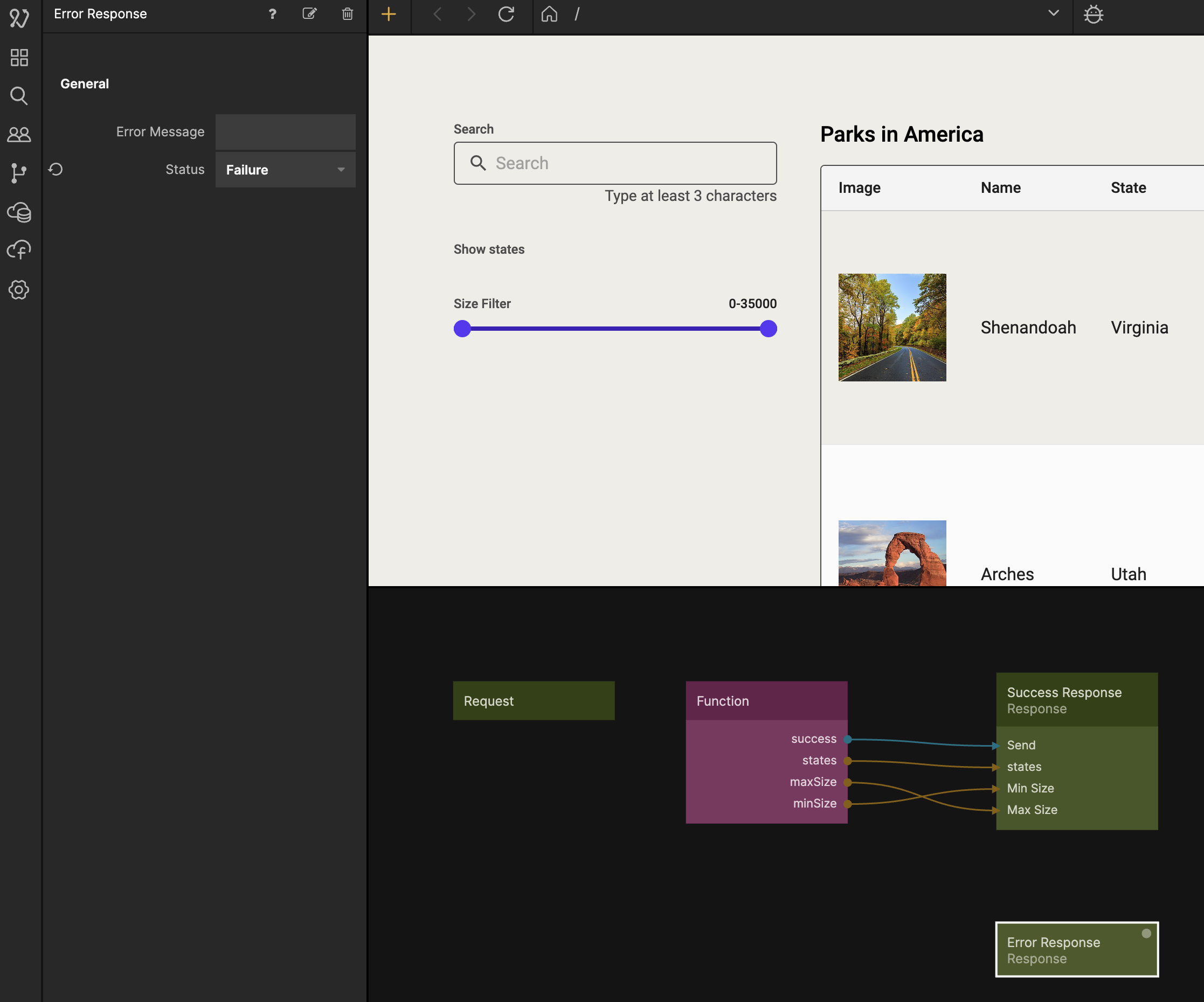
The code pulls out all distinct states from the Parks class and make them available in the Outputs.states. We also get the minimum and maximum size in an object that we call minMax, that we then make available as outputs in the Outputs.maxSize and Outputs.minSize, and send a success signal if it is successful. If there is an error it will give us an error message and send an error signal. Let's first handle the success case. Select the Response node and name it Success Response and then add parameters called states, Max Size, and Min Size.
Then from the Function node make the connections like in the image below.
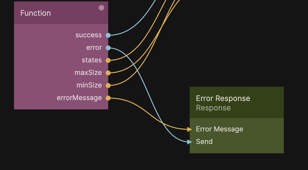
Bring up the Node Picker and add a second Response node. Call it Error Response, and change the Status property to Failure, then connect it like in the second image.
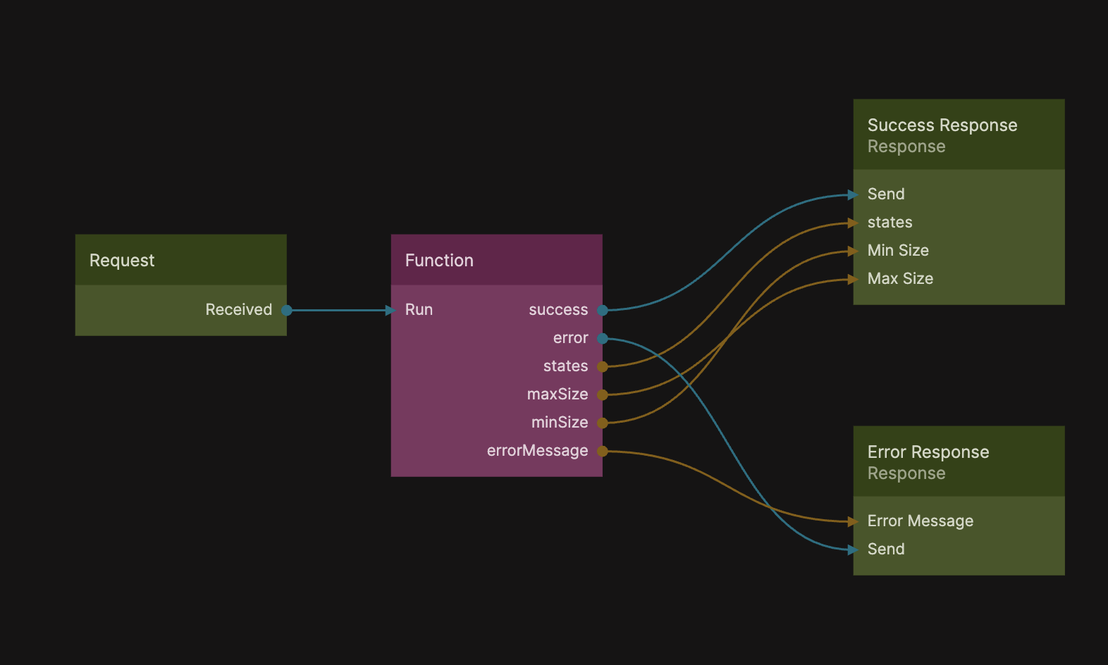
Now we just need to connect the Received signal from the Request node to the Run action of the Function node.
That's it for the Cloud Function, now let's use it in our Start Page.
Add Cloud Function to Start Page
Go back to your Start Page component, and add a Cloud Function node from the Node Picker.
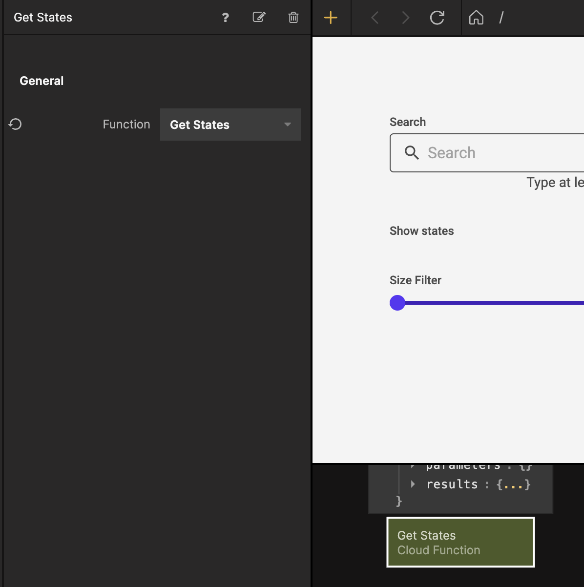
Select the Cloud Function node and from the Function dropdown select the Get States function.
We want the Cloud Function to execute as soon as the page becomes visible so let's connect the Did Mount signal from the Page node to the Received signal.
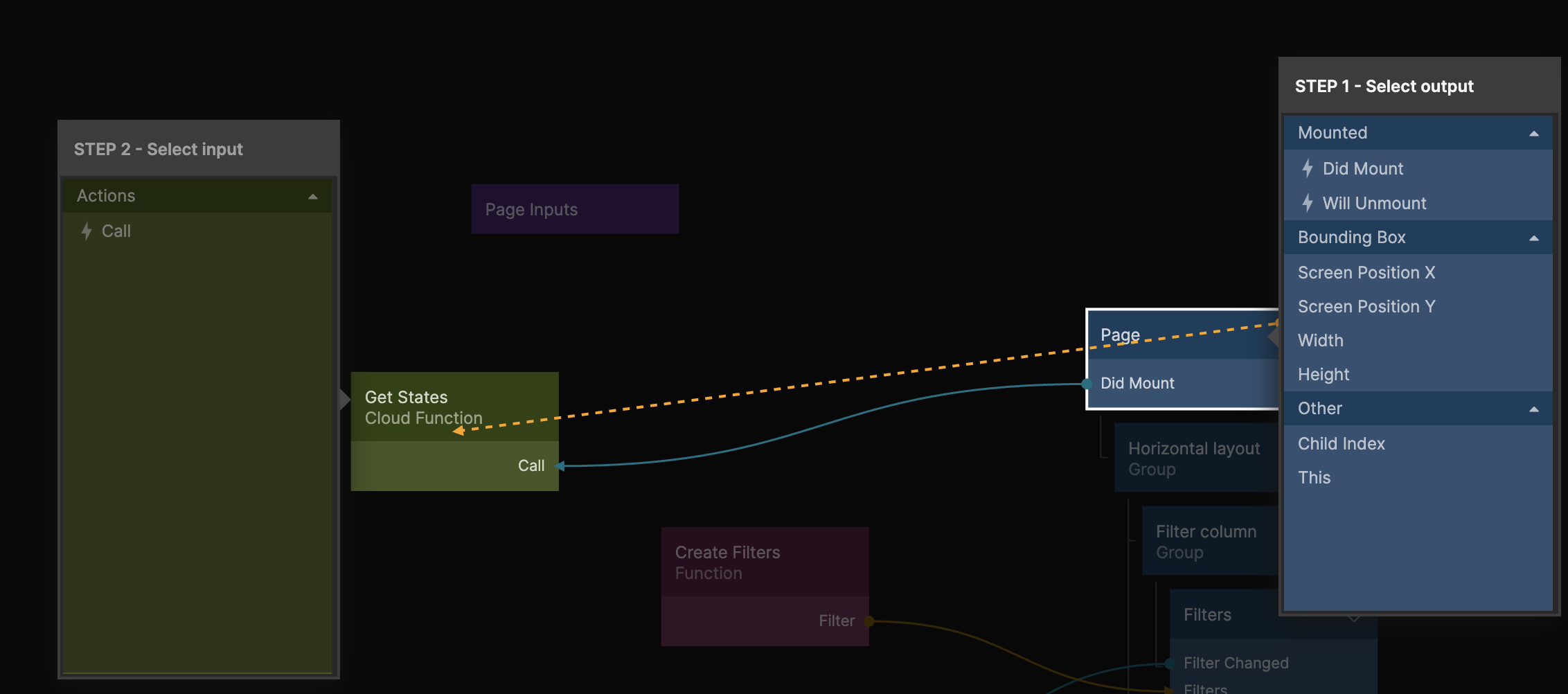
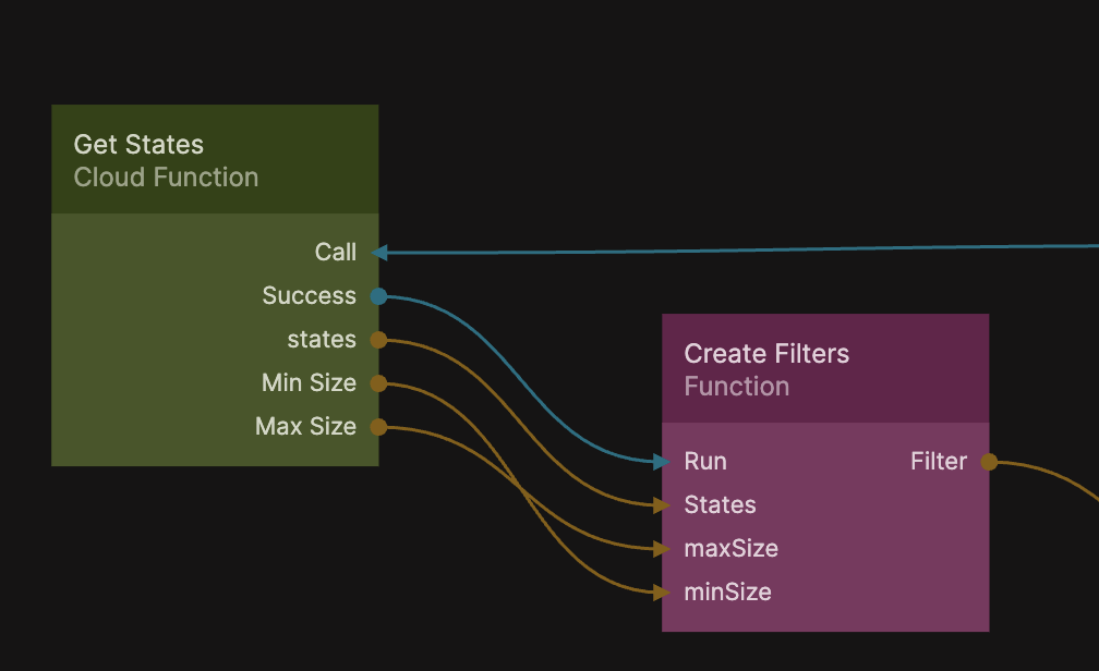
Next connect the Cloud Function to the Function node like in the image below:
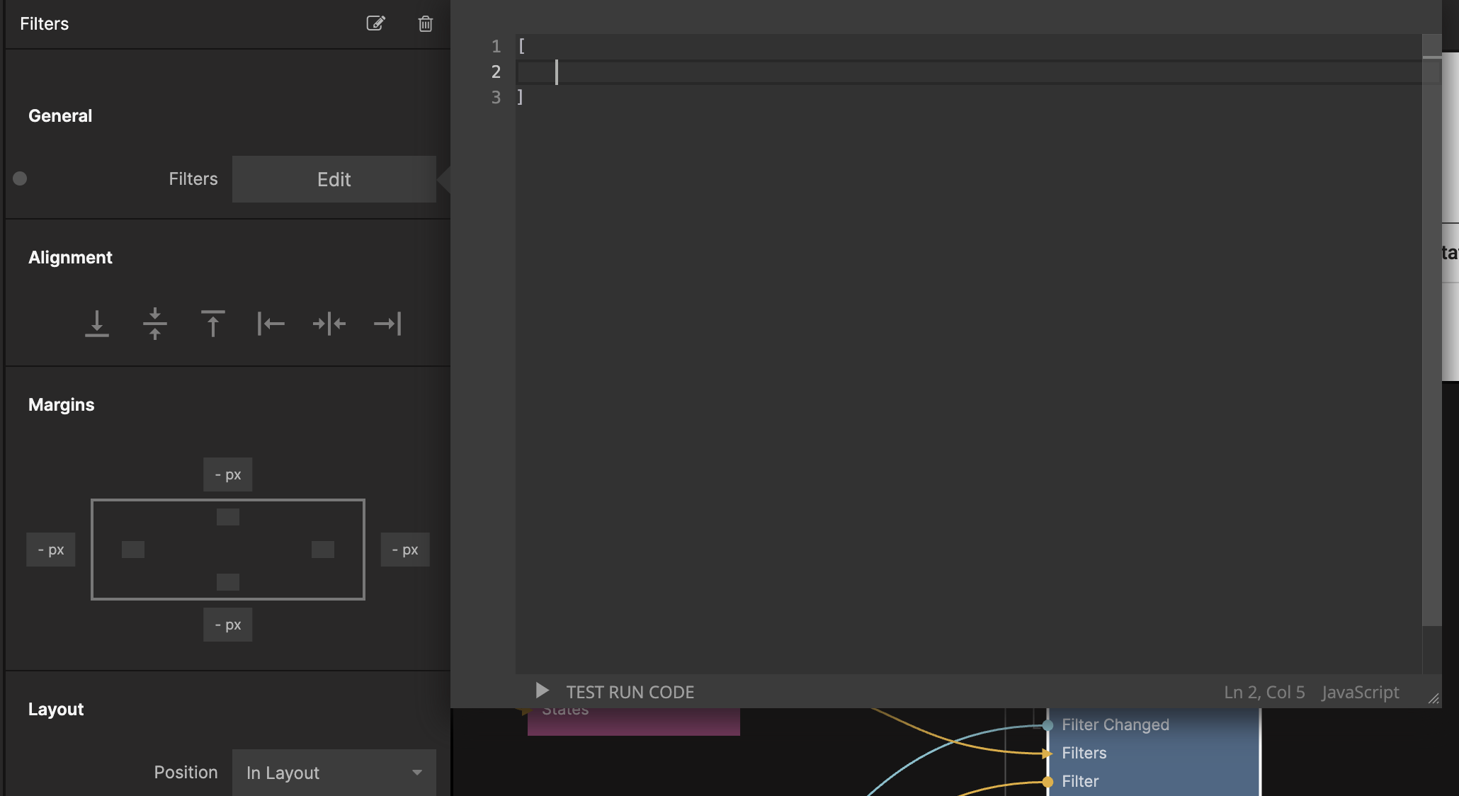
Let's also empty out the default filters from the Filters component by selecting the Filters property and leaving an empty array like in the screenshot:
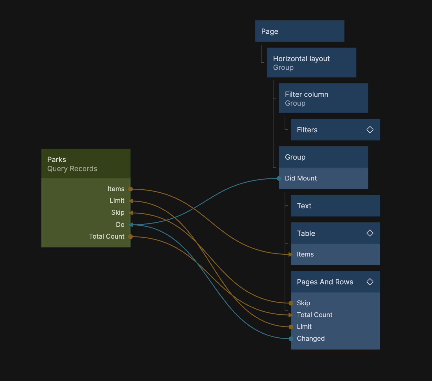
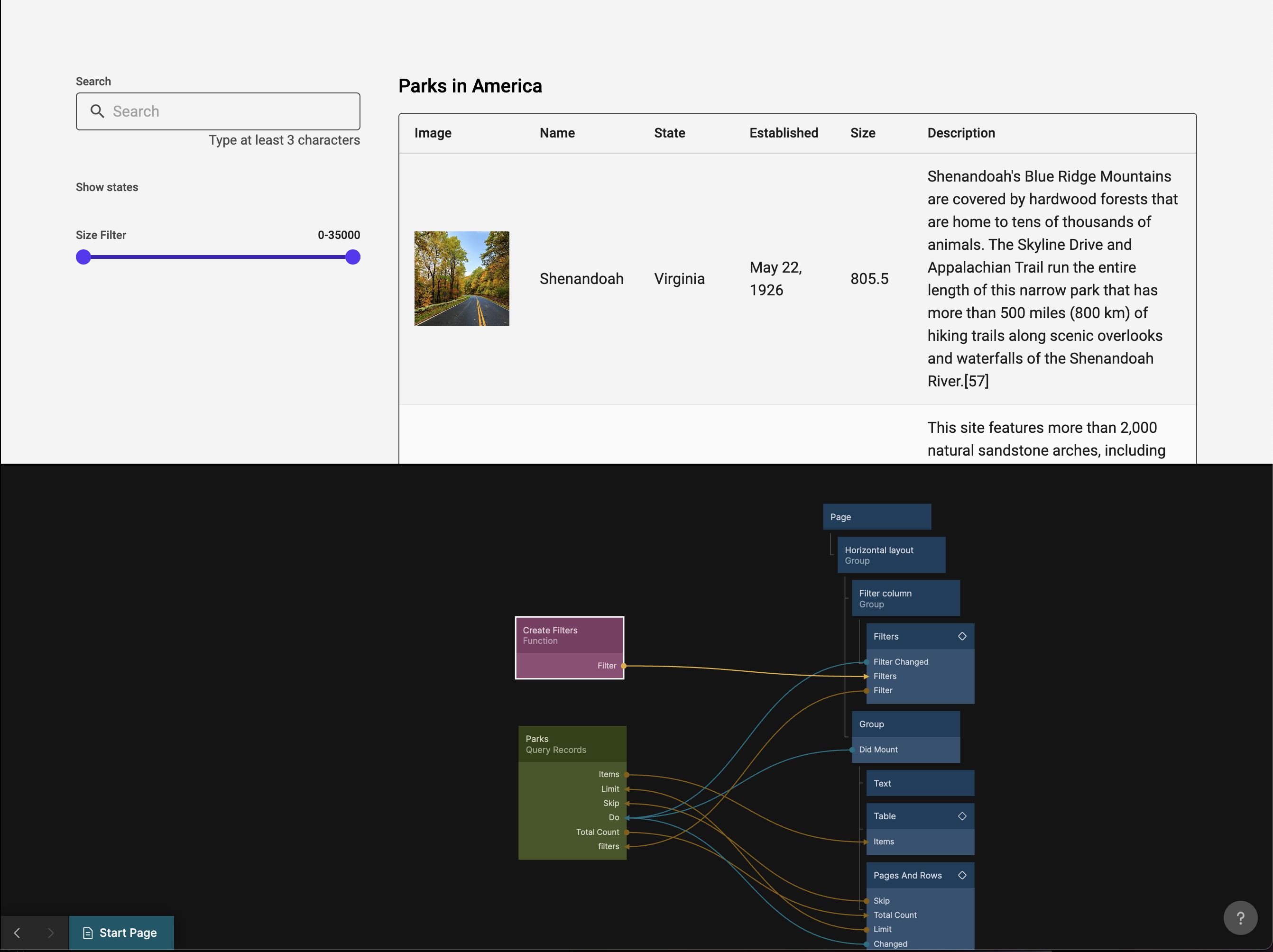
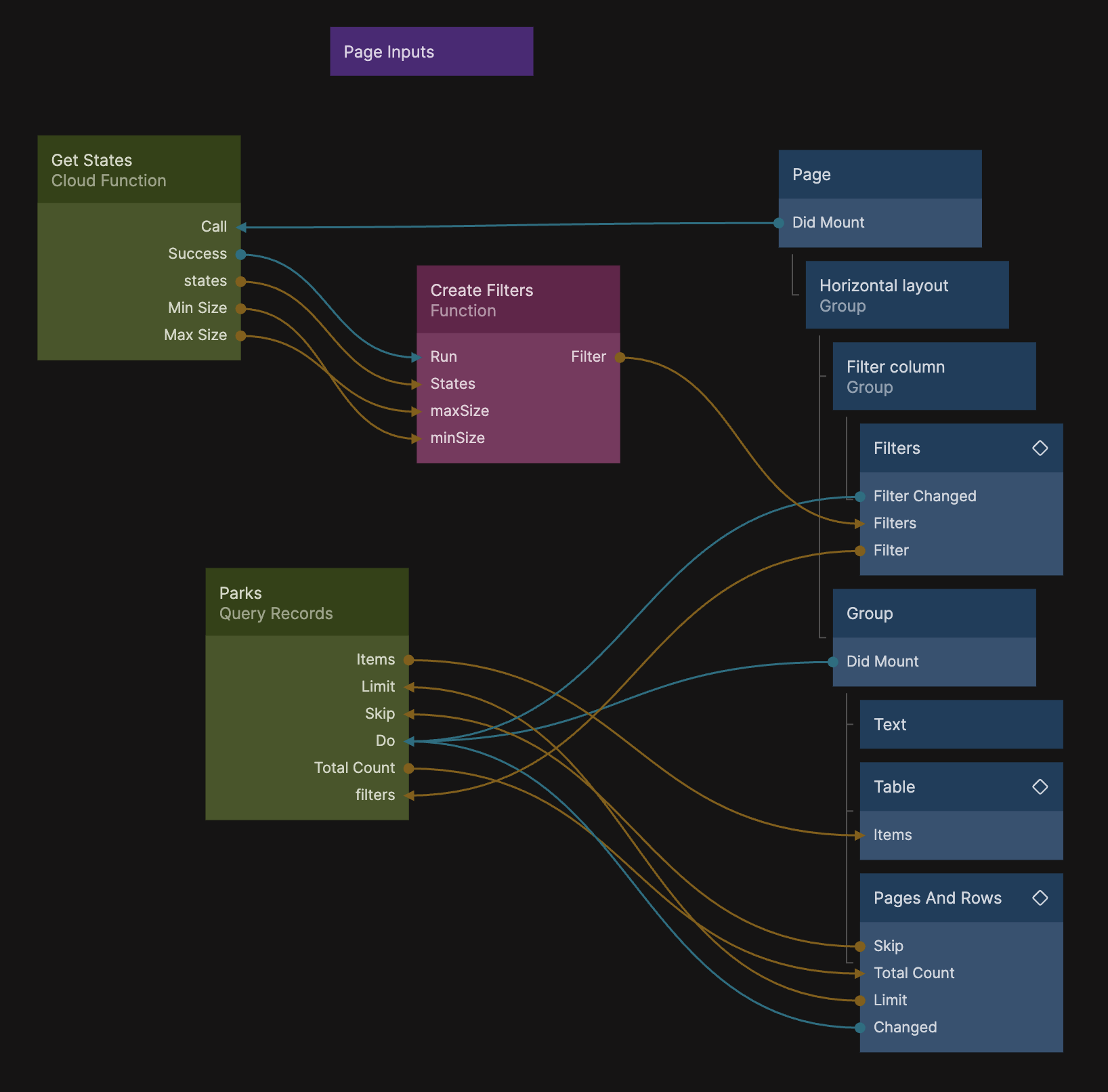
Now your final Node Graph should look like this:
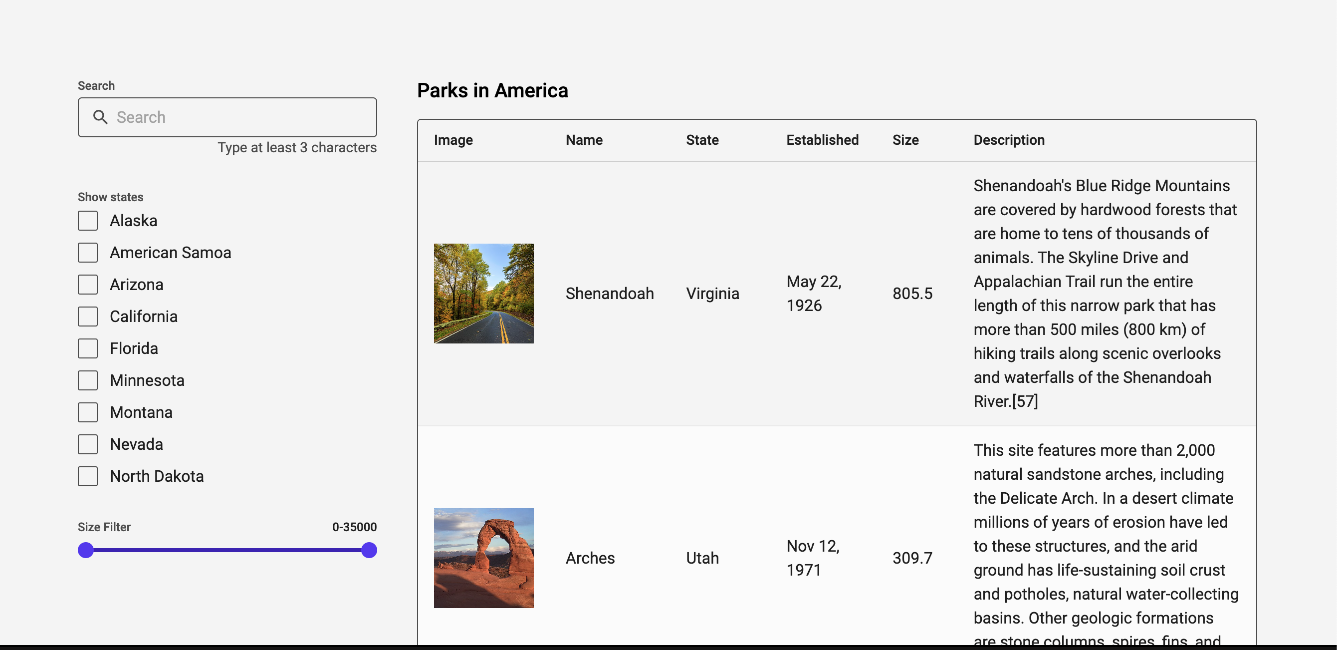
And your app should have selections for states and fully functioning filters:
Summary
In this guide we used the Filters component prefab to help us filter the data our Table shows. We also used a Cloud Function to pull out a list of distinct states from our data in the backend.