Table
A component for creating tables. This is also a great starting point for creating your own custom tables.
Basic usage
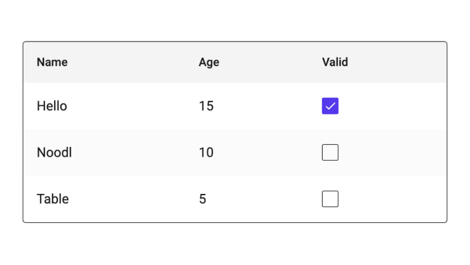
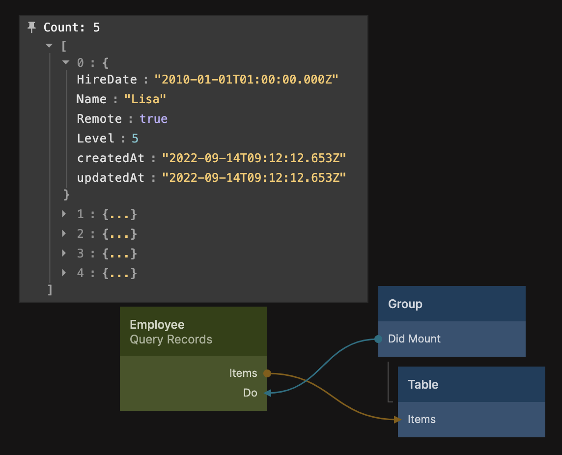
The most simple use case is to show an array of objects. This can be done by simply providing the array items as the Items input of the table component. Here is a simple example of just using the result from a Query Records and feeding it to a table.
This will simply present all properties of the objects as columns, as show below:
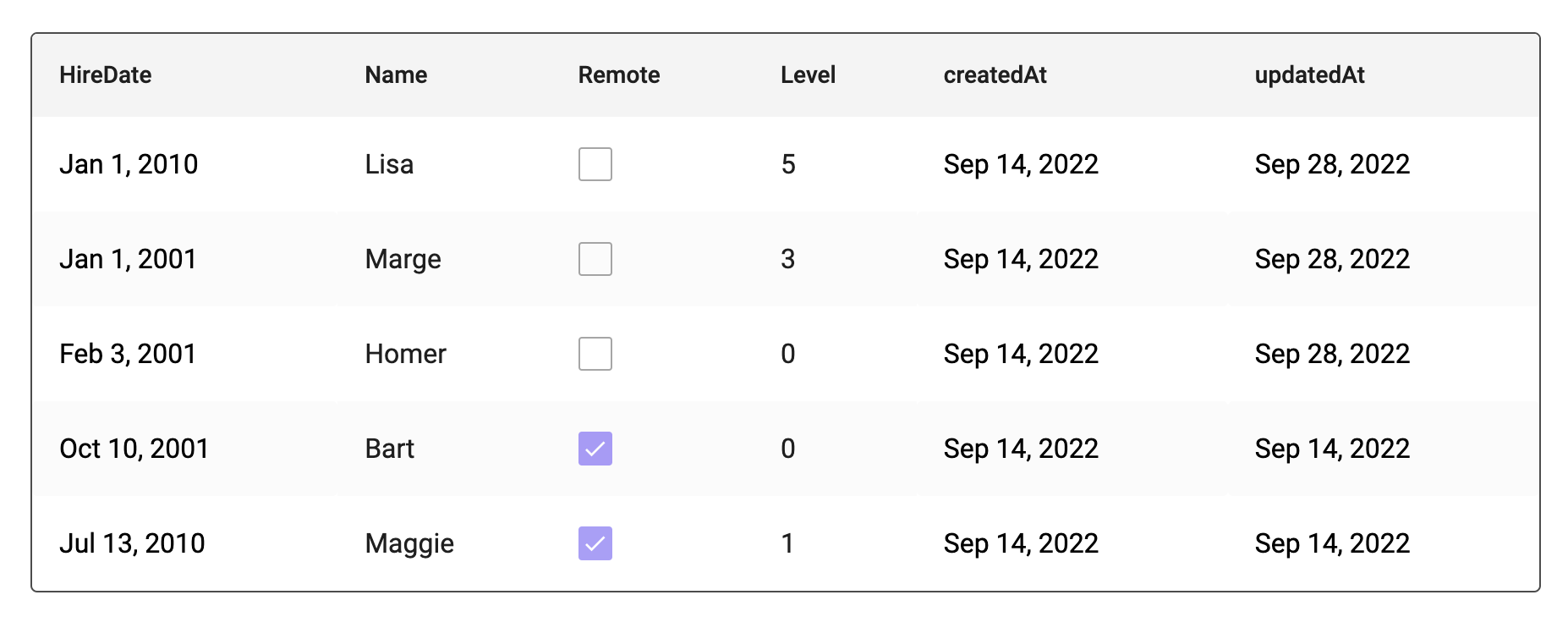
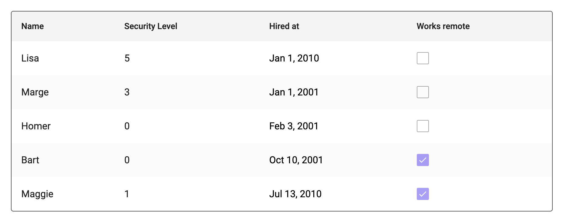
The table will automatically show String, Boolean, Number and Date types. Other types will not be presented correctly. Now you might not want to show all properties of the objects. This can be easily achieved with the Headers innput of the table. There you can specify which columns to use.
Providing the following headers in this example:
[
  {
    Field: 'Name',
    Label: 'Name',
  },
  {
    Field: 'Level',
    Label: 'Security Level',
  },
  {
    Field: 'HireDate',
    Label: 'Hired at',
  },
  {
    Field: 'Remote',
    Label: 'Works remote',
  },
];
You can also clear the default sample items of the table by editing the Items input in the property panel. Just put in an empty array.
[];
Would instead produce the following table:
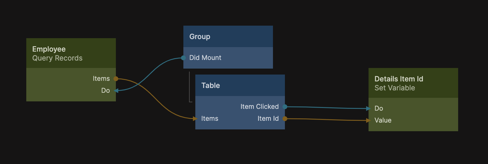
Row clicked signal
When a row is clicked the Item Clicked signal will be emitted along with the Item Id of the object or record representing that row. You can for instance use that to show details for the object in a different panel. The example below sets the Item Id to a variable that could be used somewhere else to present the object in a different UI.
Editing columns
You can make a column editable by specifying the Editable property in the corresponding header item. Let's say we want to make the Works remote column editable, we would simply provide it in the Headers array.
[
  ...{
    Field: 'Remote',
    Label: 'Works remote',
    Editable: true,
  },
];
This would allow the checkboxes in the column to be edited. The table will edit the actual object or record property, you can see this by inspecting the content of the Items array output of the Query Records node while editing the table.
When an item is edited the Cell Changed signal will be emitted from the table, along with the Item Id and the Field. You can, for instance, use this event to trigger a record save to the cloud.
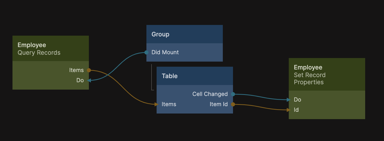
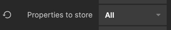
With this setup you have a very basic CRUD interface to a list of objects. Make sure to set the Properties to store to All on the Set Record Properties node.
Custom Cells
The table component is entierly built using Noodl core nodes which means you can rebuilt it to completely fit your needs. One setting you can provide in the Headers input is to set the column width in pixels. You can do this be specifying Width, as shown below:
[
  ...{
    Field: 'Remote',
    Label: 'Works remote',
    Editable: true,
    Width: 50,
  },
];
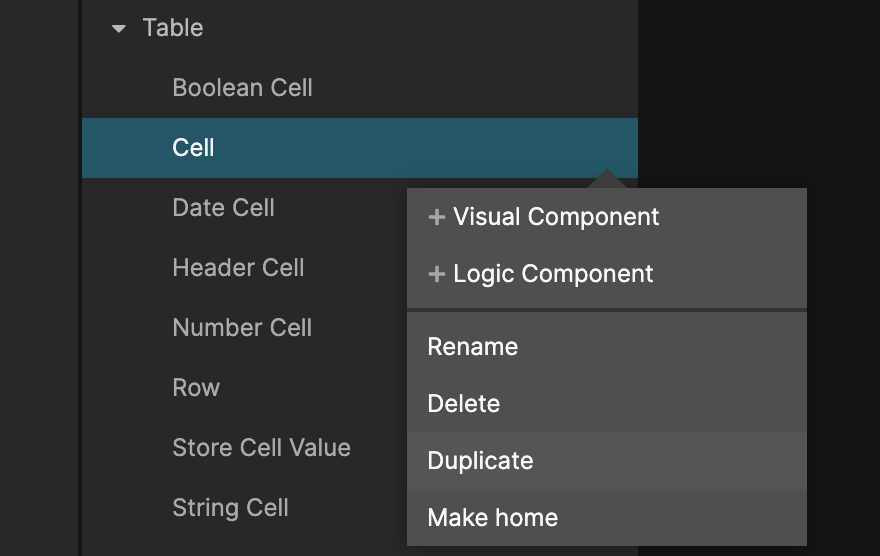
You can also customize the cells of the table by simply editing their individual subcomponents, or by creating completely new ones. The Table component have a number of subcomponents, one for each type of cell, and one default simply called Cell. You can duplicate this one to use as base for your own cell type.
Next, rename the new copy to a good name for your new cell type, it must end with Cell, so we will call it Security Level Cell. Now you can edit the Headers array to make the column use your new cell type.
[
    ...
    {
        Field:"Level",
        Label:"Security Level",
        Type:"Security Level"
    },
    ...
]
Now let's get started editing our new cell type, here is a simple example of how to show the security level as a colored bar.
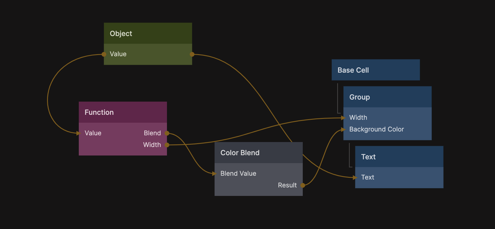
In the example above we have created a Group that has a width in percentage, some nice rounded corners and padding. The Function node computes the width and a blend for the color with the following script.
Outputs.Blend = (Inputs.Value / 5) * 2
Outputs.Width = Math.max( (Inputs.Value / 5) * 100, 20)
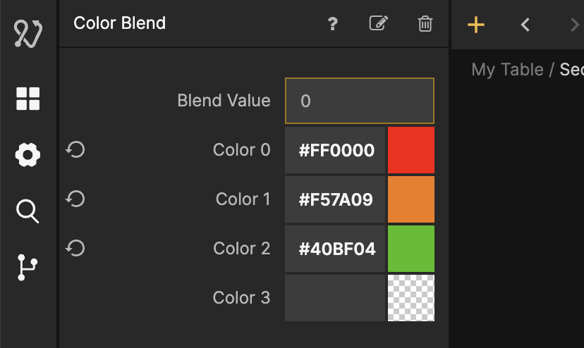
The color blend is creating the background color for the group with these settings:
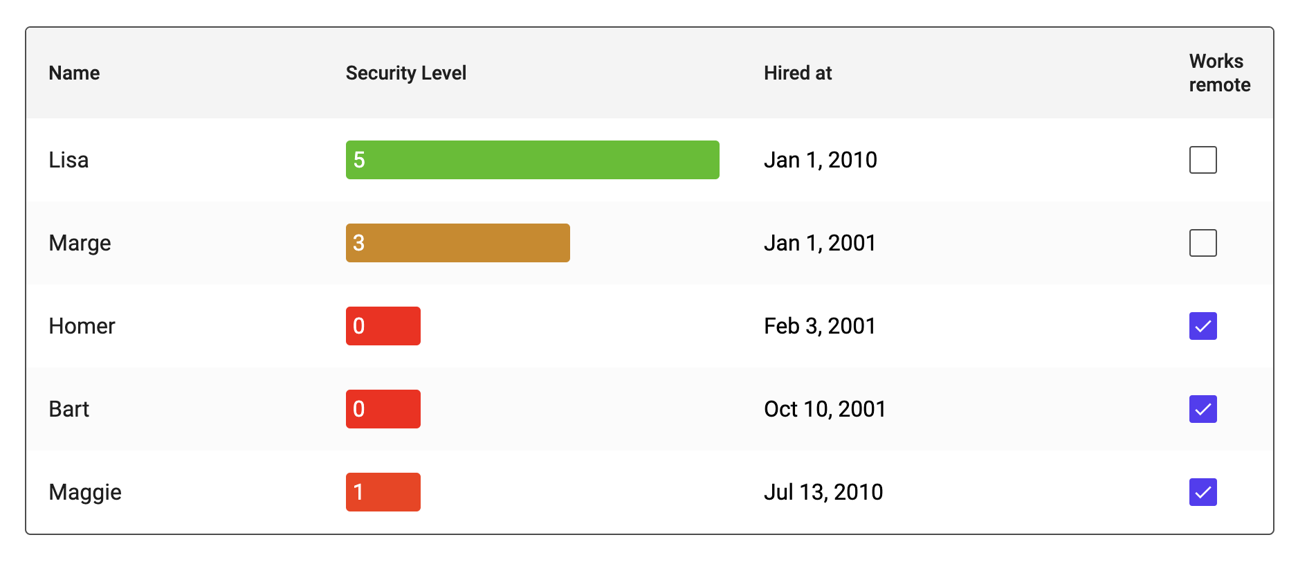
Using this cell type will give you the following table.
We recommend inspecting the default cell types and see how the handle cell editing etc.
Sorting
You can enable sorting by a column by setting the Sortable property in a header item. This will enable the header item to be clicked to switch between ascending and descending sorting.
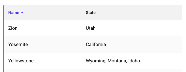
Here is an example for a table with two columns:
[
    {
        Label:"Name",
        Field:"Name",
        Sortable:true
    },
    {
        Label:"State",
        Field:"State",
        Sortable:true
    }
]
The table doesn't sort the items automatically instead it provides an output called Sorting that will contain the current selecting sorting field, and a signal Sorting Changed that will be emitted when the user clicks on a header and the sorting is changed. This will need to be hooked up to your data source to trigger a fetch, it's very simple to do this with Query Records as shown below:
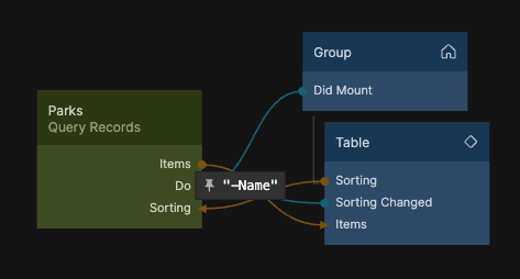
The Sorting output is a string containing the name of the selected sorting field with a prefix - if sorting is to be done descending. You can easily connect this to the Query Records node using advanced filters. Here is the most simple example:
where({ })

sort([Inputs.Sorting])
This will allow you to make the connection between the table Sorting output and the corresponding input on the Query Records node. Finally you can set the sorting via the Sorting input on the table component. This can be used to provide a default sorting, make sure you use the same sorting as default on your data source.