Filters
This prefab can be used to dynamically create filter controls that connect to a Query Records node.
This guide will show you how to use the filters prefab and the different controls plus how to connect it to Query Records. To use it, clone the prefab into your project this will create a Filters component in your default sheet.
Basic usage
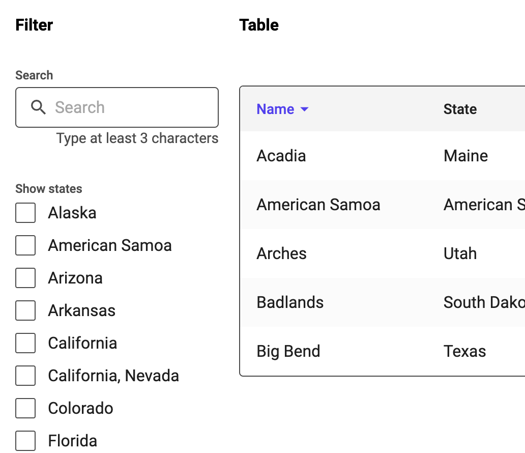
Below you can see a typical setup with the Filters component and a Query Records together with a Table.
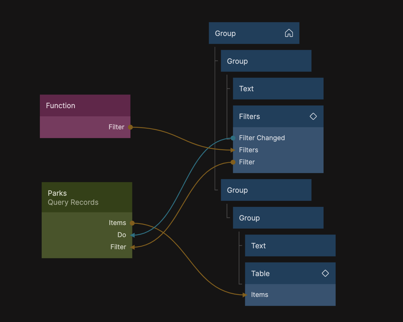
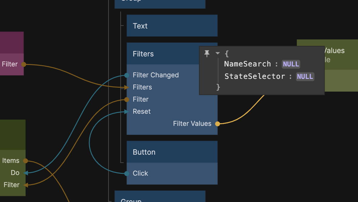
The Filters component have an output aptly named Filters that has the same format as the advanced filters. This means that you can connect it directly to a query records if you set it in Javascript filter mode and provide the following filter code.
where(Inputs.Filter)
The value on the Filters output is a Javascript object with an advanced filters matching the expected input on the query records.
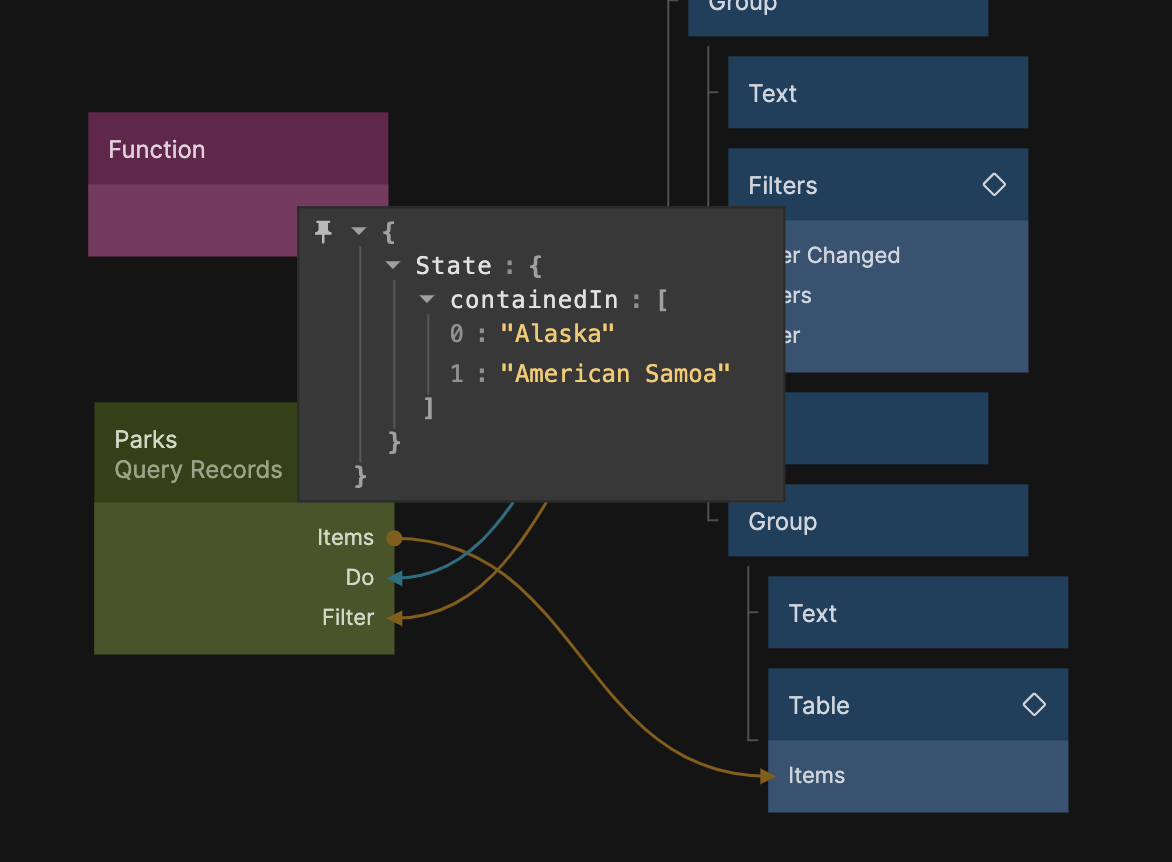
When the filter has change a signal will be sent on the Filter Changed output. This is useful for triggering a fetch on the datasource you are using. In this example above it's connected to the Do input of the query records node.
Filter Controls
Now, to replace the default filters you need to edit the Filters property (of the Filters prefab component, phew lot of filters here...) or connect to the input if you want to dynamically create your filters.
The format for the property is an array where each entry in the array maps to a certain type of filter control. Common for all controls is that they need the following properties:
[
    {
        Name:"xyz", // This is a unique identifier of the filter control
        Type:"Range", // The type of filter control, see types below
        // ... control sepecific properties
    }
]
Lets dive into different types of filter controls.
Slider
The Slider filter control can be used to create a filter for a Number property.

To add a Slider to the filter controls use this entry format in the filters array:
[
    {
        Name:"MinLevel", // A unique name for this filter control
        Type:"Slider", // The slider type
        Label:"Level", // A label for the slider
        Max:5, // Max value
        Min:0, // Min Value
        Step:1, // The size in value for one "step" of the slider
        Property:"Level", // This is the property of the class in query records that you want the filter to apply to

        // The test property is the test that will be added to the filters output, this can be any of
        // lessThan, lessThanOrEqualTo, greaterThan or greaterThanOrEqualTo
        Test:"greaterThanOrEqualTo"
    }
]
Range
A Range filter control is similar to a slider except it has a start and end interval.

To add a Range control to the filter controls use this entry format in the filters array:
[
    {
        Name:"MinMaxLevel", // A unique name for this filter control
        Type:"Slider", // The slider type
        Label:"Level", // A label for the slider
        Max:5, // Max value
        Min:0, // Min Value
        Step:1, // The size in value for one "step" of the slider
        Property:"Level", // This is the property of the records in query records that you want the filter to apply to
    }
]
Checkbox
The Checkbox control can be used to turn a filter test on and off. If the checkbox is checked the specific condition will be added to the filter, if not it will be removed.
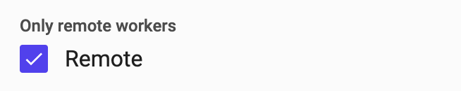
To add a Checkbox control to the filter controls use this entry format in the filters array:
[
    {
        Name:"Remote", // A unique name for this filter control
        Type:"Checkbox", // Type for the checkbox
        Label:"Only remote workers", // A label shown above the control
        Text:"Remote", // This is the text to the right of the checkbox
        Property:"Remote", // The property of the records in the query records where the condition should be applied
        Test:{equalTo:true} // The condition test, choose any from the advanced query section in query records
    }
]
Multi Choice
This control will allow you to filter on a string property of your record by giving a set of options to choose from.
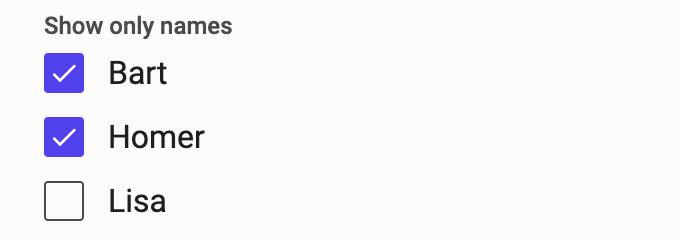
To add a Multi Choice control to the filter controls use this entry format in the filters array:
[
    {
        Name:"NameChoice", // A unique name for this filter control
        Type:"Multi Choice", // The type for the multi choice
        Label:"Show only names", // A label shown above the control
        Labels:['Bart','Lisa','Marge','Homer','Maggie'], // The labels for the options (whats shown in the UI)
        Options:['bart','lisa','marge','homer','maggie'], // The values that are used for the filter condition, this should match your db
        Property:"Name", // The property of the records in the query records where the condition should be applied
    }
]
Single Choice
The Single Choice filter control allows you to provide a number of different choices where the user can only pick one and for each choice there is a corresponding Test that will be added to the filter if that choice is checked.
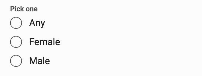
To add a Single Choice control to the filter controls use this entry format in the filters array:
[
    {
        Name:"SexSingleChoice", // A unique name for this filter control
        Type:"Single Choice", // The type for the single choice
        Label:"Pick one", // A label shown above the filter control

        Labels:["Any","Female","Male"], // Labels for the different options
        Options:["any","female","male"], // The values for the different options, this relates to the tests below

        // This is the conditions that are added to the filter corresponding to the particular choice
        // if the option is not listed below no condition will be added
        Tests:{
            "male":{Name:{containedIn:["Homer","Bart"]}},
            "female":{Name:{containedIn:["Lisa","Marge","Maggie"]}}
        }
    },
]
Date Filter
With the Date Filter control you can add a date input to your filter controls and the resulting filter can include a condition based on the selected date.
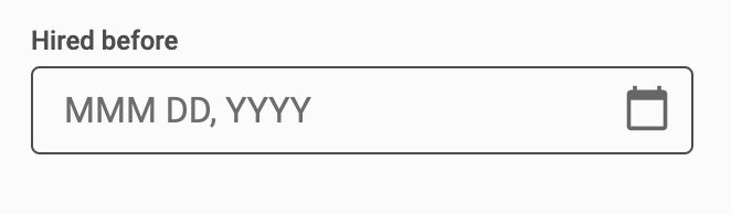
To add a Date Filter control to the filter controls use this entry format in the filters array:
[
    {
        Name:"MaxDate", // A unique name for this filter control
        Type:"Date Filter", // The date filter type
        Label:"Hired before", // A label shown above the date filter control
        Property:"HireDate", // The property of the records in the query records where the condition should be applied
        Test:"lessThan", // The test that makes up the condition for the filter
    }
]
Text Search
The Text Search filter control create a text input where the user can put a search string. It will create a condition on a given property, that should be a string, that will filter on records containing the text.
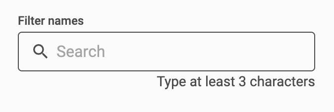
To add a Text Search control to the filter controls use this entry format in the filters array:
[
    {
        Name:"NameSearch", // A unique name for this filter control
        Type:"Text Search", // The text search type
        Label:"Filter names", // A label shown above the filter contorl
        Property:"Name" // The name of the property on the record that should be searched in
    }
]
Filter Values
Sometimes you only need the filter values, this is available on the Filter Values it is a regular javascript object with the values as properties with the names corresponding to the Name property in the filter controls. When the filter values changes a signal will be emitted on the Filter Values Changed output.
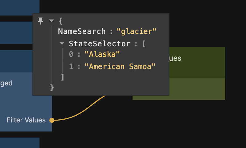
This is also useful if you want to provide presents for your filters. You can provide them via the Filter Values input on the Filters prefab component using the same format as the output.
Reset
By setting a property in the Filter Values object to null the corresponding filter controll will be reset to default and the condition will be removed from the Filter output. If you want to reset all filter controls you can send a signal to the input Reset on the Filters prefab.