Scrolling Content
What you will learn in this guide
This guide will teach you the basics on how to make content larger than its container visible through scrolling. We will mainly make use of the Scrolling property on the Group node and go into detail on how the layout engine works in relation to scrolling. We will also look at the built in scrolling functionality in the Page Router that makes it easy to build pages with scrollable content.
Overview
The guides will walk through the following topics
- How the Group node gets it size
- Scrolling in the Group node
- Scrolling in the Page Router node.
StickyLayout Position in a scrolling Group
This guide will use the Repeater node to create lists and also touch on navigation using the Page Router. So it's recommended to check out the guides for them either before or after following this guide.
You should also be familiar with layout basics so check out this guide before you start this guide, if you haven't already.
Scrolling in the Group node
The Group node is the fundamental node to create a layout. So what happens if the children of a Group node takes up more space than what's available? Well, it depends on how you set up its sizing.
The size of the Group node
On a high level there are two options (in both horizontal and vertical direction):
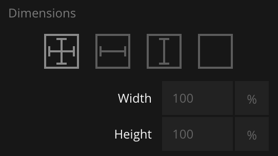
- Size is explicitly set. The size can then be given in % of available space, pixels or vw
- Size is decided by the total size of its children
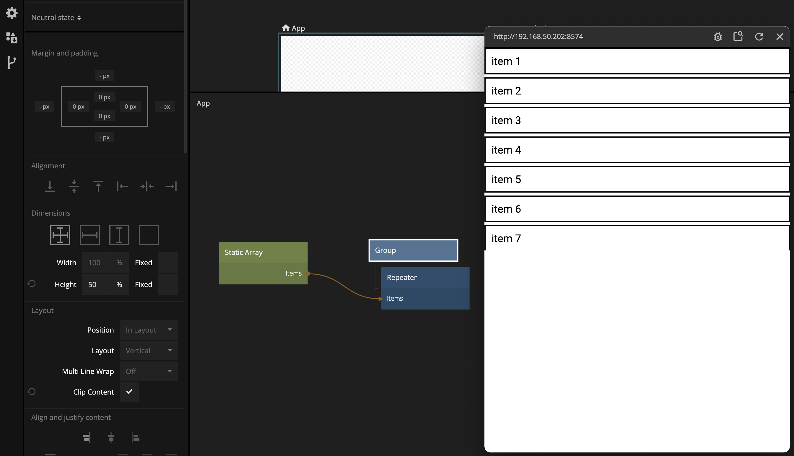
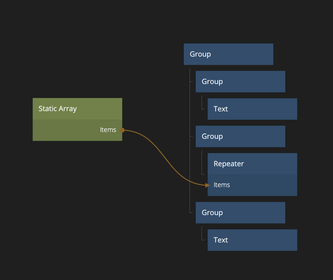
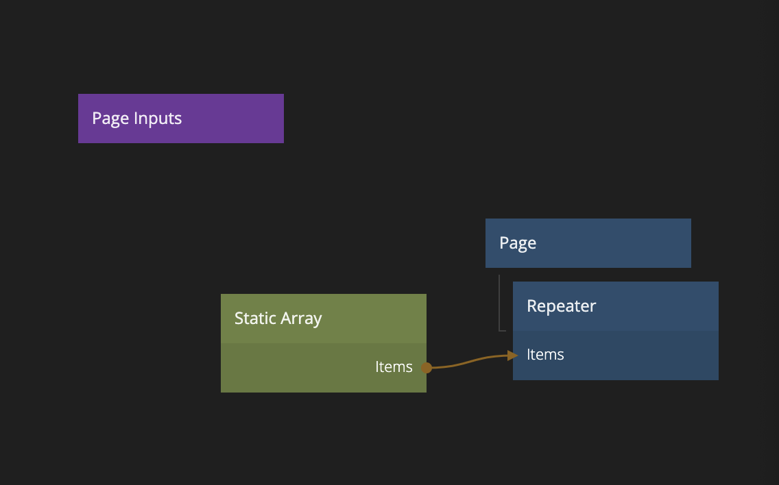
So we only need to worry about case 1), what happens if the children takes up more than the space that you give them in the Group? Let's try it. Start a new project, for example using the "Hello World" template. Replace the current nodes with the ones below.
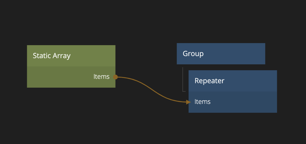
Fill up the Static Array node with some data. Make sure its set to JSON format.
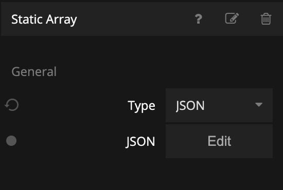
Then copy and paste the data below into the Static Array.
[
    { "label": "item 1" },
    { "label": "item 2" },
    { "label": "item 3" },
    { "label": "item 4" },
    { "label": "item 5" },
    { "label": "item 6" },
    { "label": "item 7" },
    { "label": "item 8" },
    { "label": "item 9" },
    { "label": "item 10" },
    { "label": "item 11" },
    { "label": "item 12" },
    { "label": "item 13" },
    { "label": "item 14" },
    { "label": "item 15" },
    { "label": "item 16" },
    { "label": "item 17" },
    { "label": "item 18" },
    { "label": "item 19" },
    { "label": "item 20" }
]
Then create a new visual component and call it "List Item".
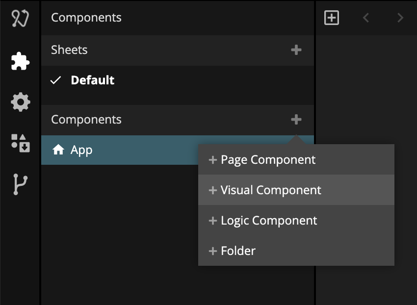
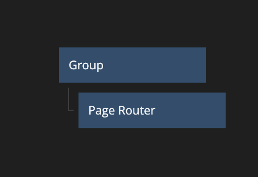
And create the following node structure:
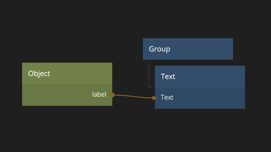
Make sure the Object node has a property called label connected to the Text node. Also set the size of the Group node to 100% width, and 45 px height. Give it a 5 px margin at the bottom. Also give it a outline so we can see it properly.
Center align the Text node vertically.
Finally go back to the "App" component and select the newly created list item as the Template.
You will now have something that looks like below. (You can also import the project directly by clicking "Import" below).
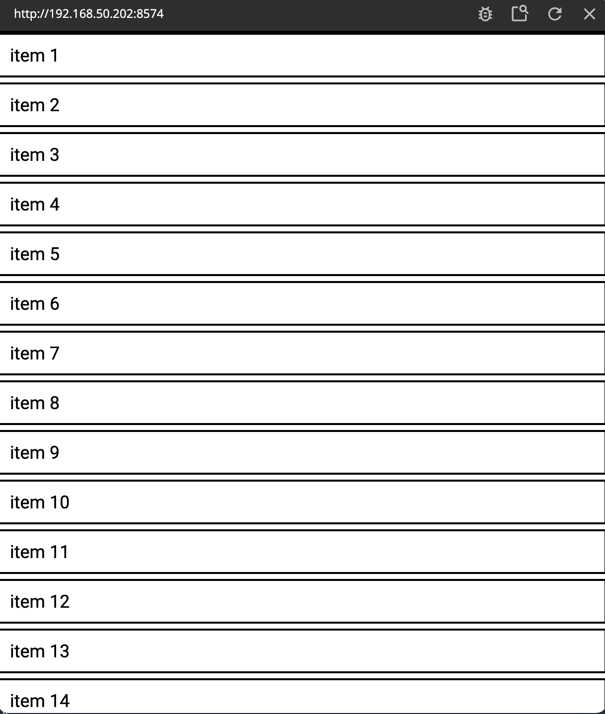
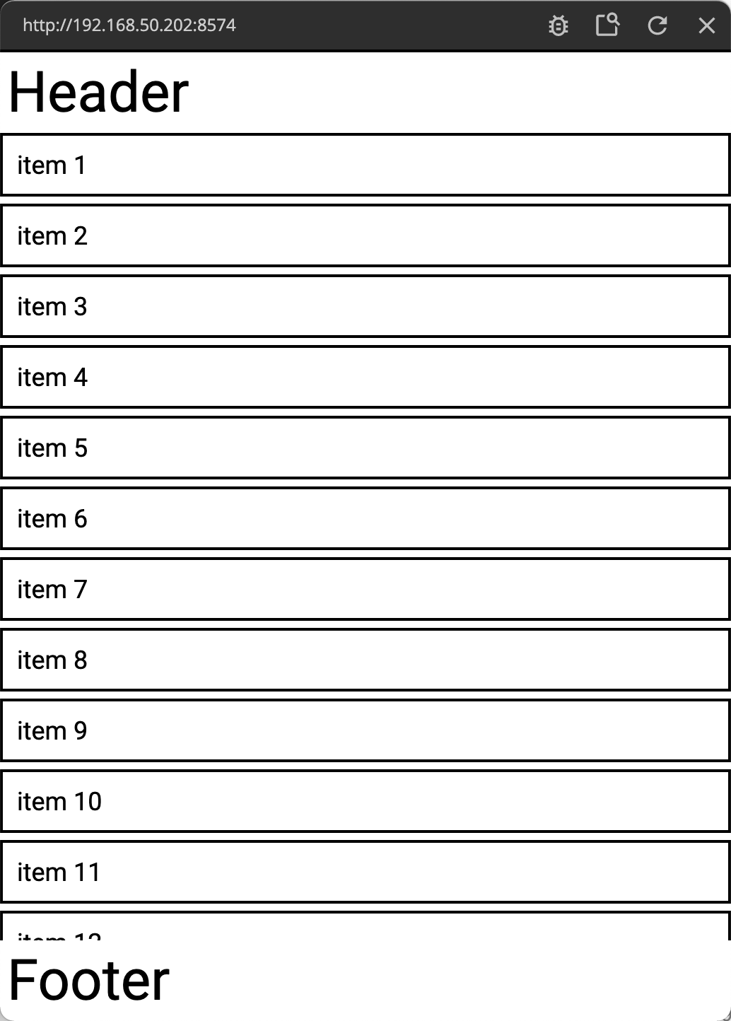
As you can see, the list takes up the full screen and unless you have a veeeeery long screen the items will flow outside the screen. You are not able to scroll the content.
Also try to change the vertical size of the Group node in the main App to 50%.
You might expect that only half the screen would be covered by the list, but you will see no change. That's because the default behavior of a Group with explicit size set is that if the size of the children are larger than the size of the Group, the size will grow to fit the children.
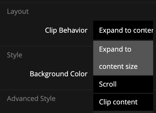
You can change that behavior and tell the Group to clip the content instead of growing. Check the Clip Content property of the group.
Getting the Group to Scroll
Another way to do it is to tell the Group that it allows scrolling. Uncheck the Clip Content and instead check Enable Scroll. You will now have a scrollable list.
As you can see there is an extra option Use native scroll. Generally you should have this checked, unless you are doing a very custom scroll interaction. We will not cover that in this guide.
Structuring Scrolling Content
Change back the size to 100% on the Group node.
Now let's add a title and and a footer. We can't add it to our Group node, because then they will scroll away with the list. So we have to restructure our layout a little.
Create a new Group node. Make the existing Group node a child of the new Group node.
Now we can add a header and a footer to the highest level Group and they will not be affected by the scrolling. The header and footer could for example be a Group node with content height and 100% width. Then add a Text with a larger font. Perhaps add a bit of padding in the Group containing the text.
Now you can see that the footer and header are allowed to take its space while the scrolling content takes whatever is left and lets its content scroll if it doesn't fit.
Scrolling in Page Routers
The Page Router is one of the main nodes to implement navigation in Noodl. In short, the Page Router contains the Pages you navigate to. In that sense, the Page Router is quite similar to a Group node. That's why a Page Router also have the options to make it's content scrollable by chosing Clip Behavior and setting Scrolling.
Lets try it out!
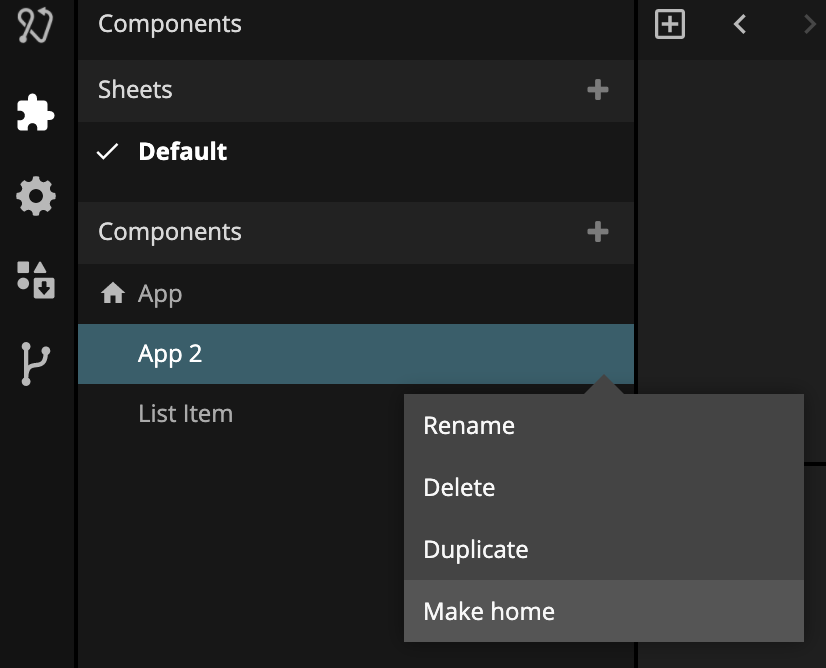
Create a new visual component. Call it "App 2". Select "Make Home" to make it the new home component (i.e it will be shown in the viewer).
Add a Page Router as the first child of the root Group
Click on the Page Router and click Add new Page and add a new Page called Page 1.
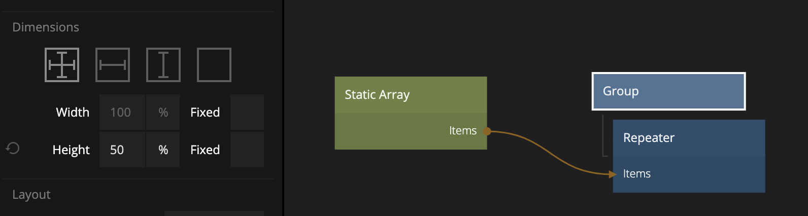
We can now simplify the previous structure. Since the Page Router will work as the Group we can move the Repeater (and the Static Array that provides the items) to right under the Page node in our newly created Page component.
Make sure to set the Clip Behavior to Scrolling on the Page Router and you now have scrolling content in your Page. Try it out.
Sticky Layout Position option
There is another way to get things like headers and footers to not be scrolled out of the Group node even if scrolling is enabled, and we will try it out on our Page. Instead of creating a new structure we can add our header and footer to be direct children to the Page node. So copy and paste them so they end up before and after our Repeater.
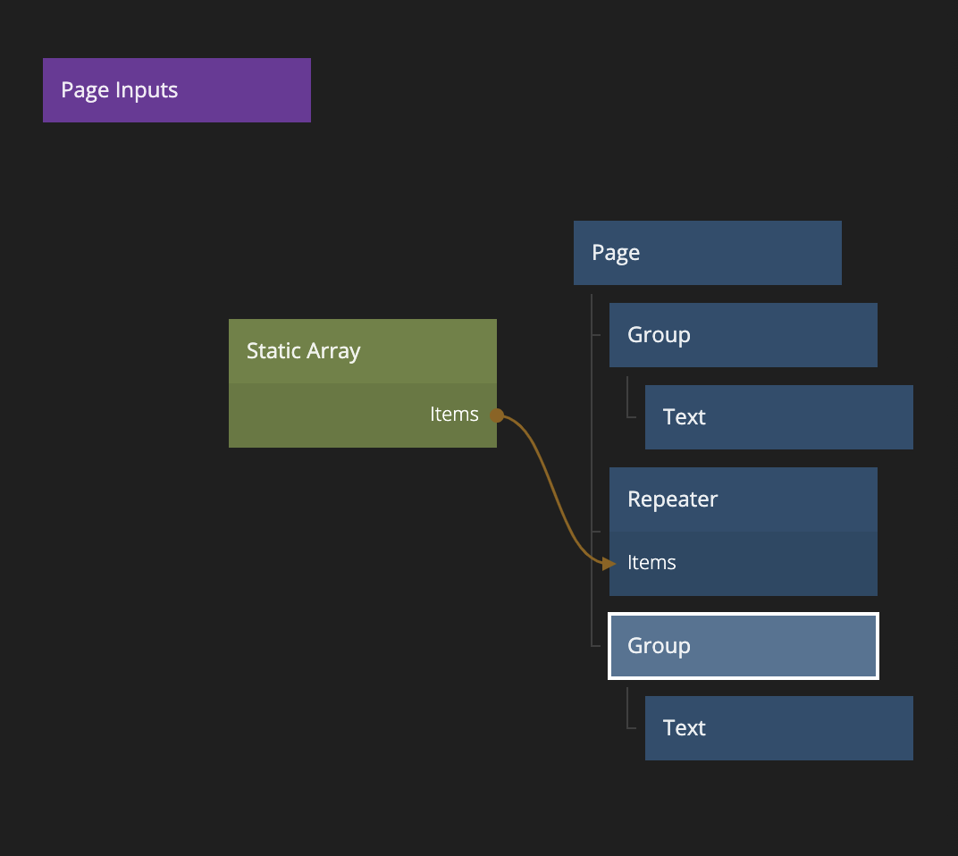
Also make sure the header is aligned to the top and the footer aligned to the bottom.
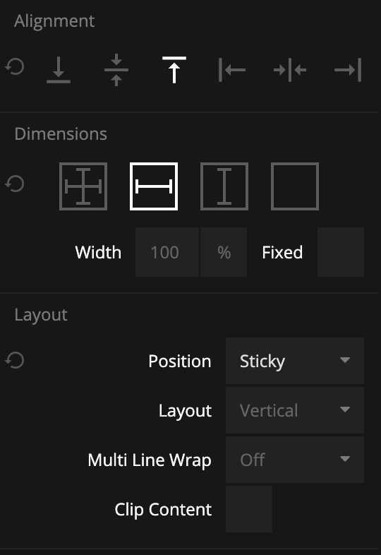
If you try scrolling now, they will be scrolled in and out of the screen. However if you change the Position setting for the header and footer Group to Sticky you will see that they will stay on screen.
The only issue is that you can see the list scroll behind the header and footer. This is probably not what you want.
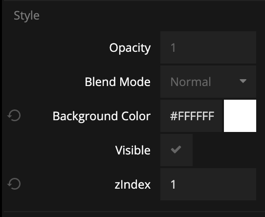
You fix that by setting the background color to non-transparent white. Also since Noodl by default renders everything in the order as it's in the tree (nodes later in the tree will be rendered on top of nodes earlier in the tree if they overlap), we also need to change the zIndex of the header to 1 to stay on top of the Repeater that's below it in the tree.
You now have a working scrolling list with a sticky header and footer.
If you want to try out the full project, import the project below.