Page Router
This node lets you navigate between your Page nodes using the Navigate or Navigate To Path nodes. You can also use the External Link node to navigate to a page outside your app.
Unlike the somewhat similar Component Stack the Page Router is optimized for web type navigation (in contrast to app type) and uses URLs and routing as part of the navigation as well as the browser history.
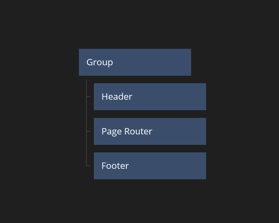
Every Page Router has a Start Page. The pages are rendered inside of the Page Router. You can use the Clip Behavior option to decide how the Page Router should wrap its content.
Implementation
The Page Router uses standard browser navigation which means that the user can use the browser Back button to navigate back in the Page Router history.
Note that the Page Router only navigates between Pages. Pages cannot be created through the Node Picker. You create them using Create Page in the component side bar.
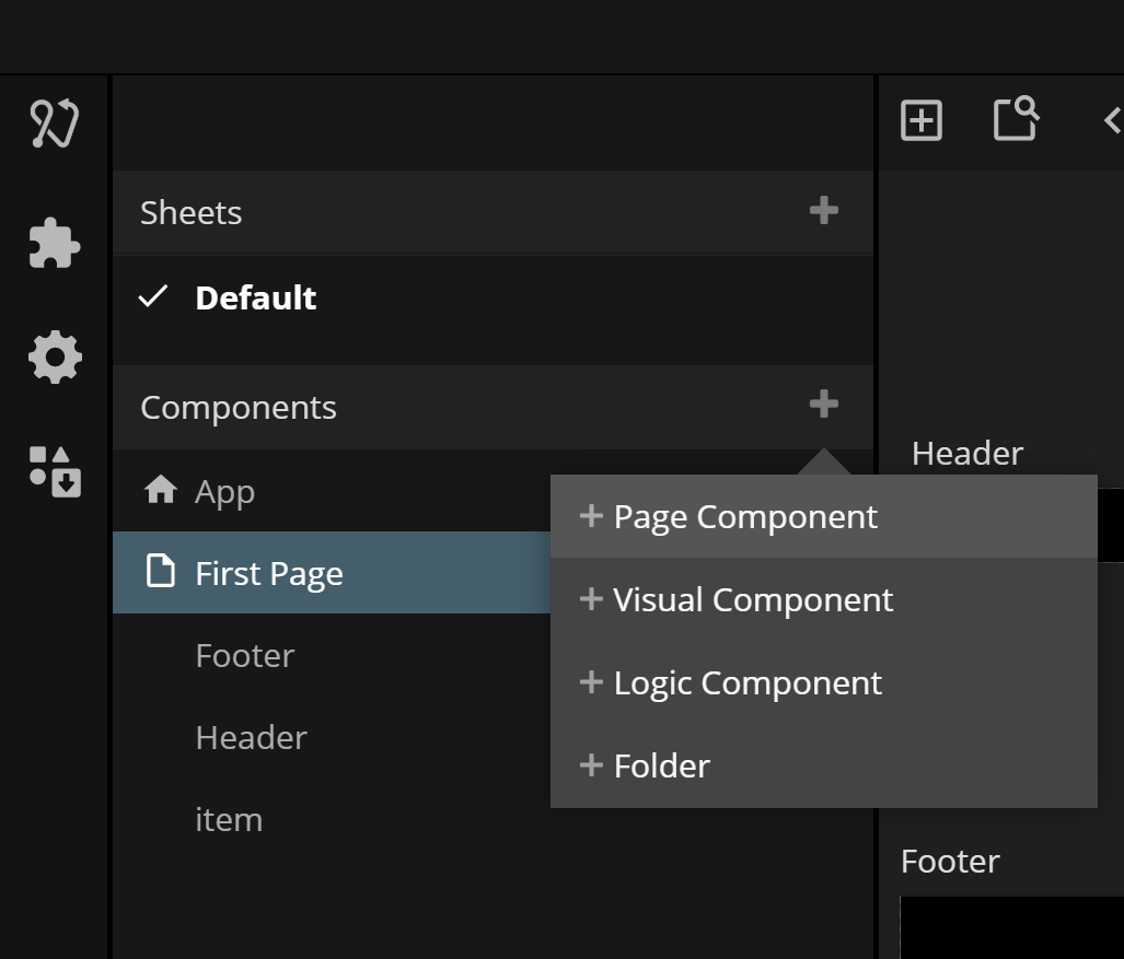
After creating your Pages they are automatically added to your Page Router unless you have multiple Page Routers in your project. Then you'll have to add them manually to where they belong.
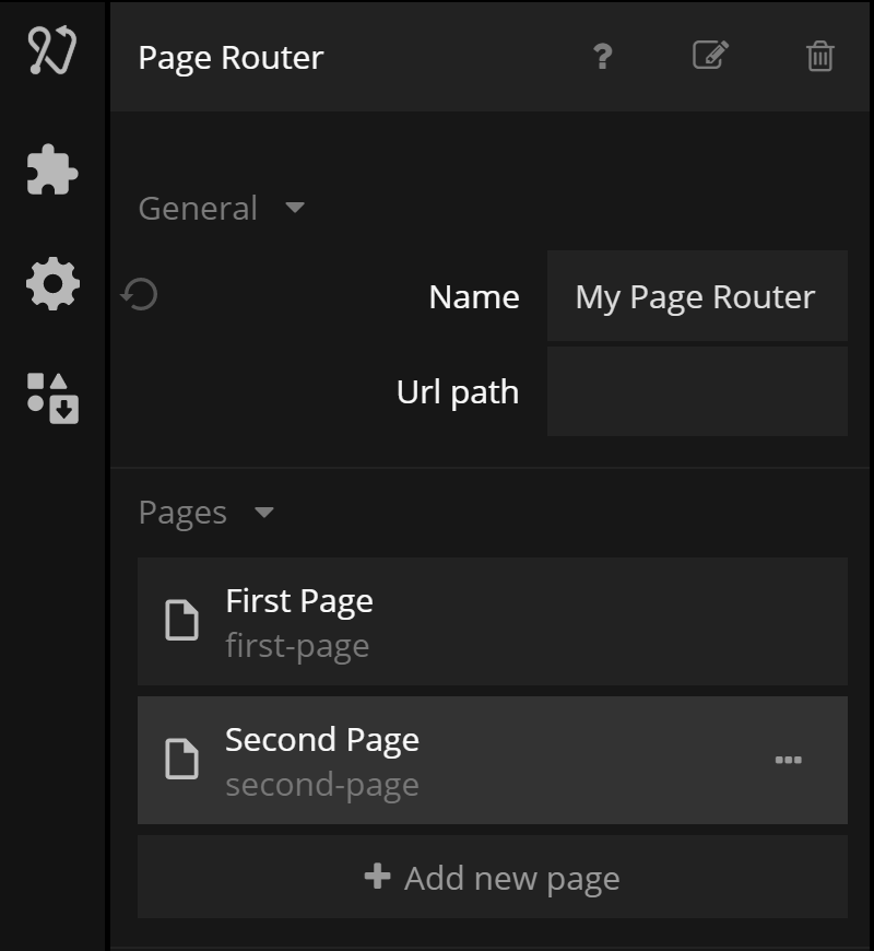
Start Page
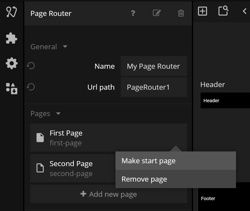
When creating and adding pages to your Page Router you will have to make one of the pages a starting page by opening the menu on the page item in the Page Router properties and selecting Make Start Page".
Navigating
URLs to Page Routers and Pages
Noodl uses a URL to route a Page Router to a specific Page. A Page Router may optionally have a URL Path. Each page has also has a URL Path that will uniquely identify the URL route to that page.
Generally, the route to a Page looks like the following
<domainname>#/<route1>/<route2>/<route3>...
where <domainname> is the domain on where you host the app and each <route> points to either a Page Router or a Page within a Page Router. The <route> may also include a Page Parameter and Query Parameters (see below).
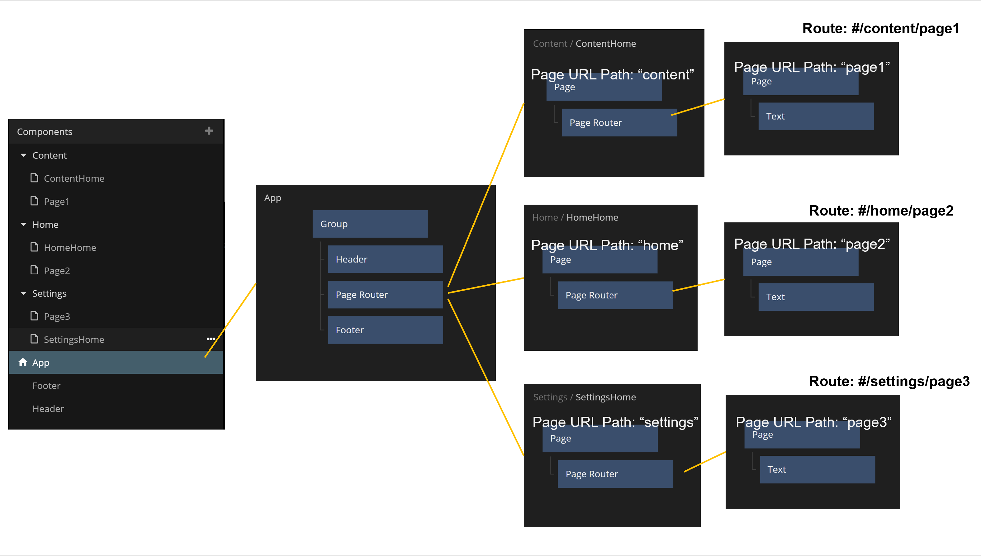
For example a Page Route with the URL Path 'myrouter', with two possible pages with URL Paths page1 and page2, will have two possible routes: myrouter/page1 and #myrouter/page2. Note the '#' character that is always added in the beginning of a route. If, for example, the Noodl App is deployed on the domain app.mynoodlapps.com, entering https://app.mynoodlapps.com#myrouter/page2 in the browser will take make the Page Router with the URL Path myrouter navigate to the Page with the URL Path page2.
Navigating using Navigation node
The most straight forward way of navigating between pages within an app is to use the Navigate node. This node will navigate to the Page selected in the Navigation node. This will update the URL of the browser to the route pointing to that page. There is also a Navigate To Path node that allows an explicit path to be set, that could for example perform navigation on multiple Page Routers at the same time by simply specifying a full URL path.
Multiple Page Routers
If needed, you can use multiple Page Routers at the same time. This could for example be used if you have multiple navigation flows within a higher level navigation flow. For example, you may have a top level navigation between the pages Home Settings and Content and within each page have sub navigation into specific pages under each section.
Encoding Parameters in the URL
The Page Inputs node is used to send parameters between Pages by encoding them in the URL. This is useful for example if you want certain input parameters to be available at a page, no matter the state of the app. The user may for example press Refresh in the browser. Since the parameters are encoded in the URL they will still be available in the Page through a Page Inputs node. Another case for encoding parameters in the URL is for users to be able to share a link, with a full route to a specific place in your app, with specific parameters set.
There are two types of parameters Path Parameters and Query Parameters. There can only be one Path Parameter while you can have any number of Query Parameters.
Path Parameter
A Path Parameter is added to the route of the page at the end. For example a Page with URL Path mypage with a path parameter defined, will expect the next part of the route to be the value of that parameter. The route mypage/monkey will result in the Path Parameter of the Page to get the value monkey. Using Path Parameter is a convenient way to encode a specific data entry to be prepopulated in a Page. As an example the Path Parameter could be the Id of a Record.
Query Parameter
A Query Parameter are encoded using ?parameter=value; notation in the URL. You can have any number of Query Parameters.
Visual Appearance
The Page Router is a visual node. It will automatically expand to take all space available in the current layout, unless its Clipping Behavior is set to Expand To Content Size in which case it will have the same size as the Page its showing (if available).
Inputs
| Data | Description |
|---|---|
| Name | The name of the Page Router. If you have multiple Page Routers the name will be used to identify them. |
| URL path | An optional path of the Page Router when routing a URL towards it. |
| Clip Behavior | This property controls the size and clipping behavior of the Page Router. It has three possible values: Expand To Content Size, Scroll or Clip Content.Expand To Content Size: Changes the size of the Page Router to fit the size of the Page it's currently showing.Scroll: Makes the Page Router take as much space as it can. Any Page inside it will be scrollable if it cannot fit inside the Page Router. |
| Background Color | The color that will be shown when there is no Page covering the Page Router or when the Page is transparent. |
| Mounted | This property is used to completely remove the node from the DOM. If this property is set to false the node is removed from the DOM. It differs from the Visible property where the node is still part of the DOM but invisible. |
| Signal | Description |
|---|---|
| Reset | Triggering this action will reset the Page Router making it show the start page. |
Visual
This node also supports the Advanced Style gadget from the Visual Input Properties.
Outputs
| Data | Description |
|---|---|
| Current Page Title | The title of the page that is currently showing in this Page Router. |
Visual
This node supports the following Visual Output Properties:
Visual Input Properties
All visual nodes feature a plethora of visual properties that can be accessed both in the Property Panel and through inputs. These are documented below. Plese refer to the individual node documentation pages to see which nodes feature what visual properties.
Margin
Margins are the spacings around the node, outside of the borders. The margins for the node can be set individually in the Spacing Gadget.

| Data | Description |
|---|---|
| Margin Left | The left margin in px, or % of the parents width. |
| Margin Right | The right margin in px, or % of the parents width. |
| Margin Top | The top margin in px or, % of the parents width. |
| Margin Bottom | The bottom margin in px, or % of the parents width. |
Padding
Paddings are the spacings around the nodes content, inside of the borders. The margins for the node can be set individually in the Spacing Gadget.

| Data | Description |
|---|---|
| Padding Left | The left padding in px, or % of the parents width. |
| Padding Right | The right padding in px, or % of the parents width. |
| Padding Top | The top padding in px or, % of the parents width. |
| Padding Bottom | The bottom padding in px, or % of the parents width. |
Alignment
To specify how the node is aligned to its parent you can use the Alignment Gadget.

From left to right, the alignment options are:
| Data | Description |
|---|---|
| Align Bottom | Align this node to the bottom of its parent. |
| Align Vertical Center | Align this node to the bottom of its parent. |
| Align Top | Align this node to the top of its parent. |
| Align Left | Align this node to the left side of its parent. |
| Align Horizontal Center | Align this node to the horizontal center of its parent. |
| Align Right | Align this node to the right of its parent. |
Connection Values
When making a connection to the layout property, the values are a little different than the ones in the dropdown. Here is a list of the values, that should be passed in:
| Display Name | Value |
|---|---|
| Align Bottom | bottom |
| Align Vertical Center | center |
| Align Top | top |
| Align Left | left |
| Align Horizontal Center | center |
| Align Right | right |
Dimensions
Controling the width and height of the node is done with the Dimension Gadget.

The first four controls the Size Mode of the node. It decides how the width and height of the node is specified. From left to right, the options are:
| Data | Description |
|---|---|
| Explicit width and height | Set the width and height directly in pixels or percentage. Percentage is in relation to the parent, so 100% is the same size as the parent. |
| Explicit height, Content Width | The node will calculate the width to fit all of its children. The height is explicitly set. |
| Explicit width, Content Height | The node will calculate the height to fit all of its children. The width is explicitly set. |
| Content Size | Both the width and the height is calculated to fit all of the node's children. |
The other properties are:
| Data | Description |
|---|---|
| Width | Specify the width of this node in pixels, percentage of parent's width or the unit vw which is percentage of the browser window width. |
| Height | Specify the height of this node in pixels, percentage of parent's height or the unit vw which is percentage of the browser window height. |
| Fixed | Controls if an element will try to resize and share space with siblings without going outside of the bounds of the parent. If Fixed is enabled, the element will be the exact specified size. If it is disabled, the element will resize to fill up empty space, or shrink to make space for siblings. |
You can use the Dimension Contstraints Gadget to set a min and/or a max size for the node.
Layout
The supported properties of the Layout Gadget can be very different depending on the node. All possible properties are listed below.

• Position
Controls the layout of this node is in its parent group.
| Option | Description |
|---|---|
| In Layout | This node is part of the parent group layout, it will be stacked with its siblings depending on the parent group layout settings. |
| Absolute | This node will not be part of the parent group layout, instead you are free to use the Pos X and Pos Y to place this node explicitly. |
| Sticky | Behaves like In Layout, except when the node is about the be scrolled outside the parent. It'll stick to an edge of the parent instead of scrolling away. The edge it sticks to can be controlled with the Alignment input. |
• Layout Direction
By default all children are stacked. This property specifies the stacking direction.
| Data | Description |
|---|---|
| Vertical | Children are stacked vertically. |
| Horizontal | Children are stacked horizontally. |
| None | Children are not stacked. |
When making a connection to the layout property, the values are a little different than the ones in the dropdown. Here is a list of the values, that should be passed in:
| Display Name | Value |
|---|---|
| Vertical | column |
| Horizontal | row |
| None | none |
• Multi Line Wrap
This property specifies what happens with children that are stacked outside of the border of the node.
| Data | Description |
|---|---|
| Off | Children are stacked beyond the boundaries of the node. If Clip is enabled they will not be visible. |
| On | Children are wrapped to the next row or column (depending on layout direction). |
| On Reverse | Same as On but opposite layout direction. |
• Gap
This property is used to add spacing between children in the group.
| Data | Description |
|---|---|
| Vertical Gap | Vertical space between children. Shown if Layout is set to Vertical or Multi Line Wrap is On. |
| Horizontal Gap | Horizontal space between children. Shown if Layout is set to Horizontal or Multi Line Wrap is On. |
• Clip content
This property controls if elements that are too big to fit inside the node will be clipped.
If disabled, a group will always expand to contain all of its children. So if the children are taller than the size of the group, the group will expand and be larger than its specified size.
Align and justify content
This Gadget controls how children are aligned and justified by default. Children can override these settings with their Alignment input.

The first set of options control cross-axis alignment, meaning vertical alignment for horizontal layouts, and horizontal alignment for vertical layouts. From left to right, the options are:
| Option | Description |
|---|---|
| Align items start | Children are stacked at the start of the parent. |
| Align items center | Children are stacked at the center of the parent. |
| Align items end | Children are stacked at the end of the parent. |
The second set of options control alignment in the same direction as the layout. From left to right, the options are:
| Option | Description |
|---|---|
| Justify content start | Children are stacked at the start of the parent. |
| Justify content center | Children are stacked at the center of the parent. |
| Justify content end | Children are stacked at the end of the parent. |
| Justify content space between | Children are evenly distributed. No space is added between the parent and the first and last child. |
| Justify content space around | Children are evenly distributed. Space is added between the parent and the first and last child. |
| Justify content space evenly | Children are evenly distributed with equal space between them. |
Scroll
This Gadget controls how scrolling should be handled within the node.

| Data | Description |
|---|---|
| Enable Scroll | This specifies if the node should have scrolling enabled for children that overflow outside of the nodes boundaries. Scrolling direction is determined by the nodes Layout direction. Enabling this will show the scrolling properties below. |
| Data | Description |
|---|---|
| Native Platform Scroll | When enabled, uses the web's native scrolling dependent on the platform. Uses custom Noodl scrolling when disabled. The custom Noodl scrolling is platform independent and has both touch and mouse support. |
| Show Scrollbar | Only available if Native Platform Scroll is disabled. Toggles the visibility of the scrollbar. |
| Bounce at boundaries | Only available if Native Platform Scroll is disabled. Toggles if scrolling bounces when you are at top or bottom of list. |
| Snap | Only available if Native Platform Scroll is disabled. Enabling this will snap the scrolling between every screen. |
| Snap To Every Item | Only available if Snap is enabled. Enabling this will force the scrolling to snap to individual items. |
Text Style
| Data | Description |
|---|---|
| Text Style | Set an existing text style to this node, or create a new text style from the current properties. |
| Font Family | The font family of the text to display. Choose a font in the project folder or type font name. |
| Font Size | The size of the font of the text to be displayed, in px. |
| Color | The color of the text to be displayed. |
| Letter spacing | The distance between letters in the string to be displayed. Can be specified in the following units: px: Pixels. This is CSS pixels, so one pixel will be two physical pixels on a retina displayem: Relative to the font size. 1em is the same as the current font size |
| Line height | The line height of the string, if the string is on multiple lines. Can be specified in the following units: No unit: Relative to the current font size. Preferred way to set line height px: Pixels. This is CSS pixels, so one pixel will be two physical pixels on a retina display %: Percentage |
| Case | Control how to capitalize the text: None: Characters are unmodifiedUppercase: All characters will be uppercaseLowercase: All characters will be lowercaseCapitalize: The first letter of each word will be converted to uppercase |
Style
This Gadget controls basic styling of the node.

| Data | Description |
|---|---|
| Opacity | The opacity of the node. 0 is completely transparent and invisible. 1 is completely solid and opaque. |
| Background Color | Specifies the background color for this node. |
| Visible | Toggle the visibility of this node on and off. |
| zIndex | The depth index for this node, this can be any number. |
| Blend Mode | Controls how this element should blend with the elements behind it. The blend mode can be set to one of the following: Multiply Normal Screen Overlay Darken Lighten Color Dodge Color Burn Hard Light Soft Light Difference Exclusion Hue Saturation Color Luminosity |
Border Style
The Border Style Gadget is used to style the borders.

You can select to style all borders at once, or only style individual borders. The styling for the individual borders will override the all-borders option.
| Data | Description |
|---|---|
| Border Style | Specifies whether this node should have a border and what it should look like. The options are None, Solid, Dotted and Dashed. |
| Border Width | The width of the border. Only available if Border Style is set to have a border. |
| Border Color | The color of the border. Only available if Border Style is set to have a border. |
Corner Radius
The Corner Radius Gadget is used to round the corners of the node.

You can select to set the corner radius all corners at once, or only style individual corners. The styling for the individual corners will override the all-corners option.
The corner radius is specified in px or % of the nodes width.
Box Shadow
You use the Box Shadow Gadget to set the shadow behind or inside of the node.

| Data | Description |
|---|---|
| Shadow Enabled | Enables and disables the shadow. |
| Offset X | The horizontal offset of the shadow. A positive value puts the shadow on the right side of the node, a negative value puts the shadow on the left side of the node. |
| Offset Y | The vertical offset of the shadow. A positive value puts the shadow below the node, a negative value puts the shadow above node. |
| Blur Radius | The blur radius. The higher the number, the blurrier the shadow will be. |
| Spread Radius | The spread radius. A positive value increases the size of the shadow, a negative value decreases the size of the shadow. |
| Inset | Changes the shadow from an outer shadow (outset) to an inner shadow. |
| Shadow Color | The color of the shadow. |
Placement
The Placement Gadget lets you offset, rotate and scale the node. It uses CSS Transforms under the hood, meaning that the nod will still take up the original size and position in the visual tree.

| Data | Description |
|---|---|
| Pos X | The X position of the node. Either relative to its parent top left corner or relative to its layout position depending on the Position property. Can be specified in pixels or as a percentage of its parent's width. |
| Pos Y | The Y position of the node either relative to its parent's top left corner or relative to its layout position depending on the Position property. Can be specified in pixels or as a percentage of its parent's height. |
| Rotation | The rotation in degrees. |
| Scale | Specifies scaling of this node. A value of 0 scales the node down completely so that it is no longer be visible. A value of 1 gives it the original size, and a value of 2 doubles the size and so on. |
| Transform Origin X | Specifies the X position, within this node, that will be the center for rotation and scale. By default it is the center of the node (i.e. 50%) but you can specify an arbitrary value in either percentage of the node's width or explicitly in pixels. |
| Transform Origin Y | Specifies the Y position, within this node, that will be the center for rotation and scale. By default it is the center of the node (i.e. 50%) but you can specify an arbitrary value in either percentage of the node's height or explicitly in pixels. |
Dimension Constraints
The Dimension Constraints Gadget allows you to clamp the values of the Dimensions Gadget.

| Data | Description |
|---|---|
| Min Width | The minimum width that can be assumed by growing with children or parent. Can be specified in % or pixels, or vw which is percentage of window width. |
| Max Width | The maximum width that can be assumed by growing with children or parent. Can be specified in % or pixels, or vw which is percentage of window width. |
| Min Height | The minimum height that can be assumed by growing with children or parent. Can be specified in % or pixels, or vh which is percentage of window height. |
| Max Height | The maximum height that can be assumed by growing with children or parent. Can be specified in % or pixels, or vh which is percentage of window height. |
Focus
| Signal | Description |
|---|---|
| Focus | Focuses this node. Will trigger the Focused signal output on this node, as well as Focused Lost on other nodes that now lost focus. |
Other
| Data | Description |
|---|---|
| Pointer Events Mode | This specifies how this node responds to pointer events.Inherit sets the node to respond to pointer events in the same way as its parent.Explicit sets the node to respond to pointer events as specified by Pointer Events Enabled. |
| Pointer Events Enabled | This property is only available if Pointer Events Mode is set to Explicit. It will specify if this node responds to pointer events or not. If set to false this node will completely ignore pointer events. |
| Block Pointer Events | This will cause this node to block all pointer events, e.g. any node that is behind this node will not receive pointer events. |
| Mounted | This property is used to completely remove the node from the DOM. If this property is set to false the node is removed from the visual tree. It differs from the Visible property where the node is still part of the visual tree but invisible. |
Advanced Style
| Data | Description |
|---|---|
| CSS Class | Specify a CSS class this node will have. |
| CSS Style | Use this property to specify your custom CSS. |
Visual Output Properties
Scrolling
| Data | Description |
|---|---|
| Scroll Position | The current position of scrolling in pixels. |
| Signal | Description |
|---|---|
| Scroll Start | Signal emitted when scrolling starts. |
| Scroll End | Signal emitted when scrolling ends. |
Bounding Box
| Data | Description |
|---|---|
| Screen Position X | Where this node is on the screen's X-axis, in px. |
| Screen Position Y | Where this node is on the screen's Y-axis, in px. |
| Width | Current width of this node. |
| Height | Current height of this node. |
Mounted
| Signal | Description |
|---|---|
| Did Mount | Signal sent when this node has been mounted, i.e. has become part of the visual tree and is visible. |
| Will Unmount | Signal sent when this node is about to be removed from the visual tree and become hidden. |
Pointer Events
| Signal | Description |
|---|---|
| Click | Triggered when the node is clicked or tapped. |
| Pointer Down | Triggered when the mouse is pressed or finger is down on the node. |
| Pointer Up | Triggered when the mouse is released or finger is lifted on the node. |
| Pointer Enter | Triggered when the mouse enters the node. |
Hover Events
| Signal | Description |
|---|---|
| Hover Start | Triggered when the mouse enters the node. |
| Hover End | Triggered when the mouse leaves the node. |
Focus
| Signal | Description |
|---|---|
| Focused | Triggered when the node, or one if its descendants, is clicked, or if the Focused input is triggered. |
| Blurred | Triggered when this node had focus and another node gained focus. Focus is only lost if the new focused node is not a descendant. |
Other
| Data | Description |
|---|---|
| Child Index | The place this node has in relation to its parent. E.g. if a Group has three children, then the first child will have Child Index 0, the second child will have Child Index 1, and so on. |
| This | A reference to this node. Used in custom JavaScript nodes and more. |