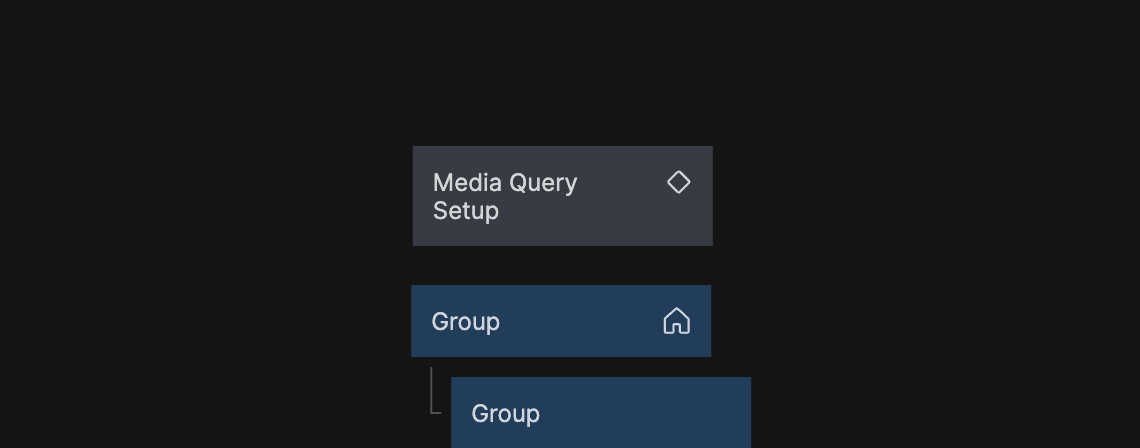
Media Query Setup
This component sets up all media queries for your app. It should be placed in you home component. Your project should only include one Media Query Setup node.
Changing the breakpoints
This component comes with a prediefined set of commonly used breakpoints:
- Small Mobile: 400px and smaller
- Regular Mobile: 401px to 700px
- Tablet: 701px to 1200px
- Regular Desktop: 1201px to 1800px
- Large Desktop: 1801px and above
If you want to change the recommended defaults, this can be done at the top of the Register media queries Script node.