Match Custom Media Query
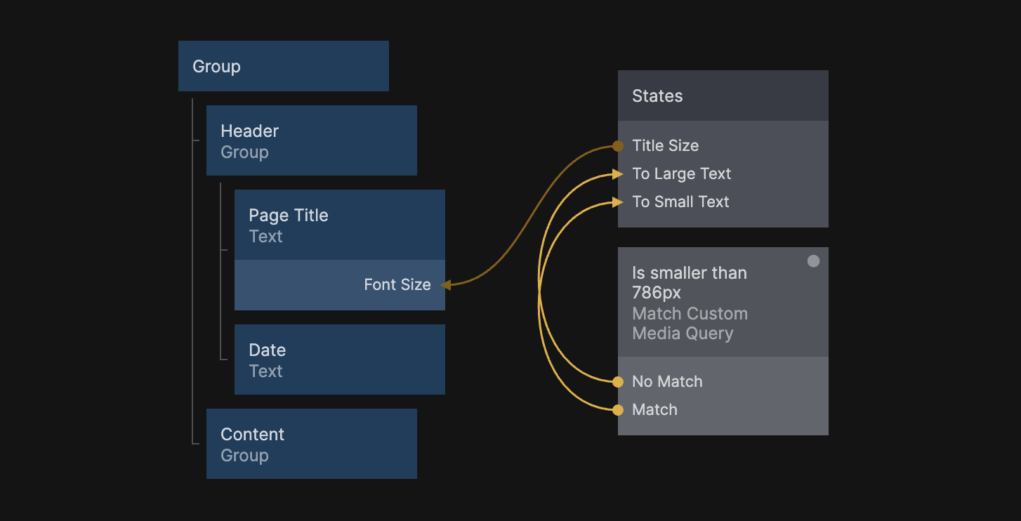
This component is used to check for a custom media query. It is mostly used for one-off edge cases. For general media query usage it is recommended to use the Match Media Query component.
Media Query
Here's a few examples of media queries:
(max-width: 375px). This will match if the screen size is375pxor smaller, like on an iPhone 8, or iPhone X.(max-width: 768px). Typical size to check for tablets.(max-width: 1224px). Typical size to check for desktop and laptops.
You can also create more complex media queries that check for multiple sizes, or a range:
(min-device-width: 320px) and (max-device-height: 640px). This will match any size that's above320px, and no larger than640px.
Inputs
| Data | Description |
|---|---|
| Media Query | The Media Query String you want to detect |
Outputs
| Signal | Description |
|---|---|
| Match | Sends a signal if the Media Query String matches the device |
| No Match | Sends a signal if the Media Query String does not match the device |