Custom UI Components
What you will learn in this guide
A very powerful feature of Noodl is the ability to create re-usable components easily. This guide will cover some useful patterns for create re-usable UI components. This guide will involve a bit of coding so it is good if you have some basic coding skills in Javascript and have read our previous guides on business logic in Javascript.
Component Inputs and Outputs
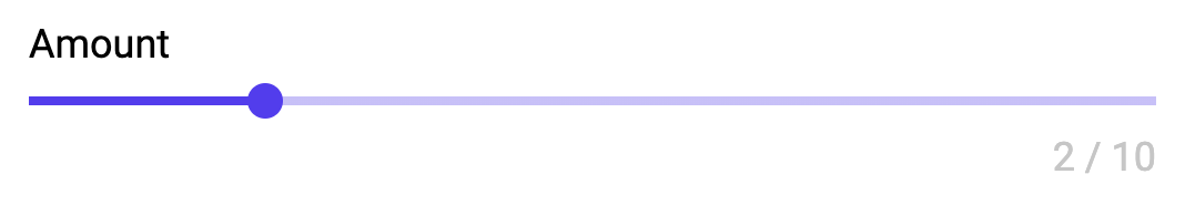
The key to creating good re-usable components is to provide inputs and outputs that makes it useable. There are some good patterns to follow here and we will outline them here. We will start with a simple example where we create a component with a slider plus two labels. This is what it will look like:
And here is the content of the component. This is a simple UI component that has a slider and two text labels. One label is simple the header for the slider, and the other is formatted using the String Format node and the current Value and the Max value.
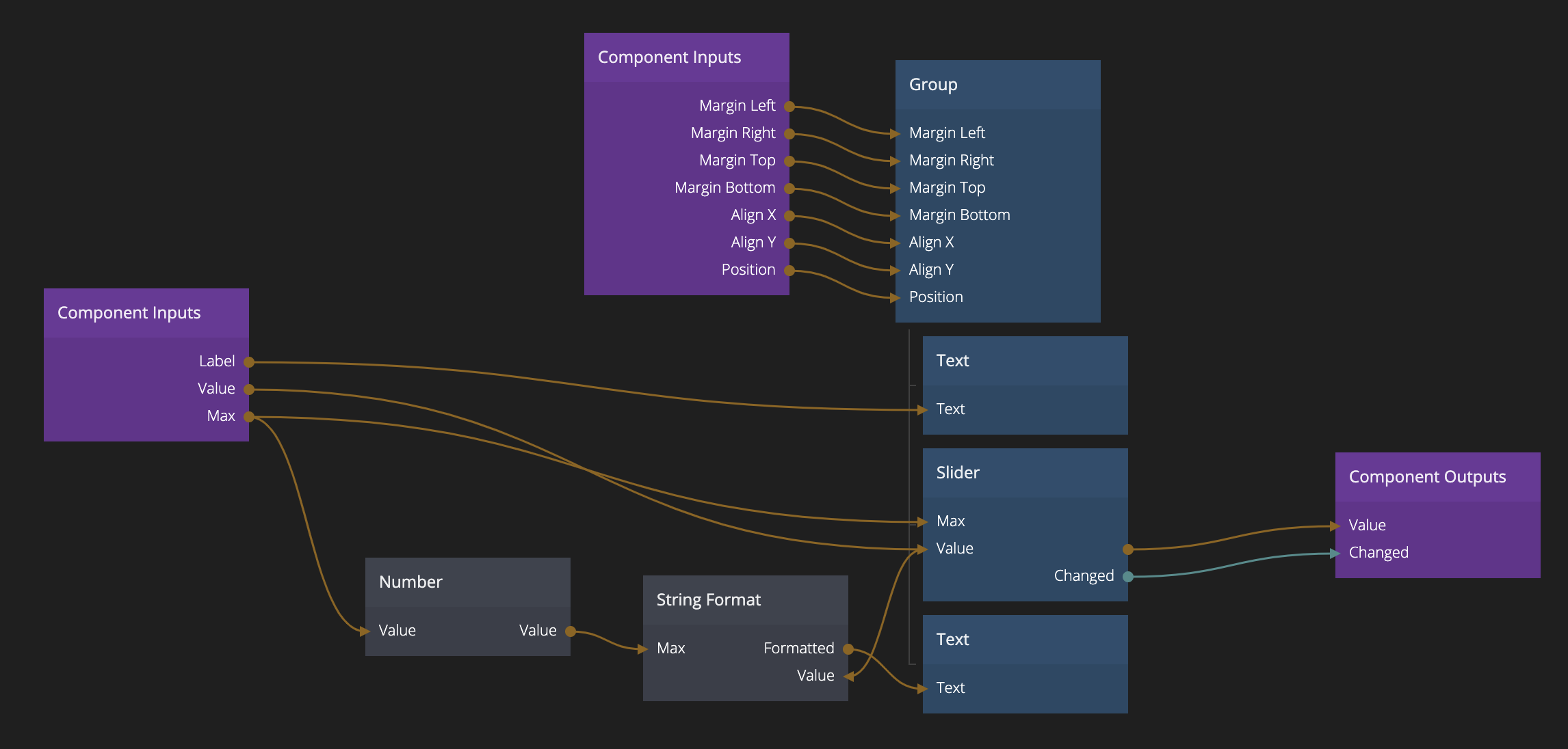
Let's take a closer look at the Component Inputs of this component. First we have a couple of inputs that are the basic settings for the component, the Label, Max and Value inputs. There are a couple of things to note about this component inputs. If you look at the Max input it is first connected to a Number node and then to the String Format node. This is a common pattern to ensure that the Max input is represented as a number in the property panel when this component is used. The component input will get the same type in the property panel, as the node it is connected to and in this case it is connected to both the Max of the Slider (which is a number) and the Max input of the String Format node which is a string. That fact that we go via a Number node will make sure the property panel knows what input field to show for that input.
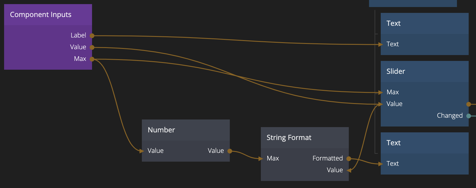
Another thing to note is that the Value component input is connected to the Value input of the Slider. Most UI Components is collecting some sort of data from the user, in this case it's a range value, it is very important that the data is also exposed as an input so that it can be properly connected to a data source.
Moving on to the component outputs. Here you of course need the Value as an output as well, so that the UI component can be used to collect data from the user. It is also important to have a Changed signal.
warning
The Changed signal should ALWAYS be on a user input, not just if the Value input have changed. This is to make sure that the UI component doesn't report a change if the input value is changed. That can cause unnecessary data feedback loops.
Finally it's a good idea to expose some minimum set of layout properties on the root node. This will make the UI component easier to use.
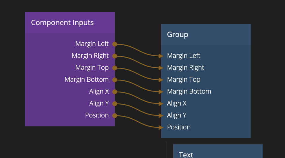
You can choose yourself what you want to expose as inputs but here are a few recommendations:
- Margins At least exposing margins will remove the need for extra Group nodes when using your component.
- Align It's also common to need to re-align your component when using it, providing this as an input is helpful.
- Position Maybe not as common, but could still be good to expose.
Component Object
You have learnt how to use the Object node in the working with data guides and how to connect it to UI controls in the Connecting UI controls to data guide. There is another node which is very useful when working on re-usable UI componets and that is the Component Object node. This node works just like the Object node except that it is unique to the component instance, so it will not be shared between component instances like regular objects. This is very useful when keeping the state of UI controls.
We will take a look at a very simple example below, the Segment Control UI Component.
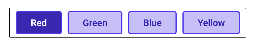
This example actually contains two components the Segment Control component and the Segment Control Button component. What it does is that it accepts an array as input containing the possible options for the control, each object in the array should have a Label and a Value. It also accepts an input that is the current selected Value of the control, this should correspond to one of the values in the array and that button will be shown as selected (like radio buttons).
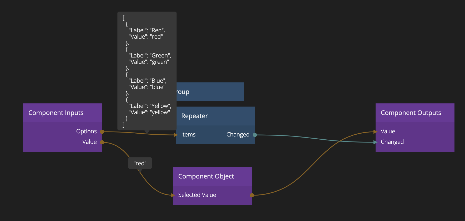
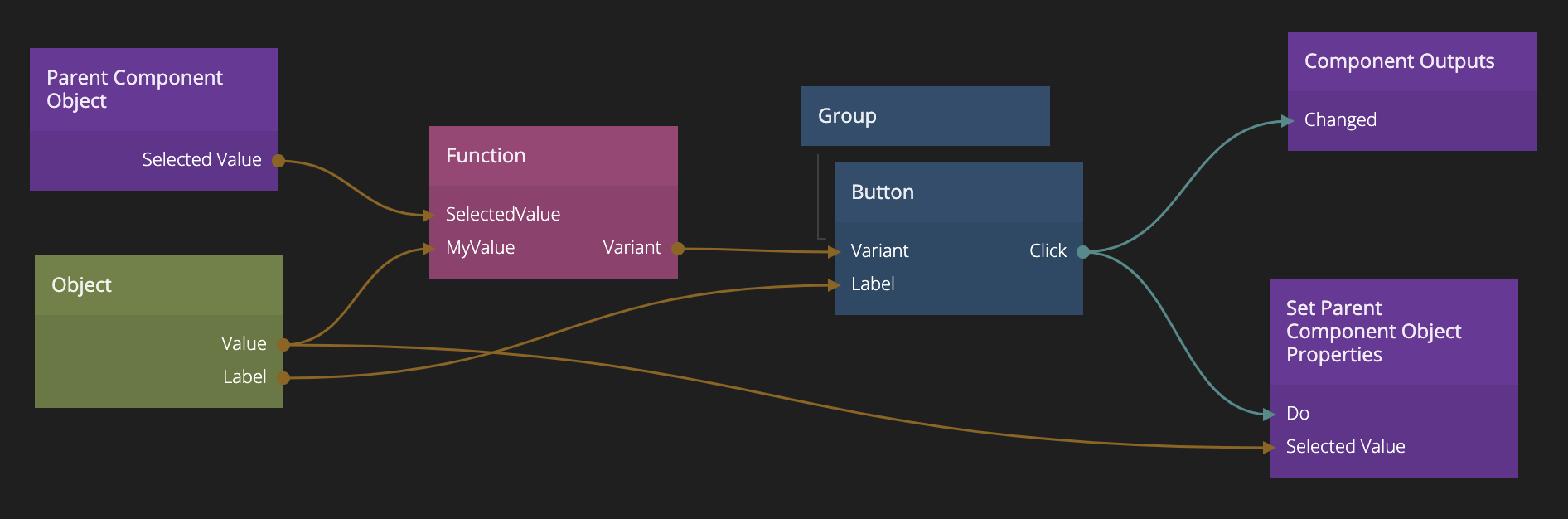
Here you can see how we use the Component Object node to store the currently Selected Value and how it is also passed through as the Value output. We will take a look at how it is used later. The options input array is used directly as items in the Repeater node. If we take a closer look at the Segment Control Button component (that is used as template in the repeater) we will see where the magic happends.
Let's go over this one quickly:
- The Object node is used to connect the Label to the button. So each button that is created by the repeater will get the correct label.
- Here we introduce a new action node, the Set Parent Component Object Properties node that is used to set a property on the component object. But not the component object of this component instance, but instead it's closets visual parent. In this case (since this component is used as template in the repeater) it will be the Segment Control component. That is, each Segment Control Button component in the repeater will, when clicked, set it's Value as the Selected Value of the Component Object.
- Now we also use the Parent Component Object to compare the currently Selected Value with the Value of this segment control button, this is done in the Function node that takes both the currently selected value and the value from the repeater instance object as inputs. It has the following code:
if(Inputs.SelectedValue == Inputs.MyValue)
  Outputs.Variant = "Segment Control Button Selected"
else
  Outputs.Variant = "Segment Control Button"
- Here comes the next little trick. The Variant of the Button is choosen by the Function to be either Segment Control Button or Segment Control Button Selected. We have created two different Button variants with those names so we can design how we want the button to look if it is selected and not. Learn more about style variants in this guide.
- Finally we send the Click signal from the button as Component Output from this component, this will allow us to use that signal from the Repeater node in the parent component.
The Component Object and Parent Component Object nodes, and their action nodes to set properties, Set Component Object Properties and Set Parent Component Object Properties are very useful when building re-usable UI components. We recommend storing the state of your UI component in these.
State management
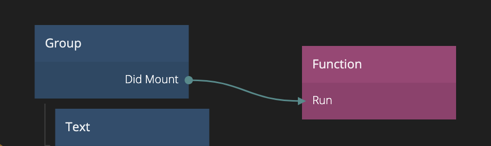
Some times you need to initialise your UI components when they are created. Then you can use the Did mount signal from the root UI element, often a Group node.
You can also access the Component Object and Parent Component Object from Function and Script nodes by simply writing:
Component.Object.MyValue = "Hello"
Component.Object["Selected Value"] = "Use this for properties with spaces"

Component.ParentObject.MyValue = "This works too"
So this is a great place to initialise your Component Object when the UI component is created.
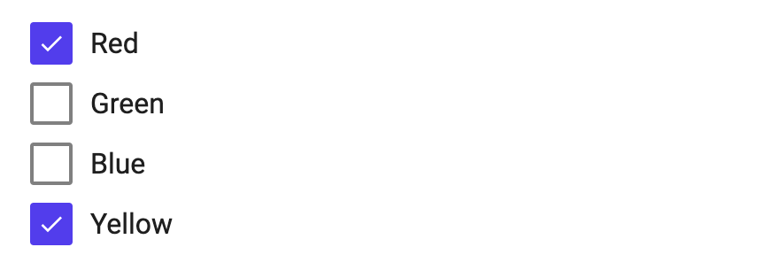
Here is another interesting example to look at. This is a Multi Checkbox Group example. It takes two arrays as input, one with all possible options each with their Value and Label and a second array which is the value, this array contains objects with just Value. So you can choose multiple options and not just one like the segment control. This is a little more complex so we wont go into detail here, but you can check out the example below and we will look at a few details.
If we take a close look at the nodes in the Multi Checkbox Group component, this is what we find:
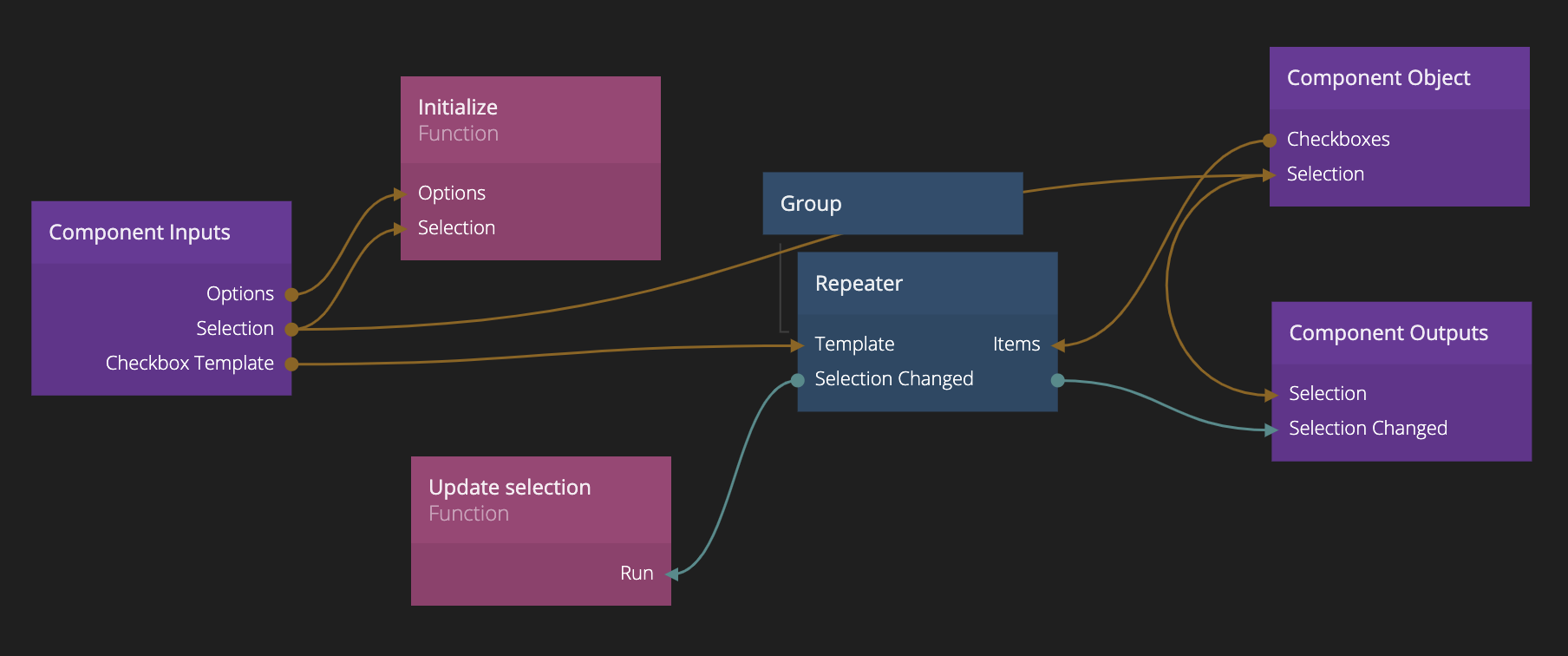
Here is we can see that if any of the Options or Selection inputs change, we will run a Function node. The code of that node is as follows:
if(!Inputs.Options) return // No options, no fun

Component.Object.Checkboxes = Inputs.Options.map(o => Noodl.Object.create({
    id:Component.Object.id+'-'+o.Value,
    Value:o.Value,
    Label:o.Label || o.Value,
    Checked:Inputs.Selection!==undefined && !!Inputs.Selection.find(s => s.Value === o.Value)
}))
It creates a new array of objects in the Component Object called Checkboxes, these will get the value and label, and a Checked property that is true if that value is represented in the in the selection. This array is that is then used in the Repeater node to show all components. It is important that this function is re-run if the Options or Selection is changed so that the UI control will always show the correct state as corresponds to its inputs.
note
We set the id of the object. This makes sure that the Repeater doesn't create new items every time the array changes. This increases performance.
Another important thing to notice is that the Selection input is passed to the Component Object and then directly to the corresponding output. This is also very common.
Finally, we have another Function node that is run whenever the selection changes due to user input, just like the segment control component above this is sent out from the Repeater node. In this component we update the current Selection on the Component Object by filtering out the objects that currently are checked, and then filtering out the Value property for those objects. We update the Component Object which in turn will update the selection output.
Component.Object.Selection = Component.Object.Checkboxes.filter(o => o.Checked).map(o => ({Value:o.Value}))
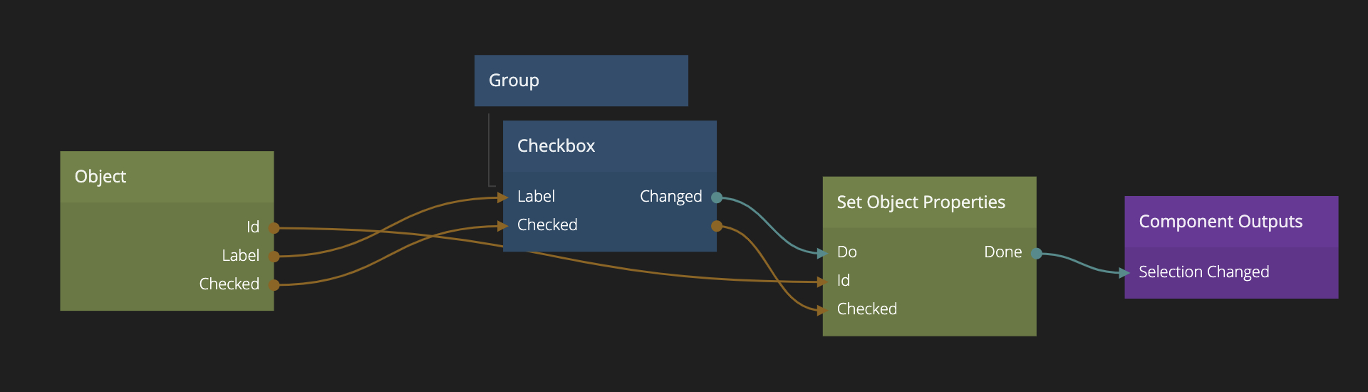
If we look at the Multi Checkbox Group Item component we will see that it is very basic. It is simply a checkbox that with the corresponding Checked and Label from the object in the Checkboxes array that we created before. When the checkbox is updated we update the Checked value of the object and report the change.
There you go, that's everything need to create a multi checkbox component. This pattern can be used to create all sorts of UI components with multi selection.