Grouping & Layout
What you will learn in this guide
This guide will cover how to lay out visual elements. It's an important concept for creating responsive, dynamic interfaces for your apps.
The central node for defining a layout in Noodl is the Group node. This guide will walk through the most important Group properties for defining a layout.
Overview
We will cover the following topics in this guide:
- The Group Node
- Layout Direction and position
- Size and Dimensions
- Alignment
- Margin and Padding
- Multi Line Layout
The Group Node
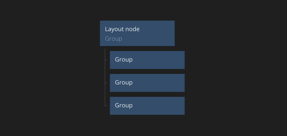
The Group node is the most central node for doing a layout. It's the fundamental way of building visual hierarchies and structures in Noodl.
Group nodes are arranged in a hierarchy and can have other nodes as children. It controls the layout of its children and there are a number of properties that can be used to specify how the children of a Group node will be laid out. You can copy the various node examples used in this guide by clicking "Copy nodes" and then pasting into a Noodl project.
tip
Hovering on a node in Noodl with the mouse cursor will highlight the corresponding visual element in the preview window. This is a great way to debug your layout. For example you hover over a node and you cannot see it in the preview window, it's likely that it has a zero size or lies outside the screen.
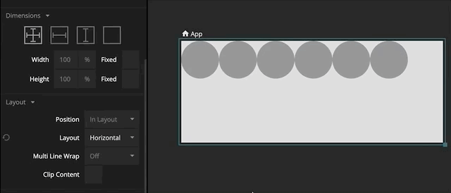
Layout direction
By default the Group node will stack its children vertically. You can change the layout direction by editing the Layout property:
VerticalChildren are stacked vertically.HorizontalChildren are stacked horizontally.NoneChildren are not stacked. You will have to position them yourselves, for example by using margins, x/y positions or various alginments (see below).
Here's an example you can copy into Noodl. Click the "Copy nodes" button next to the image and press Ctrl+V (Windows) or Cmd+V (macOS) to paste them into Noodl. Make sure you have a project open.
Change the Layout of the top level node to see how the direction of the child nodes change.
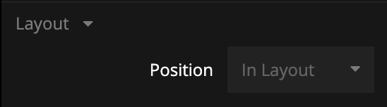
Layout Position
As a child of a group you can also control how you will be layouted by setting the Position property:
In Layout- This node is part of the parent node's layout. It will be stacked with its siblings depending on the parent node's layout settings as explained above.Absolute- Removes a node from the flow of a layout. Use margins and alignment to set the position.Sticky- Behaves likeIn Layout, except when the node is about the be scrolled outside the parent. It'll stick to an edge of the parent instead of scrolling away. Which edge can be controlled with the Alignment input.
Dimensions
The dimensions section control how the size of a Group will be calculated.
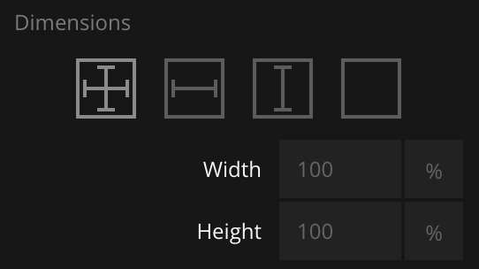
A Group can also get its dimensions from the size of its children. You use the icons at the top to change between the four modes (from right):
- Explicit width & height Specify both width and height explicitly in pixels (
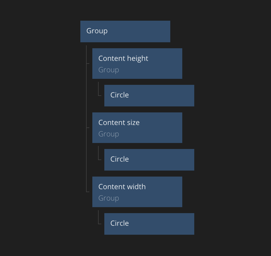
px), percentage of parent (%), or as a percentage of the viewport size (vwandvh). - Explicit width & content height Specify the width explicitly but the height will be the total of the children heights and margins.
- Explicit height & content width Specify the height explicitly but the width will be the total of the children widths and margins.
- Content width & height The size of this group will be the total width and height of the children based on the layout.
You can copy the nodes below to an empty component in Noodl. The result is shown to the right. These nodes each use a different setting for the Dimensions icons.
Fixed dimension
Sizes specified in % enables an additional set of dynamic size rules.
- The group will expand to fill the parent. Space is shared with siblings and the
%value controls how much of the remaining space each node will get. - If the content of a Group is larger than the Group itself, it'll expand to contain the children.
This dynamic sizing can be disabled by enabling Fixed.
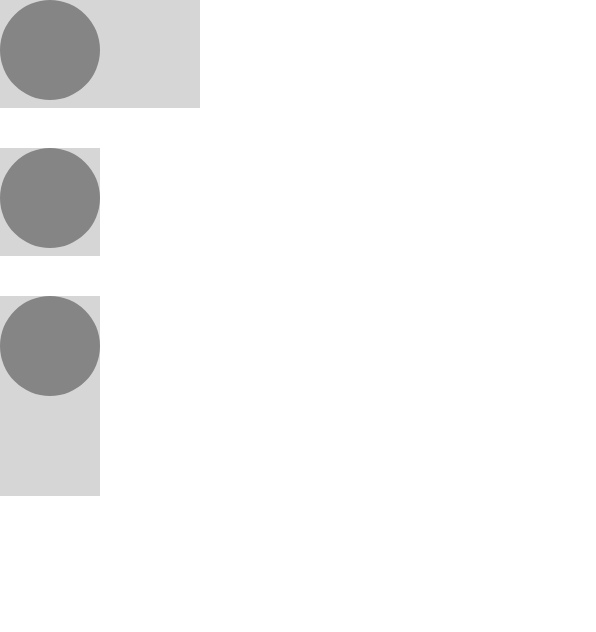
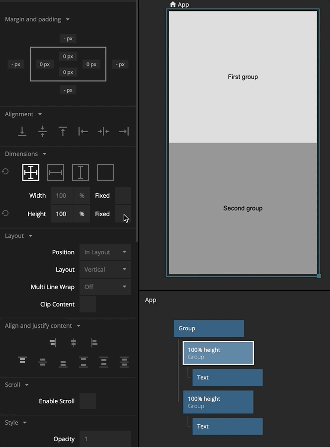
Here's an example with two Groups, both set to 100% height. With Fixed disabled they will both try to grow to the same size as the parent. As the rules above implied, the Groups final size will be 50% to make sure that both Groups have equal space and are shown on the screen.
Enabling Fixed will force a Group to be exactly the size that's specified and disable dynamic sizing. With Fixed enabled the first Group will cover the entire screen, and there will be no space left for the second Group that'll be pushed outside the screen.
Clip content
A Group with dimensions set in % will expand to make sure it at least the same size as all of its content.
This can be changed be either enabling Fixed or as in this example, enable Clip content.
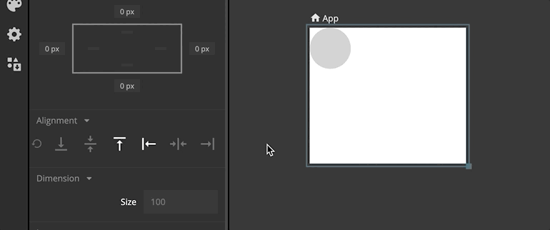
Alignment
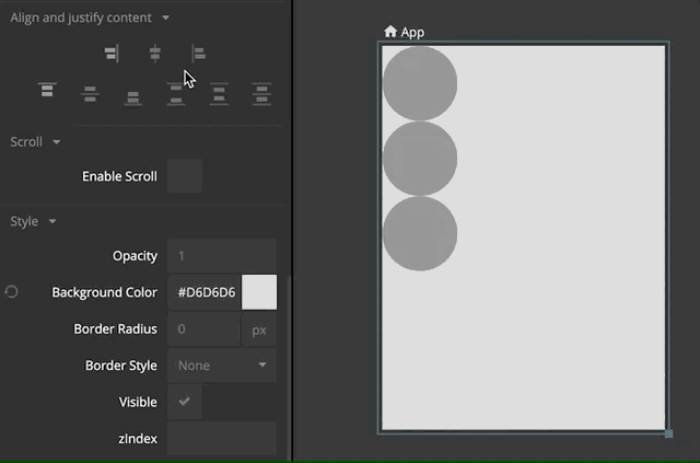
You can use the alignment controls to pin the children to a specific edge, or how the remaining space should be distributed among the children. The padding of a group determines where that edge is.
A Group can control the alignment of its children using the Align and justify content property.
Children can use the alignment controls to override the parent's alignment settings.
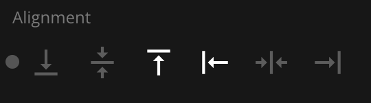
Children can use margins to offset the position from how it's aligned.
Margin and padding
Clicking on a node will select it and open the property panel. This panel has controls for setting the margin and padding.
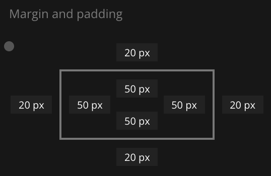
Here you can specify the margin, i.e. the distance between this node and its siblings in the layout. You can specify the margins in all four directions. You can also specify the padding, which is the distance from the borders of the Group to its children.
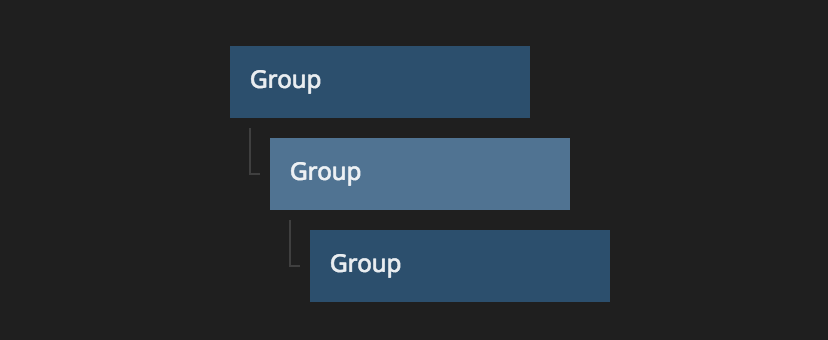
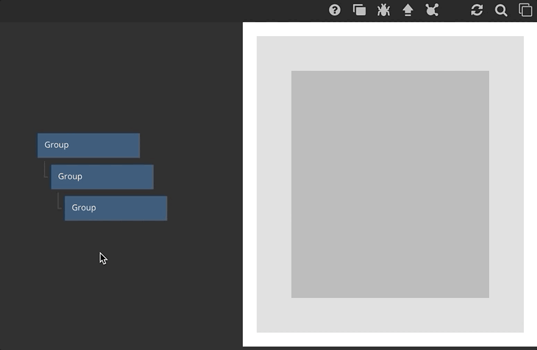
A good way to learn these concepts is to adjust and tweak the three nodes in this simple hierarchy. Try modifying the padding and margins and note the difference between them.
Multiple lines
If the child nodes extend beyond the border of the parent you have a couple of options to control the behavior, wrapping or scrolling. This section will explain the wrapping options that are available.
Wrapping is controlled by the Multi Line Wrap option in the properties.
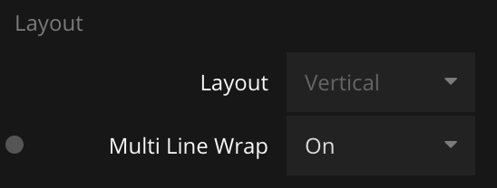
You can choose any of these options:
OffChildren will extend beyond the borders of the parent node (default).OnChildren will be placed on multiple linesOn ReverseThe children will wrap but in the reverse direction.
Here's an example of a horizontal layout with Multi Line Wrap set to On.