Components
What you will learn in this guide
In this guide you will learn how to create visual components to make re-usable UI components. This is essential to create dynamic user interfaces connected to data that we will learn later.
Creating visual components
Visual components are parts of a user interface that can be reused. You create new visual components using the Component Panel.
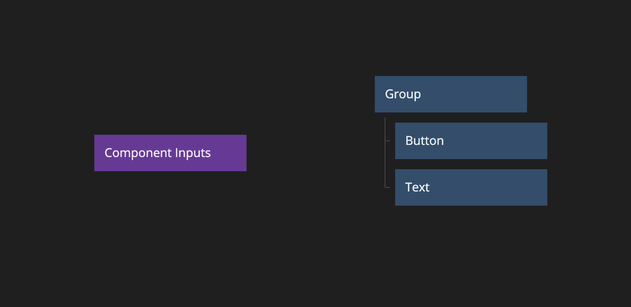
Next you give it a name and it will show up in the components list, as well as in the visual canvas. Newly created visual components only contain a single root Group node. Once you have your component created you can start working on it like you have already learnt, or you can cut and paste UI elements from another component that you want to make re-usable.
When you have your component all done, you can re-use it anywhere in your application user interface by simply dragging it from the component panel.
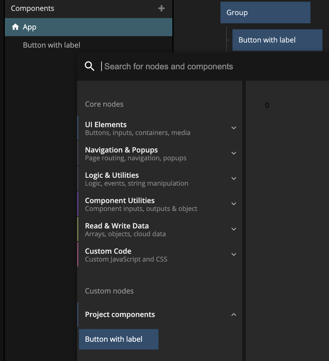
If you prefer, you can also find your components in the node picker.
Component Inputs & Outputs
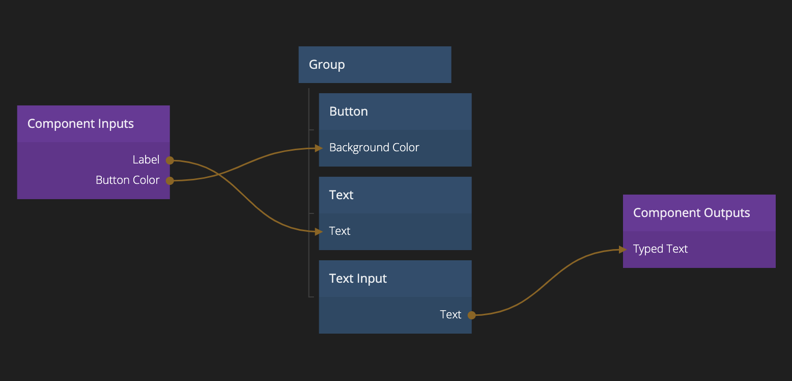
That's a pretty neat trick. Now we can create our own re-usable UI components. But it would be even more powerful if we could turn them into templates and change some things up for each new instance of the UI component we create. This is where Component Inputs come into play. This is a concept where you can expose certain inputs of some of your nodes in the component as inputs to the component instance. This is done with the Component Inputs node.
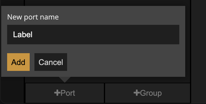
If you go ahead and edit the properties of this node you will see that you can add ports to it. Each port will become an input (and property) of your component instances when you use the component in your application. In this example, we create two ports one called Label and another called Button Color.
After that is done, we can go ahead and make connections from the Component Inputs node to the inputs that we want each Port to connect to.
- So the Label port we want to connect to the Text input of the Text node.
- And the Button Color port we want to connect to the Background Color of the Button node.
Now with your new component inputs in place, you will see that the ports show up as properties on your component instance and you can go ahead and customize them individually.
This works in the same way for component outputs, you simply use the Component Outputs node instead. This is very useful when you are creating UI component that accept some sort of user intput via UI controls.
Component inputs and outputs, and connecting to these is not just important for making re-usable UI components. It's also a core concept in connecting data to your user interfaces and creating dynamic data driver applications. We will take a closer look at that in the Working with data section.
Sheets
When your application grows you will be creating more and more components and after a while the visual canvas can become crowded. When this happends it's a good idea to orginise your application into sheets. Each sheet is a new empty visual canvas for you to place more components into. To create a new sheet
You can move components between sheets by simply dragging from the components panel and dropping onto the sheet you want to move it to.