Scatter Chart Example
Basic
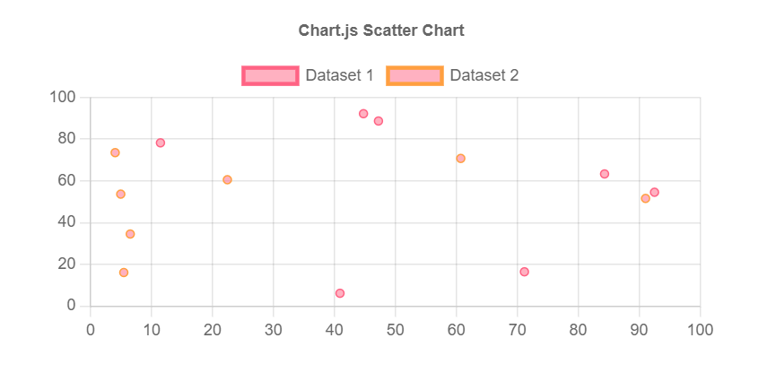
Outputs.Data = {
    labels: ["January", "February", "March", "April", "May", "June", "July"],
    datasets: [
        {
            label: "Dataset 1",
            data: [
                { x: 47.22136488, y: 88.67283951, r: 1 },
                { x: 84.31584362, y: 63.31875857, r: 1 },
                { x: 44.76423182, y: 92.18278464, r: 1 },
                { x: 40.91220850, y: 6.129115230, r: 1 },
                { x: 92.51286008, y: 54.54046639, r: 1 },
                { x: 71.17112483, y: 16.42918381, r: 1 },
                { x: 11.45490398, y: 78.21502058, r: 1 }
            ],
            borderColor: "rgb(255, 99, 132)",
            backgroundColor: "rgba(255, 99, 132, 0.5)"
        },
        {
            label: "Dataset 2",
            data: [
                { x: 5.441100820, y: 16.07981824, r: 1 },
                { x: 91.04381001, y: 51.57964678, r: 1 },
                { x: 4.938700270, y: 53.64326132, r: 1 },
                { x: 22.43441358, y: 60.54226680, r: 1 },
                { x: 4.024777090, y: 73.51123114, r: 1 },
                { x: 6.499914270, y: 34.52546296, r: 1 },
                { x: 60.72402263, y: 70.74545610, r: 1 }
            ],
            borderColor: "rgb(255, 159, 64)",
            backgroundColor: "rgba(255, 99, 132, 0.5)"
        }
    ]
}
Multi axis
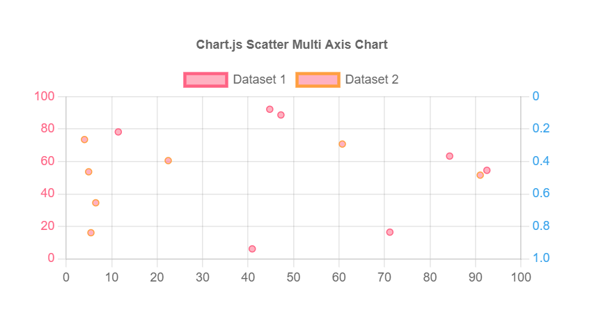
Outputs.Scales = {
    y: {
        type: 'linear', // only linear but allow scale type registration. This allows extensions to exist solely for  log    scale for instance
        position: 'left',
        ticks: {
            color: "rgb(255, 99, 132)",
        }
    },
    y2: {
        type: 'linear', // only linear but allow scale type registration. This allows extensions to exist solely for  log    scale for instance
        position: 'right',
        reverse: true,
        ticks: {
            color: "rgb(54, 162, 235)",
        },
        grid: {
            drawOnChartArea: false // only want the grid lines for one axis to show up
        }
    }
}