Responsive Design
What you will learn in this guide
In this guide we will take a look at a couple of different techiques you can use to build responsive UIs in your Noodl app.
Simple grids with the Columns node
One of the most common situations where responsiveness is needed is in grids of items. The easiest way to create responsive grids is through the Min Column Width input on the Columns node. This approach works best when dealing with grids where the items should have the same width, like cards or images. Let's focus on the two key inputs for this technique:
Layout String
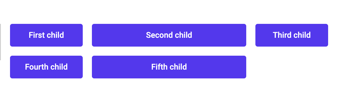
A layout string is simply a string of numbers with spaces between them. Every number represents a fraction of the full container width and is converted to a column. A Columns node with the layout string 1 2 1 that contains 5 children will be rendered like this:
Min Column Width
The Min Column Width sets the minimum width for each column. It first checks if the columns can fit based on the provided Layout String. If the container cannot hold the columns at their minimum width, the layout will automatically fold into a grid with fewer columns.
Make sure the children you pass are set to a width of
100%of their parent.
Strategy
The most common way of using this method is to set the Layout String to the maximum amount of columns we want the layout to have. Then set the Min Column Width to the value where the grid items starts looking broken. This will produce a result like this:
Media Query prefab and States node
The techique above works great for grids that are even, but what if we have a more advanced layout? Maybe we need to add more padding, change the font size or even change the Layout String altogether?
For this we can use the Media Query prefab, together with the States node. It's a good idea to read the documentation for these, but for now you'll get a quick introduction. Let's begin by understanding the States node.
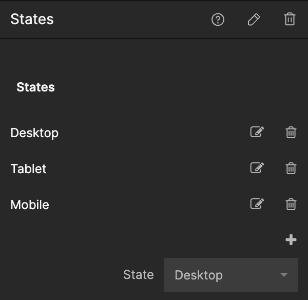
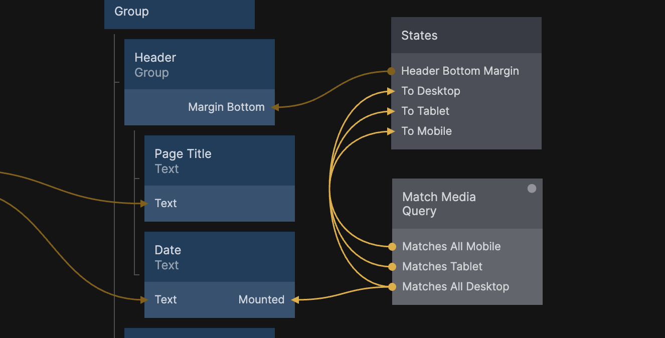
The States node is a really useful and flexible tool in Noodl. In this guide however, we'll only need to focus on its most basic features. In essence, it allows us to set up different Values that hold different data depending on the State of the node. This can be found in the three main sections of the States node's property panel. Let's look at an example.
With properties
First we setup the different States we want. These can be named anything, but since we are working with screen size responsiveness, let's make it descriptive:
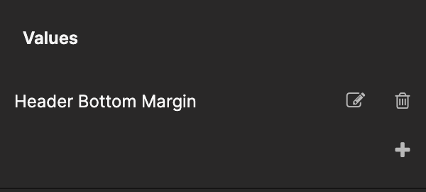
Now we can create the Values we want this node to output. In this example we will be working with a bottom margin for a header, so let's name it that:
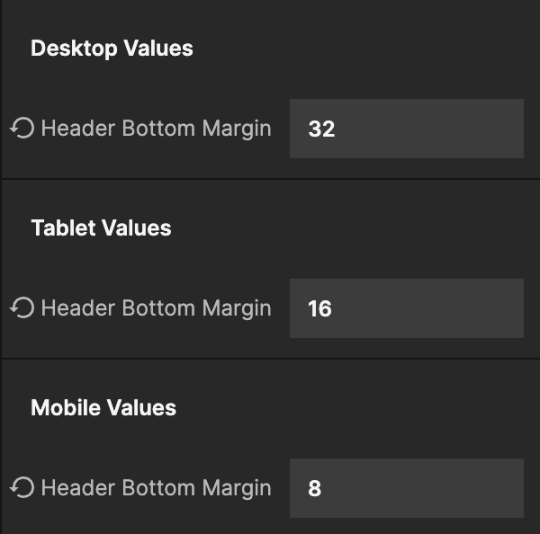
Now we can fill in what data we want the Value to output for the different states:
Now that we have the states set up, we need to determine when a specific state is active. The Media Query prefab's Match Media Query component checks the active screen size breakpoint and outputs true or false based on matches. We can use these outputs to trigger our defined states:
This method can be used with any trigger, to set any value - even text in buttons!
With Columns
This technique becomes really powerful when we use it to send different Layout Strings to the Columns node. Here's an example where we change the layout between 1 1 2 1, 2 1 1 and 1 2 depending on viewport size:
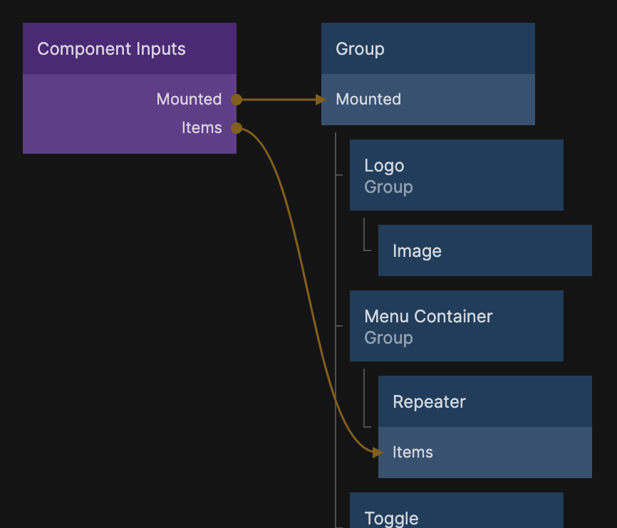
With Mounted
Responsive layouts can vary a lot at different screen sizes. For example, header menus can look totally different on desktop and mobile, making it hard (or messy) to use the above technique. For this we can use the breakpoint outputs on Match Media Query and send them to the Mounted input on any visual node, to show/hide different parts of our visual tree:
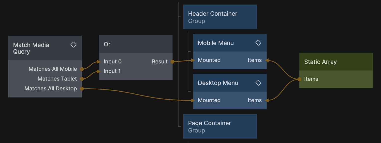
In the case above, we have created two components that have a Mounted in their Comonent Inputs node. That value is being passed to the Mounted input on the root node of the component:
Container queries
So far we've been making our UI responsive by checking the size of the screen. This is the most traditional approach, and it still works well. However, as app architecture and design has evolved, the industry has found a need for more hands-off component systems that work well in any context.
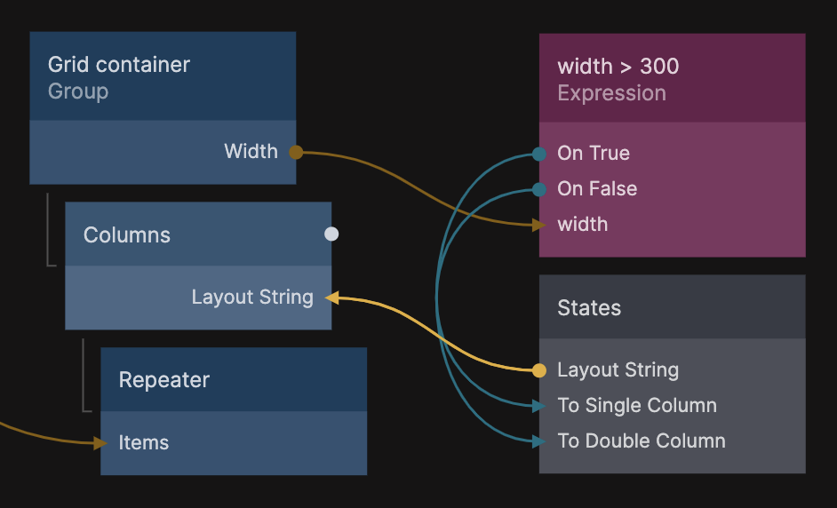
One solution to this is a concept called Container Queries. Here we check for the size of the component in question, and set the responsiveness based on that (instead of the viewport).
Here's a very basic example using an Expression node to check a components witdth and set different Layout Strings:
We can now use this item grid everywhere, without caring if it's in a page-wide or column-narrow container. It will always render in a layout we know works.
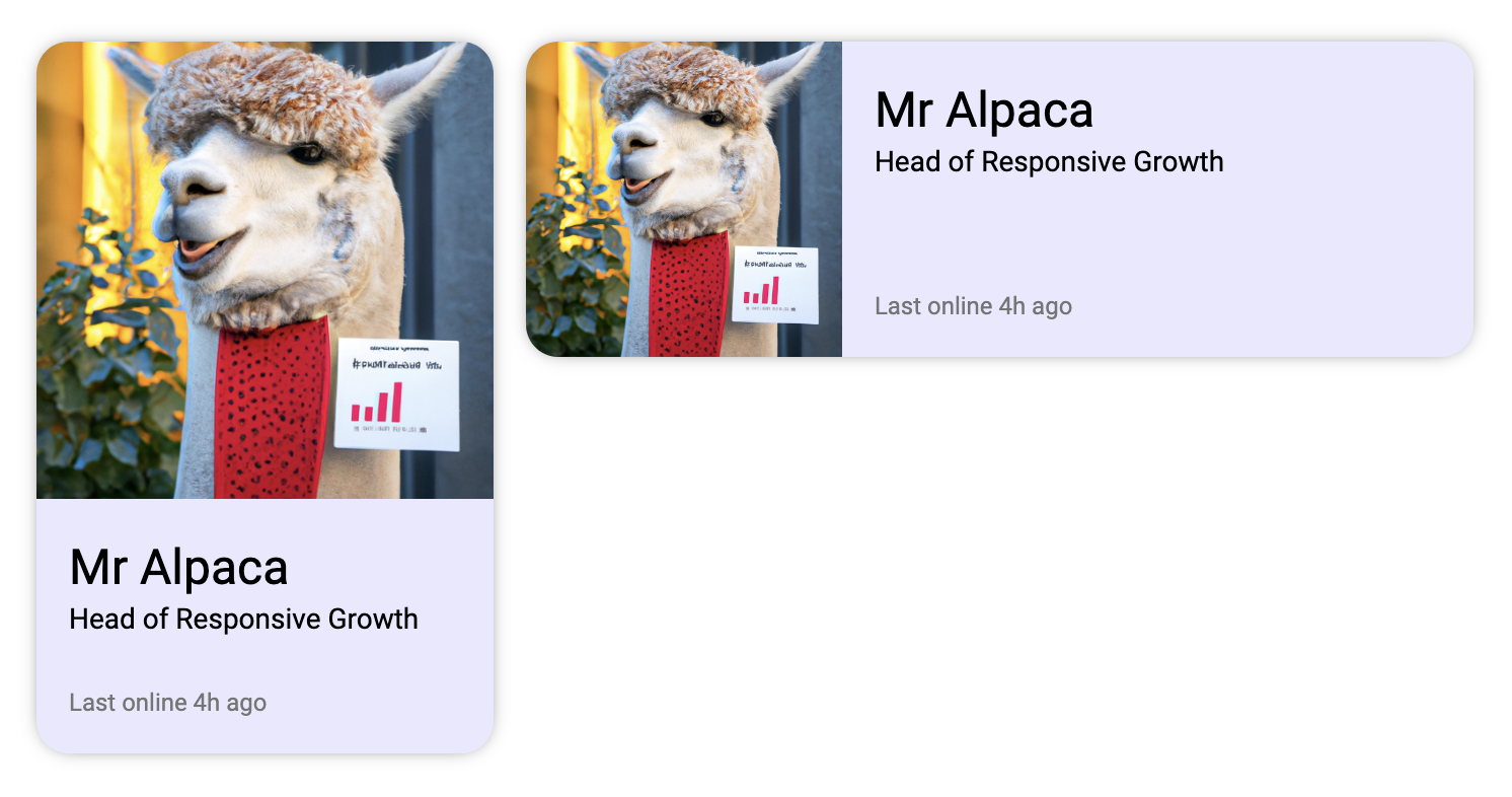
This is great for both responsivity and reusability. Here's an example of a profile card in two different sized containers. It can be placed in any context and still look good:
Generating checks with AI
In the container query example, we used an Expression node to check the size. It worked great because we only needed to switch between two states when the container was larger or smaller than 300px.
If we want to do more advanced queries we can use the Function node to output different signals. This can either be written by hand, or generated by the AI assistant, using the /Function command:
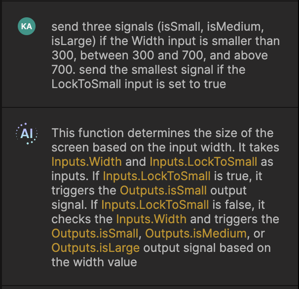
(Note that the AI assumed that we wanted to use this function with a screen width. Since we asked for a Width input, that doesn't matter. It will work with any number sent to it.)
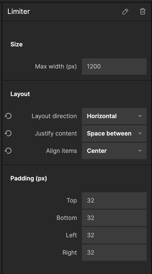
Limiter component
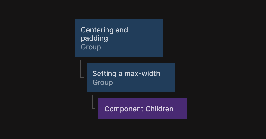
So far we've mainly talked about making content fit smaller screens. But it's also important to limit the content when the screen gets bigger. To do this, we can use a Limiter component. The basic version uses two Group nodes: one for centering and padding, and another with a max-width to hold the content:
This will provide the following result:
This component will allow us to keep the content size and spacing consistent across the app.
A more advanced and configurable version of this component can be copied by pressing the "Copy nodes" button below:
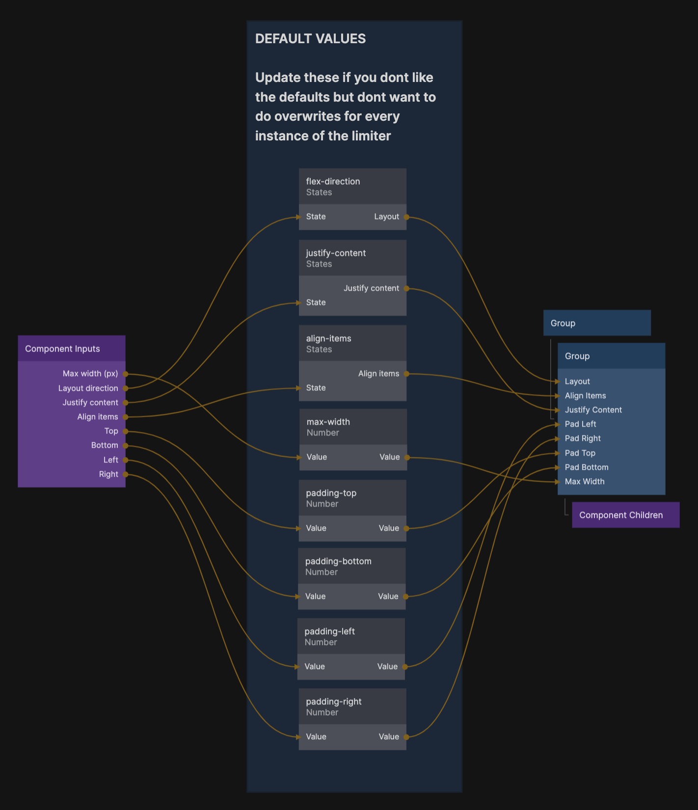
It features the following options in the property panel:
Get building!
Now you know all of the techniques we use when building responsive designs. However, Noodl is flexible, and we always learn new things from the community. If you have any tips and tricks that you use, but that we havent touched upon here and feel like sharing it, feel free to hop on in to on our Discord server. We are always happy to hear your ideas and feedback.
Happy Noodling!