Columns
This node is used to layout your content in columns with gaps.
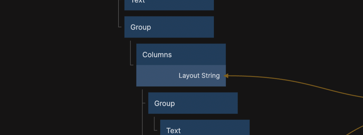
The Columns node does not have any own styling attached to it. Instead it arranges all its children into dynamic layouts using layout strings.
Layout strings
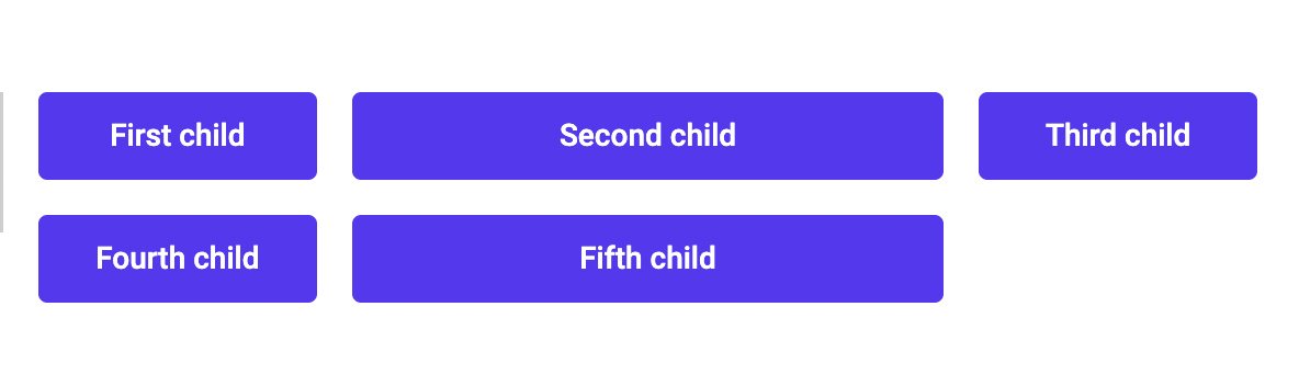
A layout string is simply a string of numbers with spaces between them. Every number represents a fraction of the full container width and is converted to a column. A Columns node with the layout string 1 2 1 that contains 5 children will be rendered like this:
Responsive layouts
Using the Min Column Width value
The easiest way of making the columns responsive is by setting the Min Column Width value. This will check if the columns will fit with your specified Layout String. If the container can't fit the columns when they are at their Min Width, the layout will fold into a grid with fewer columns.
Make sure the children you pass are set to a width of 100% of their parent.
Using different layout strings
Advanced responsive layouts can easily be created by passing different values to the Layout String input using a States node and the Media Queries prefab.
Make sure the children you pass are set to a width of 100% of their parent.
Inputs
| Data | Description |
|---|---|
| Layout String | Determines the size and layout of the columns that the children are rendered into. |
| Horizontal Gap | The horizontal spacing between the columns in px. |
| Vertical Gap | The vertical spacing between the columns in px. |
| Layout Direction | If the columns should be rendered horizontally or vertically. |
| Min Column Width | The smallest the columns are allowed to be before they fold into a layout with fewer columns. |
| Mounted | If the columns node should be rendered in the app or not. |
| Justify Content | The position of children in unfilled rows. |