Component Stack Guide
What you will learn in this guide
In this guide we will take a look at the Component Stack node and the related navigation node Push Component To Stack and Pop Component From Stack.
They are an alternative navigation component compared to the Page Router and related nodes. Instead of giving each Page a URL, and making use if the browser back history, Component Stack is completely handled from within the App. Both these styles of navigations can of course be combined. In this guide we will combine Component Stack with Popups. You will learn how to make a little modal wizard.
Overview
The guide will cover the following topics
- Defining a component stack
- Pushing and popping components on the stack
- Forwarding data between components on the stack and outside the stack
- Keeping track of which component that is on top of the stack (and how many)
- Transitions when pushing and popping components
The guide is a continuation of the Popup Guide and it's recommended that you go through that guide first. It's also good to know the basics on data in Noodl, so also have a look at the Object and Arrays guides before starting this guide. We will also use Events in the guide.
Creating a modal Wizard using Component Stack
This guide will show you how to create a little "Wizard" type UI contained in a Popup. It's a continuation on the Popup Guide. So start by importing the project below (by clicking the Import Button) into Noodl if you haven't finished that guide.
Navigation within a Popup
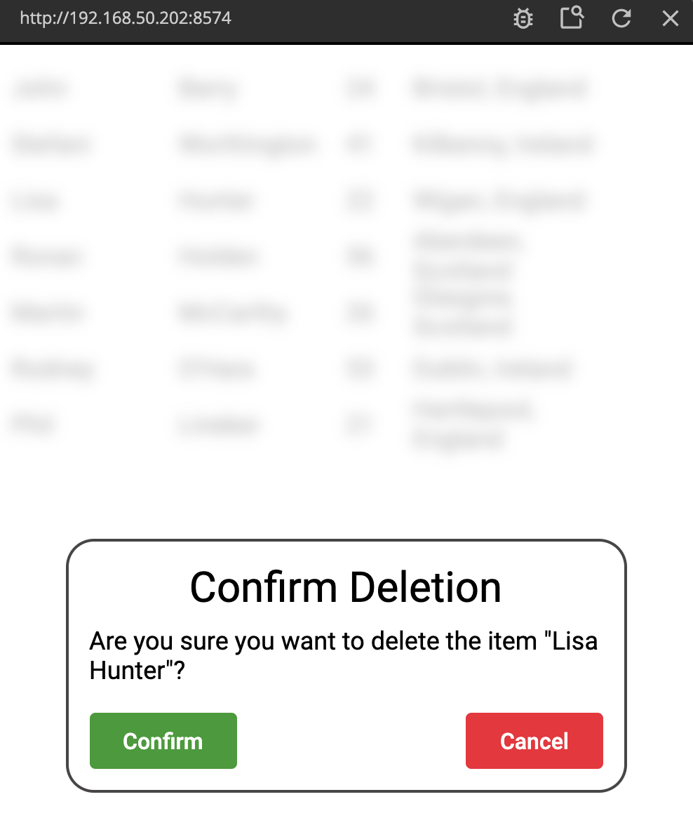
To quickly recap what we achieved in the Popup Guide. We had a list of People and we created a Popup that had us confirm any deletion in the list. We also created a Popup Base component that we can use to make new nice looking Popups.
We now want to do a wizard style Popup were the user can add more persons to our list of people. "Wizard style" meaning the user will move through multiple screens within the Popup to create the entry. Normally, navigation in Noodl is done using the Page Router node (check out the guide here), but this it typically not meant for modal states of the app, since each Page have a unique URL. Instead you can use the Component Stack node which doesn't affect the URL and therefore is more fit for a modal state in the app. It also supports transitions which is nice.
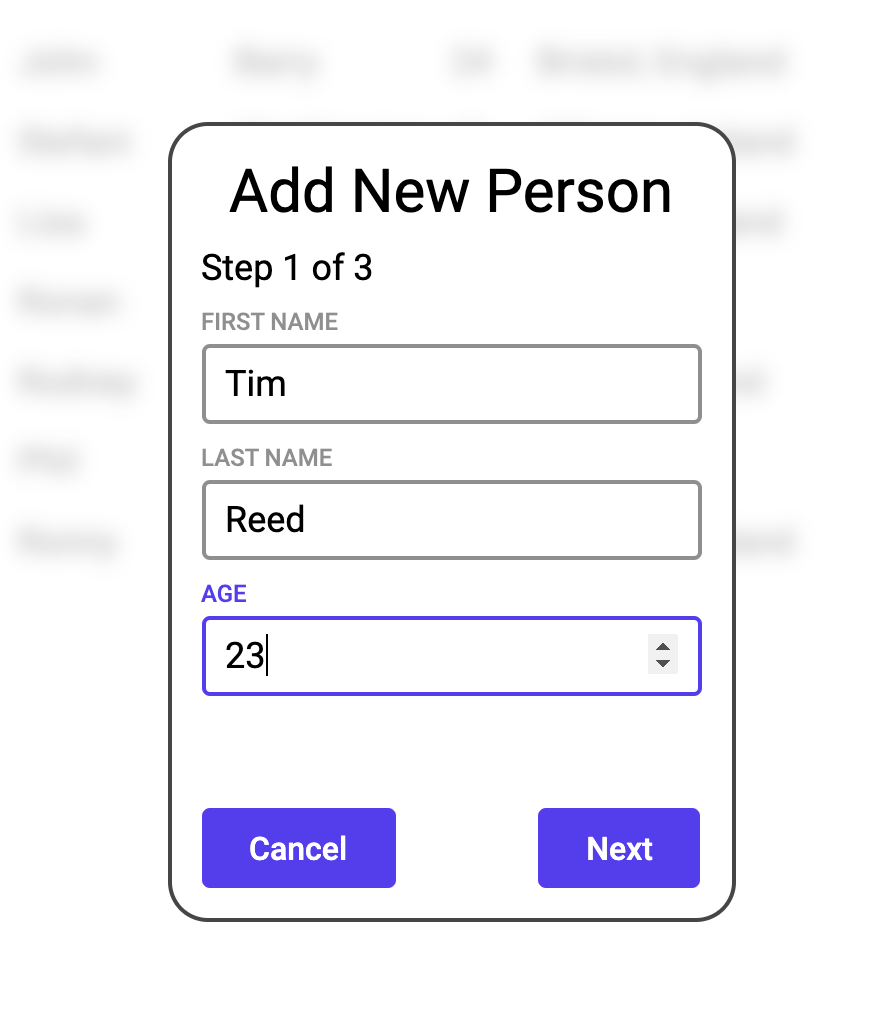
We want our "Add new Person" popup two have three states.
- Fill out first name, last name and age of the new person to add to the list
- Select country
- Based on the country, select city
We also need to think about the data aspect. From the Popup guide we know that each person is stored in an object of this type:
{
    "firstname":<first name of the person>,
    "lastname":<last name of the person>,
    "age":<The age of the person>,
    "location":<the city and country where the person lives>
}
The plan is the following:
- When we open the popup, we create a new Object represening the new person
- The first screen fills out
firstname,lastnameandageof the Object - The second screen the user selects their country
- The third screen presents city options based on the country and then stores location in the Object
- When the popup is closed, the new Object is added to the Array
Let's get started!
Start by creating a new Visual Component. Call it Add New Person Popup. Replace the Group node in it with a Popup Base. Change the title of it to "Add New Person".
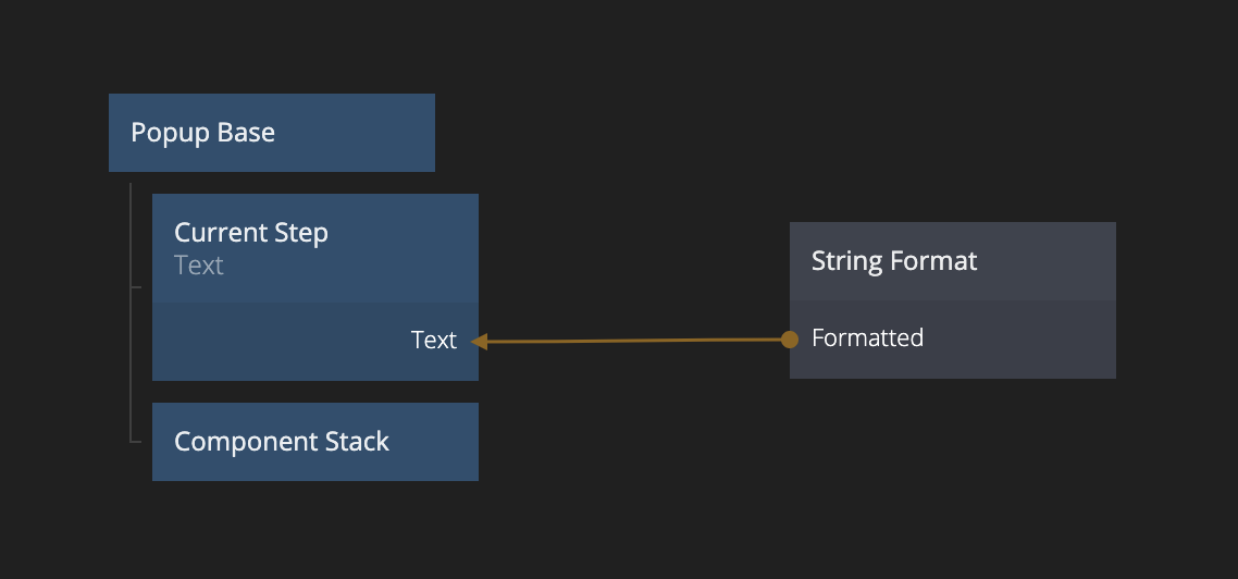
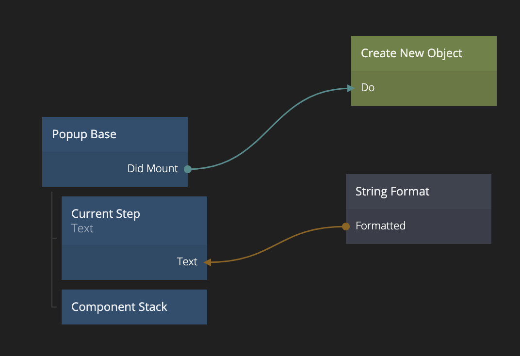
As content in that Popup we are going to start with a Text node which will be consistent in the Popup that holds the current step of the wizard. ("Step x of 3"). So add a String Format node with the string Step {current_step} of 3.
Then we want our dynamic content that will change as the user progresses through the wizard. Create a Component Stack and add after the Text node.
Adding components to a Component Stack
We are ready to create our components in our Component Stack.
note
When using a Component Stack we should not use Page components, since they are only to be used with Page Routers.
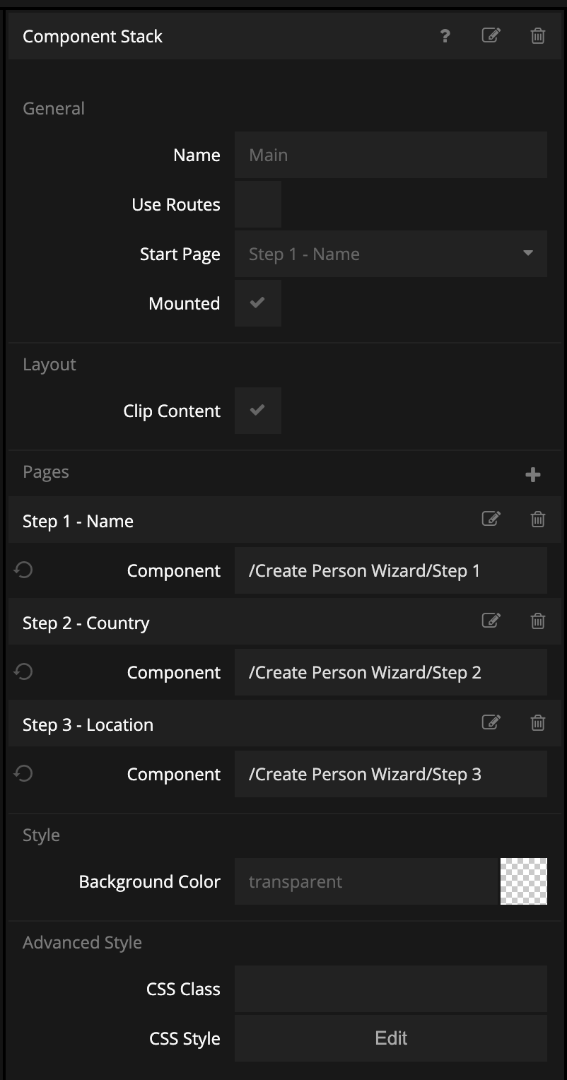
Click on the Component Stack. Click the + under "Components" to add new components.
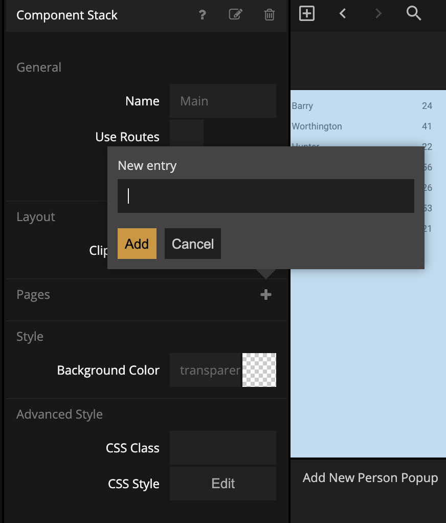
We want three components, call them Step 1 - Name, Step 2 - Country, Step 3 - City.
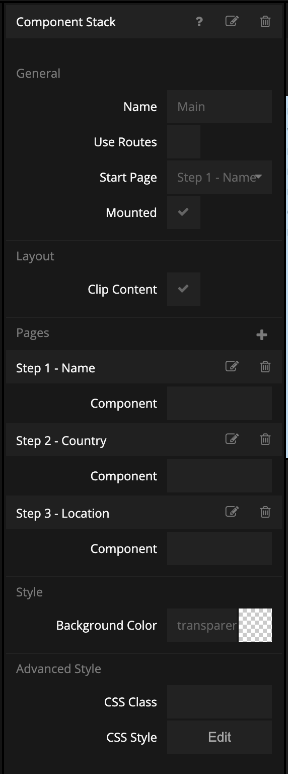
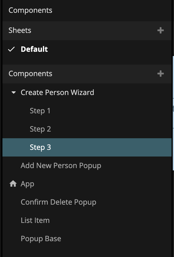
We are going to need to create components for each of these components. To keep better track of them we will put them in a folder of its own, so create a new component folder, Create Person Wizard. Create three visual components in the folder called Step 1, Step 2 and Step 3.
You can now assign the components in the Component Stack in the Add New Person Popup. Click on it and set the components.
It's probably time that we add a Button to open the Popup. Go back to the main App. Add a horizontally centered Button with the label Add New Person. Also give it some top margin seperate it from the list. Then add a new Show Popup node. Connect the Click signal from the Button to the Show Popup signal Show. Also make sure to select the Add New Person Popup as the component to show.
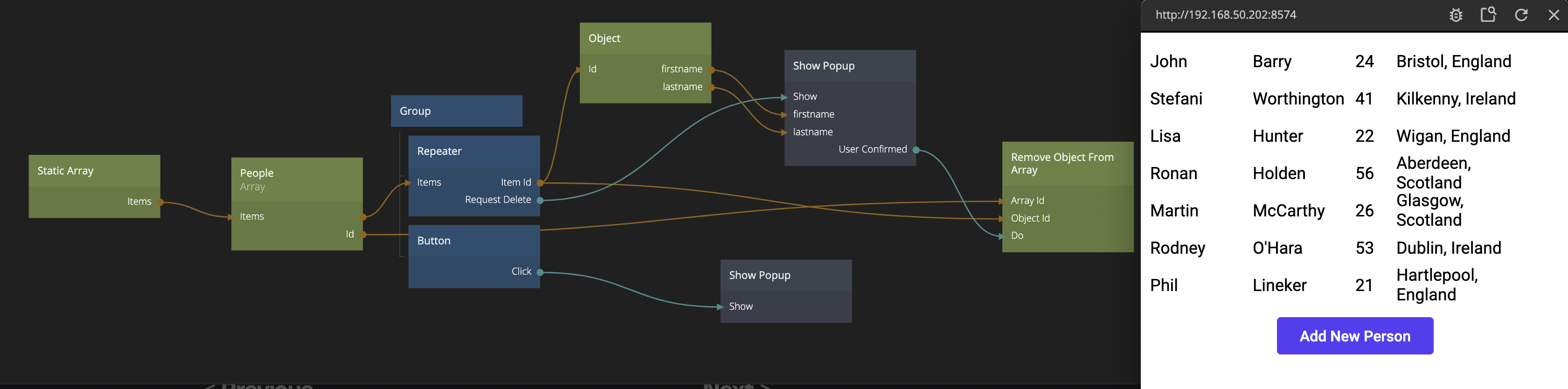
Make sure the Button opens up the Popup.
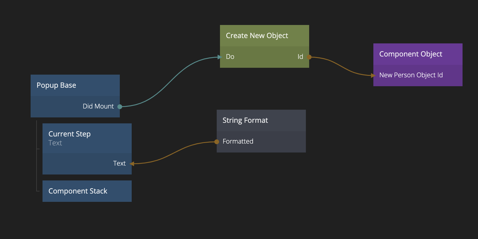
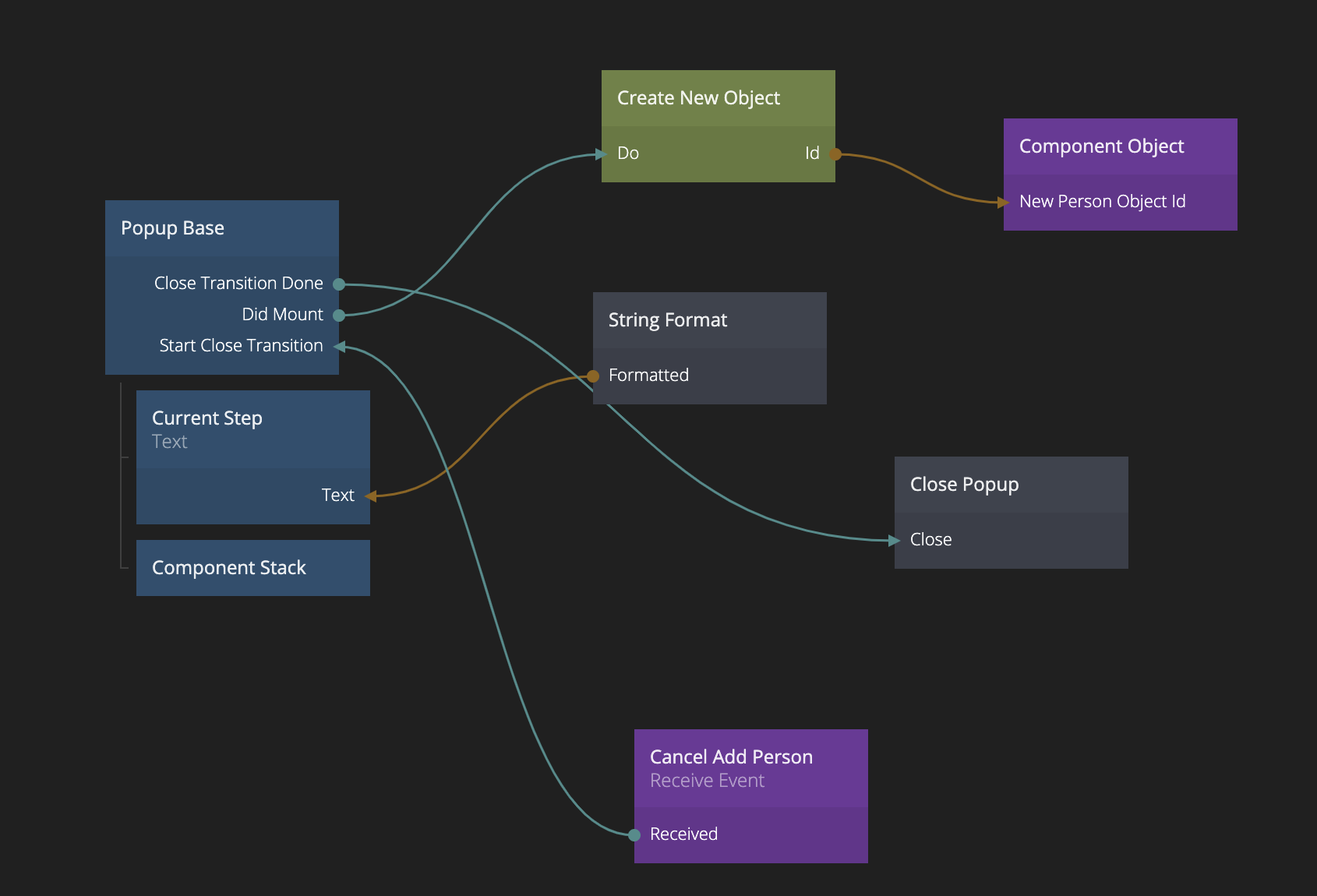
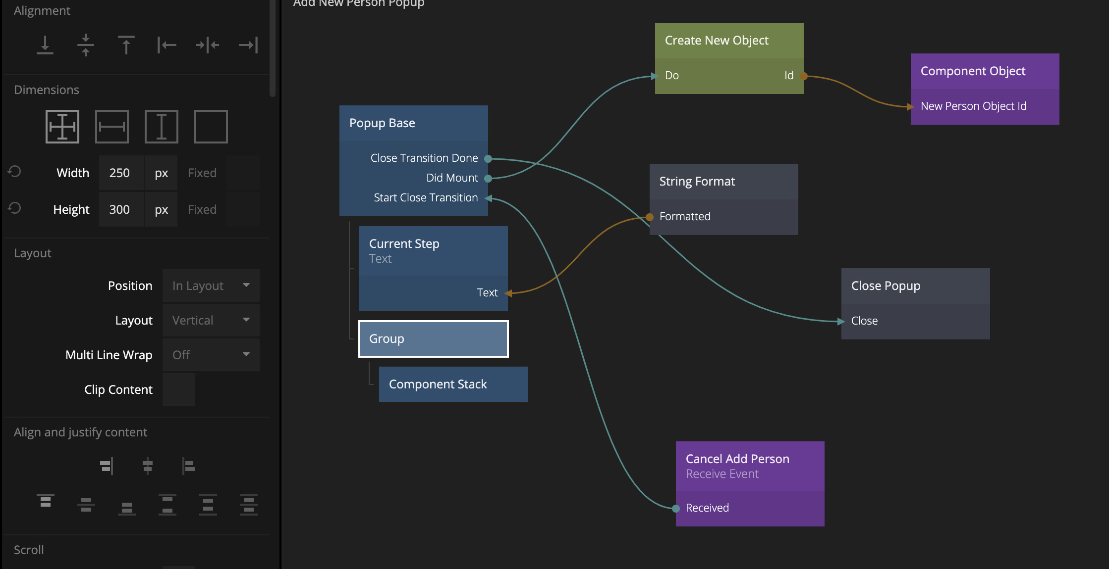
Now let's work on the data part of the Wizard. We want to start by creating a new Object that we can fill out with data as the wizard progresses. In the Add New Person Popup we add a Create New Object node. We want to trigger the creation of the Object when the Popup is created. However we are not exposing the Did Mount signal on our Popup Base component, so we need to do that first. Open the Popup Base component, add a new property Did Mount on the Component Outputs and connect it to the Did Mount signal of the root Group.
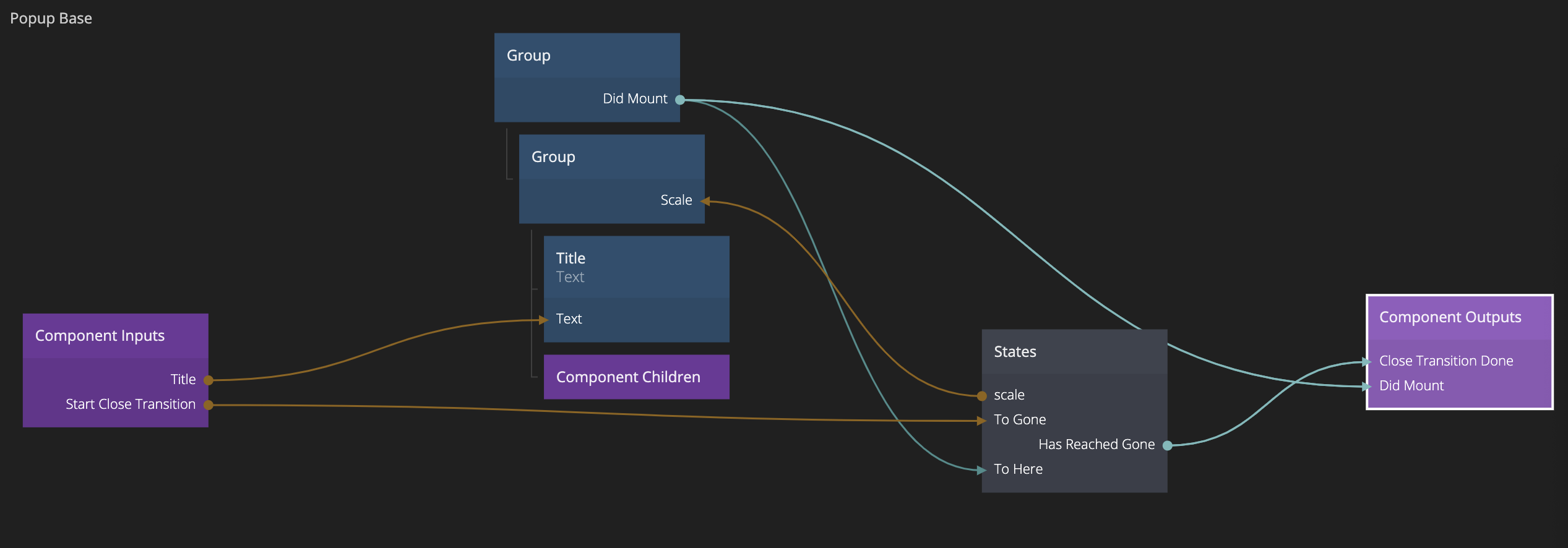
We can now connect the Did Mount signal from the Popup Base component to the Do signal of the Create New Object node in the Add New Person Popup, creating a new Object once the Popup opens.
Sharing data betweem components in a Component Stack
This new Object is the one we will fill with data in the Wizard, so we need to be able to access it in our different subcomponents, Step 1, Step 2 and Step 3. We could store the Id of the Object in a Variable but an even neater solution is to use a Component Object. While Variables are global, the Component Object is only available to the children (and sub children) of the component where it resides, so there is no risk that someone accidently changes it where it shouldn't.
tip
The components on the Component Stack are considered children of the Component Stack, hence using Component Objects as a way to share data between different components on the Component Stack is often a good idea.
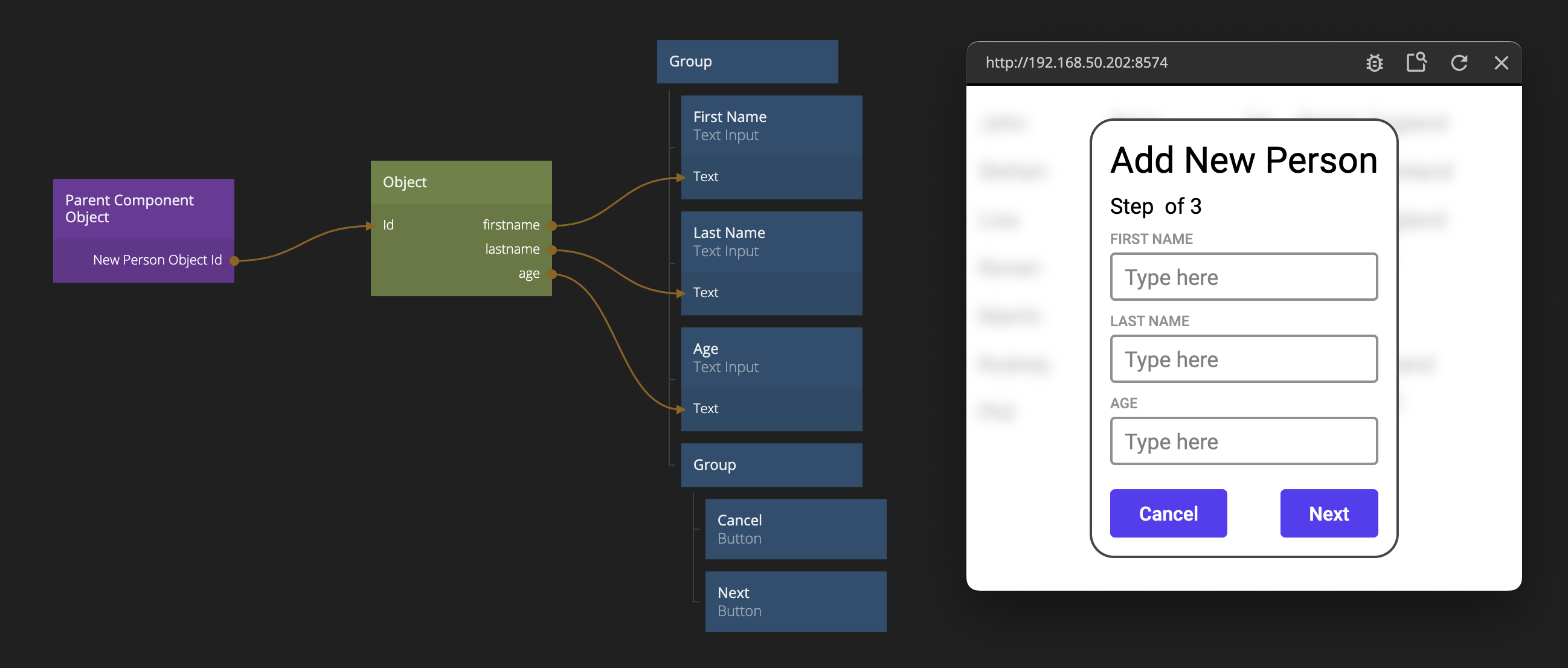
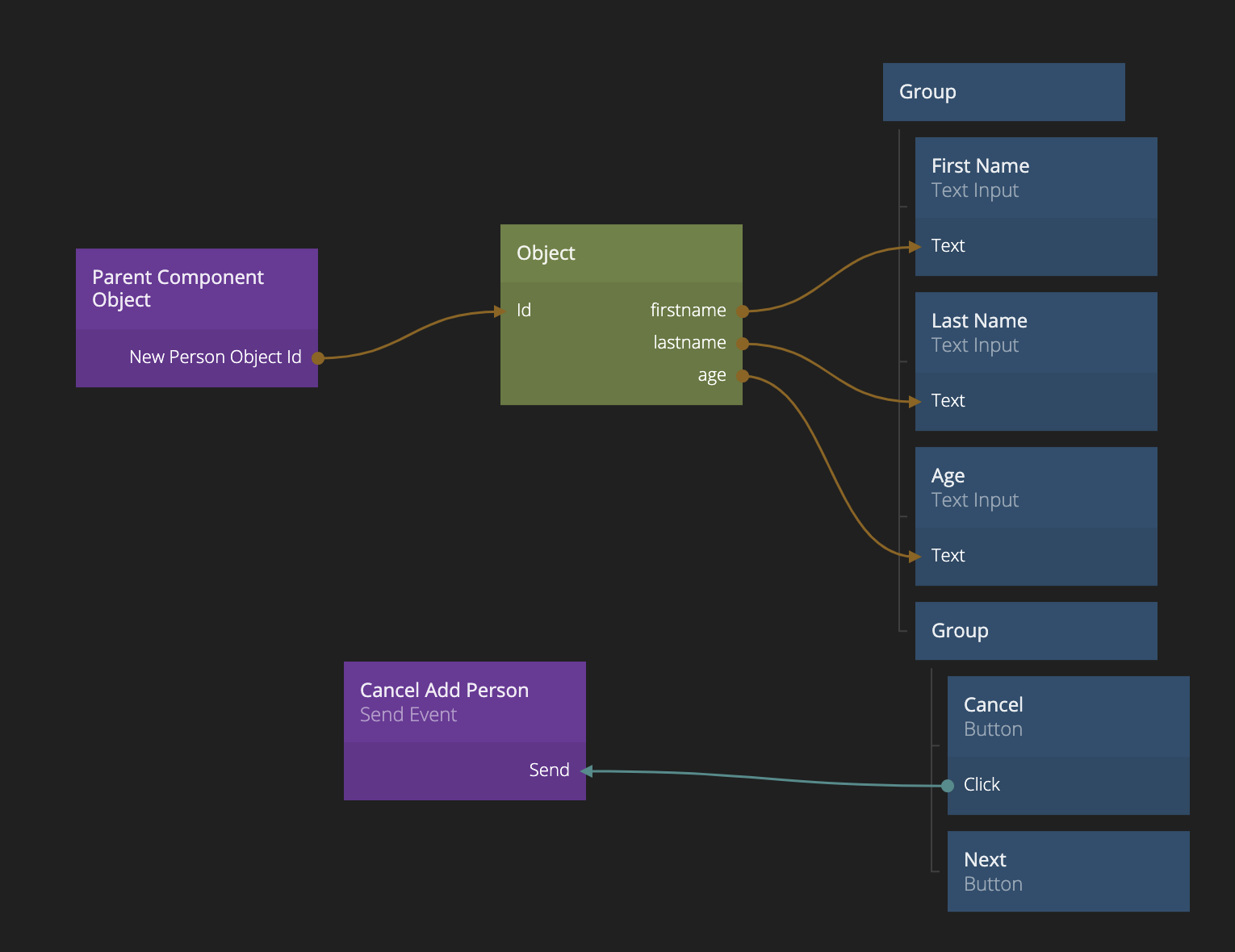
So in the Add New Person Popup, create a Component Object. Give it a property New Person Object Id. Then connect the Id of the Create New Project to the new property of the Component Object.
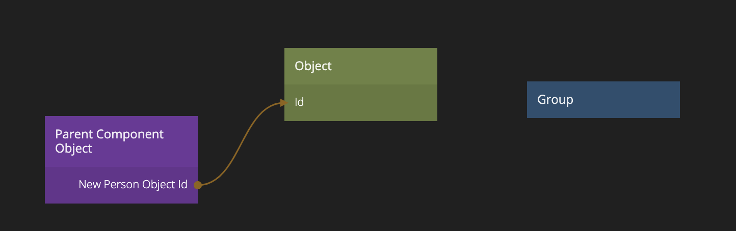
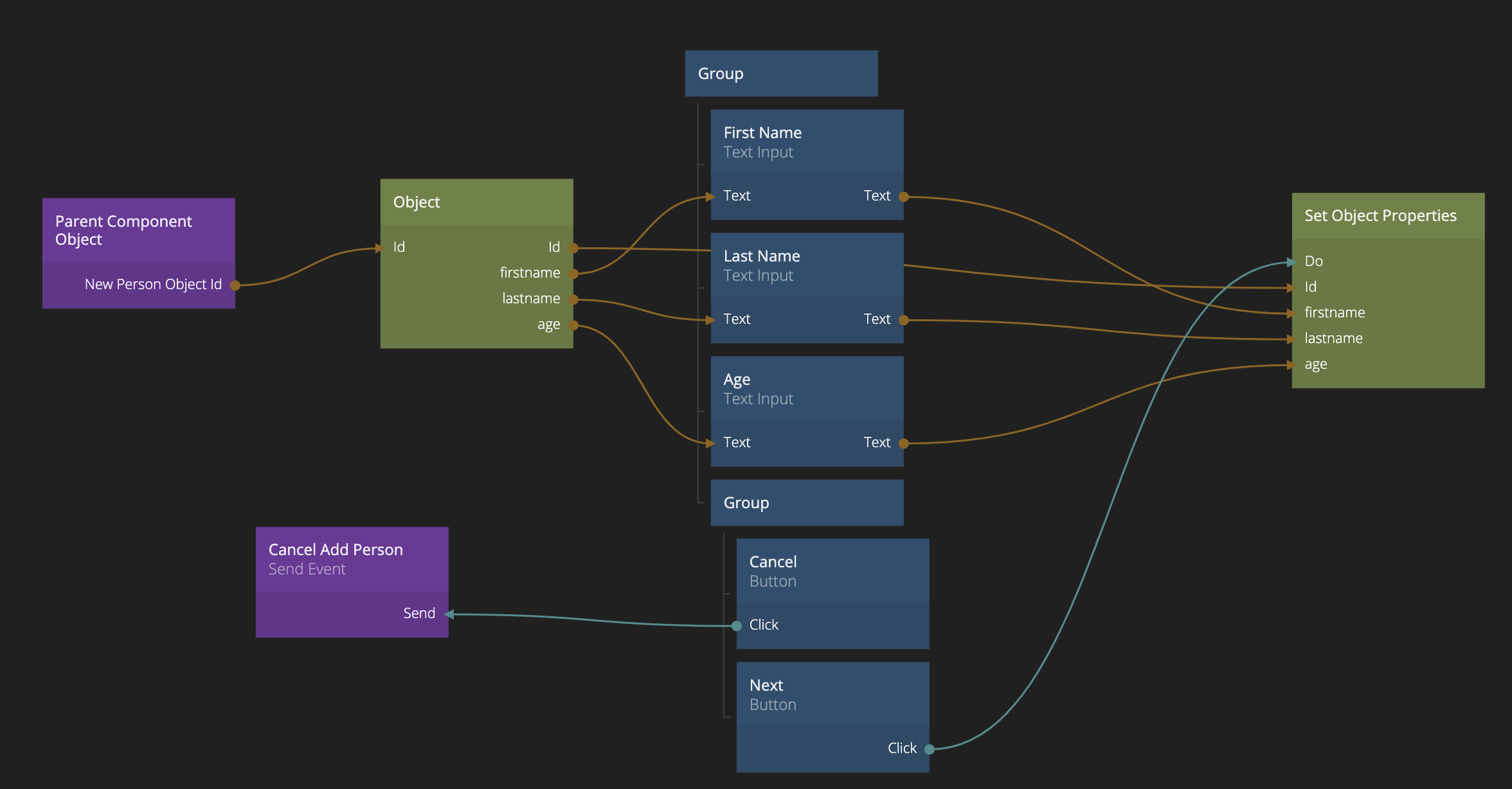
We can now start creating our simplr form in the first component, Step 1. First, lets get our newly created Object set up. This time we use the Parent Component Object to retrieve it. Make sure to add the same property as before New Person Object Id. Then we can connect it to the Id of an Object node to retrieve the Object.
So let's add three Text Input fields (for first name, last name and age). Hook them up to the Object (by adding the properties firstname, lastname and age - the last one being a number input only Text Input). Also add two Buttons one for "Cancel" and one for "Next" in a horizontal layout in a Group.
Sending events to communicate outside the Component Stack
Left to do on this screen is to store the content of our Text Inputs in the Object once the user clicks "Next" and then go to the next step, Step 2. We also need to handle the "Cancel" click. Let's start with the latter.
When the user clicks "Cancel" we want to close the Popup but we have to do Close Popup in the component that was opened directly using a Show Popup (i.e. the Add New Person Popup). How do we notify that component that the user clicked "Cancel"? Again, since the component that's on top of the Component Stack can be seen as a child to the stack, we can Send an Event to the parent component (for a dedicated guide on Events, see here).
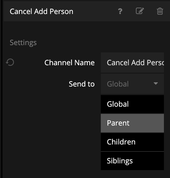
So add a Send Event node and give the channel name Cancel Add Person. Make sure it's only directed towards the parent.
Then trigger Send when the user clicks "Cancel".
Go back to the Add New Person Popup. We need to add a Receive Event node here to react to the event. Make sure the Cancel Add Person channel is set. Also consume the event (set it to Always) to avoid the event propagating the tree - it's not needed beyond this component. Add a Close Popup node. Then we trigger the Start Close Transition signal on the Base Popup (to start the close transition) and then when the transition is done (the Close Transition Done signal is triggered), we trigger Close on the Close Popup Node.
Pushing and replacing components on the Component Stack
Ok, now let's go back to the Step 1 component to finish it off. First, we need to save the content of the Text Inputs in the Object. We do this by adding a Set Object Properties node, add our three properties (firstname,lastname, age). Also, don't forget to set the Id to the same Id we got from our Parent Component Object. Then we connect the Click signal on the "Next" Button to the Do signal on the Set Object Properties.
After saving we need to move to the Step 2 component. Add a Push Component To Stack node. When you click on it, you can see a number of options. We see that it's using our Main (if we had more than one Component Stack in our project we would have to select the right one here). First let's change the Target Component to Step 2 - Country. We also see the Mode property. Here you can select Push or Replace. Since we want to be able to let the user go back in the Wizard in the each step, we probably want to keep Push as the mode. Essentially each component will be stacked on top of each other, and we can use the Pop Component Stack to go back to the previous component on the stack.
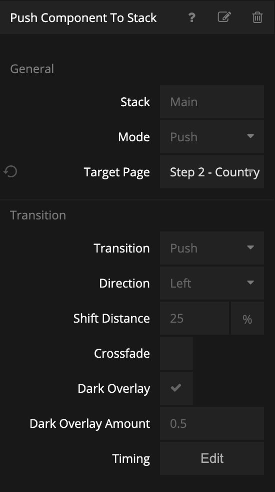
We should trigger the Navigate signal on the Push Component To Stack when the data is stored, using the Done signal.
Tweaking Transitions
Try out the navigation to the next step. You will see that the Dark Overlay option in the Push Component To Stack makes it looks weird so untick that option. Feel free to play around more with the transitions. Maybe change the Shift Transition to 100% to make it look more like a proper transition. You will see that it's important the the containing Group node clips its children for the transition to work. In the Popup Base component, that is the second Group that holds the Component Children.
Editing Step 2
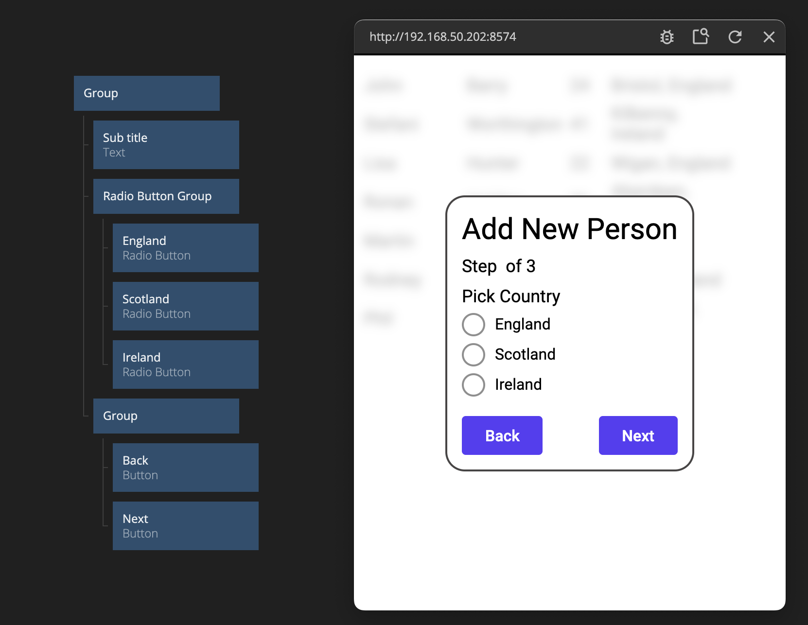
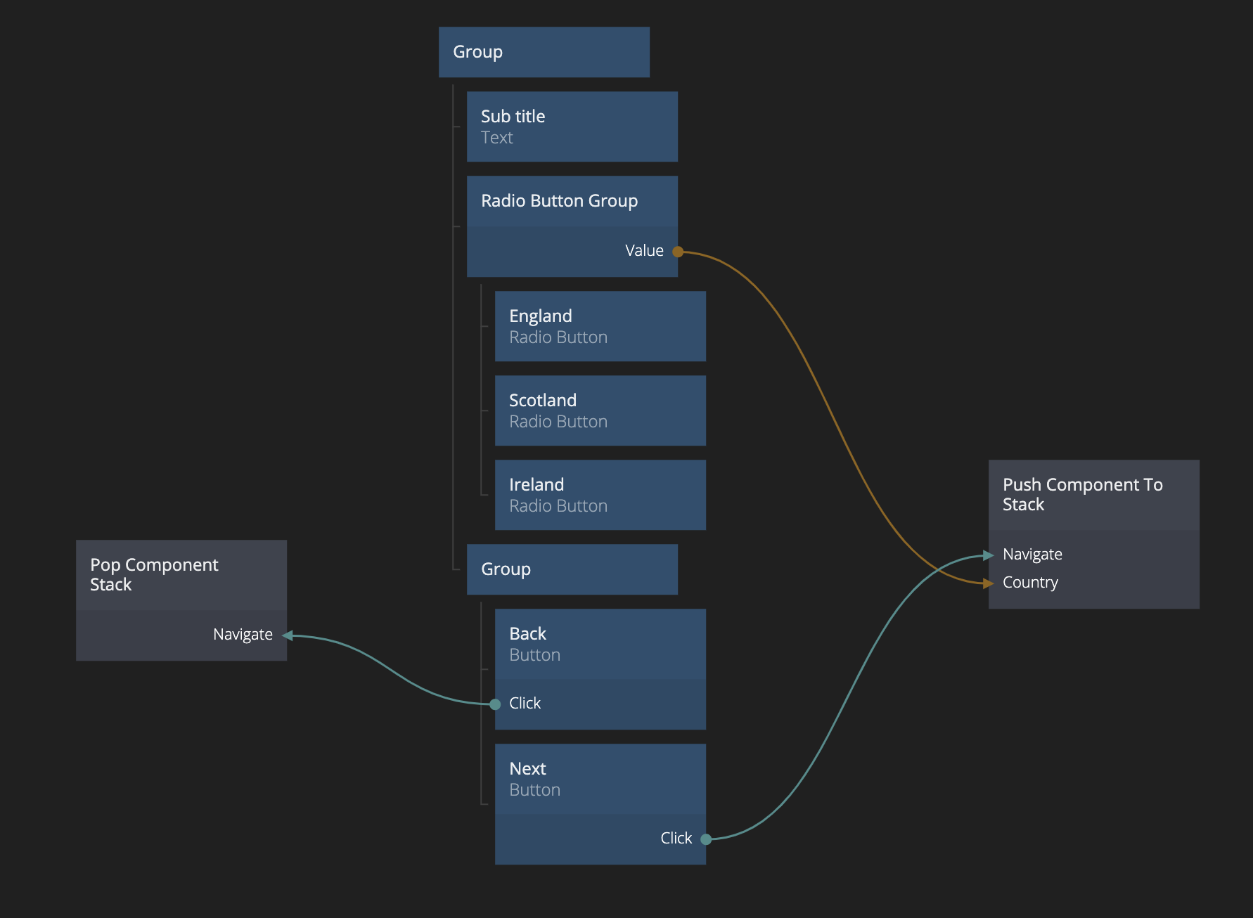
This will be a simpler form, containing a Radio Button Group with our country options. So let's add it in, together with three Radio Buttons. We only have three options in this case, England, Scotland and Ireland. Make sure both Label and Value of the Radio Buttons are set to the respective value. Also add a sub title that says Pick Country. Finally, add two buttons at the bottom Back and Next. We can copy/paste them from the previous step and just change the title of the first Button.
Popping from the Component Stack
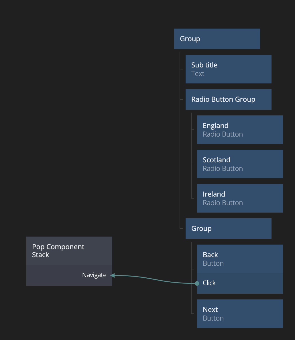
We start by adding in a Pop Component Stack node. As you can see you can send results back in a similar way as the Close Popup (Results and Back Actions). In this case we don't have any data to pass. Instead just connect Click from the "Back" button to Navigate.
As you can see, popping from the stack plays the push transition, but in reverse. We can see that having different sizes of our components is a little bit annoying since the popup changes size dynamically as they are shown and hidden. Let's fix that by having a fixed size on the components Step 1, Step 2 and Step 3.
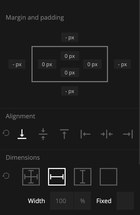
We do this by going to our Add New Parson Popup and move in a new Group with a fixed size (250px / 300 px) as a parent to the Component Stack.
While we see that there is still a little layout-tweaking to be done (the buttons at the bottom moves around, etc). Let's fix that quickly. We want to make sure the buttons are always at the bottom of the screen. So find the Group containin the Buttons for Step 1 and Step 2. Make sure to remove the Margin of the Group, or it will compete with the alignment, and then align it at the bottom.
Great, now the buttons stay at the bottom!
Instead we want to add Step 3 to the Component Stack when the user clicks "Next" in Step 2. We also need to pass on the selected country. We could of course store it in our Object but as you can see in the data model above, the country is not stored seperately. Instead we want to pass it on to Step 3. We could store it in the Component Object, as before, but in this case we can make use of the Component Inputs of the component to be opened.
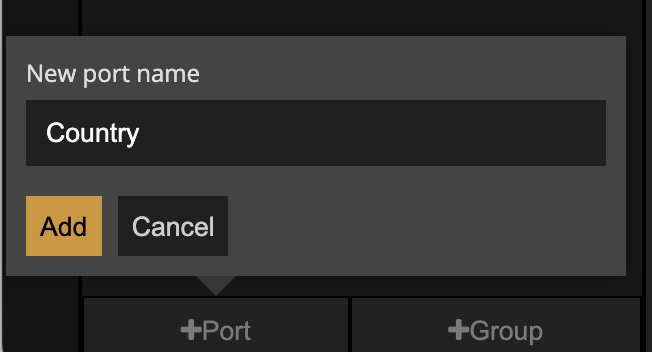
Go to Step 3 and add in a Component Inputs node. Add the port Country.
Forwarding data to a component on the stack using Component Inputs
Now, if you go back to Step 2, and add in a Push Component To Stack and select Step 3 as the target (also fix the transition as before), you will se that there is a new input called Country. We can connect the Value of the Radio Button Group to the Country input. Also connect Click on the "Next" Button to Navigate on Push Component To Stack.
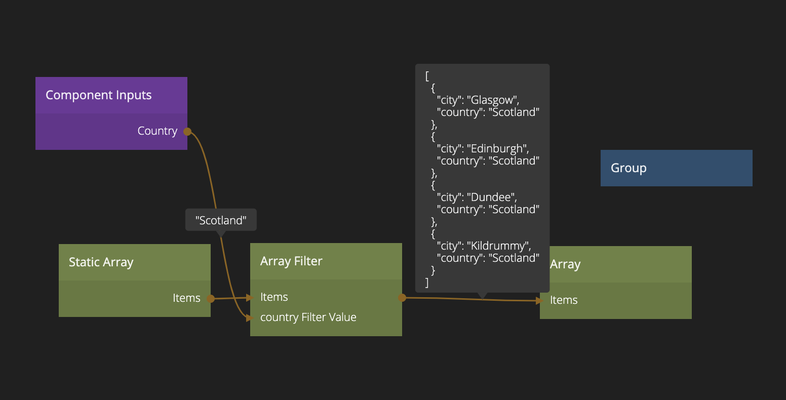
Great! Let's move to Step 3 then. Here we want to display options of cities depending on which country that was selected. Let's create a Static Array (set to JSON format) with the following data:
[
  { "city": "Bristol", "country": "England" },
  { "city": "Hartlepool", "country": "England" },
  { "city": "Newcastle", "country": "England" },
  { "city": "Wigan", "country": "England" },
  { "city": "Kilkenny", "country": "Ireland" },
  { "city": "Dublin", "country": "Ireland" },
  { "city": "Cork", "country": "Ireland" },
  { "city": "Galway", "country": "Ireland" },
  { "city": "Glasgow", "country": "Scotland" },
  { "city": "Edinburgh", "country": "Scotland" },
  { "city": "Dundee", "country": "Scotland" },
  { "city": "Kildrummy", "country": "Scotland" }
]
We want to present a Radio Button Group with only the valid cities for the country that was selected in the previous step. So let's start with an Array Filter.
Add a filter on the property country.
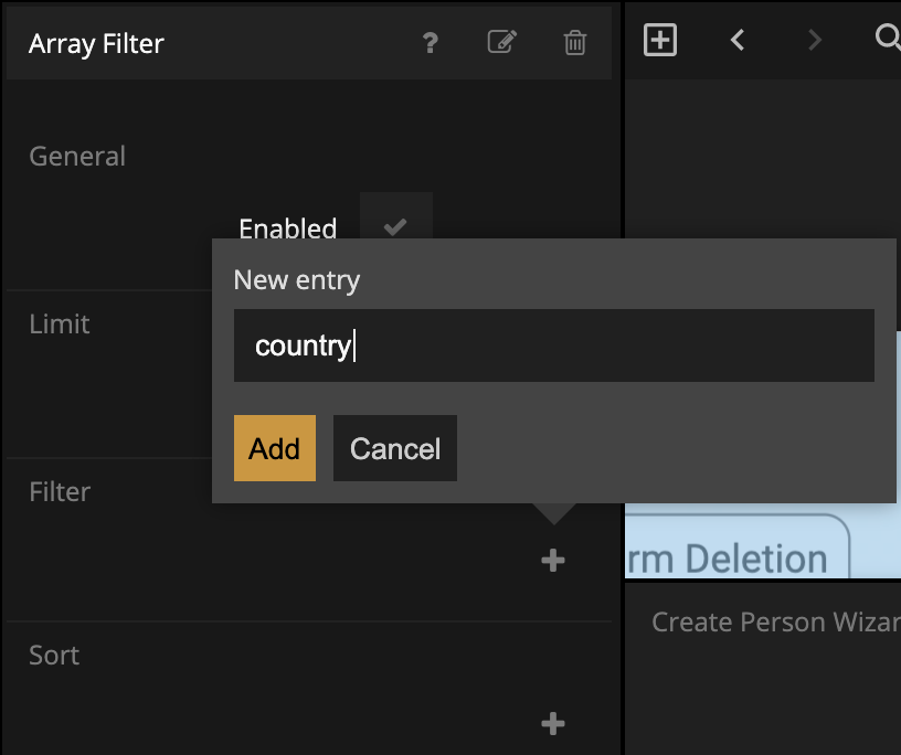
Make sure it's of the Equals type (and a String).
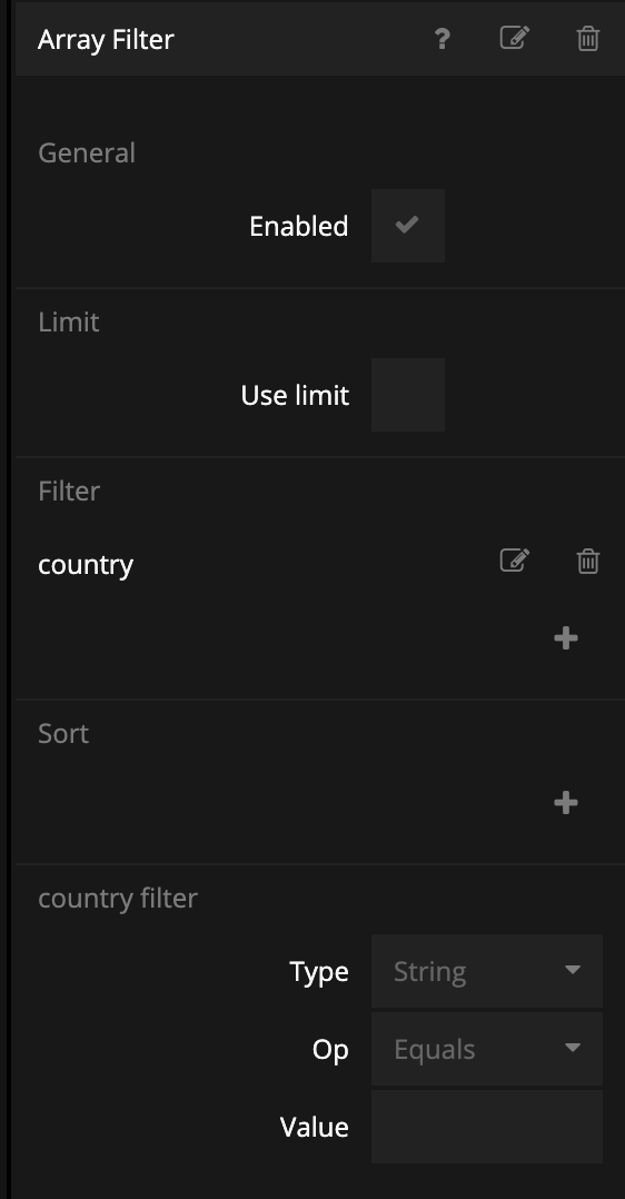
Then connect Items of the Static Array to the Items of the Array Filter. Then connect the country output of the Component Inputs to the Value of the country filter.
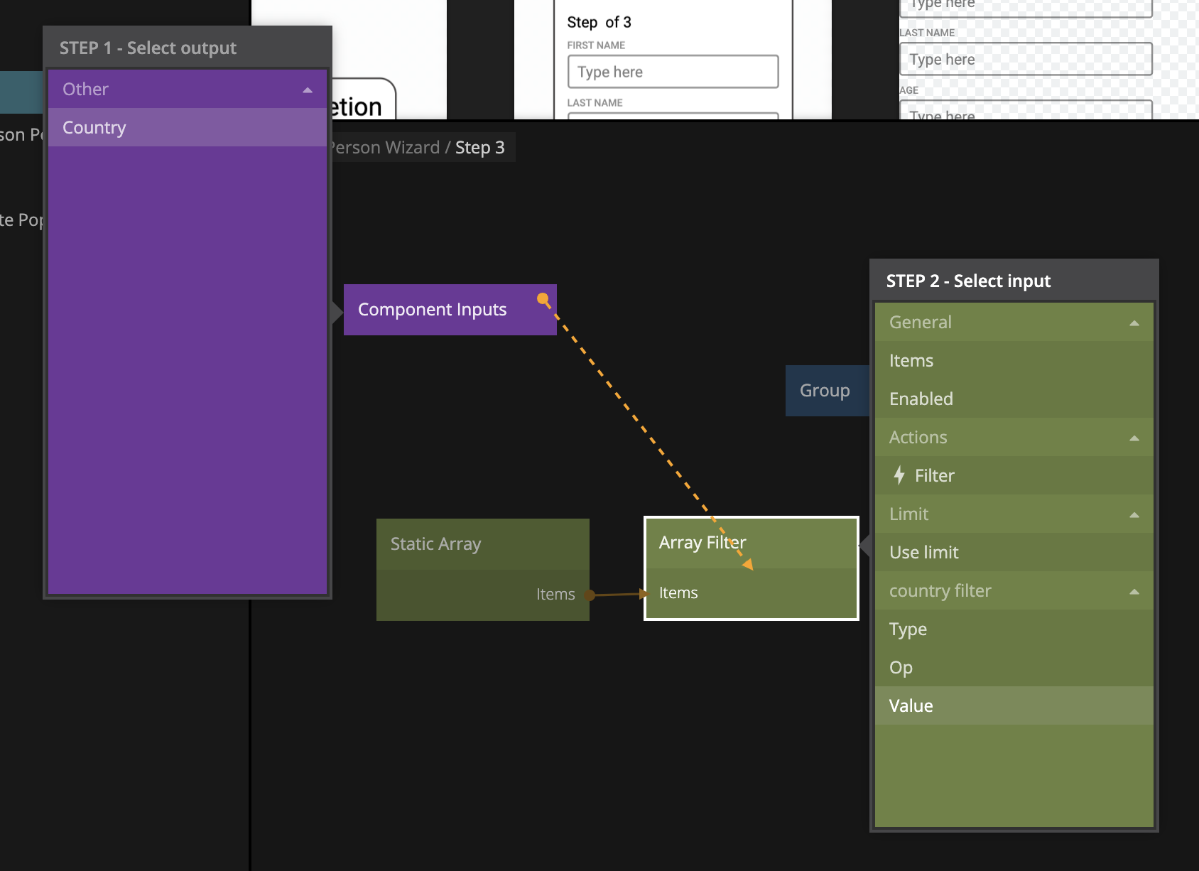
Add an Array to have a look at the results. We can now see that only the items that matches the country is filtered out. Nice!
Now we need to visualize the option in a list, using a Radio Button Group, Repeater and Radio Button. Start by creating the list item. Call it Step 3 List Item. It should look like below:
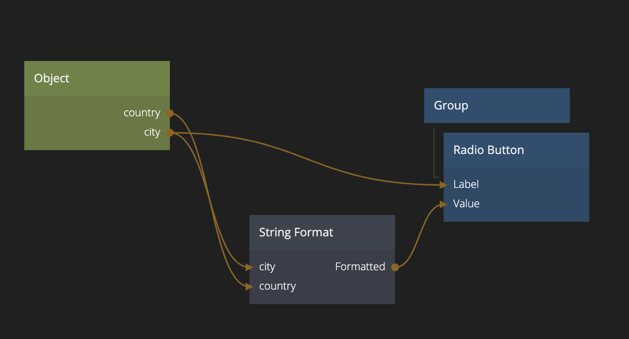
The Object has two properties country and city and gets its Id from the Repeater. Also note that the Value of the Radio Button is using a String Format (with the string {location}, {city}) to construct the final location string that matches the data model (for example Dublin, Ireland).
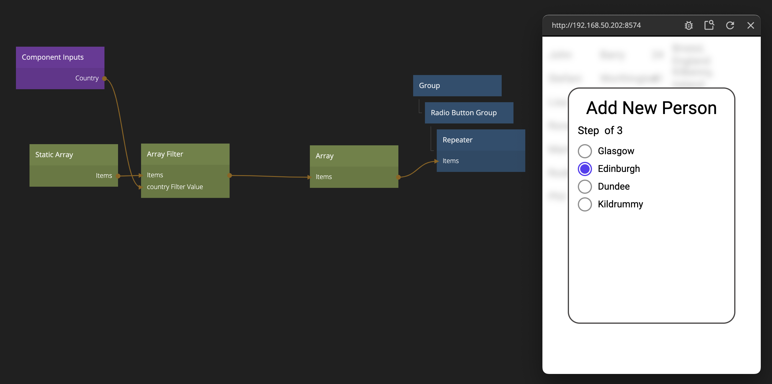
Then we go back to Step 3 component and add in a Radio Button Group and a Repeater (using our new Step 3 List Item) and then feed it with data. With some margin tweaking it will look something like below.
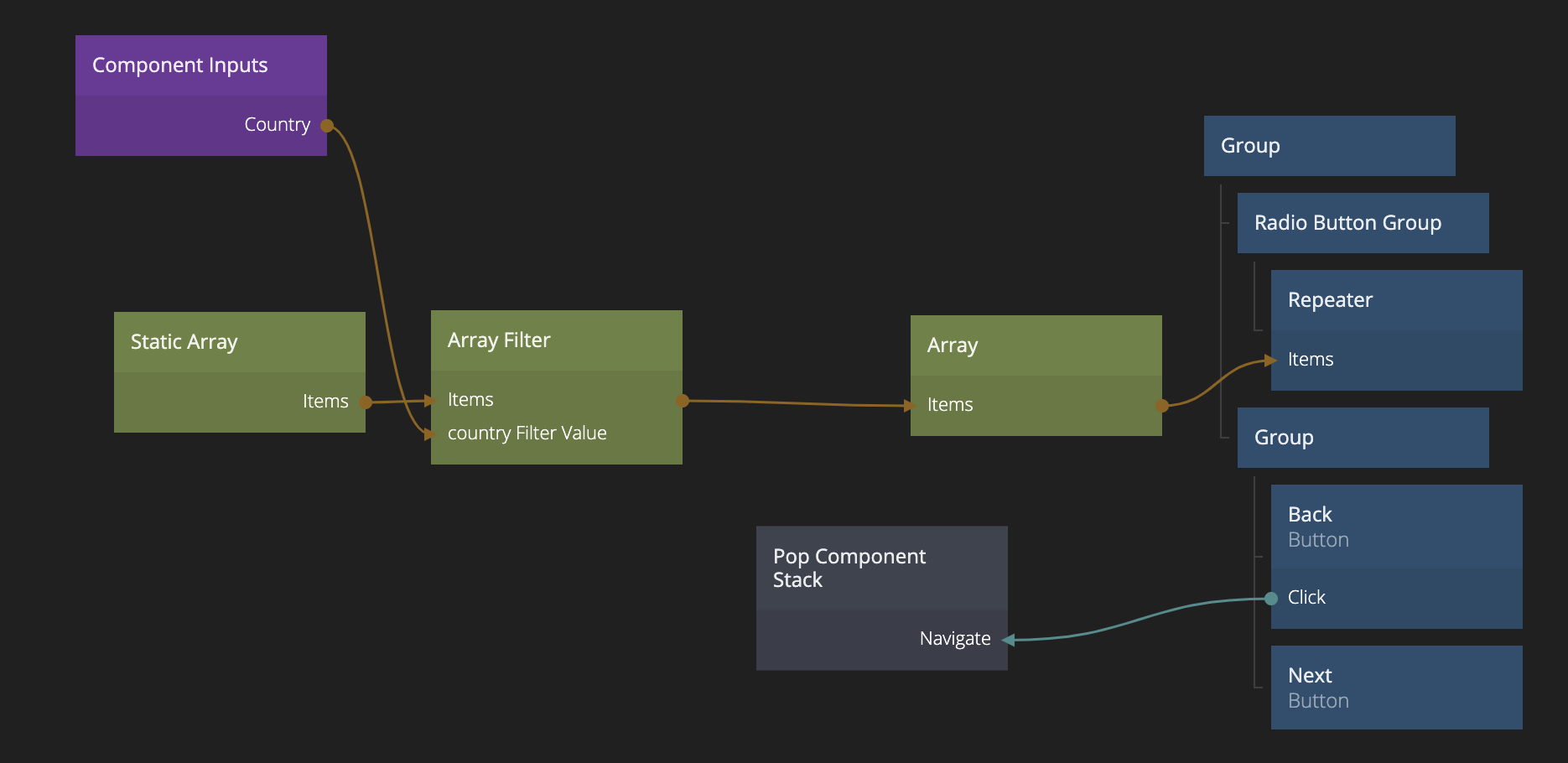
Ok, we continue by copying and pasting the Buttons from the previous step (we should really make these into a re-usable component!). Let's also bring the Pop Component Stack node as well (connected to the "Back" button) as we need one in this step as well.
Saving the created Object
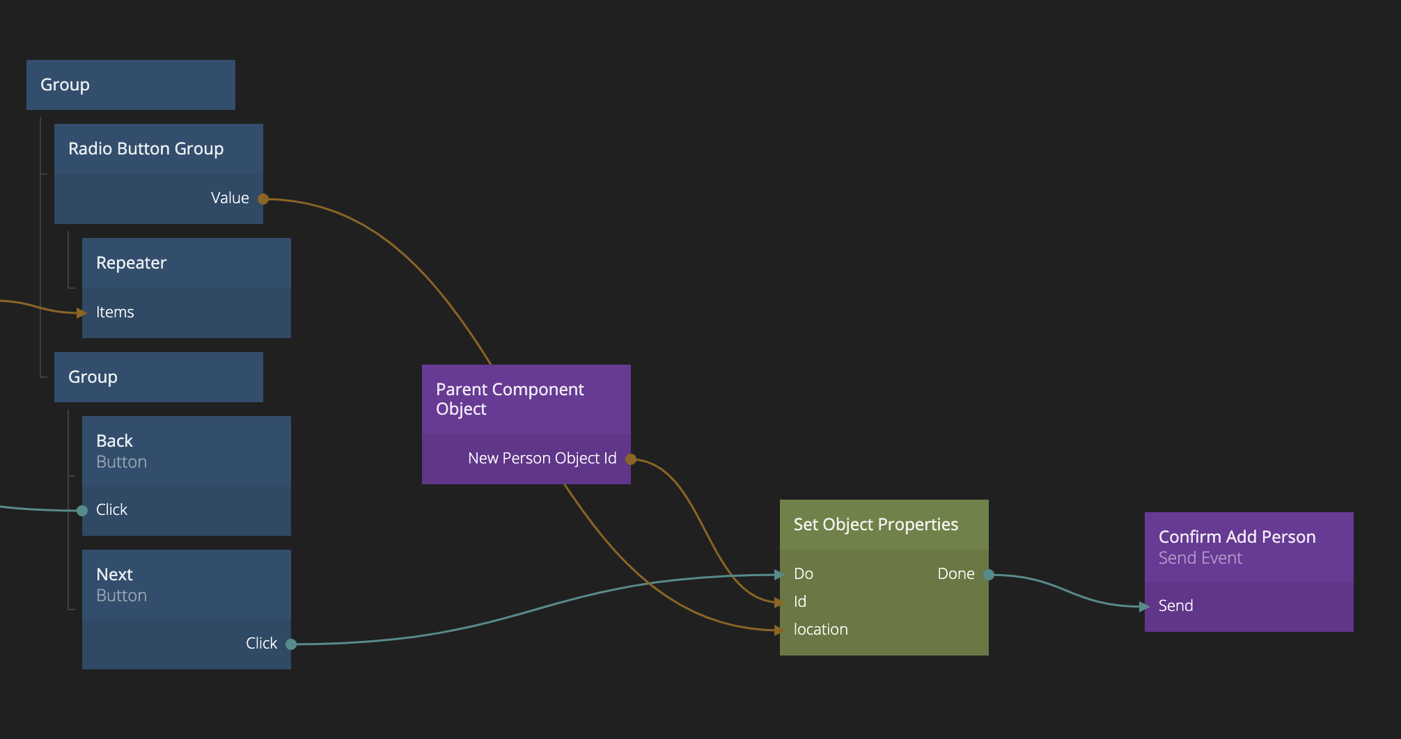
Ok we are almost done with our wizard. We need to save the location to the Object containing the info on the new person. We do it in the same way as in the Step 1 component, we use a Parent Component Object to retrieve the Object that was created in the Popup. This time we store the Value of the Radio Button Group in a property called location We store the value when the user clicks "Next".
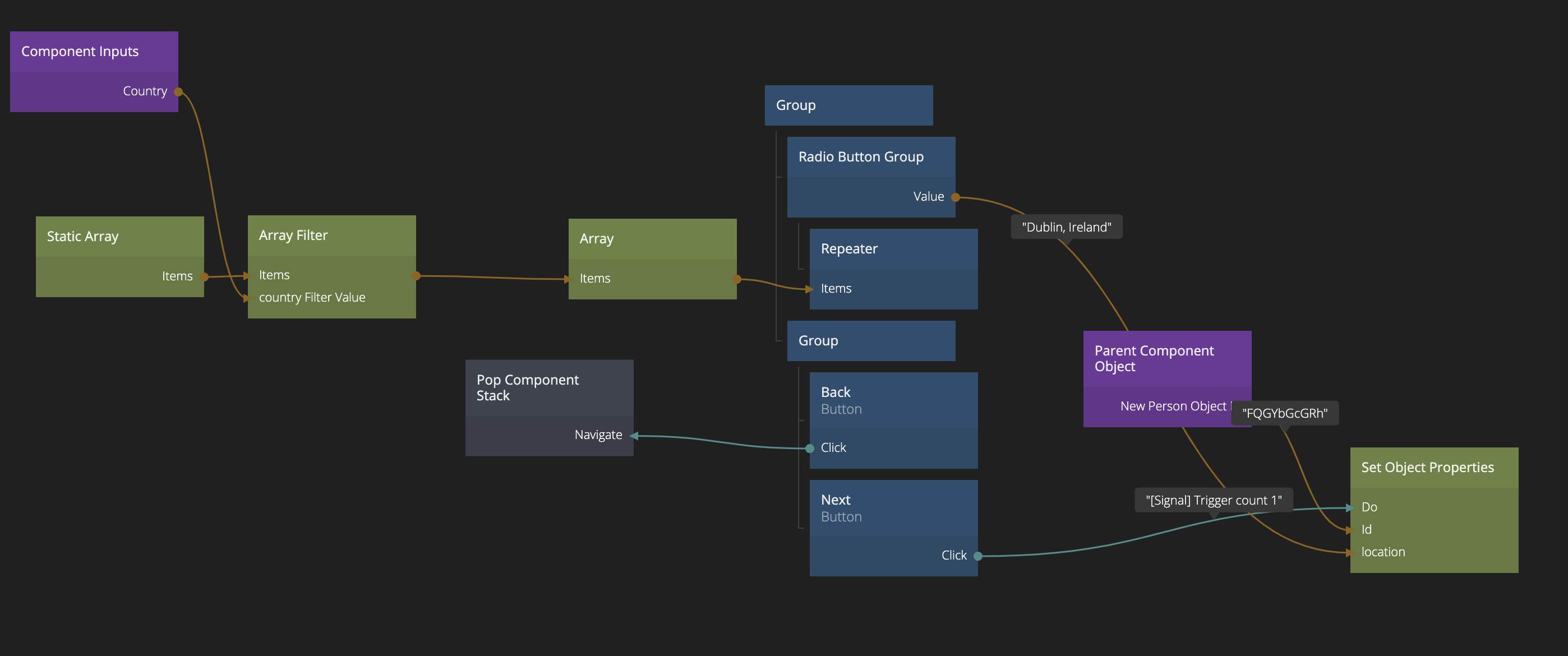
Finally we need to let the Create New Person Popup know that the Object is filled out when the user clicks "Next" on the last stage. Again, we do that by sending an Event this time with the Channel Name Confirm Add Person, send it to Parent. We do that once the Set Object Properties is done.
Passing data from the Popup
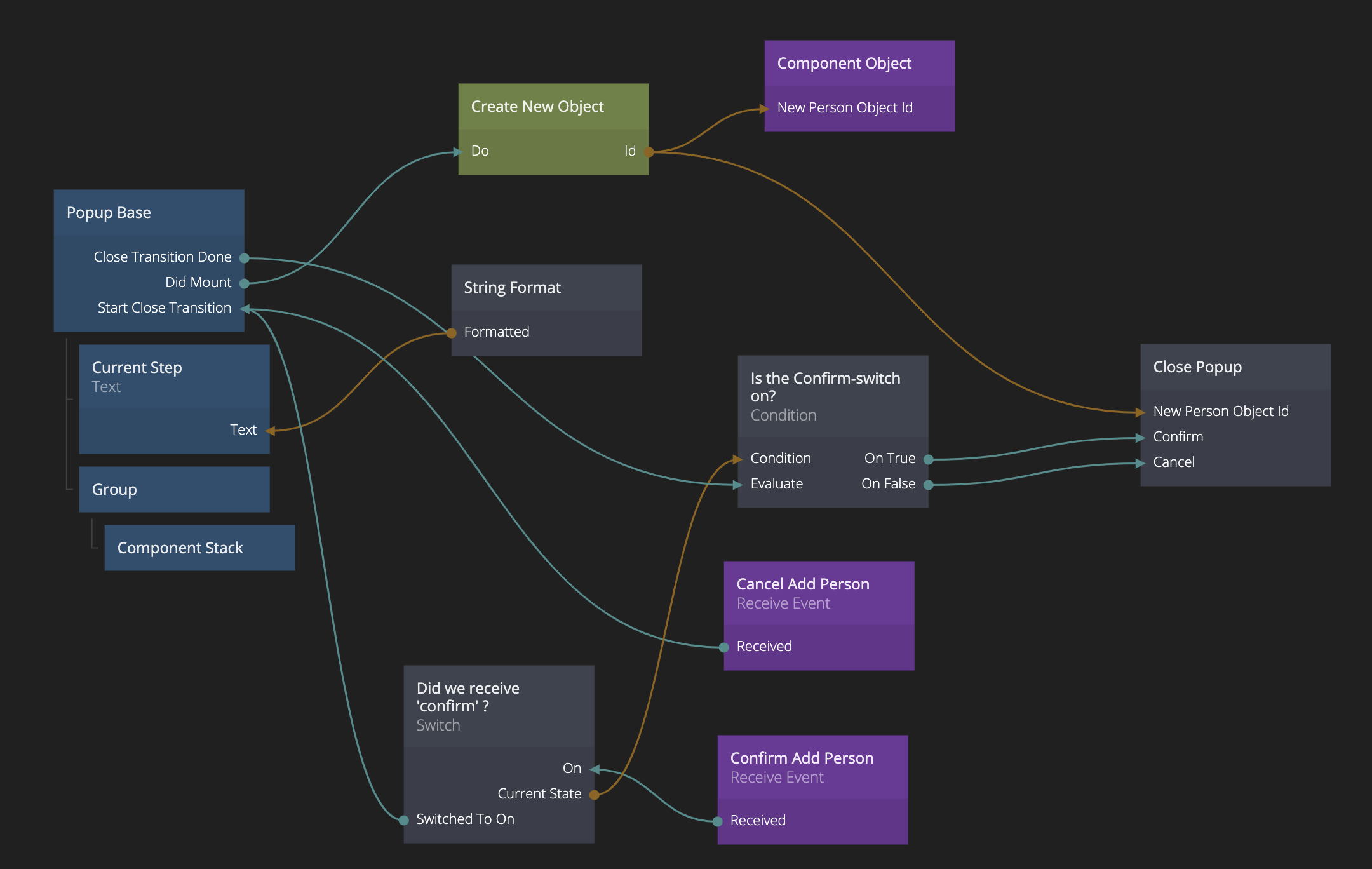
We go back to our Add New Person Popup to receive the event. Add in a Receive Event Node receiving from the channel Confirm Add Person.
Event logic
We are going to need some extra logic here. Since both the Cancel Add Person and Confirm Add Person will trigger the close transition of the popup we need to be able to distinguish the two cases one the transition is ready. Because, in the Confirm Add Person case we want to pass the created Object to the main App, so it can be added to the list of People.
We add in a Switch node, that's only set to true if the Confirm Add Person event is received. The, once the transition is closed, we use a Condition node to test the value of the Switch. Depending on the case (i.e. onTrue or onFalse from the Condition node) we trigger two different Close Actions on the Close Popup node (Confirm or Cancel). We also make sure to pass the Id of the Object representing the person in a result called New Person Object Id.
Here's how the whole thing looks.
Adding the Object to the Array
Now we need to receive the Object in our main App. We will get it through the New Person Object Id and add it if we get the Confirm Add Person signal from the Popup. We use the Insert Object into Array node to add it.
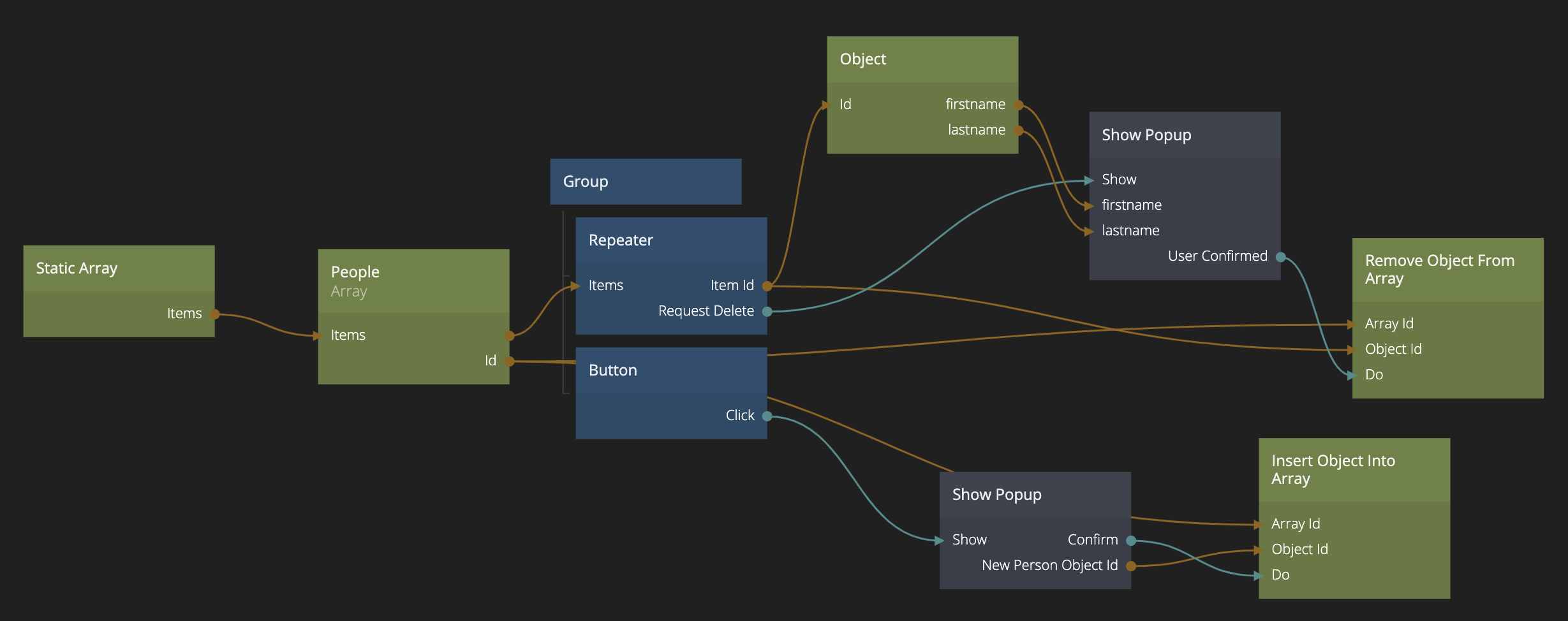
Try it out, we can now add new persons to our list using our little Wizard in a popup!
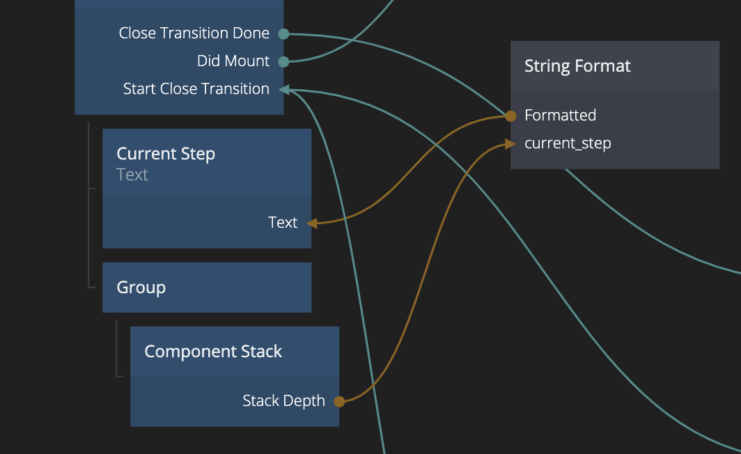
Reading which component is on top of the Component Stack
In our Wizard we still have our text Step x of 3. We want to make that work. Go back to the Add New Person Popup. The Component Stack has an output called Top Component Name that will hold the name of the component that's currently on top Note that it's the name of the component in the Component Stack, not the component that's used to represent it. So in out case it will be Step 1 - Name, Step 2 - Country, Step 3 - Location. If we somehow could transfor this to the number 1,2 or 3, we can just feed it into our String Format. What might be an even easier solution is to use the Stack Depth property. Since we use Push rather than Replace our Component Stack will grow in size from 1 to 2 to 3, which is exactly what we want. So we connect it to the String Format node.
Making sure the data is filled out
We are almost done. There are many ways to improve this wizard but one obvious thing is that we want users to be forced to select something before moving to the next step. For example not selecting a country will mess up Step 3.
In Step 1 we can look at the length of the Text value coming out of the Text Input nodes. We use the String node which has a Length output. We connect these three length values to an expression that makes sure all three of them are greater than zero (using the expression a>0&&b>0&&c>0). Then we connect the Result of that expression to the Enabled input of the "Next" Button.
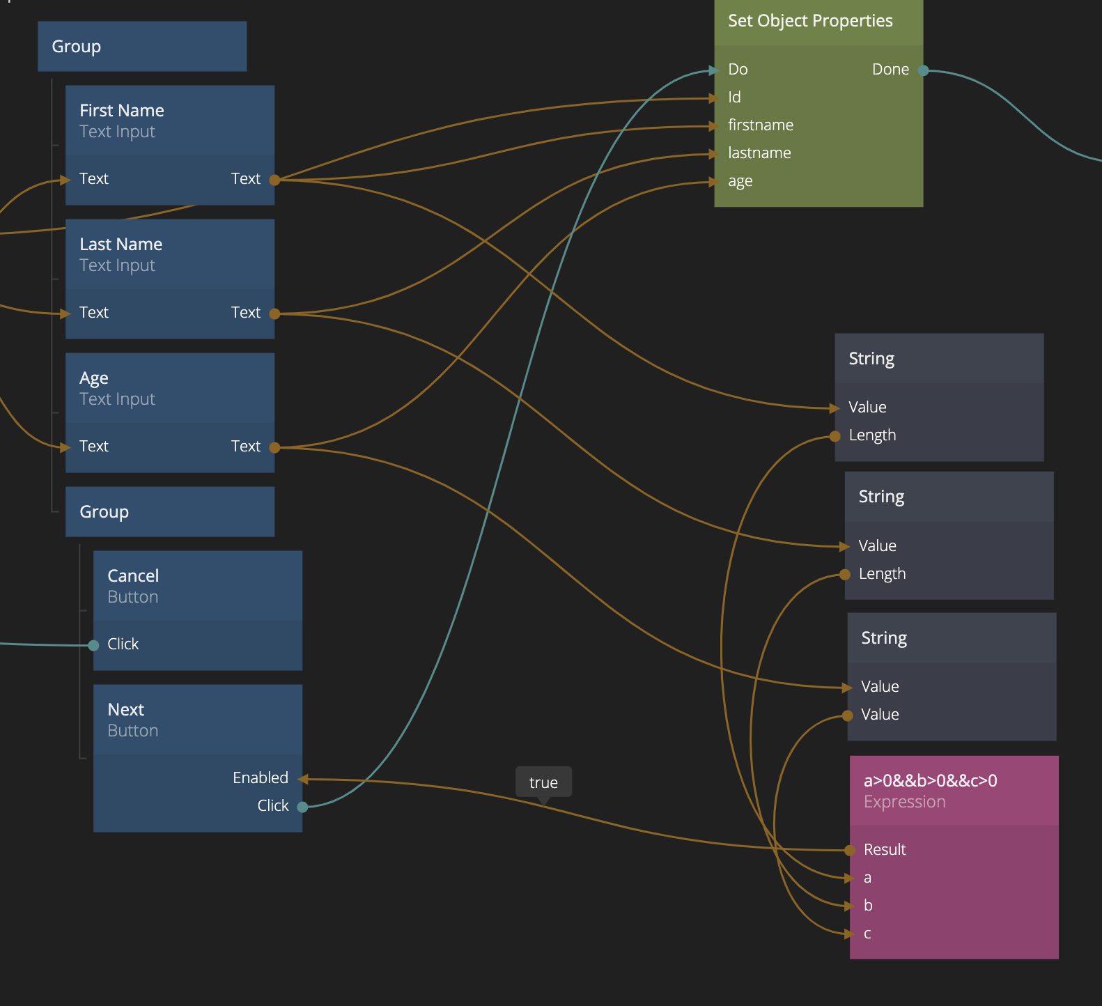
In Step 2 and Step 3 we essentially do the same, but we look at the length of the Value of the Radio Button Group.
We are done! We have a small wizard in a Popup to fill information when adding new persons!
Click the Import button below to import the final project.