Slider
This node places a range slider in the visual tree. It is used to select a number between a min and a max value.

The Slider node allows you to set a Step value. This controls in what intervals the slider can be incremented or decremented.
Inputs
| Data | Description |
|---|---|
| Value | Sets the numeric value of the control. |
| Min | Sets the numeric minumum value that can be selected using this range control. Default is 0. |
| Max | Sets the numeric maximum value that can be selected using this range control. Default is 100. |
| Step | Sets the numeric step value for this range control. Values can only be selected in the specified steps. Default is 1. |
It can be enabled and disabled using the Enabled input:
| Data | Description |
|---|---|
| Enabled | Specifies if the control is Enabled (true) or Disabled (false). A disabled control will not respond to any user interaction. |
Thumb and track
The Property Panel features editing popouts for the Slider Thumb and Track. These are styled separately using modified versions of the Dimensions, Border Style, Corner Radius and Box Shadow gadgets.
Visual
This node supports the following Visual Input Properties:
Outputs
| Data | Description |
|---|---|
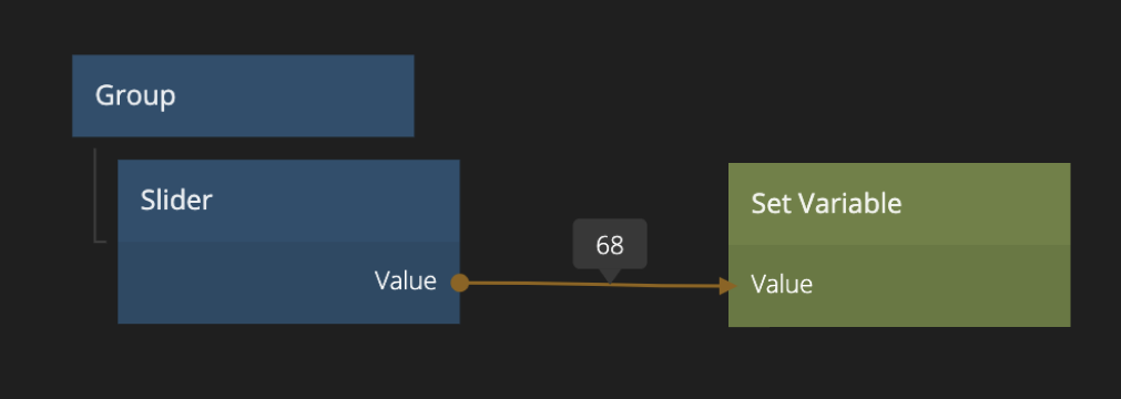
| Value | The current selected numeric value of the range control. |
| Value Percent | The current selected numeric value of the range control adjusted to be between 0 and 100, so the value of the range control in %. |
| Signal | Description |
|---|---|
| Changed | A signal is sent on this output when the value of the control is changed by user interaction. |
| Focused | A signal is sent on this output when the control is focused. |
| Blurred | A signal is sent on this output when the control is blurred, i.e. it has lost the input focus. |
| Pointer Down | Emitted when the mouse is pressed or finger is down on the node. |
| Pointer Up | Emitted when the mouse is released or finger is lifted on the node. |
| Hover Start | Emitted when the mouse enters the node. |
| Hover End | Emitted when the mouse leaves the node. |
States
The Slider
| Data | Description |
|---|---|
| Enabled | A boolean output that is true if the control is in Enabled state and false if it is Disabled. This is useful when using this control as a base for your own component that will represent visually that it is enabled or disabled. |
| Focused | This is a boolean type output that will be true if the control is in Focused state, and false otherwise. This is useful when using this control as a base for your own component that will represent visually that it is focused. This can be due to the user selecting the control for input or by using the keyboard. |
| Hover | A boolean type output that is true when the user hovers over this control with the mouse and false otherwise. This is useful when using this control as a base for your own component that will represent visually that it is hovered. |
| Pressed | A boolean output that is true when the user is currently pressing the control. This is useful when using this control as a base for your own component that will represent visually that it is pressed. |
Visual
This node supports the following Visual Output Properties:
@include "../shared-props/inputs/visual-input-properties.md" @include "../shared-props/outputs/visual-output-properties.md"