Radio Button
This node places a radio button in the visual tree. The Radio Button must be placed in a Radio Button Group node to function properly.
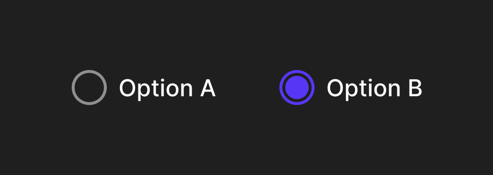
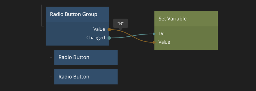
You must specify a unique Value for each Radio Button node. Only one Radio Button in a Radio Button Group can be selected at once.
The core radio button has a very simple visual appearance and is most often used in other components as part of a design system. This control contains all logic such as accessibility etc. It can be styled in via it's properties, or you can use it only for the logic and create your own radio button component in your own design system.
Inputs
The main input of the Radio Button node is the Value input:
| Data | Description |
|---|---|
| Value | The value for this radio button. The value of the selected radio button in a radio button group will be passed as the Value output of the radio button group. All radio buttons in a group should have unique values. |
| Background Color | The background color when the radio button is "checked". |
It can be enabled and disabled using the Enabled input:
| Data | Description |
|---|---|
| Enabled | Specifies if the control is Enabled (true) or Disabled (false). A disabled control will not respond to any user interaction. |
The Checkbox node has a set of label properties that can be set:
| Data | Description |
|---|---|
| Enable Label | Sets whether the label is visible or not. |
| Text Style | Set an existing text style to this node, or create a new text style from the current properties. |
| Label | A text string that will be shown as the label on the button. |
| Spacing | The spacing between the label and the checkbox. |
Similarly, it has a set of icon properties:
| Data | Description |
|---|---|
| Enable Icon | Sets whether the icon is visible or not. |
| Type | Use this to set if you want to use a predefined icon or a custom image from the project folder. |
| Source | Where to get the icon. |
| Placement | Sets whether the icon should be to the left or to the right of the Label |
| Size | The width of the icon in px. |
| Color | Sets the color of the icon. Only visible if Type is set to icon. |
Visual
This node supports the following Visual Input Properties:
- Margin
- Padding
- Alignment
- Dimensions
- Layout, Position
- Style
- Border Style
- Corner Radius
- Box Shadow
- Placement
- Other
- Advanced Style
Outputs
The main output of the Radio Button node is the Checked output.
| Data | Description |
|---|---|
| Checked | A boolean output that is true when this radio button control is checked and false if not. This is useful when using this control as a base for your own component that will represent visually that it is checked. |
It also features a set of signals:
| Signal | Description |
|---|---|
| Changed | A signal is sent on this output when the value of the control is changed by user interaction. |
| Focused | A signal is sent on this output when the control is focused. |
| Blurred | A signal is sent on this output when the control is blurred, i.e. it has lost the input focus. |
| Pointer Down | Emitted when the mouse is pressed or finger is down on the node. |
| Pointer Up | Emitted when the mouse is released or finger is lifted on the node. |
| Hover Start | Emitted when the mouse enters the node. |
| Hover End | Emitted when the mouse leaves the node. |
States
Apart from triggering signals the Checkbox node also notifies of its state through data outputs:
| Data | Description |
|---|---|
| Enabled | A boolean output that is true if the control is in Enabled state and false if it is Disabled. This is useful when using this control as a base for your own component that will represent visually that it is enabled or disabled. |
| Focused | This is a boolean type output that will be true if the control is in Focused state, and false otherwise. This is useful when using this control as a base for your own component that will represent visually that it is focused. This can be due to the user selecting the control for input or by using the keyboard. |
| Hover | A boolean type output that is true when the user hovers over this control with the mouse and false otherwise. This is useful when using this control as a base for your own component that will represent visually that it is hovered. |
| Pressed | A boolean output that is true when the user is currently pressing the control. This is useful when using this control as a base for your own component that will represent visually that it is pressed. |
This node supports the following Visual Output Properties:
@include "../shared-props/inputs/visual-input-properties.md" @include "../shared-props/outputs/visual-output-properties.md"