Radio Button Group
This node is a non visual control used to group Radio Button nodes. The Radio Button must be placed in a Radio Button Group node to function properly.
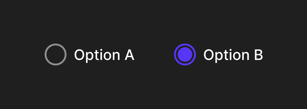
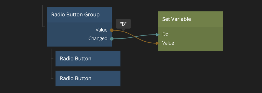
The output of the Radio Button Group node is the Value of the selected Radio Button. Only one Radio Button in a Radio Button Group can be selected at the same time.
Inputs
| Data | Description |
|---|---|
| Value | The value of the current selected radio button. By changing this value will change which radio button is currently selected. |
It can be enabled and disabled using the Enabled input:
| Data | Description |
|---|---|
| Enabled | Specifies if the control is Enabled (true) or Disabled (false). A disabled control will not respond to any user interaction. |
Visual
This node supports the following Visual Input Properties:
Outputs
| Data | Description |
|---|---|
| Value | The current selected radio button value will be output here. |
| Signal | Description |
|---|---|
| Changed | This event is triggered when the Value of the radio button group is changed due to user interaction. |
Visual
This node supports the following Visual Output Properties:
@include "../shared-props/inputs/visual-input-properties.md" @include "../shared-props/outputs/visual-output-properties.md")