Dropdown
This node places a dropdown input field in the visual tree. The input can for example be used to capture information from a user.

The dropdown takes an array of options as an input, which will be shown in the dropdown for the user to pick from.
The Incoming Items Format
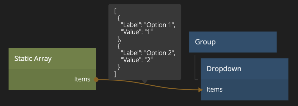
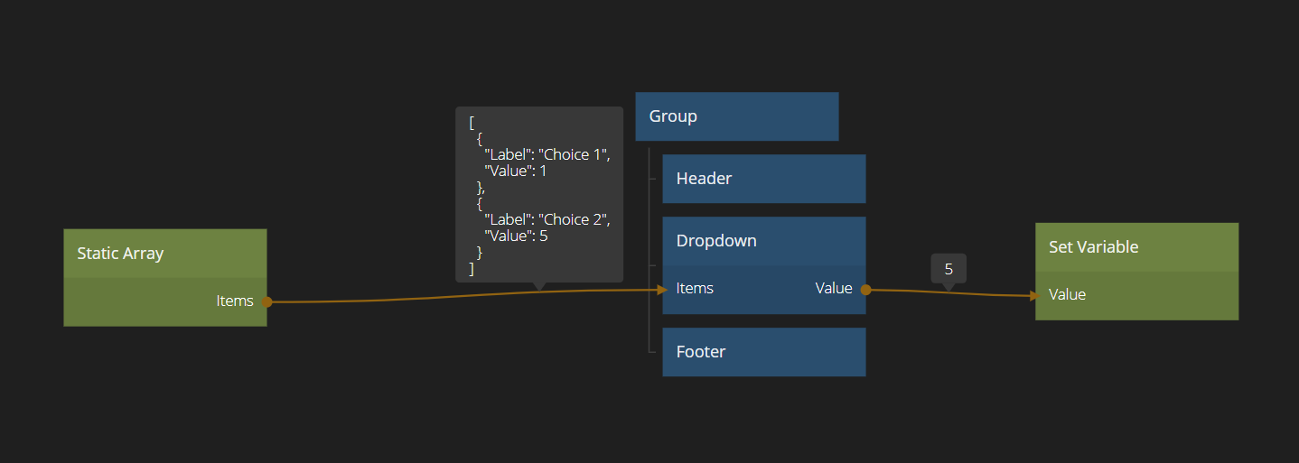
The incoming items should be an Array of Objects, for example coming from a Static Array, Query Records or a Function node.
The Object should have two mandatory properties: Label, Value (note that the case matters, value would not work). The Label property should contain the string to be shown in the Dropdown.
The Value property will be set on the output Value on the Dropdown.
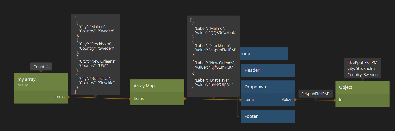
Depending on how your original data looks, it may be necessary to use the Array Map node to re-map values in the original data towards Label and Value.
One useful pattern is to map the id of an Object to the Value property in the Array Map to easily access the selected Object.
The mapping can be achieved through Value: function (object) { return object.id }.
Inputs
| Data | Description |
|---|---|
| Items | This input takes an Array of Objects that will populate the Dropdown. You should make sure that they have the two properties Label and Value set as they are used to represent the item in the Dropdown. |
| Value | Setting this input will force the Dropdown to select the item with the same value set in its Value property. |
| Placeholder | The placeholder text for when the dropdown is empty. |
| Placeholder Opacity | The opacity of the placeholder text. 0 is completely transparent and invisible. 1 is completely solid and opaque. |
User interaction can be enabled and disabled:
| Data | Description |
|---|---|
| Enabled | Specifies if the control is Enabled (true) or Disabled (false). A disabled control will not respond to any user interaction. |
Visual
This node supports the following Visual Input Properties:
- Margin
- Alignment
- Dimensions
- Layout, Position
- Text Style
- Style
- Border Style
- Corner Radius
- Box Shadow
- Placement
- Other
- Advanced Style
Outputs
The main output is the following:
| Data | Description |
|---|---|
| Value | This output holds the value, i.e. what is in the property Value in the currently selected Object in the Dropdown. |
| Signal | Description |
|---|---|
| Changed | This signal signal is emitted when the selection of the Dropdown changes. |
It also features a set of more in depth signals:
| Signal | Description |
|---|---|
| Changed | A signal is sent on this output when the value of the control is changed by user interaction. |
| Focused | A signal is sent on this output when the control is focused. |
| Blurred | A signal is sent on this output when the control is blurred, i.e. it has lost the input focus. |
| Pointer Down | Emitted when the mouse is pressed or finger is down on the node. |
| Pointer Up | Emitted when the mouse is released or finger is lifted on the node. |
| Hover Start | Emitted when the mouse enters the node. |
| Hover End | Emitted when the mouse leaves the node. |
States
Apart from triggering signals the Dropdown node also notifies of its state through data outputs:
| Data | Description |
|---|---|
| Enabled | A boolean output that is true if the control is in Enabled state and false if it is Disabled. This is useful when using this control as a base for your own component that will represent visually that it is enabled or disabled. |
| Focused | This is a boolean type output that will be true if the control is in Focused state, and false otherwise. This is useful when using this control as a base for your own component that will represent visually that it is focused. This can be due to the user selecting the control for input or by using the keyboard. |
| Hover | A boolean type output that is true when the user hovers over this control with the mouse and false otherwise. This is useful when using this control as a base for your own component that will represent visually that it is hovered. |
| Pressed | A boolean output that is true when the user is currently pressing the control. This is useful when using this control as a base for your own component that will represent visually that it is pressed. |
Visual
This node supports the following Visual Output Properties:
@include "../shared-props/inputs/visual-input-properties.md" @include "../shared-props/outputs/visual-output-properties.md"