States Node
A common concept in Noodl is the use of different visual states. In this guide we will cover states with an example of how to create a simple reusable switch component, and an example of hovering effects.
The examples will cover how to use a States node for handling transitions and interactions.
The visuals
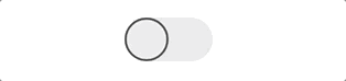
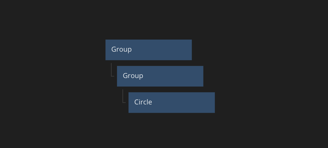
First let's start with the basic visual nodes that make up the switch. This is simply a Group and a Circle with proper styling. You can copy the nodes below and paste into your own project.
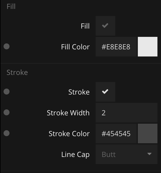
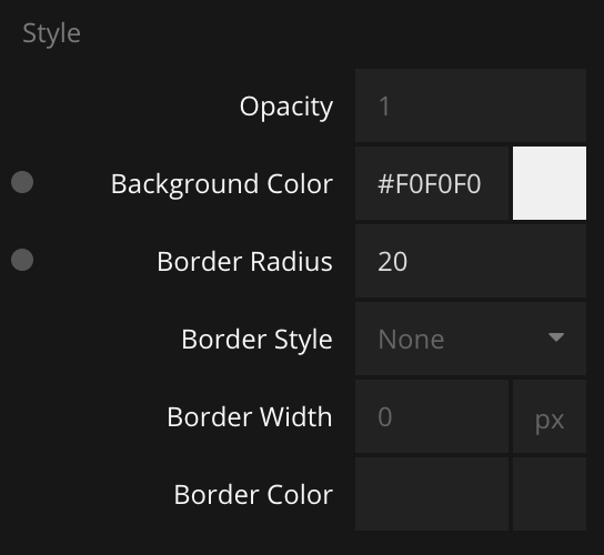
Below you can see the styling of the two nodes. The first image shows the Circle node's properties and the second image shows the Group node's properties. Don't forget that you can hover the nodes in the graph to see their placement in the preview.
The states node
A very common pattern is to represent states visually. In this example we want our switch to have two states On and Off, and we want it to have different visuals for these states. This is achieved with the States node. Start by creating a new States node.
Next, create the two states.
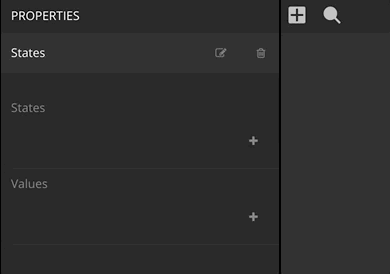
The States node will be in one of the states that we just defined. It starts in the state specified by the State property that shows up when you add states. Later we will switch state by connecting a signal.
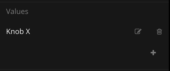
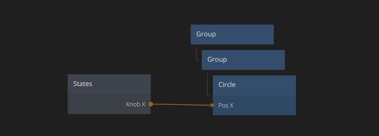
We will also specify Values for each of our states. In the same way you added states, add a single value and call it Knob X. It doesn't really matter what you call it, as long as you know what it is for. In this case it's for moving the knob's (the Circle node) X position to its correct position for the two states.
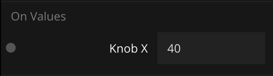
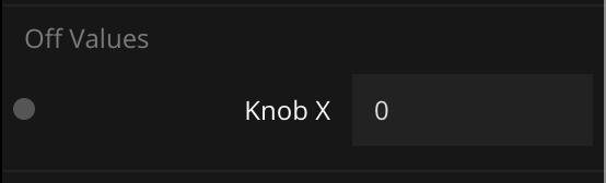
Specify the value for each state. The X position should be 40 when the switch is in the On state and 0 when the switch is in the Off state. Enter these values in the States node properties.
Connect the Knob X output of the States node to the Pos X input of the Circle node.
As you can see the States node will get an output corresponding to each value that is defined under Values. This output will transition to the specified values when the States node changes state. One way to see the different states and transitions is to play with the State dropdown menu in the properties panel.
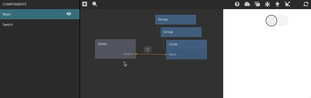
If you hover over the output connection of the States node a small popup will show the current value that is being outputted. If you click this small popup, you pin the popup so that it stays visible. Now you can see the output value change as it transitions from one state to another.
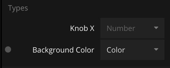
You can connect the outputs of the States node to anything you like. In this example we connected the output to an input where they were both of the type Number. You can use different types than numbers. Add a new Value to the States node. Call it "Background Color" and give it a Color type instead of the default Number type. Then choose two different colors for the two states and connect the output to the Background Color of the Group node containing the Circle.
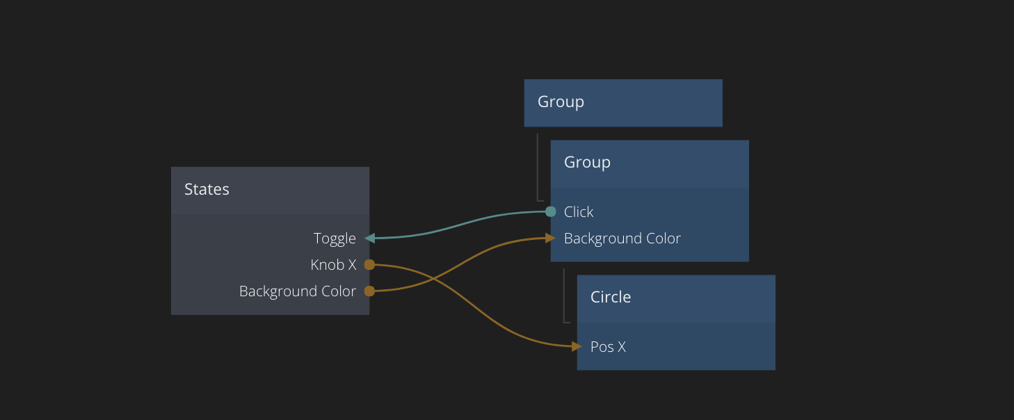
Finally, we can make the States node toggle state when the switch Group node is clicked. This is achieved by connecting the Click signal from the Group to the Toggle input of the States node. This will make the States node jump to the next state in the list and when the last one is reached it will jump to the first one again. In this case we only have two states, so it will toggle between On and Off.
Transitions
For number and color types the States node will try to smoothly transition between the states. Sometimes this is not the desired behaviour, and sometimes you want to change how the transition behaves. Noodl let's you edit the transition curves to change the transition behaviour. Take a look at the example below. You can copy the nodes and replace the old nodes in your project or create a new component.
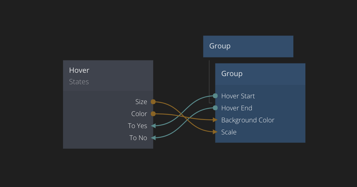
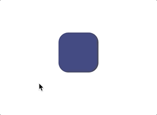
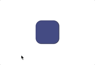
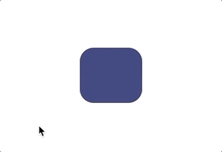
This simple graph has a States node that controls the hover state of a Group. As you can see the Group sends a signal when it is hovered which transitions the States node to the Yes state. A different signal is sent when the mouse leaves (you stop hovering), which changes the States node to the No state. The States node changes the Scale and Color of the Group node when it goes between its states. The effect is shown below:
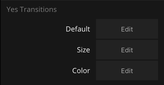
Both transitions (color and size) have the default transition curves. You can edit the transition curves in the properties of the States node. Look for the transitions when moving to the Yes state (i.e. the hovered state).
The Default property is a transition curve that is used for all values if they don't have a specific transition curve set for themselves. If you want to change the curve for all transitions use this.
In this case we want to change the curve for the Size transition. You can edit the curve via the curve editor.
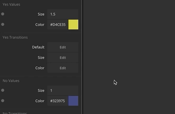
You can play with different settings for the curves and see them working when you hover the rectangle in the preview. Here is one example with a little bounce in the Size transition and a linear Color transition. Don't forget that you can use the preset icons on the right in the curve editor to choose between four presets:
- Ease In Slower in the beginning and accelerating towards the end.
- Ease Out Decelerates towards the end.
- Ease In and Out Smooth/slower start and end.
- Linear Linear animation, starts instantly and keeps constant speed.
Chaining States
You can also connect several States nodes together to create more complex types of animations. In the node graph below we have a second States node that expands the Group node (changes the width). The second States node labeled Expand changes the width between the states Yes and No. The neat thing is that it is triggered when the first states node (the hover states) has reached the Yes state. It is returned to No when the mouse leaves (the hover end), just like the first node.
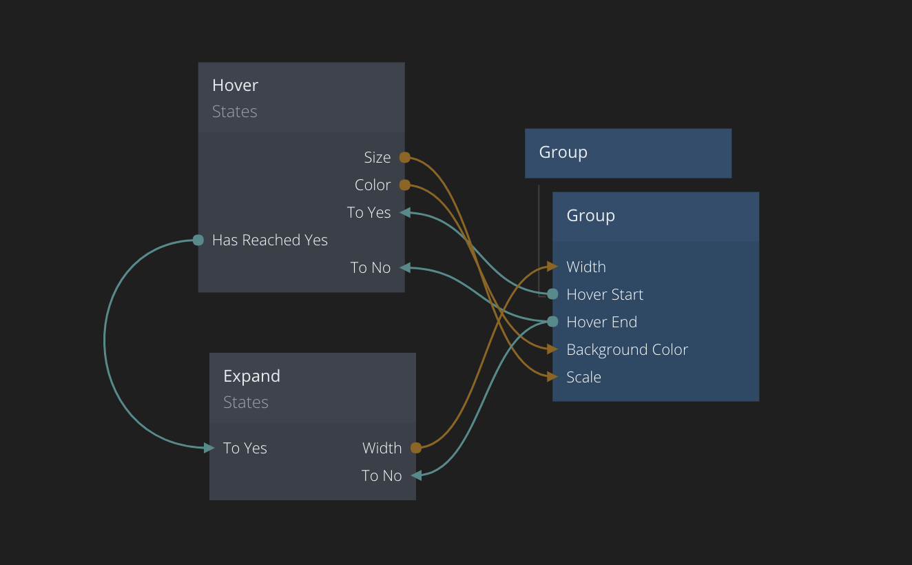
This will result in the behaviour shown below. As you can see the first States node triggers the bouncy size change, which is immediately followed by the second Expand states node that changes the state to Yes and transitions the width to the expanded state.
The States node is one of the most commonly used nodes in Noodl apps, and mastering it will let you create many great interactions. Have fun!