Toast
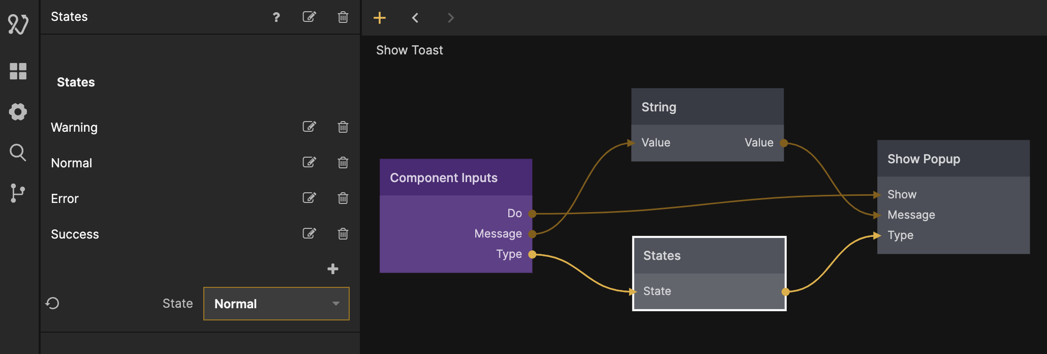
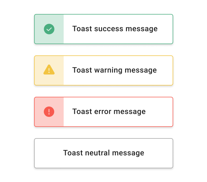
A UI component for displaying Toast messages. This UI component comes with four Toast variations; A Warning, Error, Success, and a Neutral variation. This component utilizes the Show Popup node to display the toast from a Signal input, you can read more about popups in this guide.
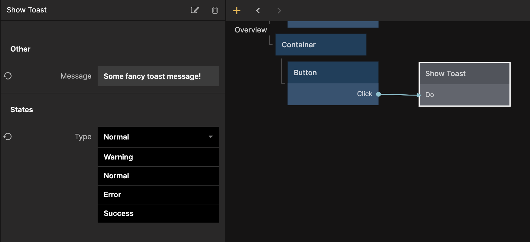
After cloning the prefab you will see a logic component called Show Toast in your project. The example below demonstrates how to show the Toast with a click event from a Button node, by connecting a Signal to the Do Input of the Show Toast node. In the Sidebar you can select what Toast type to show.
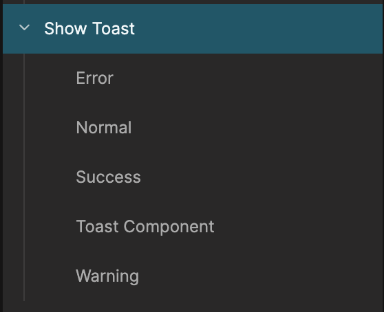
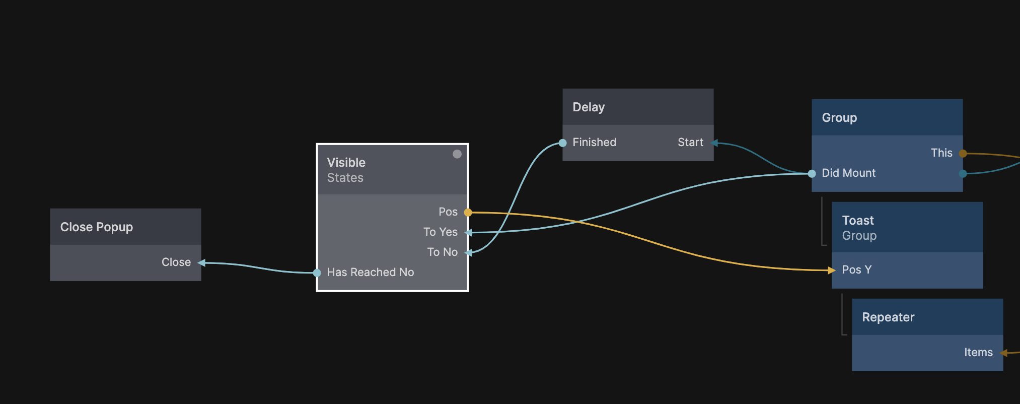
You can modify the appearence of the toast by editing the sub components of the Show Toast parent component. Each type of toast has its own component with its unique styling, and the Toast Component contains animations and logic that are shared between all types of toasts.
In the Toast Component you can modify the show and hide transition using the State node. You can read more about how to use the State node in this guide. A Delay node is used to control the time the toast is visible, and the Close Popup is triggered after the close transition is completed (important).
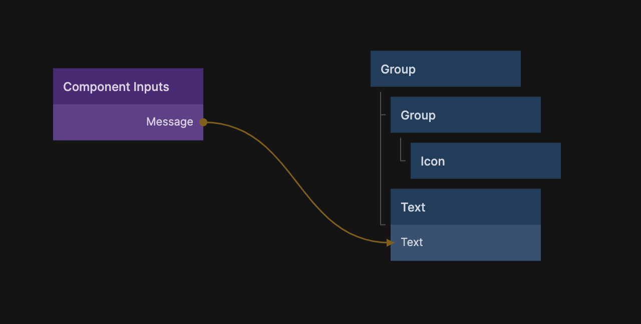
The content of a toast component for a specific type is faily straight forward. It contains the visual elements of the toast and the message as a Component Input.
If you want to add additional types of toast you will need to modify the State node in the Show Toast logic parent component. It contains a state for each type of toast. You will then need to create a child component with the corresponding name (simply duplicate one of the existing components, such as Normal and rename it).