Tags
This component can be used to display an array of objects with labels as tags. It can automatically create colors based on the label and you can receive click and optionally a remove signal (a small remove cross is displayed.)

You simplye provide an array of objects containing at least the Label property to the Items input.
[
    {
        "Label":"First"
    },
    {
        "Label":"Second"
    },
    {
        "Label":"Third"
    }
]
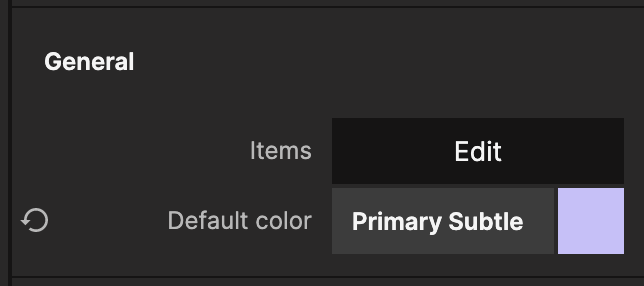
You can customize the color used for the tags via a property.
There are a couple of more options that is good to use. You can toggle if the the tags should be Removable (this will show a litte cross icon next to the label), and Clickable. By activating these you will also be able to receive the signals as shown later.
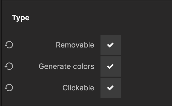
Finally you can enable Generate colors which will automatically create unique colors for all tags depending on the label text.
You can use the Tag Clicked signal along with the Tag Id output as shown below to trigger an action when a tag is clicked.
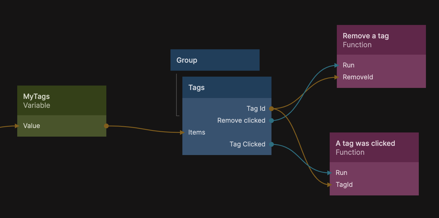
You can in the same way use the Remove Clicked signal to trigger an action when the remove cross is clicked. In the example above the MyTags variable contains an array of tags, the following Function code removes the tag.
Noodl.Variables.MyTags = Noodl.Variables.MyTags.filter(t => t.id !== Inputs.RemoveId)
It creates a new array, by filtering out the tag with the id equal to Inputs.RemoveId, which in turn is connected to the Tag Id output from the Tags component.