Tab Bar
This prefab contains a tab bar component that you can use to create tab style navigation.

The simple way to use it is to drag it into your project and specify the tabs using the Items input.
[
    {
        Label:"Tab 1",
        Value:"1"
    },
    {
        Label:"Tab 2",
        Value:"2"
    },
    {
        Label:"Tab 3",
        Value:"3"
    },
]
You simply provide a Label and a Value for each tab. The output Selected Tab will contain the value of the currently selected tab, and you can use it to mount / unount the different tab pages.
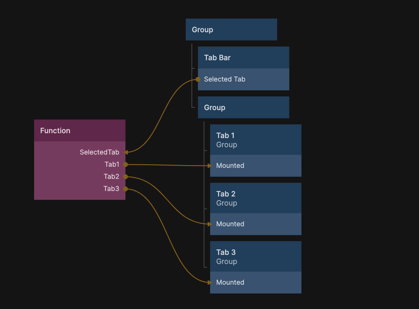
The example above uses a simple function node to create mount / unmount switches for each of the pages.
Outputs.Tab1 = Inputs.SelectedTab==="1"
Outputs.Tab2 = Inputs.SelectedTab==="2"
Outputs.Tab3 = Inputs.SelectedTab==="3"
You can change the appearance of the tab bar by editing the child component Tab Bar Item.
