Rating
A UI component for selecting a rating from 1 to 5 with stars. Adding more starts or a different scale can easily be modified in the component. This UI component uses the Icon node to show the stars, and can be changed to other icons as well like hearts, smileys, etc. if preferred.

After cloning the prefab you will see a logic component called Rating in your project. Place it into the dom-tree to render it.
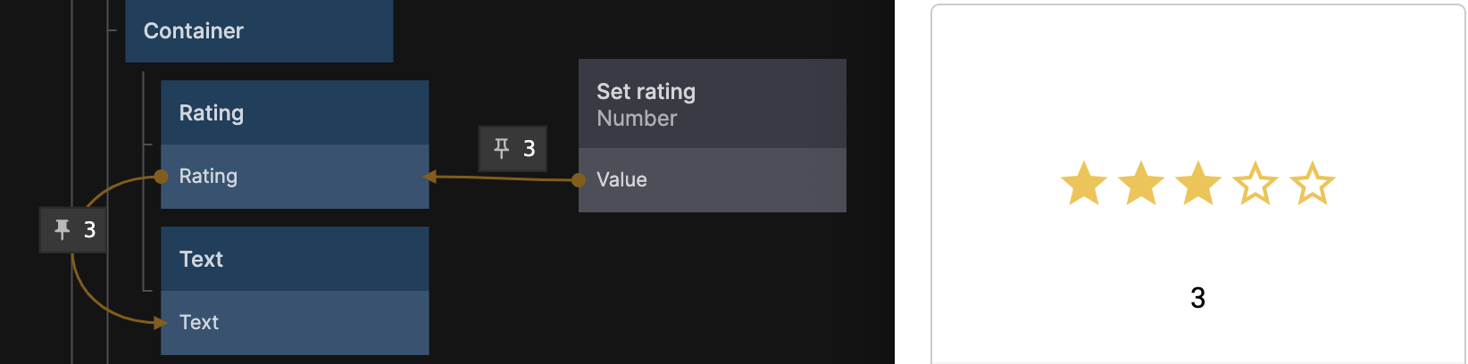
You can both set a rating to be displayed via the Rating Input, and get the selected rating from the Rating Output as shown on the image below.
The Rating output is a number between 1-5 by default.