Modal
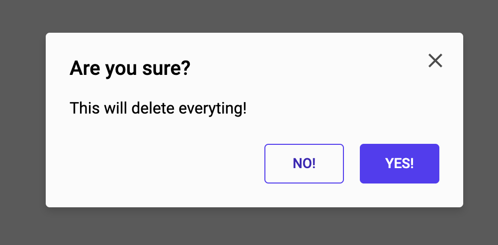
This prefab contains a simple confirmation popup modal. You can use it to display a message to your user and request a confirmation on an action.
It's easy to use, simply drag the Popup Modal action component to your node editor and connect the Show popup input to a signal.
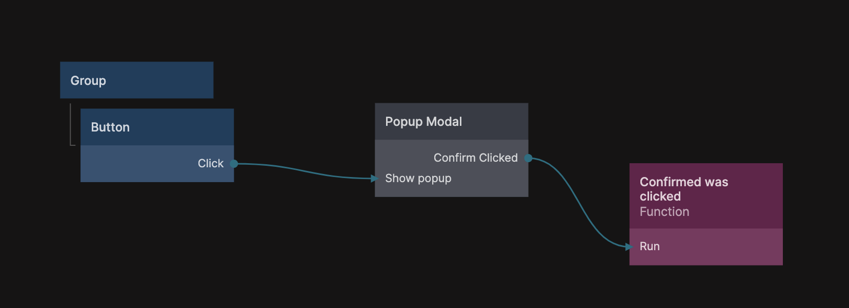
There are two Output signals that are emitted from the Popup Modal, one if the user clicked the confirm (primary) button and one if the user closed the popup or clicked the secondary button.
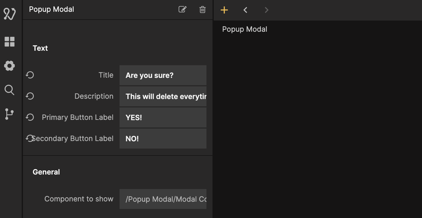
You can provide the labels for both message and buttons in the properties of the Popup Modal component instance.
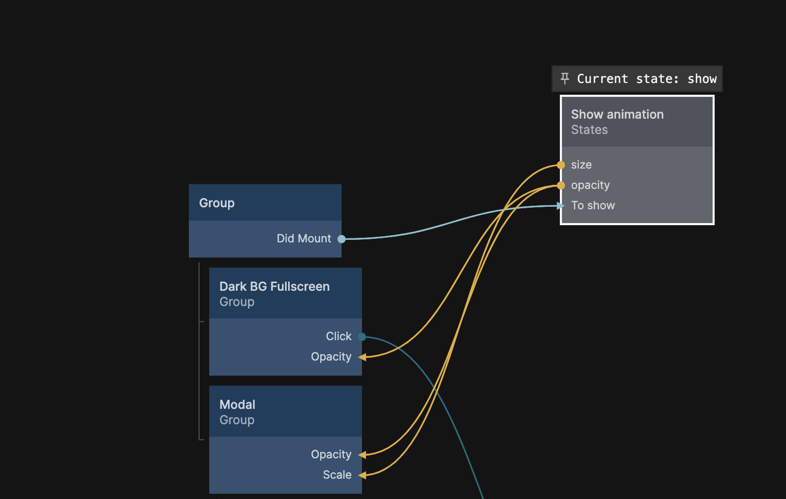
Often you will want to customize the appearance of the popup or you want to extend it with more functionality. It is good practice to duplicate the Popup Modal component and rename it to something descriptive, then you can always clone the prefab again if you need another type of popup. As a child component to the Popup Modal you will find another component called Modal Component. This component contains the actual visual elements of the popup as well as the animation for showing and hiding it.
The State node is used to control the show and hide animation. You can read more about how to use State nodes in this guide.
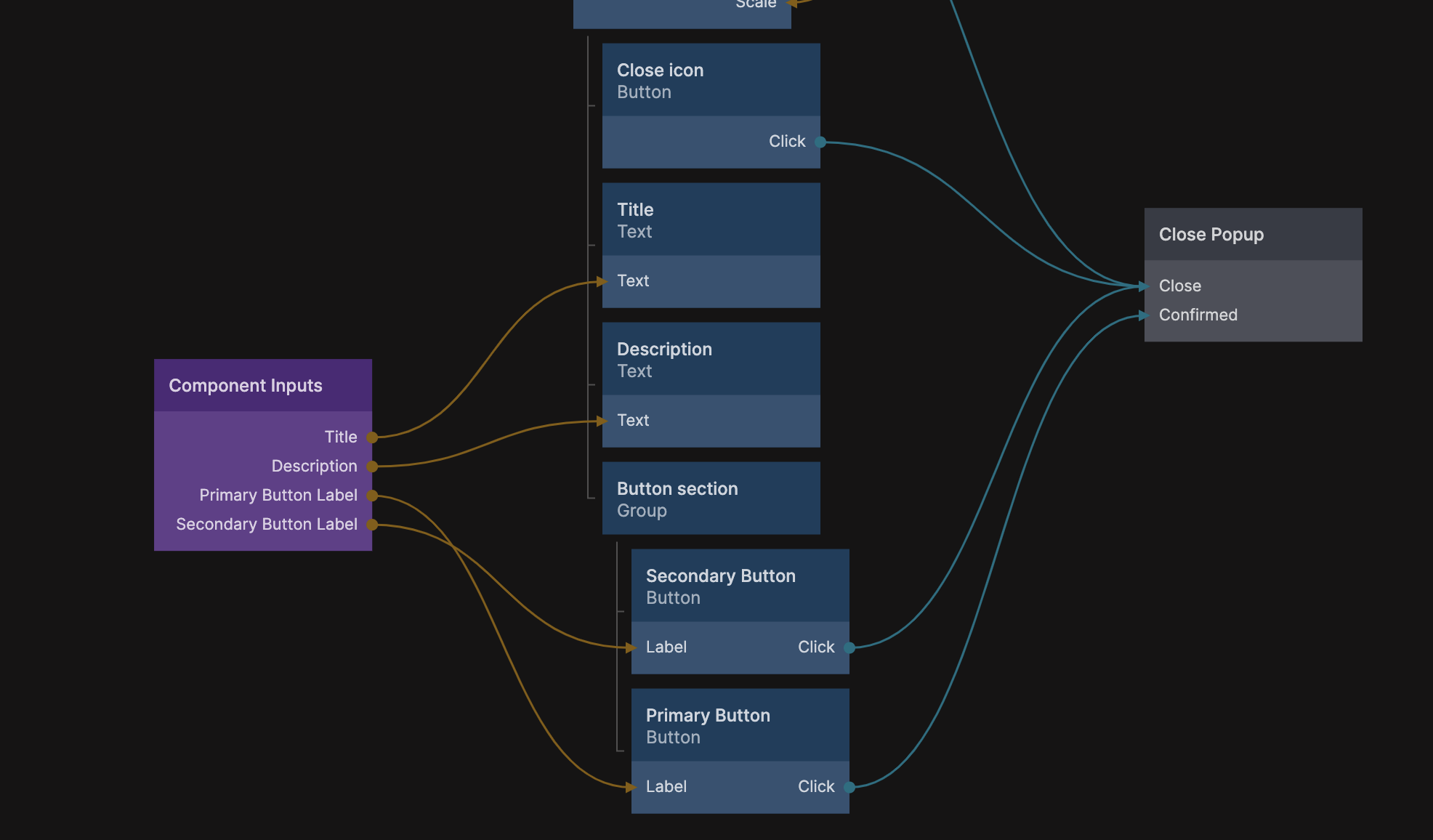
The Component Inputs is where the different labels are connected to the visual elements of the popup, and the Close Popup node contains the confirm action. You can read more about how popups work in this guide.