List With Icons
This is a very simple list component that you can use as starting point for building your own custom lists.
Basic usage
You specify the items of the list by editing the Items array in the List With Icons component. Below is the default value.
[
    {
        // Icons are references to material icons,
        // see https://fonts.google.com/icons?selected=Material+Icons
        Icon:"account_circle",
        Label:"List Item 1"
    },
    {
        Icon:"account_circle",
        Label:"List Item 2"
    },
    {
        Icon:"account_circle",
        Label:"List Item 3"
    }
]
- Icon This is an icon identifier, you can find a list of all supported icons here.
- Label The label that should be shown for the list item.
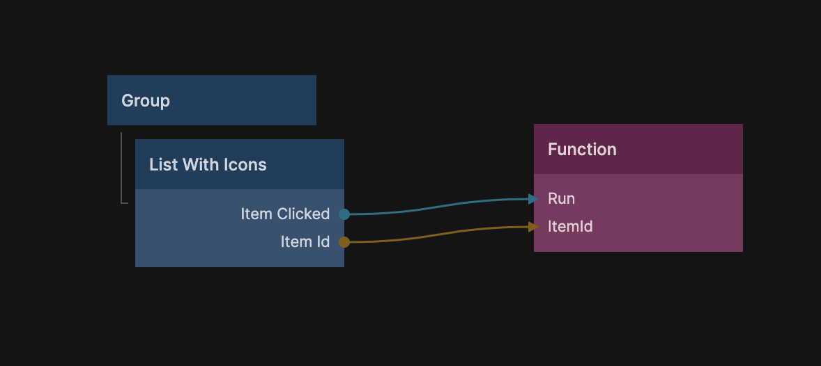
Item Clicked
The list has an output signal called Item Clicked when an item is clicked, and the output Item Id will contain the id of the object corresponding to that item.
The function node in the above example contains the following code:
const clickedListItem = Noodl.Objects[Inputs.ItemId]

console.log("This item was clicked: " + clickedListItem.Label)
Customizing
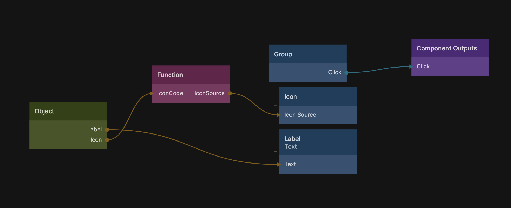
Like most UI Components in the library this is a great staring point for building your own lists. The best way is to look at the Item sub component of the List With Icons component. Here you can see how the Label and Icon are connected from the Repeater Object.
It's a starting point to build your own custom list items.