Form
A component for creating dynamic forms with validation quickly. Use as is, or as basis to creating your own custom form types.
There are guides on how to build forms using the simple approach, such as the UI Controls and data guide. But this approach has it's limits, specifically if you want to build big forms, it becomes cumbersome, and if you want dynamic forms, that is forms that change with data. This component is a great starting point for building dynamic custom forms quicker.
Basic usage
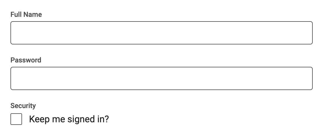
Simply dragging/adding the component to you UI will present the default form as shown above. First you need to know how to change which form controls to be shown. This is done by editing the Controls array of the Form component. This is what the default definition for the form controls looks like:
[
  {
    Type: 'Text Input',
    Label: 'Full Name',
    Property: 'Name',
  },
  {
    Type: 'Text Input',
    Label: 'Password',
    Property: 'Password',
    InputType: 'password',
  },
  {
    Type: 'Checkbox',
    Label: 'Security',
    Text: 'Keep me signed in?',
    Property: 'KeepSignedIn',
  },
];
The format is simply an array with an object for each control in the form. A control must have the following object fields:
- Type This is the type of form control that should be used, this value corresponds to a subcomponent of the Form component. So you can look at the sub components to figure out what type of controls are supported. Also, you can create your own types easily, more on this later.
- Label The label to be shown above the form control. You can of course change the appeareance of the controls completely by editing the corresponding sub component.
- Property This is important. Each form control will edit one property of the form values object, more on this later, but the property that this control will change is specified here.
Fields besides these ones are specific to the different form control types (you can take a look the different sub components on the Form to figure out what each type needs), this will also be important when we create our own types later.
Default form control types
These are the default form control types in the prefab:
Text Input, also accepts InputType which are the same as for the Text Input node, as well as Placeholder.Text Area, also accepts Placeholder. This is a bigger version of text input.Slider, also accepts Min, Max and Steps and will produce a number form value.Dropdown, also accepts an array with strings Options and a corresponding array Labels. The options array represents the different values that can be picked, and the labels array contains the labels shown in the ui control corresponding to each option value.Date Input, shows a date picker.Check Box, also accepts Text as an extra label, it will product a boolean form value.Single Choice, also accepts Options and Labels as with the dropdown, this shows all options as radio buttons.Multi Choice, also accepts Options and Labels as with the dropdown, this shows all options as check boxes.
Below you can read how to create your own form controls to extend this prefab to anything use case your require.
The Form Values Object
The Form does not have outputs for the values inputted, instead it uses an object that it fills with the values of the form controls. This is where the Propetry field above comes into play, as it is used to designate the property that particular form control will read from / write to. There are two ways to provide a form value object to the Form either you provide an Id to an object or record that you want the Form to use for values.
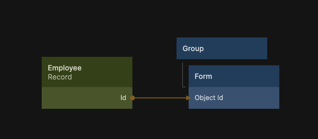
This is typically done if you want to edit an existing object or record. Here is a more complete setup for how to edit a Record using the form. A button is added at the bottom to save the result after editing. The Set Record Properties should have Properties to store set to All which will have it store the modified record to the cloud when the button is clicked.
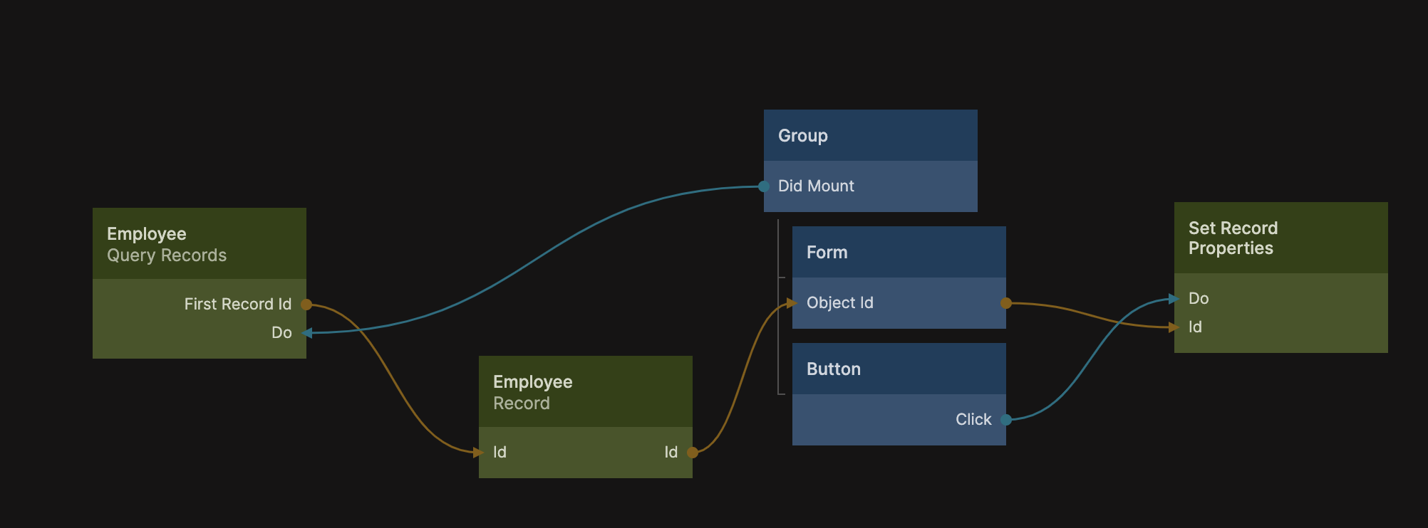
If you don't provide a value to the Object Id input an object will be created automatically to host the form values and you can use the output Object Id to retrieve it, as shown below. When you edit the Form the object will be populated with the values.
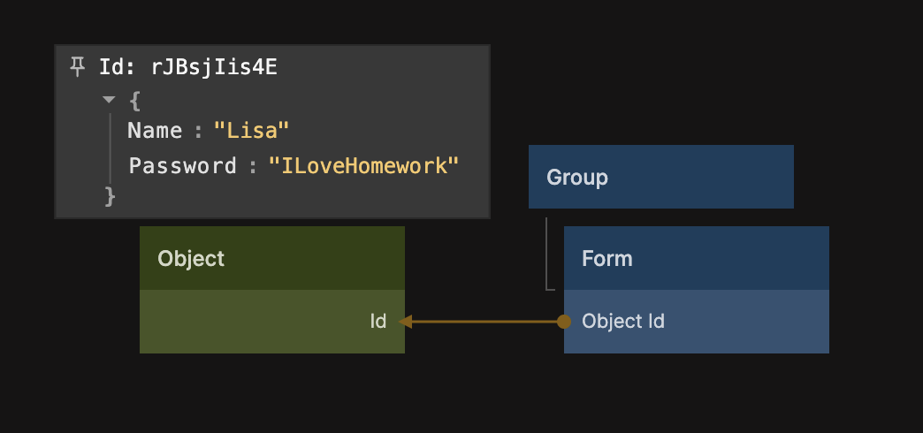
This approach is best used if you are creating a new object. You can use this together with the Source Object Id on the Create New Record node to easily create a new record from the form, e.g. when a "create" button is clicked.
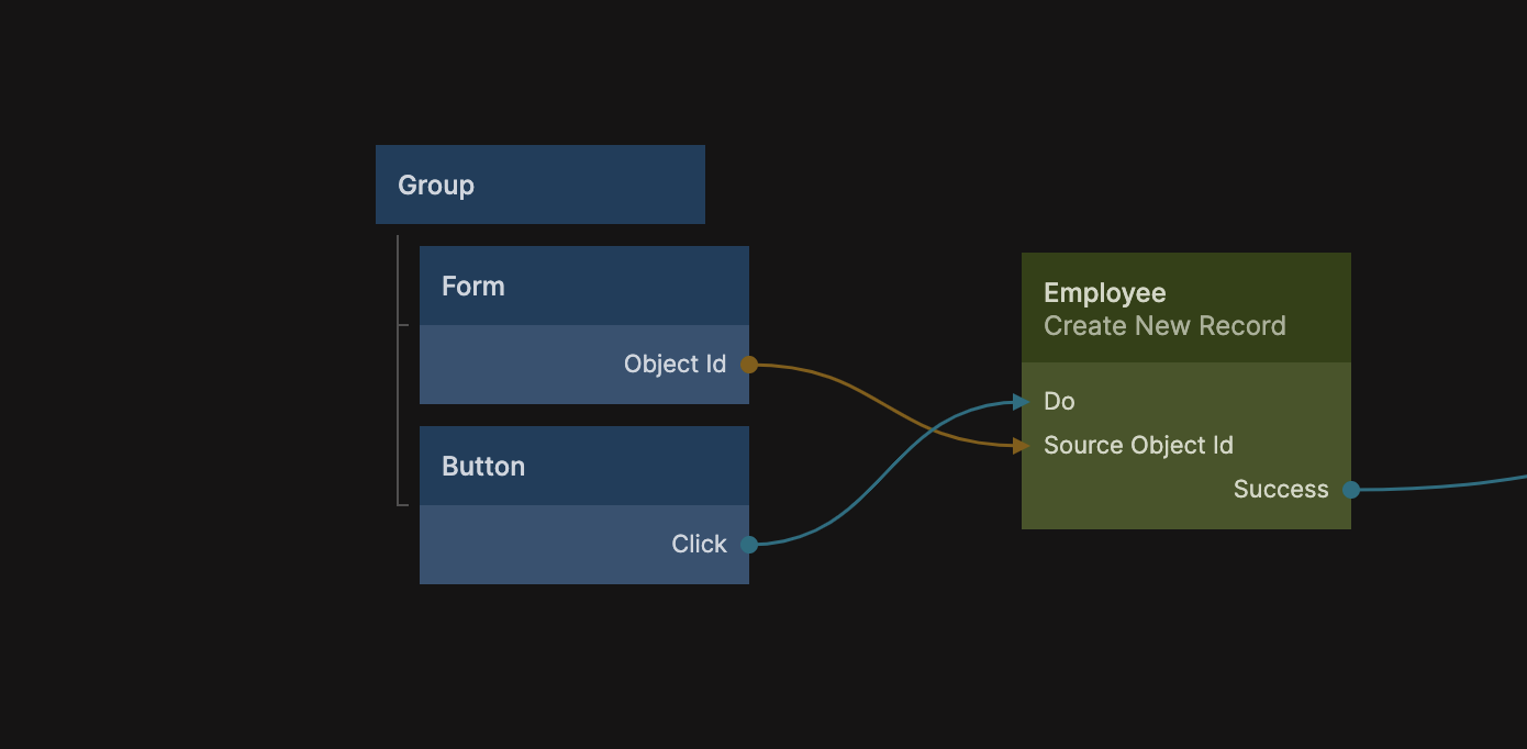
In both examples above the Employee record class is an example, you must make sure to provide correct Controls to your form for the type of object or record you are editing or creating. So you have appropriate type of form controls with matching Property values.
Validation
Validating forms are important and can often be a bit tricky to get right, the Form component have some of that tricky stuff taken care of you. Your job when validating is simply to validate the form values object and provide an array of errors to the Form in the following format:
[
    ...
    {
        Property:"Name",
        Error:"Name is a required field"
    },
    ...
]
One way to do this is to add a Function node that does the validation of the form values object and provides the Errors array as above. The example below:
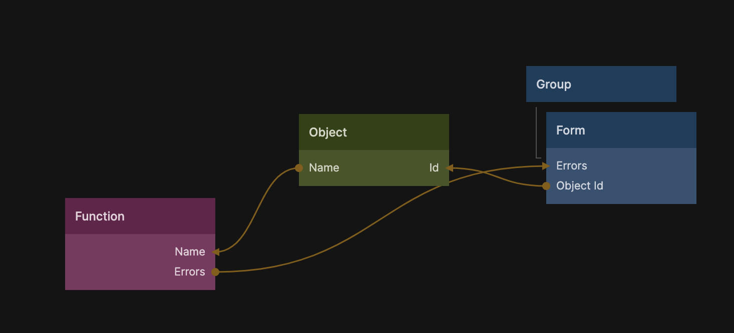
Has the following function for simply checking the Name property of the form values object. You could add more checks to this function.
const errors = [];

if (Inputs.Name === undefined || Inputs.Name === '')
  errors.push({
    Property: 'Name',
    Error: 'Name is a required field.',
  });

Outputs.Errors = errors;
If you provide an empty error message it will not show. Also the Form keeps track on if the form controls have been touched by the user and does not show the error messsage before the user have attempted to edit.
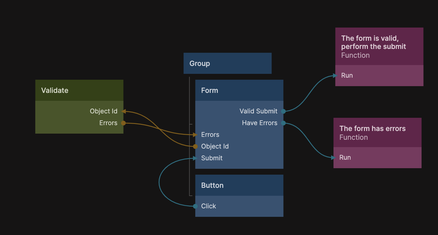
There is an even better way to do validation of forms using the Form Validation module, you can find the documentation for that module here. In essense the module will give you a new node called Validate that can take the Id of your form values object and perfom validation on it.
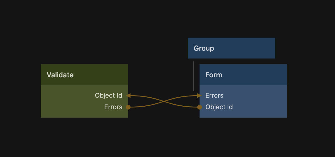
The Validate node has a very handy output called Errors that provide the errors resulting from the validation (if any) that has the correct format and can be passed directly to the Form component. You can read more about exactly how to do validation using the Validate node in the guide but in essance you provide a schema that the object must adhere to in order to be validate, and error messages if it does not pass. You can edit the schema from the properites of the Validate node, here is an example:
schema({
  Name: string().required('Must provide name.'),
  Email: string().required('Must provide email.').email('Not valid email.'),
});
This will require both the Name and Email fields of the form values object, and also make sure that the Email property is actually correctly formatted.
When the user hits the Submit action, usually a button, you can trigger the Submit signal of the form which will make a final check and the emit the Valid Submit event if the form is validated.
That is everything you need to perform sophisticated validation of your forms. As with the form controls you can find and modify the Error sub component of the Form component you imported, if you want a different look or behaviour.
Custom form controls
There are a couple of default form controls, Text Input, Checkbox, Slider, Dropdown, Date Input, but as always the power of Noodl is building your own custom components. The Form component will function as a framework for you to build your own custom forms.
As you can see the different form types that you can specify in the Controls input array via the Type property.
[
    ...
    {
        Type:"Text Input",
        Label:"Full Name",
        Property:"Name",
    },
    ...
]
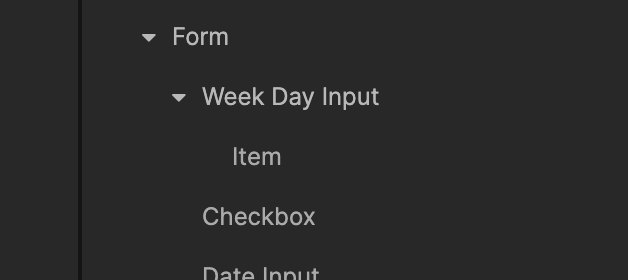
You can add you own form conrols by simply adding another visual component child to the Form component, let's say we want to create a week day picker. We create a component called Week Day Input and as a child an Item component.
When these components are in place as child components to Form you can use them by modifying the Controls array.
[
    ...
    {
        Type:"Text Input",
        Label:"Full Name",
        Property:"Name",
    },
    {
        Type:'Week Day Input',
        Label:'Choose a day of the week',
        Property:'WeekDay'
    }
    ...
]
All form control components must follow a similar pattern. Let's look at the content of the Week Day Input form control.
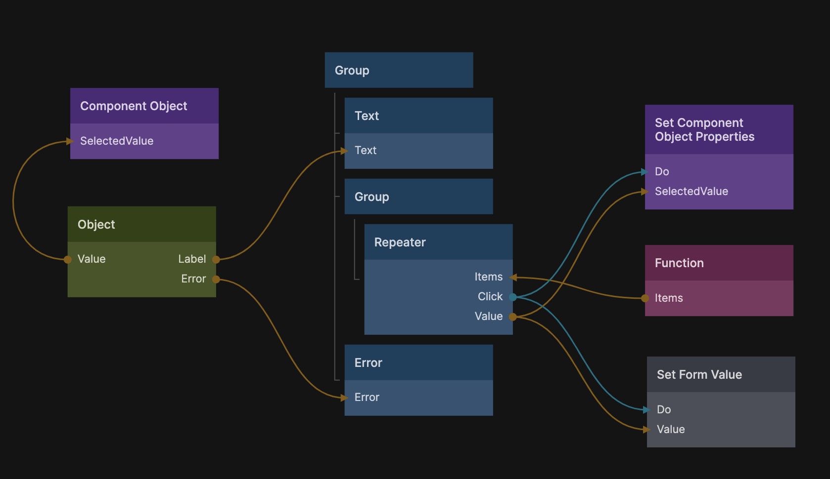
A few important things to cover in this component. First all form controls can use the Repeater Object to access properties from the individual objects in the Controls array.
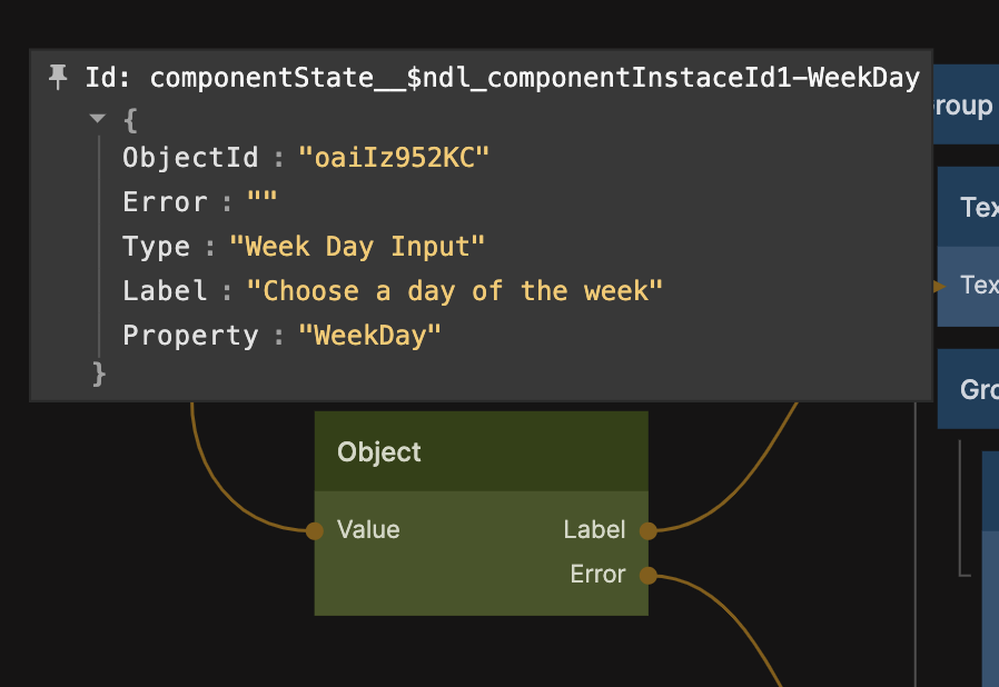
Once you have added the form control to your Controls array and it is visible on screen, you can inspect the repeater object to see what it contains.
- Value This is the value for the form control, this will read from the form values object.
- Label The label to show for this form control.
- Error Any error in validation of the value for this form control will be available here, it's the responsibility of the form control to display the error as it sees fit.
Any other properties are simply copied from the corresponding object in the Controls array.
This particular input displays an array with all the week days, generated by the Function node.
Outputs.Items = ['Mon', 'Tue', 'Wed', 'Thu', 'Fri', 'Sat', 'Sun'].map((d) => ({
  Label: d,
  Value: d.toLowerCase(),
}));
The current selected week day value is stored in the Component Object, when an item is clicked the value for that day is written to the Component Object using the Set Component Object Properties node.
There is one important thing we left to cover. The Form component has a special action that should be used to set the value for a form control. The component is a child of the Form component and called Set Form Value. It's dragged it into the Week Day Input component and connected as follows:
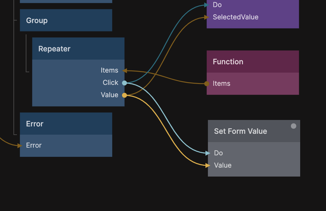
This step is important as it is what actually writes the value of the form control to the form values object.
Below you can see the nodes for the Item child component of the Work Day Input component, it simply contains a button that is repeated for each day.
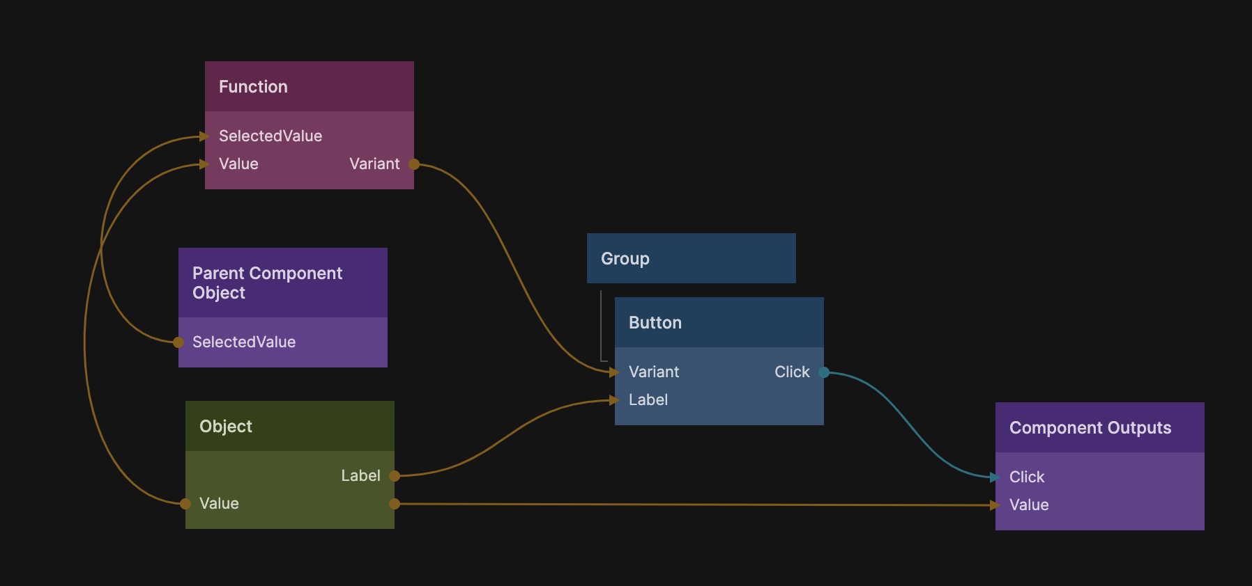
It also checks the SelectedValue of the parent component (in the function node) and supply a different variant depending on if this instance is selected or not.
if (Inputs.SelectedValue === Inputs.Value)
  Outputs.Variant = 'Week Day Button Selected';
else Outputs.Variant = 'Week Day Button';
Having different variants for different "states" of a UI control like this is a handy pattern because you can always go in and change the variants (colors, transitions, behaviours) without having to modify the code.
Finally the Value of this week day item is sent with the Click signal from the button.