Simple Tooltips Module

This module allows you to add simple tooltips to your Noodl App, they are designed to only show text and simple HTML.
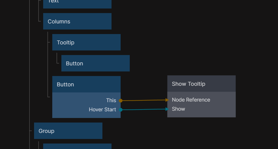
Included in this module are 2 new core nodes. The visual node Tooltip and a logic node Show Tooltip.
Getting started
After importing this module you will see 2 new nodes in the node picker called Tooltip and Show Tooltip in external libraries category.
We can start by placing the Tooltip node into our visual tree, and a button inside.

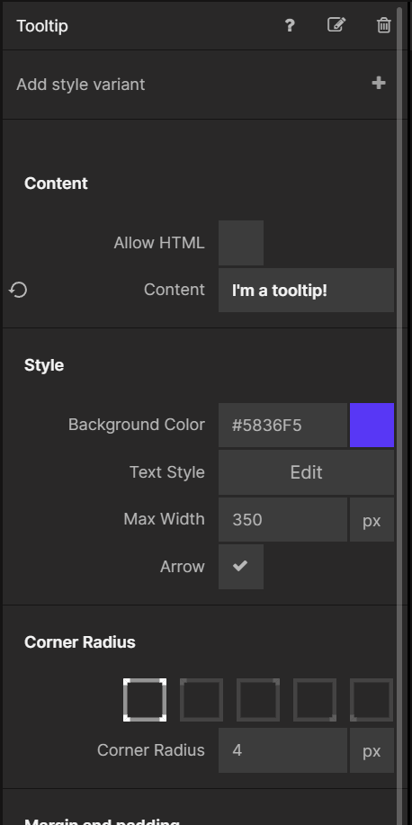
After that we will do the most important part, setting the content inside the tooltip. This can be done via the Property Panel when selecting the Tooltip node.
Now when you hover the mouse on top of the button you will see the tooltip.

But the tooltip is not in the center of the button, that is because the tooltip is taking 100% width. In most cases, the content inside is also 100% width. But if you want it to be to the content size, you can place a group above it which is content size.
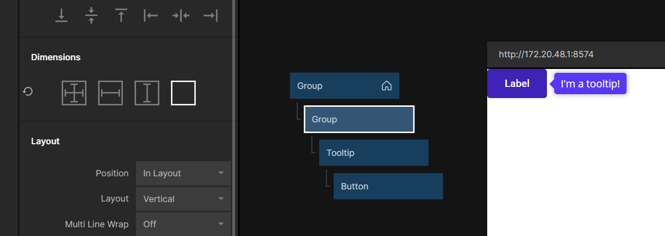
And now you have a tooltip!
Tooltip and Show Tooltip differences
These nodes share the same inputs the only differences between them are:
- The logic node needs to have a
Node Referencepassed in so it knows where to be attached. - The visual node has a 100% width and content size height, so it might change the layout a little.