Popups
What you will learn in this guide
This guide will teach you how to use Popups in Noodl (represented by the Show Popup and Close Popup nodes). Popups are modal UI components that's put on top of the regular UI flow i.e. you have to close them to return to the main flow. They are typically used to present confirmation dialogies ("Save / Cancel?") or error messages. They can also be used to present inline UI flows, for example wizards and forms, that need to be completed as part of another flow.
Overview
The guide will cover the following topics
- Simple styling of Popups
- Opening and closing Popups and sending the result of a popup
- Advanced styling of Popups
- Making a reusable, extendible Popup component
The example we are building in the guide will make use of lists so it's recommended to have done the List Basics guide before starting this guide.
What's a Popup in Noodl?
Basically any component you create can be opened as a Popup in Noodl. A Popup is layered on top of your regular UI that originates from the root node of your App. Also, when the Popup is open, you cannot interact with any of the control in the regular tree.
Let's try it out.
Some initial UI
We are going to create a small App to add Popups into. Start a new project in Noodl and select the "Hello World" template. Then remove the Text node. We want to create a list of people. Let's start with some static data. Add in a Static Array node. Make sure it's set to JSON type and paste in the data below.
[
    {"firstname":"John", "lastname":"Barry", "age":24, "location":"Bristol, England"},
    {"firstname":"Stefani", "lastname":"Worthington", "age":41, "location":"Kilkenny, Ireland"},
    {"firstname":"Lisa", "lastname":"Hunter", "age":22, "location":"Wigan, England"},
    {"firstname":"Ronan", "lastname":"Holden", "age":56, "location":"Aberdeen, Scotland"},
    {"firstname":"Martin", "lastname":"McCarthy", "age":26, "location":"Glasgow, Scotland"},
    {"firstname":"Rodney", "lastname":"O'Hara", "age":53, "location":"Dublin, Ireland"},
    {"firstname":"Phil", "lastname":"Lineker", "age":21, "location":"Hartlepool, England"}
]
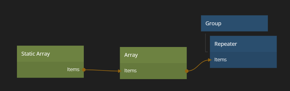
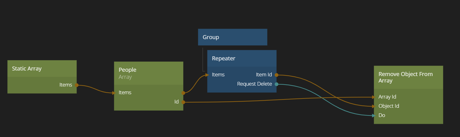
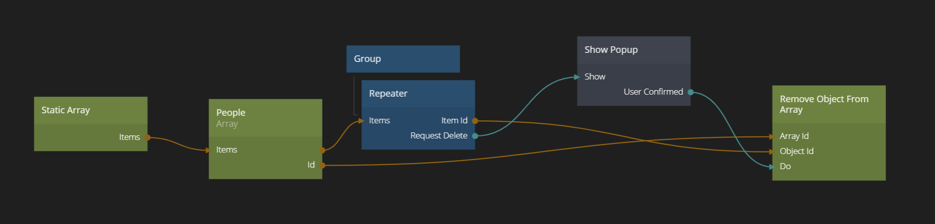
Then add in a Repeater node under the root Group node. Also add an Array node next to the Static Array. Give the Array the Id People. Finally connect the Item output of the Static Array to the same input on the Array. Then the Items output from the Array to the Items input of the Repeater.
Your main app should now look something like this:
We need to create a list item as well. Create a new visual component. Call it List Item.
Do a simple layout visualizing the data items in the Static Array. You can for example copy and paste the nodes below into the list item component.
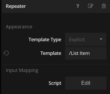
Then set the newly created List Item component as the Template in the Repeater node.
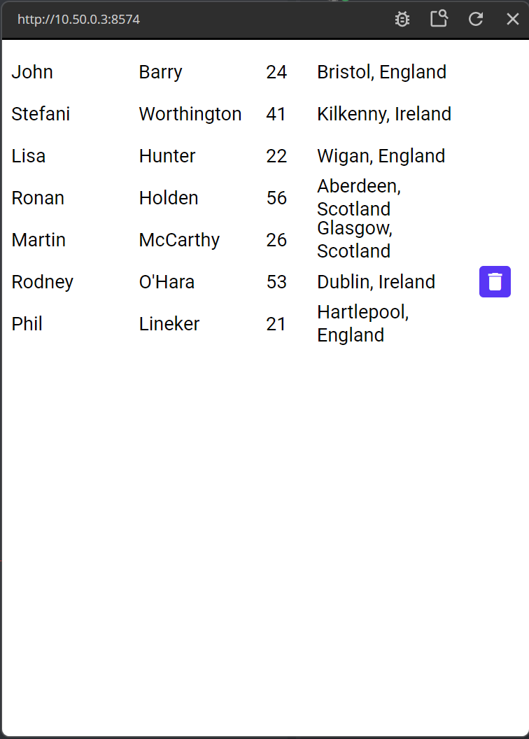
You will now have a list of people that looks something like this:
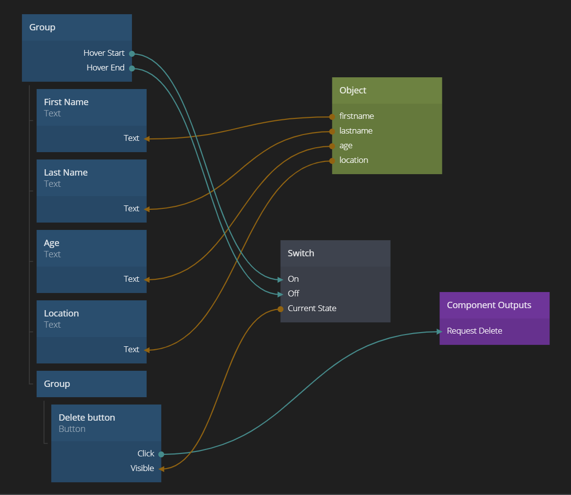
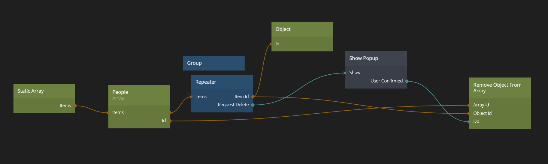
Now let's implement delete on this list. The delete button is already there. When the user clicks the delete button we want to trigger the Remove Object From Array node, with the Id of the People Array and the id of the Object to remove fed into it. There is a specific guide on Arrays if you want to learn more about how to manipulate Arrays.
The remove functionality is implemented like below in the main App.
Try clicking the delete button on some items. If you refresh the viewer, they will re-appear, since they are stored in a Static Array.
Implementing a Confirm Popup
A typical case to use a Popup is to confirm a destructive action such as a deletion. So let's create a Popup for that.
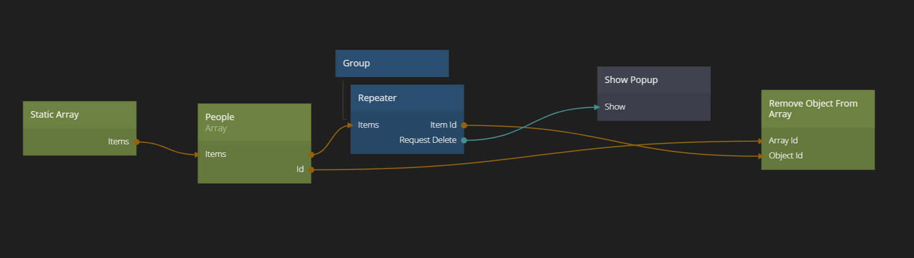
Create a new visual component. Call it "Confirm Delete Popup". Then, also in the main App, create an Show Popup node. Connect the Request Delete signal from the Repeater to the Show signal of the Show Popup node. Clicking the delete button will now open our Popup. However we need to tell the Show Popup node which component to show. Select the newly createad "Confirm Delete Popup" component.

Layout and visuals of a Popup
Go into it the Popup component. Popups are layed out in an individual layer on top of everything, so you can more or less see it as a new root node.
The Popup Background
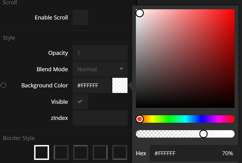
We start by modifying the root Group node. This is typically the background of the whole Popup layer, i.e. you probably would want to make this cover the whole screen and perhaps make semi transparent. We cannot use the Opacity to make it transparent, because that will be inherited by all the children of the Group as well. Instead we chose a semit transparent color. It will sort of fade out what's behind the popup.
The Popup Dialogue
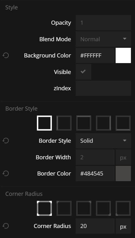
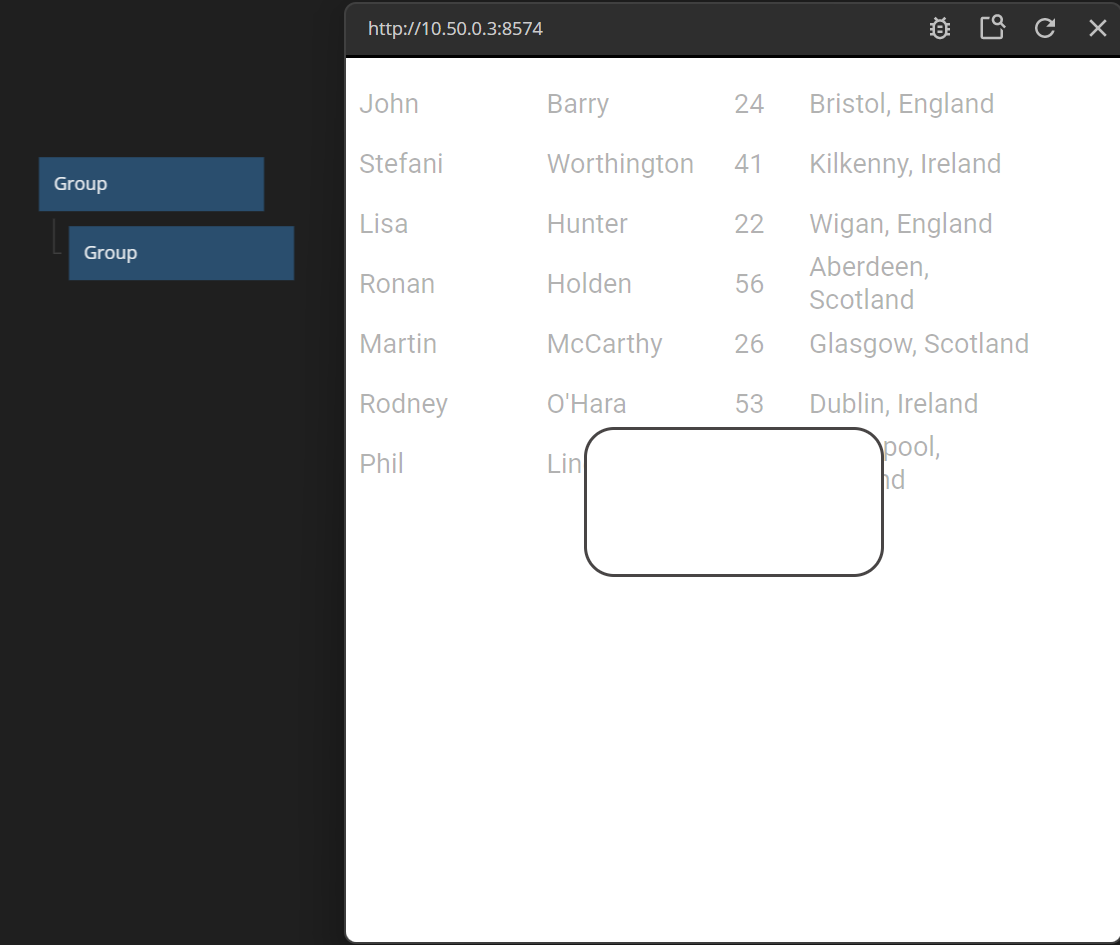
The next thing to build is the dialogue. We want it to be nice and rounded. Let's add another Group node. Give it a white color. Also make the corners rounded, with a grey color and a corner radius of 20 pixels.
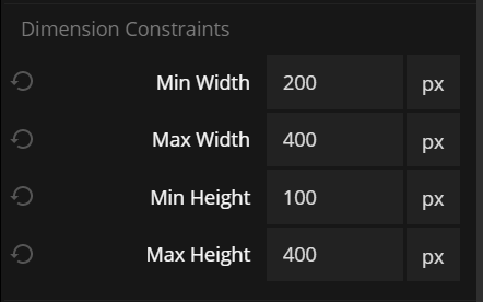
The size of the popup is interesting. We want the size to be dependen on its content. At the same time we don't want it to be too small or too wide horizontally. So we set its size to content size and center it horizontally and vertically.

Then and then go ahead set
- Min width = 200 px
- Max width = 400 px
- Min height = 100 px
- Max height = 100 px
Finally add some padding, 15 px in all directions. The popup should now look something like this:
Adding some content
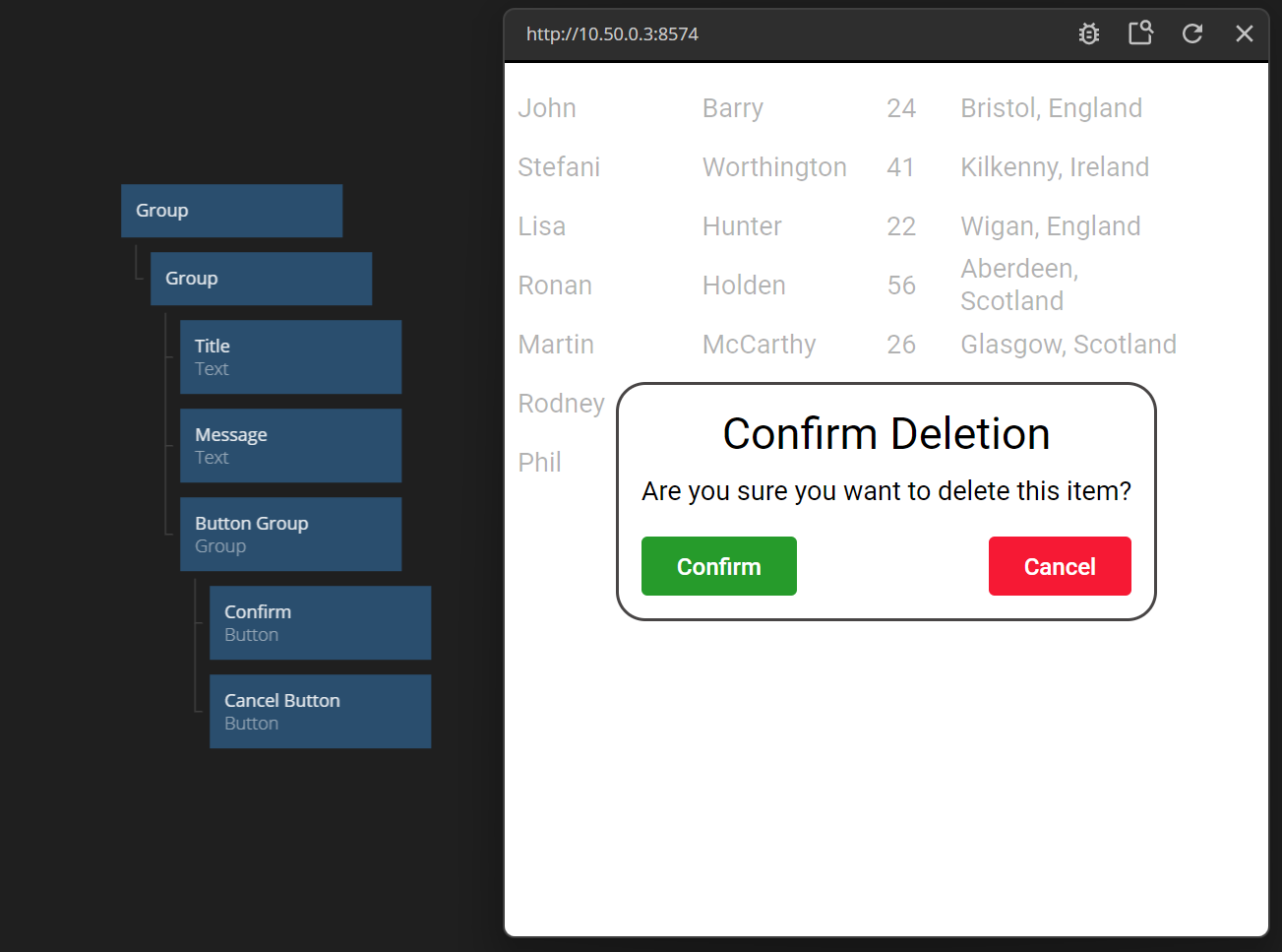
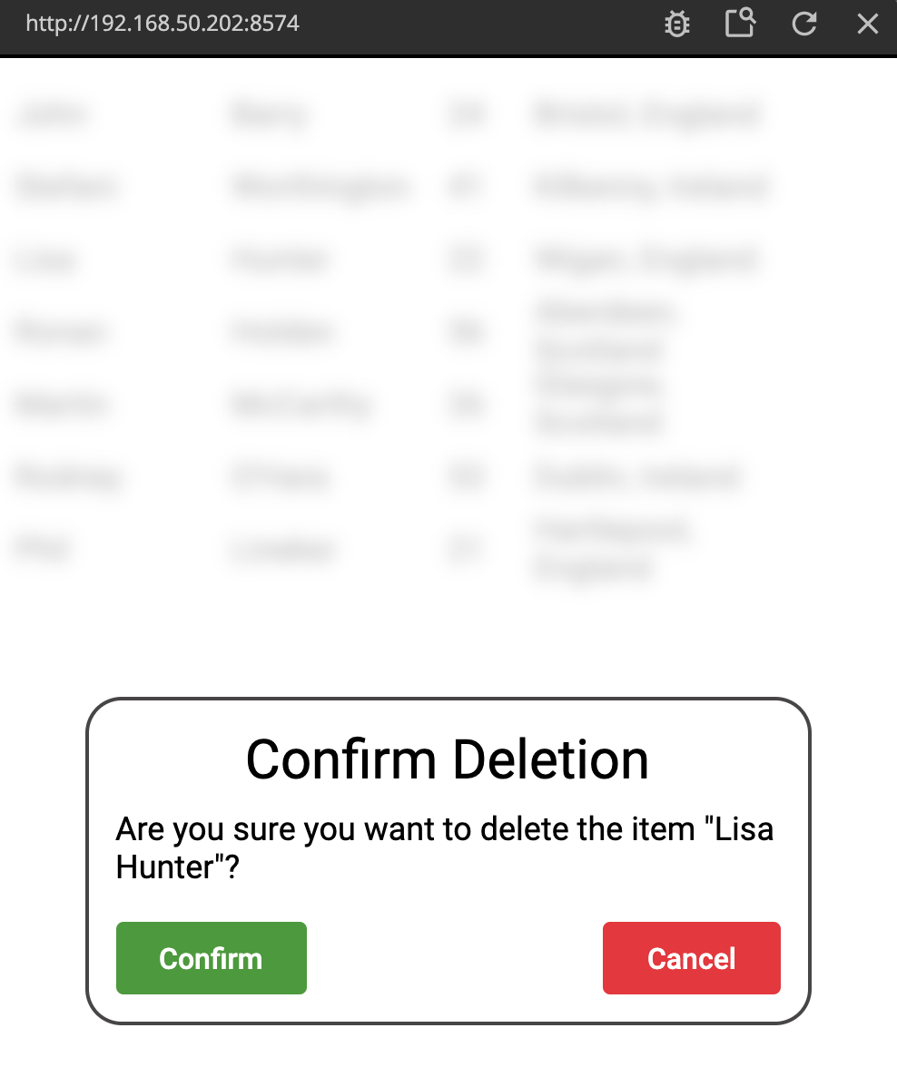
So let's add some content. A Text node which is a title, (i.e. give it a larger font size, perhaps 30 px and with centered text). Then another smaller Text with the actual deletion message. Finally add a Group that will contain the two buttons, layed out horizontally. Add the two buttons (one green and one red). Align them to the left and right. Finally add some margins to make things look less constricted.
You popup will now look something like below. You can also copy and paste the nodes if you want this exact look.
Passing data and signals to and from Popups
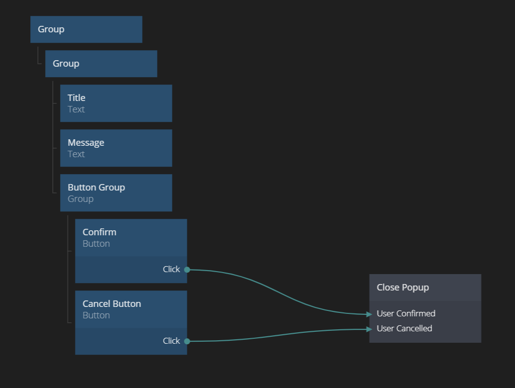
Great, we have our first Popup. Now we need to do something with it. We need to know whether the user clicked "Confirm" or "Cancel" and of course close our popup. You can do this using the Close Popup node. Add one to your Popup Component. Click on it to see its properties.

As you can see it has two sections: Results and Close Actions.
In the Results section you can add any number of inputs to pass data from the Popup back to wherever it was opened. And Close Actions is used to pass actions (i.e. signals). Whatever you add here, will be added as output signals to the Show Popup node that opened the Popup. We need to be know whether the user clicked Confirm or Cancel. The easiest way to pass this information is as signals. Create two Close Actions one called User Confirmed and one called User Cancelled. Connect the two signals to the respective button.
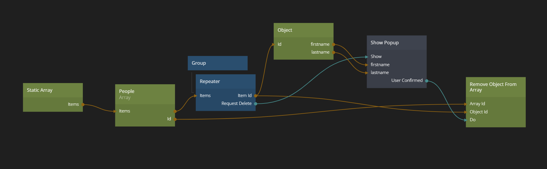
Then go back to the main App to use the signals to handle the delete. We simply hook up the User Confirmed signal to the Do signal of the Remove Object From Array node. Easy!
Nice. Let's also pass some data to the Popup, the name of the item we want to delete.
First we need to assign the Id we get from the Repeater to an Object. Create and Object node and add two properties, firstname and lastname. Connect the Item Id from the Repeater to the Id of the Object.
Then we need to go into our confirmation Popup and add in a Component Inputs. Add two properties, firstname and lastname. We want to incorporate the first and last name into our message. So also add a String Format node. Enter the following text in the node:
Are you sure you want to delete the item "{firstname} {lastname}"?
firstname and lastname will now become inputs on the String Format node and you can connect the outputs firstname and lastname from the Component Inputs node. Finally connect the Formatted output from the String Format node to the text of the "Message" Text node.
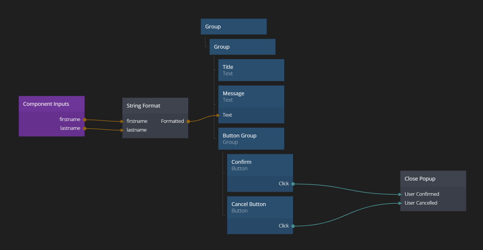
The last step is to connect the firstname and lastname of the Object to our two new inputs on the Show Popup node, coming from the Component Inputs we just added.
Advanced Styling
Let's make our Popup a little more dynamic by adding some animations to it. We can use the Did Mount signal from our root Group in the Popup component to trigger a transition when the Popup is opened. We can also use some fancy CSS for our backdrop. Let's start with the latter.
Click on the root node of the Popup Component. Find the attribute CSS Style. Set it to backdrop-filter: blur(5px);
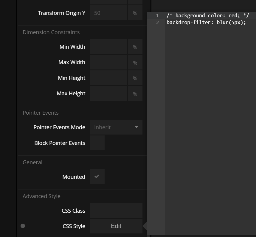
This adds an extra blurring effect to the background. Note that this CSS-effect is not supported by old browsers.
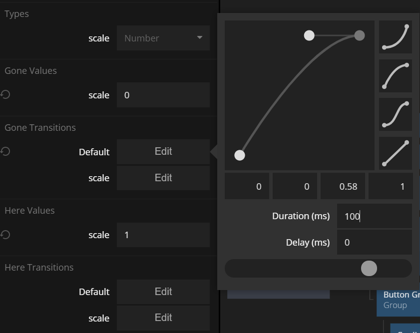
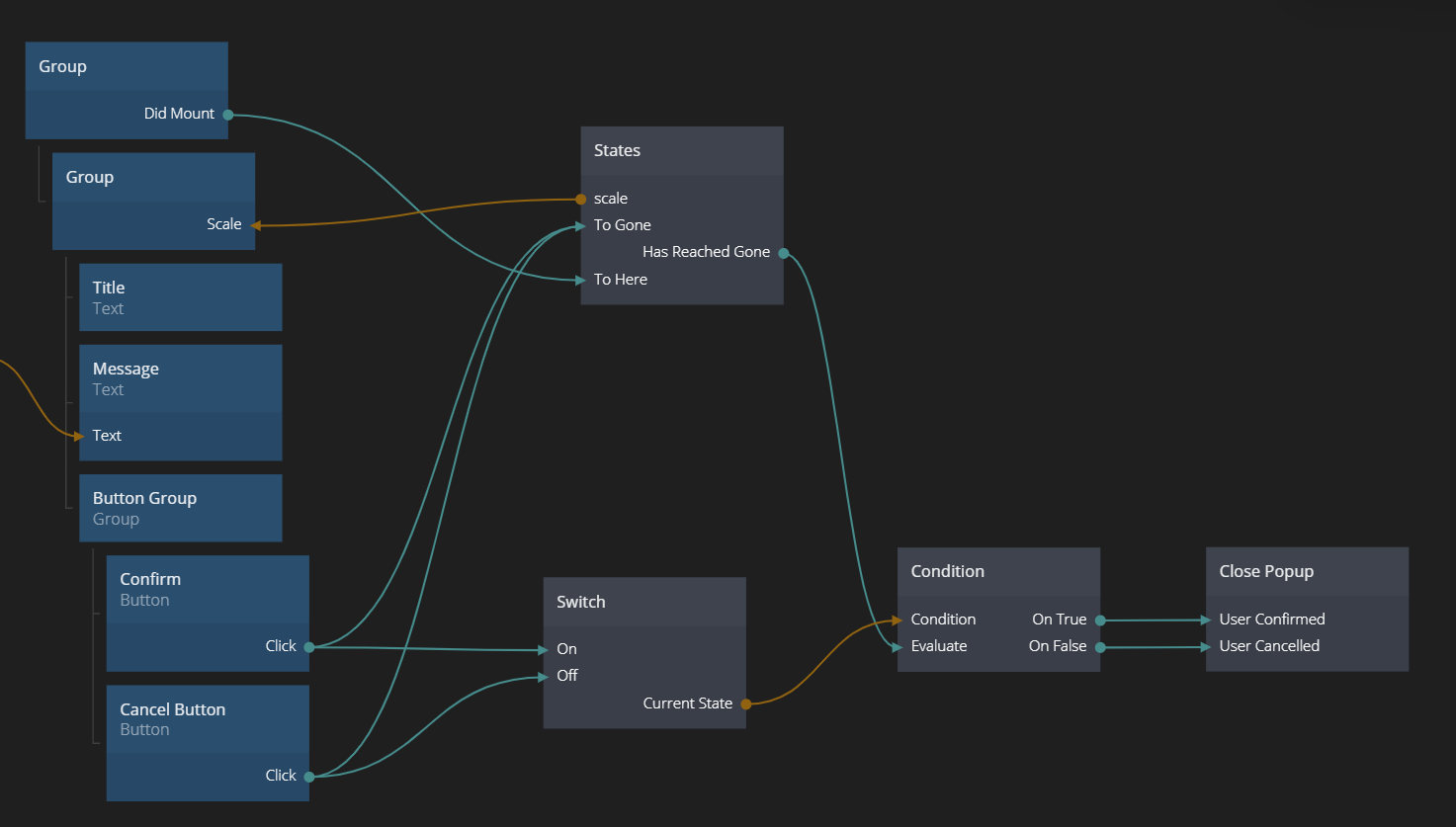
Then we want to animate the size of the Popup when the it appears and disappears. Start by adding a States node. Give it two states: Gone and Here. Create a value called scale. Set it to be 0 in the Gone state and 1 in the Here state. Make sure the initial state is Gone.
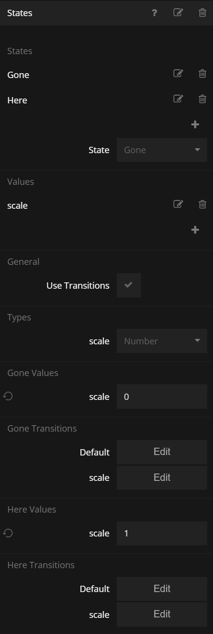
Also set the length of each transition to 100 ms - this transition need to go fairly fast to not be annoying.
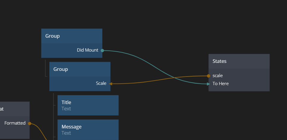
Then make the States node go to the Here state when Did Mount trigger. Connect the scale output to the Scale value of the Popup group.
Try it!
To reverse the transition when closing the Popup is a little more complicated because we need to wait for the transition to end before we send our Close Popup signals. So we need to add some logic.
First connect Click from both buttons to To Gone on our States node. That will trigger the transition. Then, we need to store which Button that was clicked wo we can send the correct signal to Close Popup. We do that using a Switch that's set to either On or Off (true or false) depending on which button that was pressed. When the animation is over (the At Gone signal will be triggered) we evaluate a Condition Node to see which close signal we want to trigger.
Building a Wizard-type Popup
As you probably know an App typically contain many types of Popups, for example Error Messages, confirmation dialogues and maybe multistep wizards. For that reason we want to refactor our Popup and make parts of it reusable and to make all Popups consistent in how they look and behave.
Making a Re-usable Popup Component
First we want to figure out what parts that all Popups should have. In this case we want the generic parts to be
- The background and layout of the Popup but not the content inside it (e.g. the text message and the Buttons)
- The title text
- The animation behavior
Let's start by duplicating our Confirm Delete Popup component.
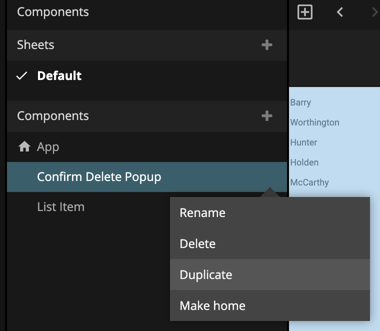
Rename it to Popup Base. The idea is that all popups should be based on this component going forward.
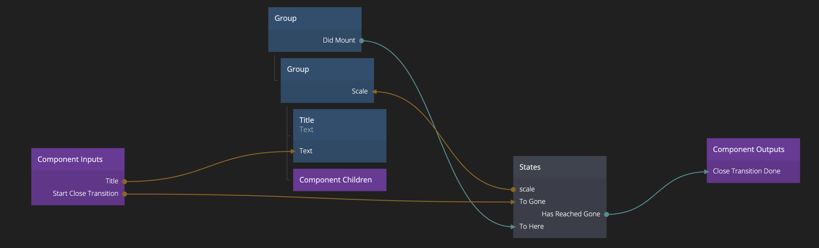
We want to remove everything that is specific to the previous delete confirmation popup.
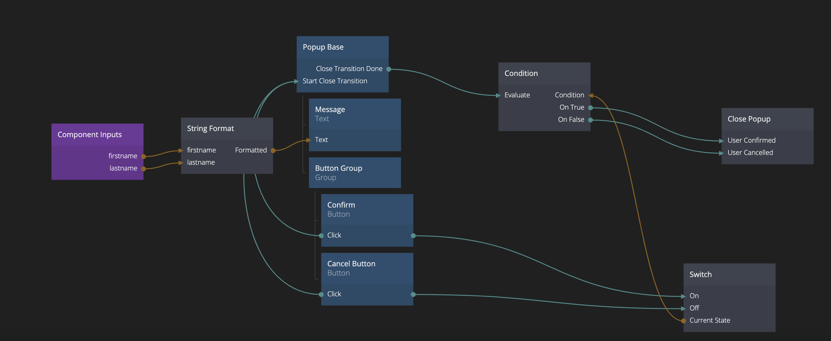
Remove the String Format node and the properties from the Component Inputs (firstname, lastname). Instead add a new property called Title. Connect it to the Text property of the Title Text node.
We also need to remove the message, the Buttons and the logic connected to the Close Popup. Instead we are going to use a Component Children node, that will give our component the ability to have nodes as children. The children will be inserted exactly where the Component Children resides in the tree.
Left to do is to handle the transition when the Popup is shown and closed. The showing part can be handled completely in the Popup Base, but the closing transition is different, since the Close Popup logic will be different for different Popups. The solution is to let the Popup Base component handle the close transition and tell when the transition is done. The user of the component also need to be able to tell the Popup Base when the transition should start.
So add a Component Outputs node and add a property Close Transition Done to it. Then connect the Has Reached Gone signal from the States node to it. Add another property on the Component Input called Start Close Transition and connect it to the To Gone input of the States node.
All in all the popup base will now look like this:
Using the Popup Base in the Confirm Delete Popup
Ok, so let's refactor our Confirm Delete popup to use our Popup Base component. Open it.
The first thing we will do is of course to add in a Popup Base node. This will be our new root once we moved all specific nodes to it.
Start by moving the Message Text node and the Button Group Group node to become children of our Popup Base node. Remember, they will be inserted into the tree according to the position of our Component Children node.
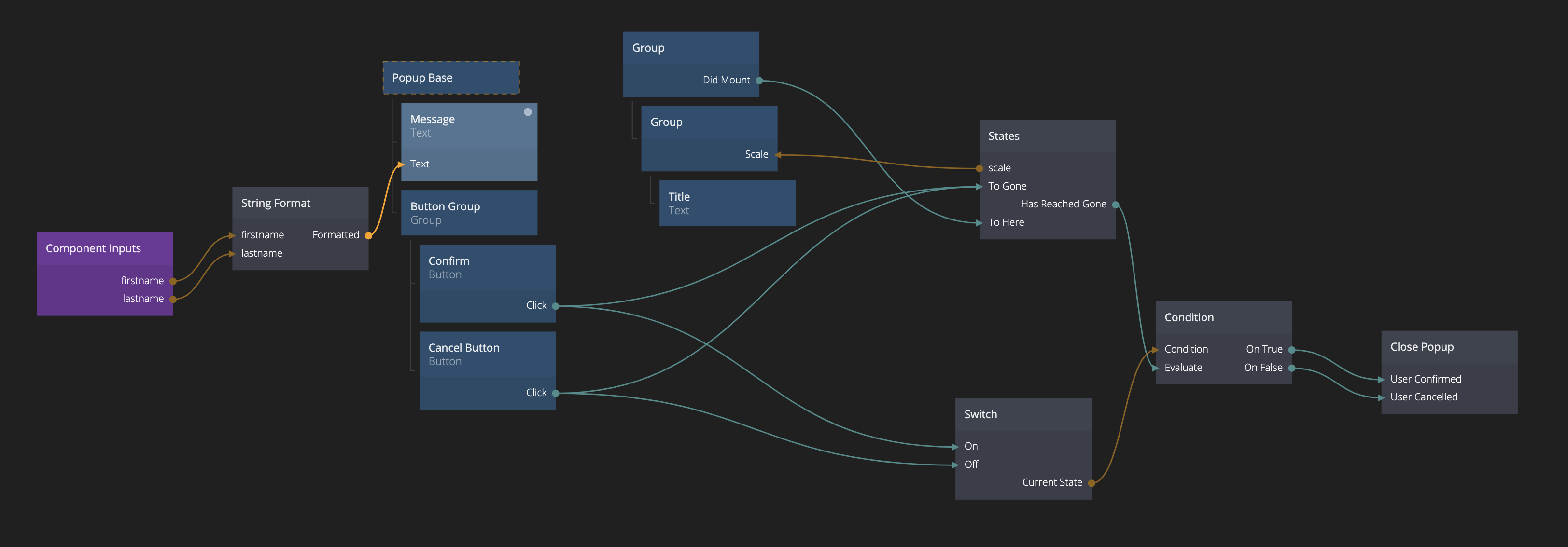
It's a bit of a mess now, because we have two root nodes. We will fix that soon.
Also make sure the Title input of our Popup Base node is correct by clicking on the node. It should be ok, because the default text came from this component when we did the refactoring.
Actually the only thing we need to hook up now is the logic for the closing of the Popup. Remove the States node, that one is part of the Popup Base component now. Reconnect the Click outputs of the buttons to the Start Close Transition signal on the Popup Base. Then connect the outgoing signal Close Transition Done to the Evaluate input of the Condition node. We can now remove the old node tree and only have the one based on the Popup Base node.
Refactoring done! Look, much cleaner looking tree. Make sure the popup still looks and works as before (it should).
You can import the complete project by clicking the Import button below.
If you want to see how to use Popups together with Component Stack you can continue building on this example in the Component Stack Guide.