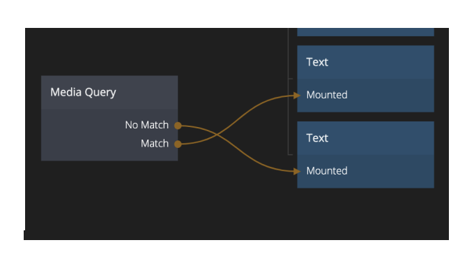
Media Queries
You can access media queries directly through a script. Here's an example you can import and use in your own applications. When you import this module you will get the Media Query component.

You can use this component to show different parts of your UI depending on the screen size.
Here's a few examples of media queries:
(max-width: 375px). This will match if the screen size is375pxor smaller, like on an iPhone 8, or iPhone X.(max-width: 768px). Typical size to check for tablets.(max-width: 1224px). Typical size to check for desktop and laptops.
You can also create more complex media queries that check for multiple sizes, or a range:
(min-device-width: 320px) and (max-device-height: 640px). This will match any size that's above320px, and no larger than640px.