Component Stack
The Component Stack node is used to navigate between components in an area on the screen. It is typically used together with the navigation nodes Push Component To Stack and Pop Component Stack.
Unlike the somewhat similar Page Router the Component Stack is optimized for app type navigation (in contrast to web type) and does not use URLs and routing as part of the navigation.
The Component Stack works as a regular stack, meaning you can Push (put a component at the top of the stack) and Pop (remove the topmost component from the stack). You can also chose to replace all components with the a new component (see Push Component To Stack.
When pushing the Component Stack will create a new instance of the component. Only the top component will be shown. This means that you can have multiple instances of the same component on the stack at the same time. You can use the Reset action to clear the stack.
Adding Component Entries to Push and Pop
A Component Stack should have a number of component entries that it can push or pop. You add components entries by clicking on Add Component button, giving the entry a name and select a component. These entries will then be available in the Push Component To Stack and Pop Component Stack nodes.
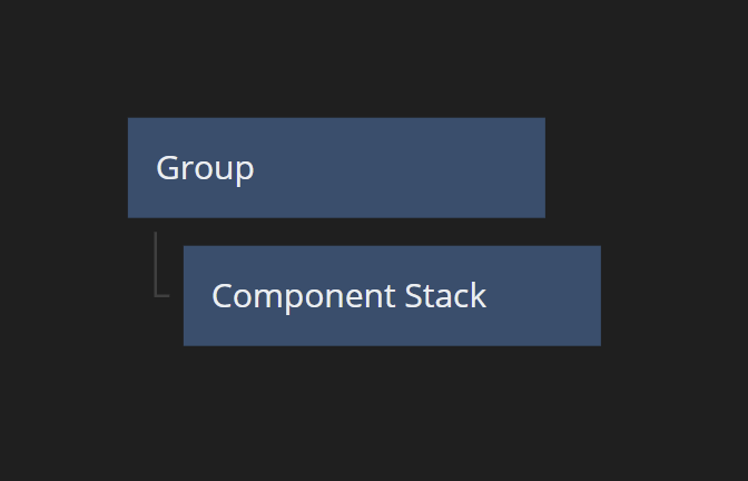
Visual Layout
With the clip property set to false, the Component Stack will automatically take up as much space as available and expand beyond that if its component currently showing is larger. If the clip property is set to true it fill up any available space in its parent container and clip its components if they are larger than that.
If you want to control the size of the Component Stack beyond that, you should put it as a child in a Group node.
Inputs
| Data | Description |
|---|---|
| Name | This is the name of the Component Stack. If you have multiple Component Stacks in your project you use the name to identify it in the Push Component To Stack and Pop Component Stack nodes. |
| Start Page | The Component which will be shown by Component Stack at the start. |
| Clip Content | If this property is set to true the Component Stack will clip any component that is extending beyond its size. If set to false the size of the Component Stack will grow if needed to fit its component. |
| Background Color | The color that will be shown when there is no component covering the Component Stack or when the component is transparent. |
| Mounted | This property is used to completely remove the node from the DOM. If this property is set to false the node is removed from the DOM. It differs from the Visible property where the node is still part of the DOM but invisible. |
| Signal | Description |
|---|---|
| Reset | Triggering this action resets the Component Stack meaning all components on the stack will be removed and only the Start Page will be on the stack. |
| Deprecated | Description |
|---|---|
| Use Routes | This Property is deprecated and should not be used. |
Visual
This node supports the following Visual Input Properties:
Outputs
| Data | Description |
|---|---|
| Top Component Name | This property holds the name of the current component that is on the top of the stack. |
| Stack Depth | This property equals to the number of components that are currently on the Component Stack. |
Visual
This node supports the following Visual Output Properties:
@include "../shared-props/inputs/visual-input-properties.md" @include "../shared-props/outputs/visual-output-properties.md"