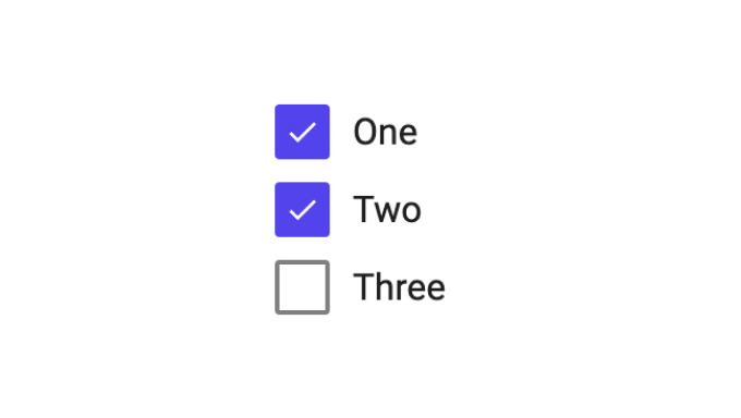
Checkbox Group
This is a small module containing a group of checkboxes that are dynamically created from an array containing at least the Value property, optionally the Label property and others as needed.
When importing the module into your project you get two components Checkbox Group and Checkbox Group Item. Then you can go ahead and use the checkbox group component as follows.
The example below shows how to hook the Checkbox Group up to data in a Record. Make sure you create a property on your record class with the type Array then you can go ahead and store the selection using the Set Record Properties node.
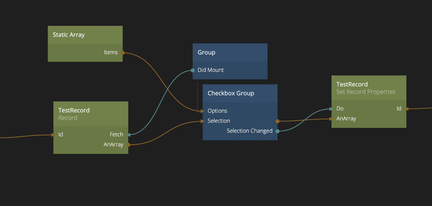
As input it requires two arrays, one containing all possible options, the Options input. This array should contains objects with at least a Value property and optionally a Label property if you do not want to display the value as the label. You can also provide other properties that will be available as inputs to the Checkbox Group Item component. The other array should contain only the current selection, this should be objects with just the Value property (corresponding to the values in the Options) array.
The component will output an array of the selected objects (each an object with a Value property) as well as a signal output called Selection Changed that will be triggered when the selection has changed (duh).