Image Cropper
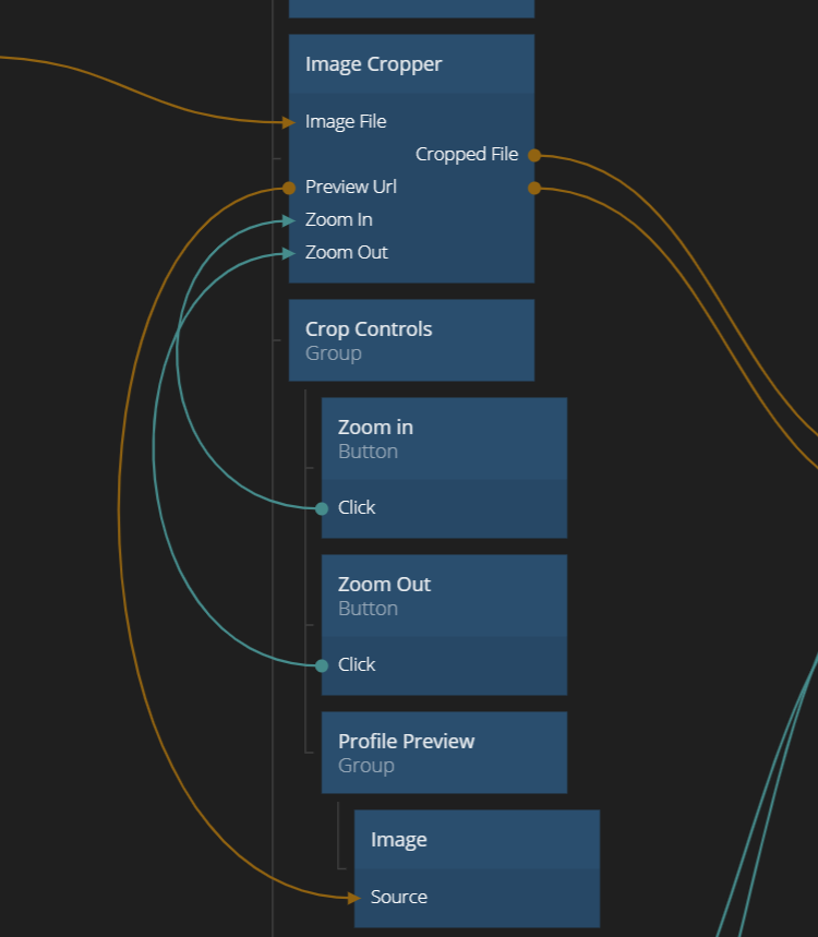
This module contains a simple Image Cropper component, along with an example of how to use it. It's mainly intended to crop images for e.g. profile pictures. The cropper takes a File containing an image as an input (typically coming from an Open File Picker node). It then lets the user pan and zoom in the image to find the area to crop out. The Image Cropper provides a URL to the image and the file object to the area that's currently being cropped out. This file is typically passed to a Upload File node.
How to use
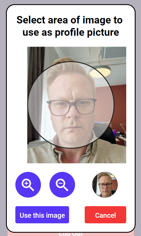
The component itself is relatively simple. It shows the provided picture and a mask on top. The area in the mask is what will be cropped out. The user can pan around and Zoom using the scroll wheel. You can also zoom in and zoom out by triggering signals (e.g. coming from Buttons). The mask can be customized to fit the style of your app.
Each time the user pans or zooms to a new area the cropped version of the image is generated. The component outputs both the File and a URL to the image (which will be a local blob file). Below is an example of how it can be used. (The example is also provided as part of the module).
When you import the module you will get a new sheet called Image Cropper. This will include a folder called Example Usage with a simple example using it in a popup. The main component is the Image Cropper.
Example Usage in 'Sign Up Template'
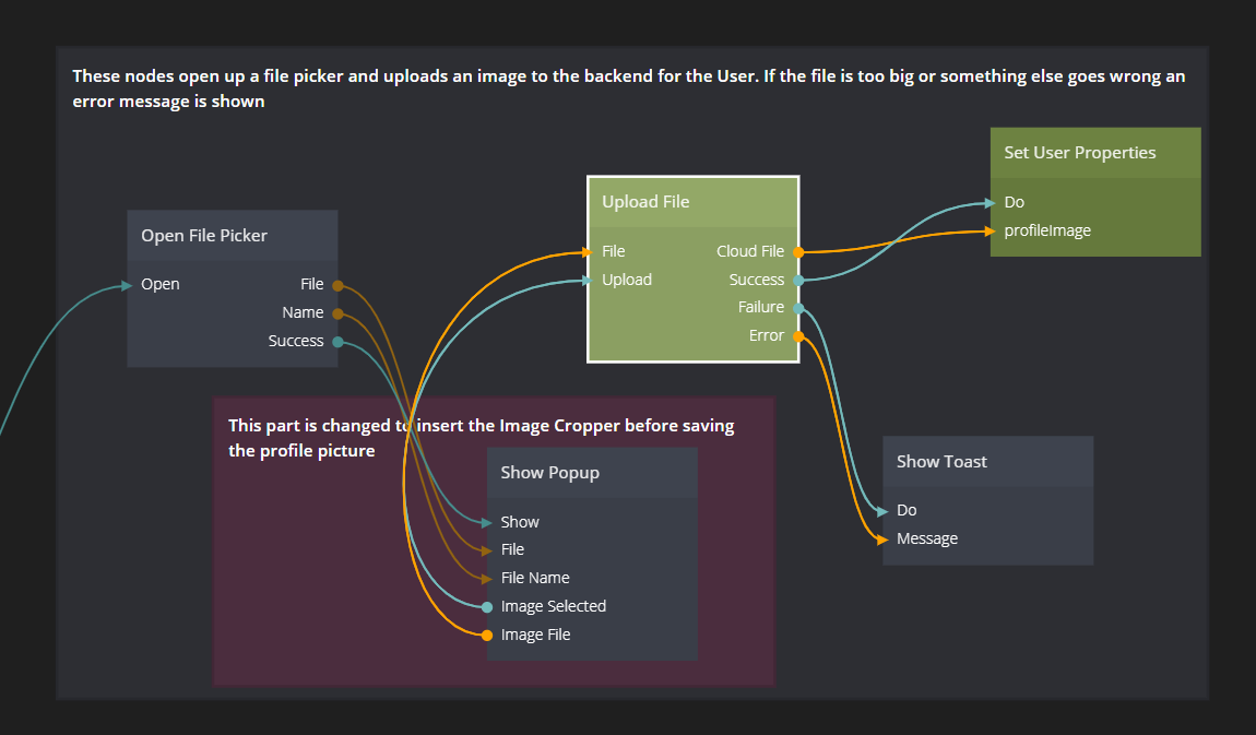
It's very easy to try out the Image Cropper in the Sign Up Template. Start a new project using that template. Then in the page Profile. Then change up the part where the profile picture is saved as the image below.
Use the popup provided in the Usage Example called Cropper Popup.
The Image Cropper Node
Inputs
| Data | Description |
|---|---|
| Circluar Mask | A boolean that decides whether tha mask should be circular or rectangular. Note that unless the ratio of the mask sides is 1:1 the mask will not be truly circular. |
| Mask Ratio Height | The ratio between height and width of the mask to use. For example 1:1 will produce a square mask. |
| Mask Ratio Width | The ratio between height and width of the mask to use. For example 1:1 will produce a square mask. |
| Mounted | Controls whether the control is mounted or not. |
| Target Resolution | The target resolution of the cropped area on it's longest dimension, in pixels. For example, if the ratio between height and width is 2:1, and the target resolution is set to 500 pixels .then the resulting crop will have a height of 500 pixels and width of 250 pixels. However, this resolution cannot exceed the source resolution and if the source resolution is lower, it will use the source resolution. |
| Mask Color | The color of the mask. You should probably use a semi-transparent color if you want the user to see what its cropping. |
| Mask Border Style | The border style of the mask, Solid, Dotted, Dashed or None. |
| Mask Border Color | The border color of the mask. Only applicable if a border style has been set. |
| Mask Border Width | The border width. Only applicable if a border style has been set. |
| Image File | The image file to be cropped. The should be a Javascript File, for example coming from a Open File Picker node. |
| Signal | Description |
|---|---|
| Zoom In | This signal will trigger a Zoom In into the image. |
| Zoom Out | This signal will trigger a Zoom Out of the image. |
Outputs
| Data | Description |
|---|---|
| Cropped File | A file containing the area that have been cropped. This can for example be inputted into a Upload Cloud File node to be stored in the cloud. |
| Preview Url | A URL to a local image. This can be fed into an Image node to render the area that's cropped. |
| Cropped File Size | The size of the image that's cropped in bytes.. |
| Signal | Description |
|---|---|
| New Area Selected | This signal is sent whenever a new area have been selected by the user. When the signal is sent there is a new Cropped File and Preview Url available on the output. |