Group
This node is a styleable container. It can have other visual nodes nested inside of it.

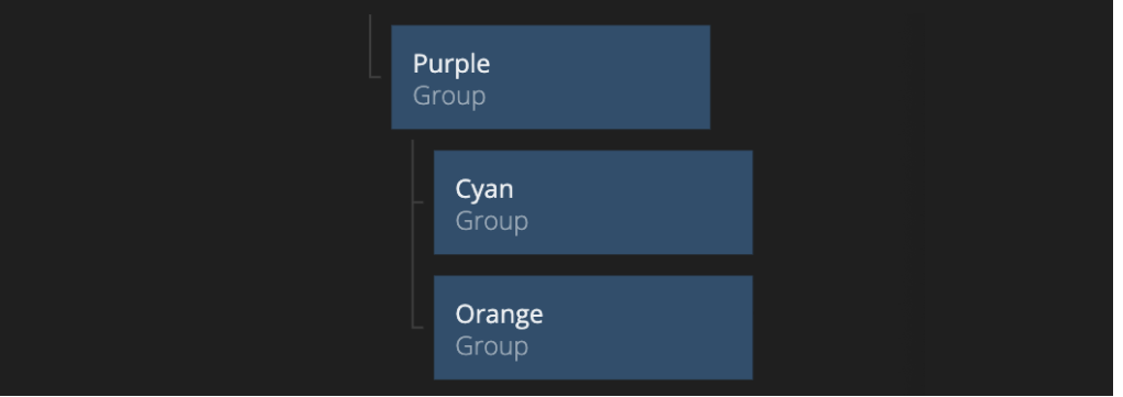
The Group is the most essential node when it comes to creating layouts and arranging visual elements.
Group nodes are typically used to layout children by stacking (the default), but can also be used to simply provide margins and padding to a group of visual nodes. To learn more about Group nodes check out the Layouting guide.
Inputs
Many of the UI nodes share the same inputs. Please refer to the Visual Input Properties documentation.
This node supports the following properties:
- Margin
- Padding
- Alignment
- Dimensions
- Layout
- Align and justify content
- Scroll
- Style
- Border Style
- Corner Radius
- Box Shadow
- Placement
- Dimension Constraints
- Focus
- Other
- Advanced Style
Outputs
Many of the UI nodes share the same outputs. Please refer to the Visual Output Properties documentation.
This node supports the following properties:
@include "../shared-props/inputs/visual-input-properties.md" @include "../shared-props/outputs/visual-output-properties.md"